Reflections [Expanded version]
Navigating the Trump Tariff Tantrum
1.Introduction
In the three days following President Donald Trump’s announcement of sweeping tariffs on April 2, 2025, dubbed “Liberation Day,” the U.S. stock market experienced a dramatic downturn, often referred to as the “Trump Tariff Tantrum.” (TTT) The Dow Jones Industrial Average plummeted over 2,200 points, with the S&P 500 dropping nearly 5% and the Nasdaq falling close to 6% by April 4, erasing post-election gains and wiping out an estimated $5-6.4 trillion in market value. The tariffs, including a minimum 10% on all imports and up to 50% on goods from 57 nations, sparked fears of a global trade war, prompting retaliatory measures like China’s 34% tariffs on U.S. goods, driving recession concerns, and shifting investor expectations toward rapid Federal Reserve rate cuts. Despite some market recovery attempts by April 7, Trump’s refusal to back down and threats of further levies on China kept volatility high and confidence low.
2.Dissecting the TTT
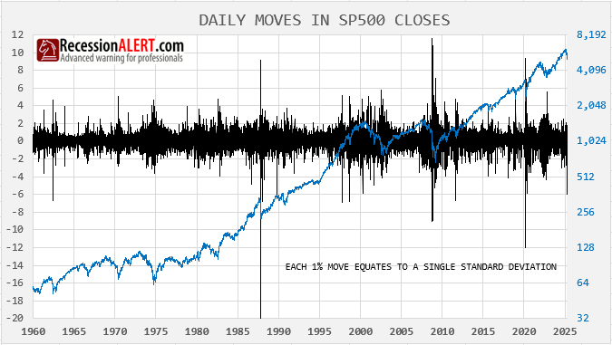
The largest one-day move we saw in the markets’ Trump Tariff Tantrum (TTT) was -5.97%. Daily SP-500 moves since 1960 have a mean of zero, standard deviation 1, so this represents a SIX SIGMA event – something that occurs 3.4 times out of a million. There have been 18 prior occurrences (> 5.95% daily move to the downside) since 1960 but the chart below suggests they are often clustered together.
In fact only 6 times in the past has the first such occurrence been the only isolated one. So entering the market now only offers you a 6/18=33% historical odds we wont see another occurrence again in the next few days. This means you will need some decent follow-through signals to enter the market to avoid potential further extreme down days.
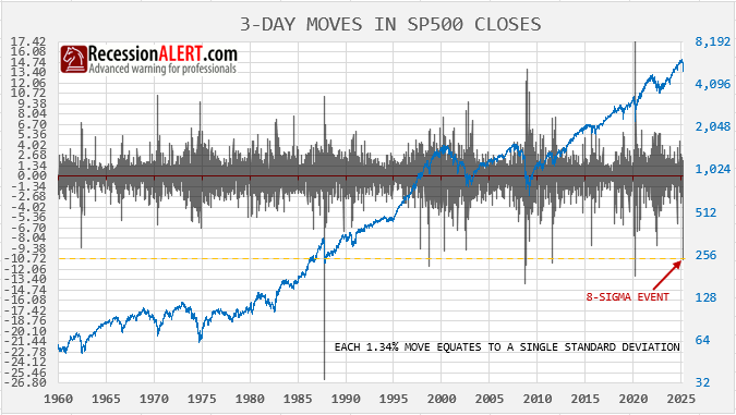
The TTT has witnessed a 3-day draw-down of 10.73% since tariffs were announced. This is the total extent of its damage so far. The TTT draw-down was an 8-sigma event. There have only been 10 cases of a 3-day draw-down exceeding 10.72% since 1960 and only in 3 cases was the first occurrence isolated. This leaves you with a 3/10=33% historical odds we wont see a 3-day draw-down of this nature again within the next 10 days (admittedly with small sample size).
The lesson from these two examples is clear – initial extreme downside volatility begets more extreme volatility in 2/3rds of cases. Extremes in downside are thus poor buy-the-dip signals and decent follow-through signals are required to properly approximate decent entry points.
One of the peculiar features of the TTT is that panic levels were much less than one would expect of a drawdown so ferocious in its nature. On the 2nd day of the TTT we noted that a significant back-to-back plunge like this – without an absence of 13 or 52-week highs – suggested we were not near the bottom as EVERY significant (and some not so significant) bottom since 1990 was characterized by a total lack of new highs:
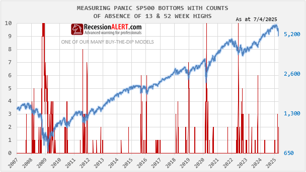
This implied there had not been widespread indiscriminate (panic) selling – a hallmark of all significant bottoms. On the first big down-day of the TTT, new highs actually rose! On the 2nd six-sigma down day, new highs were still present! We assumed that there was heavy selling of large caps, but also rotation into something else:
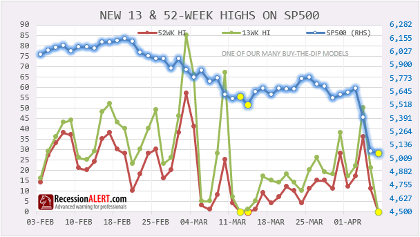
Were it not for the Tariff market surprise, we are convinced that 12/13 March would have formed the significant bottom as depicted by the presence of a lack of new highs at that time. Finally, on the 3rd day of the TTT we saw the lack of new highs characteristic of close proximity to major market bottoms.
Geek Note : Eagle-eyed subscribers will realize that one of our most popular buy-the-dip models called “LACK”, (see LACK tab in PRO>CHARTS) is based off this lack of new highs theory when seeking actionable high confidence market entries at non-trivial market bottoms. It performs so well that it qualifies as one of the seven “bullets” in our MEGA model discussed in Section-4 below.
3.How do we measure the size of the opportunity?
Our research has highlighted six common “fingerprints” witnessed at major market bottoms. These are updated in the DASHBOARD>PANIC tab on a daily basis:
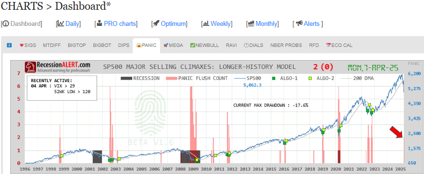
These six metrics are rare events only witnessed near major market bottoms and are a mix of drawdown, technical and breadth metric extremes and volatility measurements. The chart shows a count of the presence of these metrics. This is currently sitting at two. This PANIC indicator merely informs us that a major but rare market event is underway. The count is an expression of panic or peak selling pressure through the measurement of 6 things or “fingerprints” that are commonly present AT OR NEAR major stock market bottoms. They will be very blunt buy signals, since panic could lead to more panic. So whilst 2 levels of panic appears rare it has not been uncommon for this to reach six especially in proper bear markets.
So this is not advisable as a buy signal. Yes, if you are prepared to have massive volatility for a few weeks to even months after you enter and willing to wait out 1 year or more then likely they will appear good signals. Therefore it is best to use ACTION or FOLLOW THROUGH signals to get your market timing much closer to ground zero on these corrections rather than the broad zones depicted by the Panic diffusion (count.)
INCREDIBLE OFFER : Get a huge discount off our annual PRO Subscription, with macro- and market timing models plus unique in-depth quant research such as this research note. NOTE: order before end of month and get two years completely FREE. Get your discount HERE
4.How do we depict follow-through?
The tab to the right of the PANIC tab, called MEGA, contains a collection of 7 of our highest confidence follow-through signals for major market events with a PANIC count of 1 or more. At the top pane of this chart we just re-display the PANIC counts again. They are a depiction of the size of the potential opportunity.
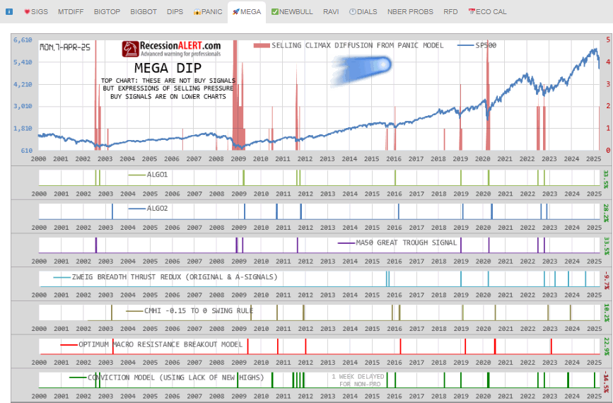
The seven models below the top pane present actionable buy-signals with appropriate follow-through characteristics to minimise volatility, drawdowns and post-signal new lows. We use seven models to diversify the signals as each model measures a different non-overlapping set of metrics and market conditions to make its determinations. The techniques and algorithms used by the models also differ widely. The collection also ensures we never miss an opportunity as its rare to find high confidence models that capture all opportunities.
You can observe that there are quite enough signals to keep even the most sedentary market participant busy. Also note that the models may differ by frequency and whilst rare, it is not uncommon to witness major buying signals within bull markets themselves when no panic signals are present.
You will notice than around major corrections with panic counts of 2 or more, many of these signals will “cluster” around the market trough. In fact historically, at least three (3) models have issued signals closely together around major bear markets. To limit risk (its always there) you could elect (as an example) to deploy 33% of free reserves into the market each time you see a signal, to stage your entries.
5. Can we determine exact bottom probabilities?
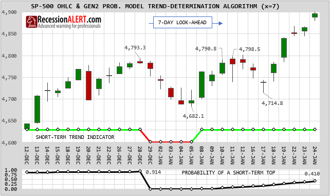
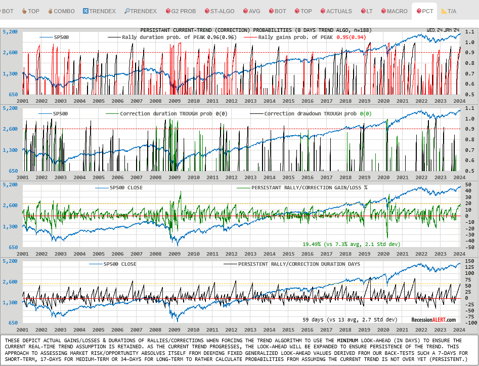
PRO subscribers can go review the SP500 GEN2 Probability model for exact statistical probabilities of a market bottom based on 25 years of history. In this instance its best to review the medium-term probabilities for such a large correction, and this is depicted below:
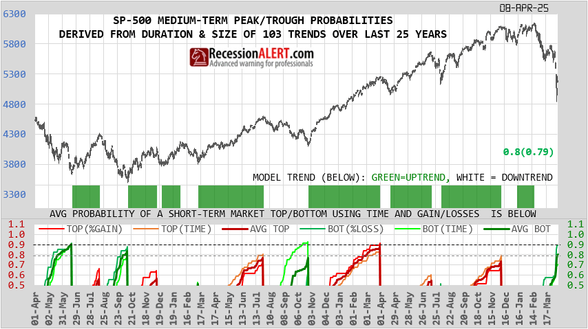
It is showing an average probability of 80% which is derived from the drawdown probability of 90% and the duration probability of 71%. As this correction has been so fast because of the TTT 3-day six sigma plunge, the probability derived from comparing the current drawdown to that of the past is obviously much higher than the probability calculated from how long the correction has been compared to those of the past.
These probabilities merely offer you an indication of your likely success and how close we are to a bottom. With the medium and long-term probabilities our approach is to always consult the highest probability rather than the average when assessing trend reversal odds. So in this case we think were more on the 90% probability.
As with the PANIC diffusion these probabilities are merely guides for descision making and not action signals in themselves. They are blunt instruments and you must always rely on robust follow-through signals to provide the lowest risk actionable market entries.
6.Summary
6.1 The PANIC tab measures size and rarity of the opportunity – un-holster the pistol.
6.2 The GEN2 probability model measures proximity and your likely success – remove the safety catch.
6.3 The MEGA tab contains a chamber of 7 bullets for action – pull the trigger.
Pull the trigger multiple times in case your target (trough ground zero) moves!
INCREDIBLE OFFER : Get a huge discount off our annual PRO Subscription, with macro- and market timing models plus unique in-depth quant research such as this research note. NOTE: order before end of month and get two years completely FREE. Get your discount HERE
Economic Wrap – 1Q2025
Economic Wrap is a quarterly series aimed at taking an objective, evidence-based balanced view snapshot of the US and Global economies – which of course has major implications on all stock markets. It references publicly available data at the time as well as more advanced or sophisticated proprietary models from RecessionALERT that are not publicly available.
In summary, the analysis below provides an evidence-based analysis of the U.S. and global economies, highlighting a complex outlook. The U.S. labor market remains resilient with a 4% unemployment rate, consistent job growth (249,000 monthly gains since May 2024), and wages outpacing inflation (4.5% vs. 2.5%), while GDP and GDI data and NBER coincident models stay above recessionary levels, though leading indicators like the USMLEI (48% recession probability) Recession Diffusion (66% recession probability) and weakening leading labor metrics signal not inconsequential vulnerability. Globally, recovery is underway post a Q3 2023 slump, with the IMF projecting 3.3% growth for 2025, supported by rising G20 LEIs and global central bank monetary policy easing. However, risks persist, including inverted yield curves, declining consumer sentiment, and stagnant U.S. industrial production, creating a mixed picture where recession odds are non-trivial and elevated but not yet dominant. The biggest wild-card for now remains the effects and reaction of the markets and global trade to the recently announced Trump reciprocal tariffs.
1. U.S Economy Recession signals
Here we examine general, widely available public indictors, prediction markets and expert models warning of U.S recession. Several US indicators and models are currently signaling an elevated risk of a recession within the next 6-12 months, as of March 31, 2025. Here’s a breakdown of the key ones based on recent economic data and expert analyses:
1.1 Inverted Yield Curve:
The yield curve, particularly the spread between the 10-year and 3-month Treasury yields, has historically been a reliable predictor of recessions. When long-term yields fall below short-term yields (inversion), it often signals economic slowdown within 12-18 months. As of early 2025, parts of the yield curve have re-inverted, with the 10-year yield dipping below the 3-month yield. The New York Federal Reserve’s model, which uses this spread, recently estimated a recession probability of around 27% for the next 12 months, though earlier in February 2025 it was as high as 58% before adjusting with new data. Despite some questioning its reliability post-COVID, it remains a widely watched indicator.
1.2 Sahm Rule:
Developed by economist Claudia Sahm, this rule suggests a recession is underway when the three-month moving average of the unemployment rate rises by 0.5 percentage points or more above its lowest point in the prior 12 months. While unemployment has increased moderately (hovering around 4% in early 2025), it hasn’t yet triggered the Sahm Rule threshold. However, if joblessness spikes in upcoming reports (e.g., April or May 2025), it could flash a stronger recession signal, especially given softening labor demand noted in recent analyses.
1.3 GDP Nowcasts:
The Atlanta Federal Reserve’s GDPNow model recently indicated negative growth for Q1 2025, with estimates dipping into contraction territory (e.g., -2.8% cited in some posts on X). While not a long-term forecast, this real-time tracker suggests economic activity may already be faltering, raising recession risks if the trend persists into Q2. Full-year 2025 growth is still projected at 2.6% by some economists, but a sharp quarterly decline could shift sentiment. More recently gold imports have been fingered for skewing this forecast and if they are removed, the Q1 2025 growth shifts to +0.25%.
1.4 Consumer Confidence Index:
The Conference Board’s Consumer Confidence Index dropped significantly in February 2025 (to 98.3, down 7 points), the steepest decline since August 2021. The Expectations Index fell below 80 (to 72.9), a level often associated with an impending recession. Over 67% of consumers surveyed expect a downturn within the next 12 months, reflecting pessimism that could curb spending—critical since consumer spending drives about 70% of GDP.
1.5 Prediction Markets and Expert Models:
Platforms like Polymarket estimate a 40-41% chance of a recession in 2025, influenced by trade policy uncertainties under the new Trump administration. J.P. Morgan’s model aligns with this, pegging a 45% probability by year-end 2025, up from 35% earlier, citing tariff risks and slowing growth. Bloomberg Economics’ model recently raised its 12-month recession odds to 38%, incorporating factors like housing permits and consumer surveys. Goldman Sachs just increased its 12-month recession probability for the U.S to 35% from 20%
1.6 Other Leading Indicators:
The Conference Board’s Leading Economic Index (LEI) and the OECD’s leading indicators have shown mixed signals, with some components (e.g., manufacturing orders, bank lending conditions) flashing negative in May 2024 data, per S&P Global. Corporate CFO surveys (e.g., CNBC’s Q1 2025 poll) also predict a recession in the second half of 2025, driven by trade war fears and policy uncertainty, with 95% of CFOs noting impacts on business decisions.
1.7 Context, Caveats & Summary:
- Timing Variability: The yield curve’s signal can precede a recession by up to 18 months, so an inversion now might point to late 2025 or early 2026. The Sahm Rule and GDP nowcasts are more immediate, reacting to current data.
- Mixed Signals: Despite these warnings, job growth remains solid (e.g., 249,000 monthly average in May 2024), and household spending has held steady, per Census Bureau data. This suggests the economy isn’t in freefall yet.
- Policy Impact: Trump’s proposed tariffs and immigration policies are wild cards, potentially amplifying risks by raising costs and constraining labor supply, as noted by J.P. Morgan and CNBC surveys.
- In Summary: The inverted yield curve, weakening GDP nowcasts, declining consumer confidence, and elevated probabilities from models like those of the NY Fed, J.P. Morgan, and Polymarket are the primary indicators pointing to a potential recession within 6-12 months (i.e., by September 2025 to March 2026). However, the absence of a full Sahm Rule trigger and resilient job/household data temper the immediacy, suggesting a slowdown rather than an imminent collapse—unless external shocks (e.g., tariffs) accelerate the downturn. Keep an eye on unemployment reports, Q2 GDP and developments on US tariffs policy for clearer confirmation.
2. U.S Economy Expansion signals
Here are additional important counterpoints specific to the US economy that argue against a recession within the next 6-12 months (i.e., by September 2025 to March 2026). These factors highlight resilience and could offset some of the recessionary signals previously mentioned:
2.1 Strong Labor Market Persistence:
Despite a slight uptick in unemployment (around 4% in early 2025), the US job market remains robust. The May 2024 average of 249,000 monthly job gains (per Census Bureau data) and a low layoffs rate suggest employers are holding onto workers, a stark contrast to pre-recession periods like 2007. Wage growth, while moderating, still outpaces inflation (e.g., 4.5% annualized vs. 2.5% CPI), bolstering household income. A resilient labor market could sustain consumer spending, delaying or averting a downturn through late 2025.
2.2 Consumer Spending Resilience:
Consumer spending, which accounts for roughly 70% of US GDP, has held steady despite confidence dips. Retail sales data from the Census Bureau show consistent growth into early 2025, supported by excess savings from pandemic-era stimulus (estimated at $1.5 trillion remaining by some analysts). Holiday spending in 2024 exceeded expectations, per Mastercard, signaling that households aren’t yet in retrenchment mode—a key buffer against recessionary pressures into mid-2025.
2.3 Monetary Policy Flexibility:
The Federal Reserve has room to maneuver after pausing rate hikes in 2024 and signaling potential cuts in 2025 if growth falters. With inflation near the 2% target (2.5% in recent estimates), the Fed could lower rates by 50-100 basis points by Q3 2025, stimulating borrowing and investment. This contrasts with pre-2008 conditions when rates were already high, leaving less room to act. Goldman Sachs cites this flexibility as a reason for their 35% recession odds, arguing it could extend the expansion through 2025.
2.4 Corporate Profit Strength:
S&P 500 earnings grew by 7% in 2024, per FactSet, with Q1 2025 projections holding steady at 6-8%. Tech and energy sectors, bolstered by AI investment and stable oil prices, are driving profits, cushioning the broader economy. Strong balance sheets—built from post-COVID cost-cutting—mean fewer firms are at immediate risk of distress, even if growth slows. This corporate resilience could keep investment and hiring afloat into 2026.
2.5 Housing Market Stabilization:
Unlike pre-2008, the housing sector isn’t a bubble primed to burst. While building permits have weakened (a recession signal in some models), home prices remain elevated due to low inventory, and mortgage rates have eased slightly from 2023 peaks (e.g., 6.5% for 30-year fixed in early 2025). The National Association of Realtors reports steady demand, suggesting housing won’t drag GDP down as it did in past recessions—potentially stabilizing growth through late 2025.
2.6 Fiscal Policy Boost:
The Trump administration’s agenda, including tax cut extensions and infrastructure spending, could inject stimulus into the economy starting in 2025. While tariffs pose risks, the Congressional Budget Office estimates that proposed tax relief could add 0.5-1% to GDP growth annually. If implemented swiftly, this fiscal tailwind might offset trade-related headwinds, pushing recession risks beyond March 2026.
2.7 Energy Price Moderation:
US energy independence and OPEC+ production adjustments have kept oil prices in a manageable range (e.g., $70-80/barrel in early 2025). This avoids the stagflationary shocks of past downturns, preserving disposable income and business margins. Lower energy costs could sustain economic activity through mid-2025, countering global commodity volatility.
2.8 Context and Implications:
These counterpoints suggest the US economy retains significant buffers: a tight labor market, healthy consumer and corporate finances, and policy levers to stimulate growth. They align with optimistic forecasts like Goldman Sachs’ (35% recession odds) and contrast with gloomier indicators like the yield curve or consumer confidence drops. However, their effectiveness hinges on execution (e.g., Fed timing, fiscal rollout) and external factors (e.g., no major trade war escalation). If unemployment spikes unexpectedly or tariffs disrupt supply chains, these strengths could erode quickly.
In short, the US economy’s labor resilience, consumer spending, policy flexibility, and sectoral stability provide compelling counterarguments to a near-term recession. These factors could keep growth positive—or at least delay a downturn—into 2026, barring significant shocks. Monitor jobs reports and Fed actions in Q2 2025 for confirmation of this trajectory.
3. U.S Economy Head-to-head
Determining whether the US recession arguments or the counterpoints “win the day” depends on weighing the strength, immediacy, and reliability of the evidence on both sides. Here’s an analysis to assess which set of arguments currently holds the upper hand:
3.1 Recession Arguments – Strengths :
- Historical Reliability: The inverted yield curve (e.g., 10-year vs. 3-month Treasury spread) has predicted every US recession since the 1950s with a lead time of 12-18 months. Its re-inversion in early 2025 strongly suggests a downturn by late 2025 or early 2026.
- Consumer Sentiment Drop: The Conference Board’s Expectations Index falling below 80 (to 72.9 in February 2025) has preceded recessions consistently, reflecting a self-fulfilling prophecy as spending slows. Over 67% of consumers expecting a downturn adds psychological weight.
- Model Consensus: J.P. Morgan (45%), Polymarket (40-41%), and Bloomberg Economics (38%) align on elevated recession odds within 12 months, bolstered by trade policy risks and GDP nowcasts showing Q1 2025 contraction (e.g., -2.8% per Atlanta Fed).
- External Risks: Trump’s tariff proposals (25% on Canada/Mexico, 20% on China) could disrupt trade, raise costs, and trigger retaliation, amplifying global and domestic slowdown signals by Q3 2025.
3.2 Recession Arguments – Weaknesses:
- Timing Uncertainty: The yield curve’s signal can lag by up to 18 months, pushing a recession beyond March 2026—outside the 6-12 month window. The Sahm Rule hasn’t triggered yet (unemployment rise below 0.5 points), weakening near-term urgency.
- Mixed Data: GDP growth forecasts for 2025 (e.g., 2.6% full-year) and solid job gains (249,000 monthly average in May 2024) contradict immediate collapse narratives.
3.3 Counterpoints – Strengths :
- Labor Market Resilience: A 4% unemployment rate, consistent job growth, and wage increases outpacing inflation (4.5% vs. 2.5%) provide a sturdy foundation. Pre-recession labor markets typically show sharper deterioration, absent here.
- Consumer Spending Power: Excess savings ($1.5 trillion) and steady retail sales (e.g., strong 2024 holiday spending) suggest households can weather sentiment dips, sustaining 70% of GDP through late 2025.
- Policy Levers: The Fed’s ability to cut rates (potentially 50-100 basis points) and Trump’s fiscal plans (tax cuts, infrastructure) offer proactive buffers, unlike pre-2008 constraints. Goldman Sachs’ 35% odds reflect confidence in these tools.
- Corporate and Sectoral Health: S&P 500 profit growth (7% in 2024, 6-8% projected for Q1 2025) and a stable housing market (no bubble, easing rates) reduce systemic risks, supporting investment and growth into 2026.
3.4 Counterpoints – Weaknesses:
- Vulnerability to Shocks: Tariffs or a sudden unemployment spike could overwhelm these strengths, eroding consumer and corporate confidence faster than policy can respond.
- Over-Optimism: Counterpoints assume smooth policy execution and no major external disruptions (e.g., Middle East conflict spiking oil prices), which may underestimate tail risks flagged by recession models.
3.5 Head-to-Head Evaluation:
- Immediacy: Recession signals like GDP nowcasts and consumer confidence are flashing now, but lack confirmation from real-time triggers like the Sahm Rule. Counterpoints lean on current strengths (jobs, spending) that are tangible and ongoing, giving them a slight edge in the 6-12 month window.
- Predictive Power: The yield curve and consumer expectations have stronger historical track records than labor resilience or policy promises, which can falter under stress. This tilts long-term credibility toward recession arguments.
- Magnitude of Impact: Recession risks amplify if trade wars escalate, a plausible near-term catalyst. Counterpoints rely on stability and gradual policy effects, which may not match the speed of a tariff-driven shock.
- Data Balance: The economy’s mixed signals—growth forecasts vs. sentiment drops—mean neither side has a knockout punch yet. However, counterpoints benefit from observable, positive metrics over speculative downturn risks.
3.6 Verdict: Counterpoints Edge Out (for Now):
The counterpoints narrowly “win the day” within the 6-12 month horizon (September 2025 to March 2026). The US economy’s current resilience—robust jobs, consumer spending, and policy flexibility—outweighs the recession signals’ immediacy, which are potent but not fully crystallized (e.g., no Sahm Rule trigger, yield curve lag). The labor market and household finances provide a buffer that could hold through mid-2025, absent a major shock like tariff implementation or a geopolitical crisis.
However, the recession arguments retain a strong case for a downturn by late 2025 or early 2026, especially if external risks materialize. The counterpoints’ victory is conditional and fragile—watch unemployment trends, Fed moves, and trade policy outcomes in Q2 2025. If those tilt negative, the recession side could reclaim dominance swiftly. For now, resilience trumps warning signs, but it’s a close call.
4. Global Economy Recession signals
Here we examine general, widely available public indictors, prediction markets and expert models warning of global recession. Several global economic indicators and models are signaling an elevated risk of a global recession within the next 6-12 months (i.e., by September 2025 to March 2026). Below is an overview of the key indicators and models currently pointing to this possibility, based on recent economic analyses and data:
4.1 Inverted Global Yield Curves:
Globally, the inversion of yield curves—where short-term interest rates exceed long-term rates—remains a potent recession signal. For instance, the US 10-year minus 3-month Treasury spread, a benchmark influencing global markets, has re-inverted in early 2025, reflecting expectations of economic slowdown. Similar patterns are observed in other major economies like Germany and the UK, where yield curve inversions have historically preceded recessions by 12-18 months. This suggests a potential global downturn could emerge by late 2025 or early 2026, driven by tighter monetary policies and weakening investor confidence.
4.2 OECD Composite Leading Indicators (CLI):
The Organisation for Economic Co-operation and Development (OECD) tracks leading indicators across its 38 member countries. Recent CLI data (as of May 2024, per S&P Global) shows a downward trend in several advanced economies, particularly in manufacturing and new orders, signaling a loss of economic momentum. While not yet at recessionary levels across all regions, the CLI’s softening in Europe and parts of Asia (e.g., Japan) raises concerns about a synchronized global slowdown within the next year, especially if trade disruptions intensify.
4.3 Global PMI (Purchasing Managers’ Index):
The J.P. Morgan Global Manufacturing PMI has hovered near or below the 50 threshold (indicating contraction) in recent months, with February 2025 data reflecting weakness in export orders due to anticipated US tariffs under the Trump administration. A sustained drop below 50, particularly if services PMIs follow, could foreshadow a recession by Q3 2025, as manufacturing often leads broader economic cycles. Europe’s PMI, especially in Germany, is already in contraction territory, amplifying global risks.
4.4 Consumer Confidence Declines:
Globally, consumer confidence is waning, a critical indicator given that consumption drives much of economic activity. In the US, the Conference Board’s Consumer Confidence Index fell sharply in February 2025 (to 98.3), with expectations dropping below 80—a recessionary signal. Similar declines are noted in Europe (e.g., Eurozone Consumer Confidence at -14.8 in early 2025) and China (post-COVID recovery stalling). If this pessimism curbs spending further, a global recession could materialize by late 2025, as seen in past downturns like 2008.
4.5 Prediction Markets and Expert Models:
Polymarkets’ global recession odds for 2025 stand at 41%, up from earlier estimates, reflecting trader bets on policy shocks like US tariffs (25% on Canada/Mexico, 20% on China). J.P. Morgan’s global recession probability rose to 40% for 2025 (from 35%), citing trade war risks and slowing US/China growth. The World Bank’s January 2025 “Global Economic Prospects” warns of a 2.7% global growth rate in 2025—near recessionary levels if downside risks like trade policy shifts or energy price spikes materialize. Bloomberg Economics pegs a 38% chance of a US-led global slowdown, factoring in consumer and trade data.
4.6 IMF and World Bank Warnings:
The International Monetary Fund (IMF) projects global growth at 3.3% for 2025 (March 2025 World Economic Outlook update), but flags downside risks from escalating conflicts (e.g., Middle East), tighter financial conditions, and trade fragmentation. A drop below 3% is often a recession precursor, and their alternative scenarios suggest a 2.5% growth rate if trade tensions worsen—possible by Q4 2025. The World Bank echoes this, highlighting policy uncertainty and climate shocks as triggers for a downturn within 12 months.
4.7 Trade and Commodity Signals:
The Baltic Dry Index, a measure of global shipping demand, has softened in early 2025, hinting at reduced trade activity amid tariff threats. Commodity prices, particularly oil, are volatile due to OPEC+ cuts and geopolitical tensions, with potential spikes risking stagflation—a recessionary condition last seen in the 1970s. Copper prices, a bellwether for industrial activity, have also trended lower, signaling weaker global demand by mid-2025 if current trajectories hold.
4.8 Context, Caveats & Summary:
- Timing Uncertainty: Indicators like yield curves and PMIs often lead recessions by 6-18 months, placing the risk window between late 2025 and early 2026. Consumer confidence and trade signals, however, can accelerate this timeline if shocks intensify.
- Regional Divergence: Europe and China face higher immediate risks (e.g., Germany’s industrial slump, China’s property sector woes), while emerging markets like India (6.2% growth forecast) may offset some global weakness—delaying but not preventing a broader recession.
- Policy Shocks: Trump’s tariff proposals and potential retaliatory measures from trading partners (e.g., EU, China) are wildcard factors. J.P. Morgan notes a possible 10-point tariff hike could slash global growth by 0.5%—enough to tip the scales by Q3 2025.
- Summary : Inverted yield curves, declining OECD CLIs, weakening PMIs, falling consumer confidence, and elevated model probabilities from J.P. Morgan, Polymarket, and the World Bank are key global indicators pointing to a recession risk within 6-12 months. The interplay of trade policy shocks and regional vulnerabilities heightens this likelihood, though robust pockets of growth could still avert a full downturn. Watch PMI trends, OECD CLI’s and trade developments in Q2 2025 for clearer signals.
5. Global Economy Expansion signals
Here are important counterpoints specific to the global economy that argue against a recession within the next 6-12 months (i.e., by September 2025 to March 2026). These factors highlight resilience and could offset some of the recessionary signals previously outlined:
5.1 Emerging Market Growth Momentum:
Economies like India and Southeast Asia are projected to grow robustly, with India’s GDP forecast at 6.2% for 2025 (per IMF) and ASEAN countries averaging 4-5%. These regions, less exposed to US tariff risks, are benefiting from manufacturing shifts away from China and strong domestic demand. Their buoyancy could offset slowdowns in advanced economies (e.g., US, Europe), stabilizing global growth through late 2025.
5.2 Global Services Sector Strength:
While manufacturing PMIs signal contraction (e.g., J.P. Morgan Global Manufacturing PMI near 50), the services sector—comprising over 60% of global GDP—remains resilient. In the US, Eurozone, and parts of Asia, services PMIs are holding above 50 in early 2025, driven by digital transformation and consumer spending. This resilience could delay a full recessionary slide into 2026, cushioning weaker industrial activity.
5.3 Central Bank Adaptability:
Major central banks (Federal Reserve, ECB, Bank of Japan) have signaled willingness to ease monetary policy if growth falters. With global inflation cooling (e.g., 3% average in OECD countries), rate cuts in 2025—potentially 50-75 basis points by Q3—could stimulate investment and consumption. The ECB, for instance, has room to act as Eurozone inflation nears 2%, offering a buffer against recession risks through mid-2025.
5.4 Energy Market Stability:
Despite geopolitical tensions, oil prices remain manageable ($70-80/barrel in early 2025), thanks to OPEC+ coordination and US production. This avoids the energy price shocks that fueled past global downturns (e.g., 1970s stagflation). Stable energy costs support industrial activity and household budgets, potentially sustaining growth into Q1 2026.
5.5 Corporate Cash Reserves:
Globally, corporations have amassed significant cash reserves post-COVID, with S&P Global 500 firms holding over $7 trillion in liquid assets by late 2024. This financial cushion—bolstered by profit growth (e.g., 7% in the US)—enables firms to weather trade disruptions or demand dips, maintaining investment and hiring through late 2025 and reducing systemic risk.
5.6 China’s Policy Stimulus:
China, the world’s second-largest economy, is rolling out fiscal and monetary measures to counter its property sector slump and boost growth (projected at 4.5% for 2025 by the World Bank). Infrastructure spending and consumer incentives could stabilize its economy, a key driver of global demand, preventing a sharper downturn by Q3 2025.
5.7 Trade Adaptation:
While US tariffs (e.g., 25% on Canada/Mexico, 20% on China) pose risks, global supply chains have shown adaptability since COVID. Firms are diversifying sourcing (e.g., Vietnam, India) and boosting regional trade (e.g., EU-Mercosur talks advancing). This flexibility could mitigate tariff impacts, keeping global trade flows intact through mid-2025 and averting a recession trigger.
5.8 Context, Caveats & Summary:
These counterpoints emphasize the global economy’s diverse strengths: growth in emerging markets, a robust services sector, policy flexibility, and adaptive capacity. They align with optimistic outlooks like Goldman Sachs’ lower recession odds (35% for the US, with global implications) and contrast with gloomier signals like inverted yield curves or declining PMIs. Their effectiveness depends on execution (e.g., timely stimulus, trade rerouting) and avoiding major disruptions (e.g., Middle East escalation spiking oil prices). If these hold, they could push recession risks beyond March 2026.
In summary, emerging market resilience, services strength, central bank agility, energy stability, corporate buffers, China’s stimulus, and trade adaptability provide a compelling case against a global recession in the next 6-12 months. These factors could sustain growth—or at least delay a downturn—into 2026, barring significant shocks. Monitor services PMIs, China’s policy outcomes, and trade data in Q2 2025 for confirmation of this resilience.
6. Global Economy Head-to-Head
Determining whether the global recession arguments or the counterpoints “win the day” within the next 6-12 months (i.e., by September 2025 to March 2026) requires a head-to-head evaluation of their strength, immediacy, and reliability. Here’s the analysis in the same format as provided for the US economy:
6.1 Recession Arguments – Strengths:
- Historical Reliability: Inverted yield curves in major economies (e.g., US, Germany, UK) have consistently foreshadowed global recessions with a 12-18 month lead time. Their presence in early 2025 points to a potential downturn by late 2025 or early 2026.
- Consumer Sentiment Drop: Declines in consumer confidence across key regions—US (Expectations Index at 72.9), Eurozone (-14.8), and China (post-COVID stall)—signal reduced spending, a critical driver of global GDP. This pessimism could accelerate a slowdown by Q3 2025.
- Model Consensus: J.P. Morgan (45%), Polymarket (41%), and Bloomberg Economics (38%) converge on heightened recession odds within 12 months, amplified by trade policy risks (e.g., US tariffs) and weakening PMIs (global manufacturing near 50).
- External Risks: Escalating trade tensions (e.g., 25% US tariffs on Canada/Mexico, 20% on China) and geopolitical flashpoints (e.g., Middle East) could disrupt supply chains and spike commodity prices, triggering a synchronized global downturn by mid-2025.
6.2 Recession Arguments – Weaknesses:
- Timing Uncertainty: Yield curve inversions and PMI declines often precede recessions by up to 18 months, potentially pushing the downturn beyond March 2026—outside the 6-12 month window. Immediate triggers like a sharp PMI drop below 50 across services haven’t materialized yet.
- Mixed Data: Global growth forecasts (e.g., IMF’s 3.3% for 2025) and resilience in emerging markets (e.g., India at 6.2%) suggest the economy isn’t in freefall, diluting the urgency of recession signals.
6.3 Counterpoints – Strengths :
- Emerging Market Resilience: India (6.2% growth) and ASEAN (4-5%) provide a counterweight to advanced economy slowdowns, sustaining global demand and trade flows through late 2025.
- Services Sector Strength: Global services PMIs above 50 (e.g., US, Eurozone) underpin over 60% of GDP, offering a buffer against manufacturing weakness and potentially delaying recession into 2026.
- Policy Levers: Central banks (Fed, ECB, BoJ) have room to cut rates (e.g., 50-75 basis points by Q3 2025), while China’s stimulus (infrastructure, consumer incentives) could stabilize its 4.5% growth, supporting the global economy through mid-2025.
- Corporate and Trade Buffers: $7 trillion in corporate cash reserves and supply chain adaptability (e.g., shifts to Vietnam, India) reduce vulnerability to trade shocks, maintaining economic activity into Q1 2026.
6.4 Counterpoints – Weaknesses :
- Vulnerability to Shocks: A rapid escalation of tariffs or an energy price surge (e.g., Middle East conflict) could overwhelm these strengths, hitting trade-dependent economies and consumer budgets faster than policy can respond.
- Over-Optimism: Counterpoints assume effective policy coordination and no major geopolitical disruptions, underestimating tail risks like those flagged by recession models (e.g., World Bank’s 2.7% downside scenario).
6.5 Head-to-Head Evaluation :
- Immediacy: Recession signals like weakening PMIs and consumer confidence are active now, but lack a definitive global trigger (e.g., services PMI collapse). Counterpoints draw on current strengths (services, emerging markets) that are measurable and ongoing, giving them a slight edge in the 6-12 month window.
- Predictive Power: Yield curves and consumer sentiment have a stronger track record of signaling global downturns (e.g., 2008) than services resilience or emerging market growth, which can falter under systemic stress. This tilts long-term credibility toward recession arguments.
- Magnitude of Impact: Recession risks escalate quickly if trade wars or commodity shocks hit, outpacing the gradual stabilizing effects of policy or corporate buffers. This gives recession arguments an edge in potential severity.
- Data Balance: Mixed signals—global growth forecasts vs. trade risks—mean neither side dominates fully. Counterpoints, however, leverage tangible positive trends over speculative risks, offering a near-term advantage.
6.6 Verdict: Counterpoints Edge Out (for Now)
The counterpoints narrowly “win the day” within the 6-12 month horizon (September 2025 to March 2026). The global economy’s current resilience—emerging market growth, services strength, policy flexibility, and adaptive trade—outweighs the recession signals’ immediacy, which are compelling but not yet conclusive (e.g., no widespread PMI collapse, yield curve lag). These buffers could sustain growth—or at least postpone a downturn—through mid-2025, barring a major shock like tariff escalation or geopolitical crisis.
That said, the recession arguments hold a potent case for a downturn by late 2025 or early 2026, especially if external risks intensify. The counterpoints’ edge is tenuous and hinges on stability in trade and energy markets. Watch global PMIs, China’s stimulus impact, and US tariff rollout in Q2 2025. If these turn negative, the recession side could swiftly take over. For now, resilience prevails, but it’s a tight race.
7. Summary of public data
In this analysis, we evaluated the likelihood of a recession within the next 6-12 months (September 2025 to March 2026) for both the US and global economies, as of March 31, 2025, by examining key public indicators and models predicting a downturn against counterpoints highlighting resilience. For the US, recession signals like an inverted yield curve, declining consumer confidence, and elevated model probabilities (e.g., J.P. Morgan at 40%) were weighed against robust job growth, consumer spending, and policy flexibility, with counterpoints edging out due to current economic strength. Globally, recession warnings from yield curves, weakening PMIs, and trade risks were pitted against emerging market growth, services sector strength, and central bank adaptability, with counterpoints again prevailing narrowly due to ongoing resilience. Each evaluation included a head-to-head comparison of strengths, weaknesses, immediacy, and predictive power, concluding that while recession risks loom—especially if trade or geopolitical shocks hit—the US and global economies’ buffers provide a slight edge against an imminent downturn, though the situation remains fluid and warrants close monitoring over the next few quarters.
8. The RecessionALERT data
In this section we will observe key non-public proprietary metrics from RecessionALERT to complement the public view in sections 1 through 7.
8.1 Recession Concerns
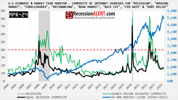
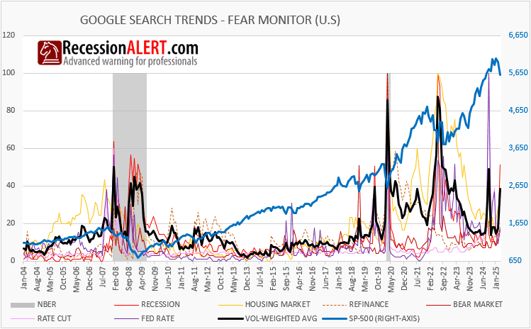
We can confirm that concerns about a US recession are on the rise again, noting however that it is isolated to the “recession” search term on Google and not the other search terms that have historically accompanied a genuine recession or wholesale recession scare such as 2022. However as this search term dominates in the search volume rankings of the group, it has had the effect of raising the volume-weighted average considerably for the month of March:
8.2 The US Coincident data
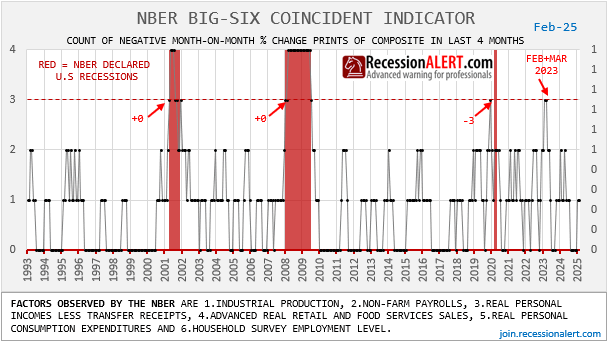
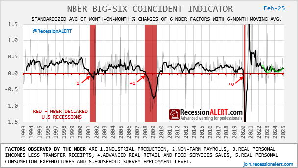
The NBER Big-Six coincident indicator shows a US economy that weakened considerably in 1Q2023, narrowly missing recessionary levels, but has since recovered and actually appears on the mend:
8.3 The Trade Volume Data
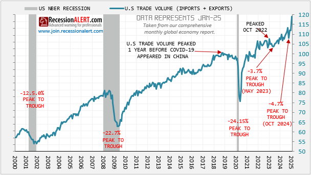
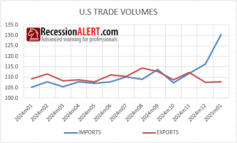
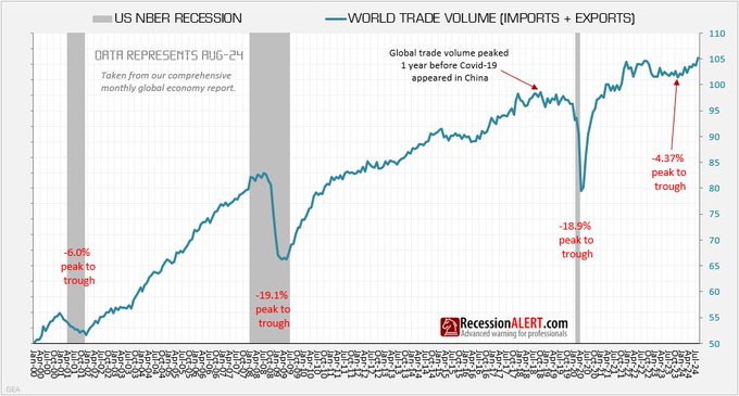
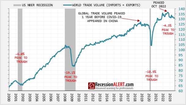
U.S (and global) trade volumes look surprisingly robust and support the view of a healthy current economy. Both appear to be actually going parabolic:
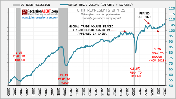
Given the massive jump the US is showing recently, one cant but help wonder if this jump is due to the gold imports issue that is being fingered for depressing the Real GDPNow forecast. Indeed this appears to be the case:
Ignoring this anomaly, trade volumes in the US are nonetheless on the climb.
8.4 The Industrial Production Data
Global industrial production seem unfazed:
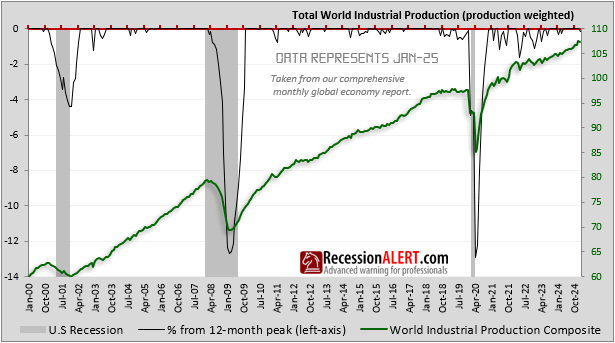
..but the US data is moribund:
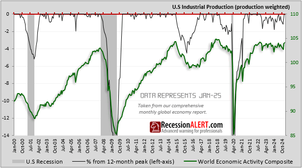
8.5 The GDP Data
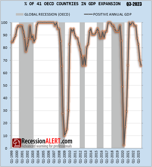
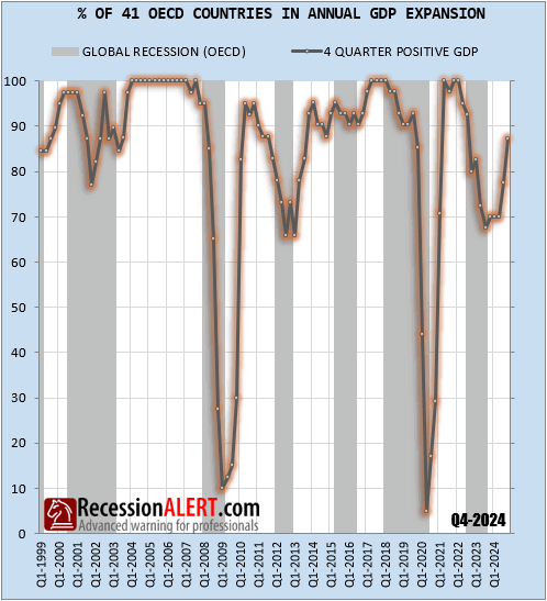
The worlds 41 largest economies, accounting for over 95% of global GDP, are on the mend after a 3Q2023 slump, most likely the depth of a global recession (not yet declared by OECD by coinciding with the US slump at the time). Another coincident (actually GDP is slightly rear-view) metric showing world economy on the mend.
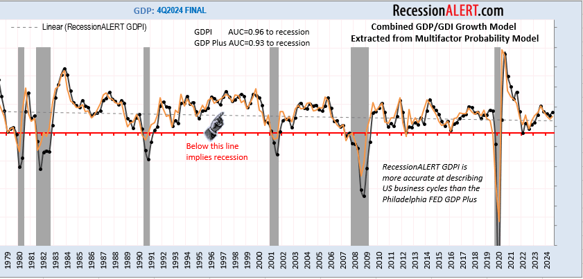
US GDP & GDI combined data is nowhere near recessionary levels but 1Q2025 will be an interesting print given the GDPNow forecasts skewed with the gold imports. Our combined GDP/GDI model (GDPI) in black below is compared to the Philadelphia FED GDP Plus model:
8.6 The U.S Leading economic data
The higher frequency Weekly Leading Economic Index (WLEI) and the pseudo-weekly SuperIndex are showing a non-trivial weakening of late. It should be noted that whilst the WLEI entered expansion territory around mid-2023, with strong future growth signalled all the way to late 2024 before declining again, the SuperIndex has yet to raise its head above water. The Weekly Leading Aggregate (WLA) which is just the average of these two is now flirting with the recessionary warning line.
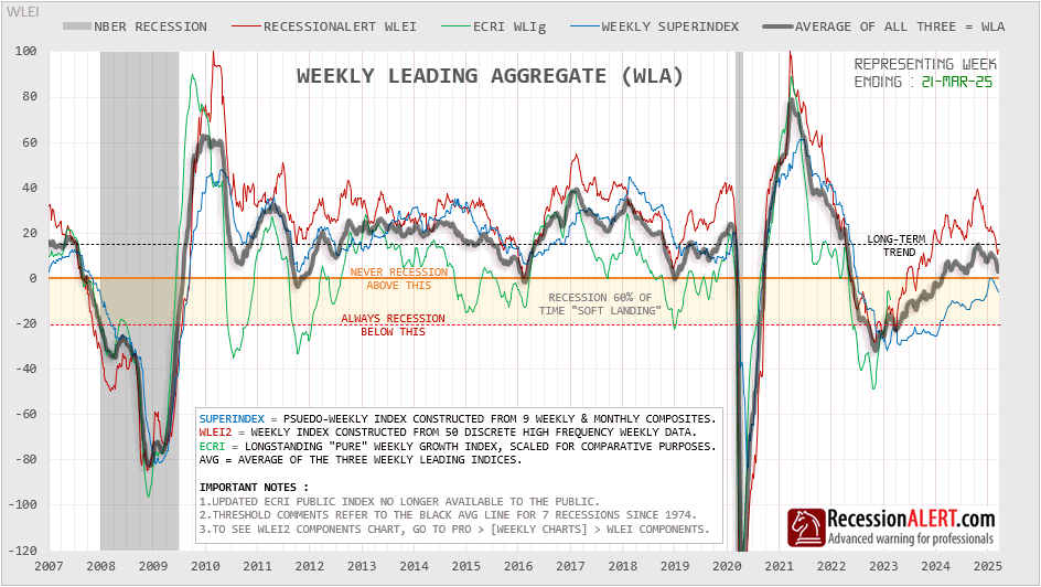
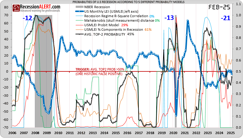
The 23 factor US Monthly Leading Economic Index (USMLEI), from which we derive 5 different probability models for recession (and focus on the top-2 probabilities) has also failed to keep head above water for longer than a 2-month stint, with over 61% of its 23 components still in recession territory. This is a story being witnessed among many other monthly leading indices such as the Conference Board one. Whilst they showed things getting much less worse from about mid 2023 they never quite reached the “things are getting better” situation. The Top-2 probabilities are now hovering around the 45% mark, very similar to other figures we saw in section 1.5 at the beginning of this report.
8.7 The Global Leading Economic Data:
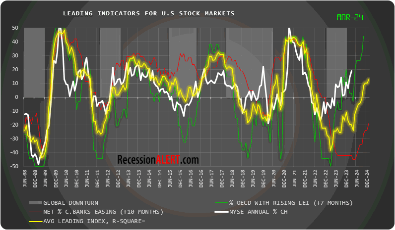
Lets look at the leading global data, picked from our monthly Global Economic Report. One of the most widely followed metrics among our clients is the percentage of G20 countries with rising “headline” LEI indices (the actual indices, not the growth metrics.) This is popular due to its high correlation to US stock market movements with an 8-month lead, as shown below. This correctly signaled a boom in US stocks from 1Q2023 to this day and suggests further upside for US stocks:
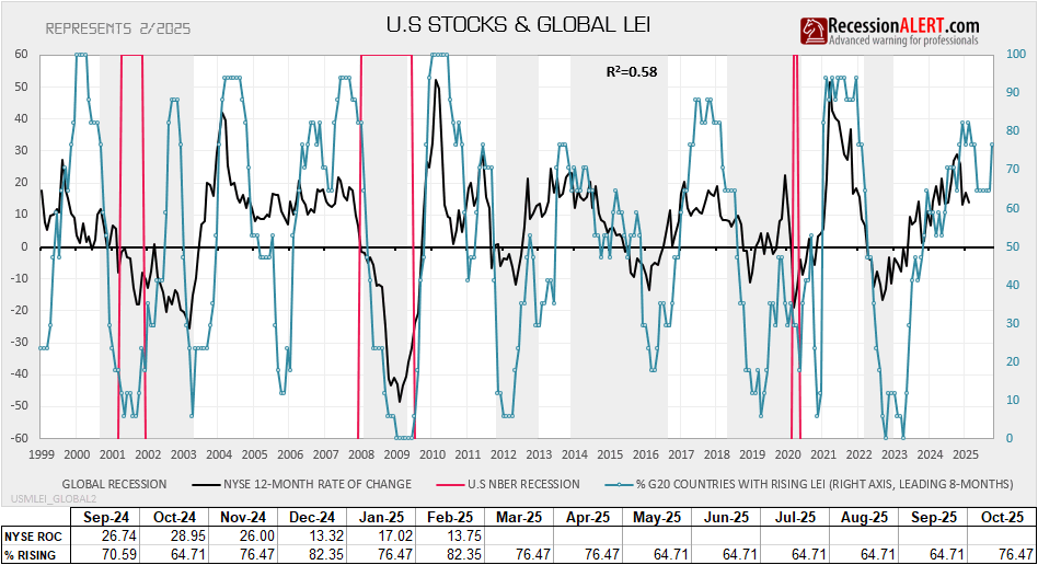
This is one of the more bullish indicators right now since this correlation to future 8-month US stocks movements extends to US economic data too – effectively giving us a “leading indicator for the US leading data” or in mathematical terms “a 2nd-deriviative” for the USMLEI or in economic terms, “a long-leading indicator for US economic conditions“. This is also suggesting a strong tailwind for the USMLEI and other such variants such as the Conference Board LEI:
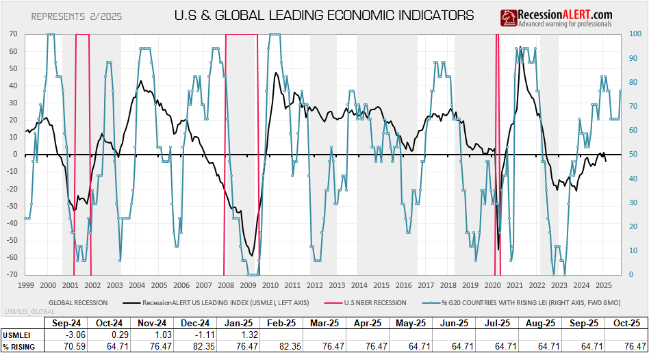
There is a caveat to this bullish metric though. If we examine its 1st derivative, namely the percentage of G20 countries with rising LEI growth metrics (based on six month smoothed growth of the headline LEI for each country) we see some cause for caution as this breadth metric is not only slowing, but it has gone “negative” (below 50%). This tells us that these headwinds are at high risk of petering out since the 1st derivative is a “leading indicator” for 3-4 month future direction of the %G20 with rising LEI metric:

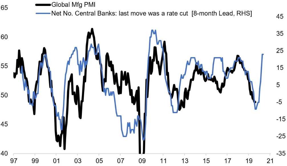
On the topic of global leading data, another important leading indicator is the breadth of global central bank monetary policy easing, as measured by the % countries with falling interest rates. This has maximum correlation with US leading economic data (USMLEI) when pushed a full 12 months into the future, maximum correlation with annual US stock returns when pushed 10 months into the future and maximum correlation with the global manufacturing PMI when pushed 8 months into the future:
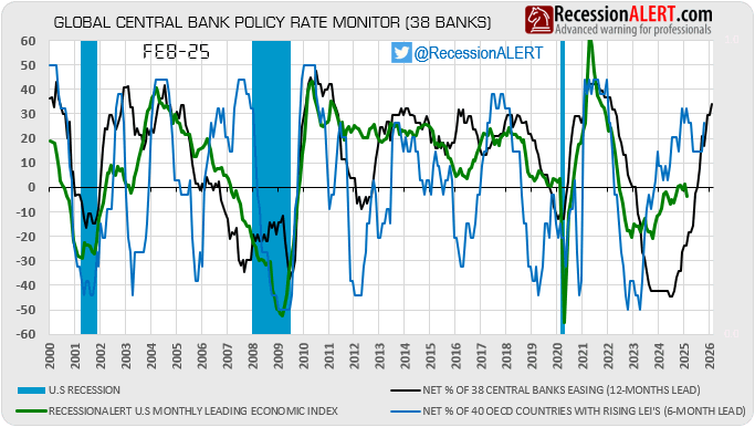
So for now, global monetary policy and % OECD countries with rising LEI’s are strongly suggesting future growth ahead for the global economy and US stocks for the next 6-8 months.
8.8 Composite Market Health Index (CMHI).
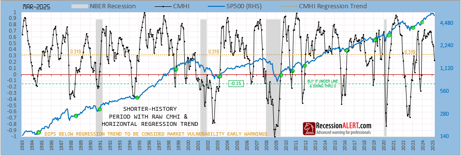
One of the more interesting indicators we developed and introduced many moons ago is the CMHI (see initial launch and subsequent improvements.)
Although this was initially developed to measure “health” of the US stock market, it also was adept at signalling warning of recessions and associated bear markets.
A short history is shown below, but the indicator has working historical data and successful warning of all US recessions going back to 1968:
Whilst this model does not produce probabilities of recession like our purpose built recession models, it does provide for fantastic high confidence “new bull market signals” (the green circled dots) and a vulnerability warning when it drops below the regression trend of 0.319 and a more decisive warning when it drops below zero. As we can see we have had the first warning in March from the monthly version above as it fell below the long-term regression trend. The daily published version (DCMHI) provided warning on 13 March 2025 and the weekly version (WCMHI) on week ended 14 march 2025. The OPT-CMHI trading regimen built around CMHI went to cash on 13 Jan 2025.
8.9 The US Labor Data
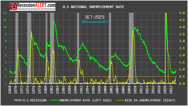
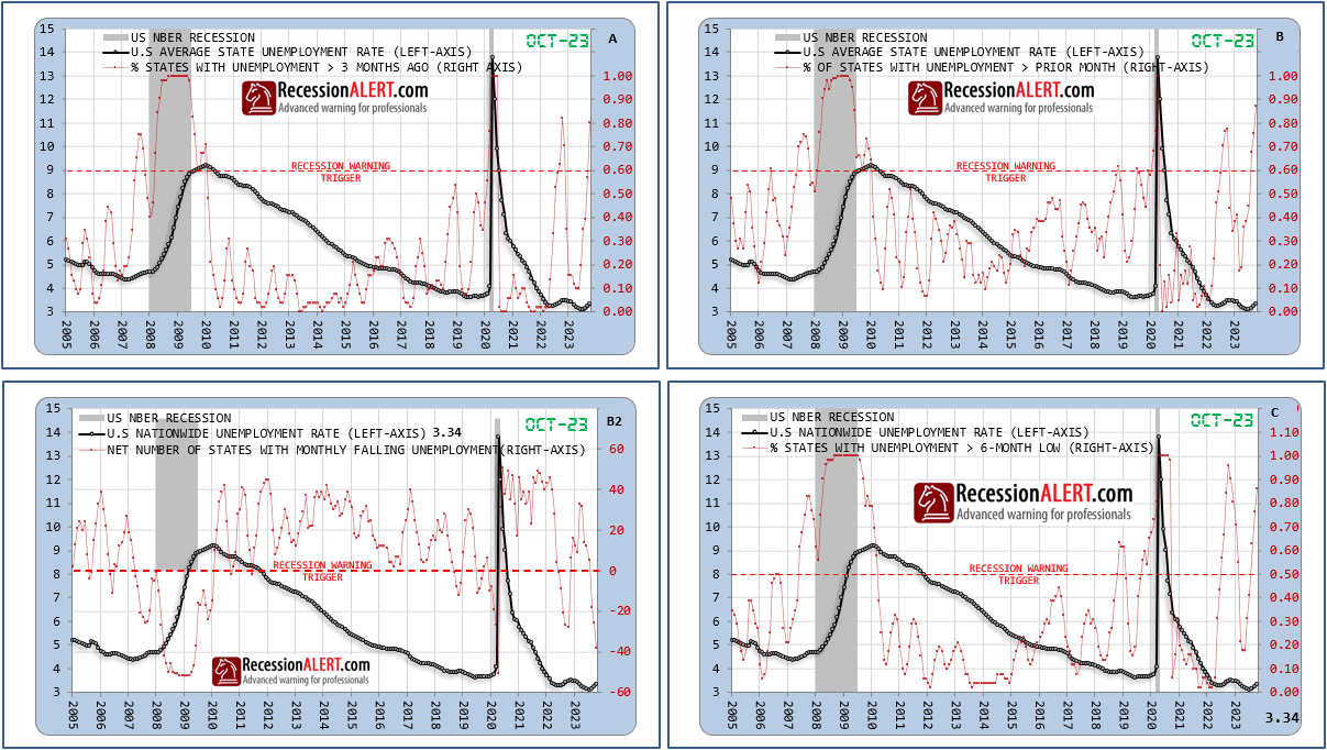
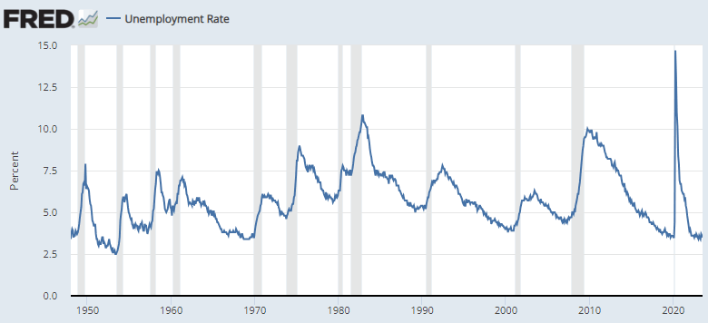
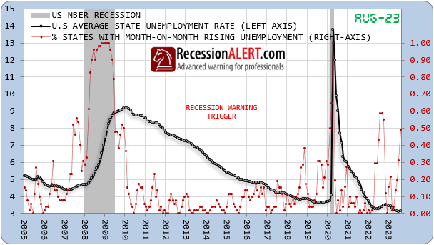
The coincident US labor data remained the “last man standing” when all the leading data tanked in 2023. As seen at the beginning of this note in section 1, it is often cited as a counter to more bearish data. The most watched metric by far for the last 18 months has been the “Sahm rule” (which uses the unemployment rate) which although flagging recession in July and Aug 2024, the author of the indicator claimed immigration as the cause for unemployment rising and as a reason to ignore the signal. At the time she made this statement, we published a research paper titled “The SAHM Rule Redux” where we looked at more varied, efficient, accurate, timely and robust interpretations using alternate models and even state and metro level employment data.
Lets have a look at what they are saying as at December 2024 (subscribers get get later data in the Monthly Charts section):
The original SAHM rule is the black line having risen above the 0.5 trigger for 2 months. We see clearly that the Metro (blue line) and State-level (red line) versions were painting a far worse picture with much earlier warning, around the time all the other leading economic data tanked, dragging all the monthly leading economic indices into recession territory. Our preferred interpretation, the “Cycle Low” SAHM in yellow signaled recession 1 month before the original SAHM and remains in recession territory:
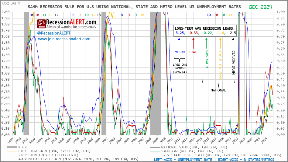
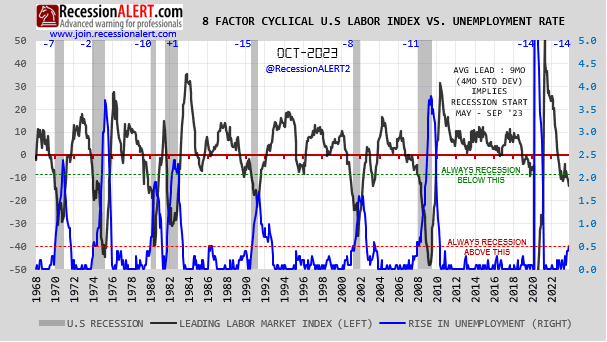
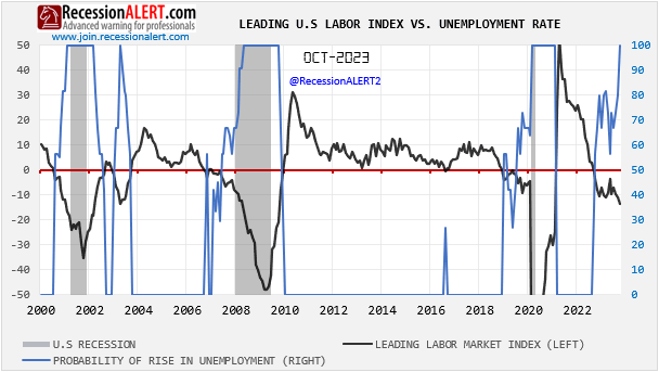
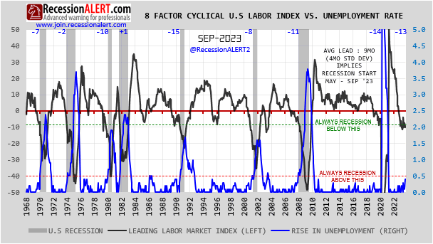
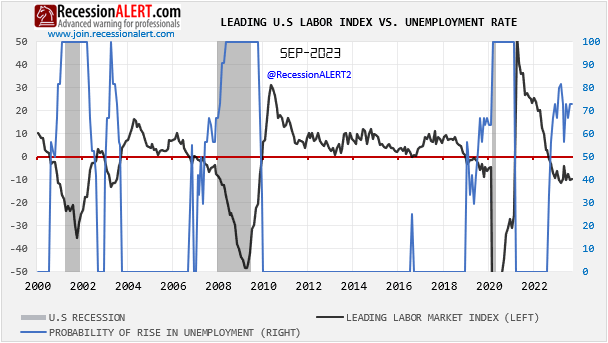
In addition to maintaining the SAHM and its derivates for subscribers, we also maintain the US Cyclically Sensitive Labor Market Index (CSLMI) – an equally weighted growth index of 8 monthly updated labor market components that are highly cyclically sensitive to the labor market and U.S business cycle. These are thus typically labor components that turn down 8-months before the traditional labor market defined by the widely used national unemployment rate and U.S non-farm payrolls. It is thus a leading labor market index:
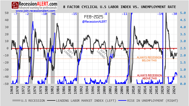
Whilst never quite entertaining a visit below the “Always recession below this line” and remaining in the “Soft Landing zone” the visitation below zero was rather extended at 30 months and remains below zero despite recent attempts at a sluggish recovery.
In conclusion, whilst payroll employment, the main labor indicator used by the NBER in its recession declaration models appears robust, just about everything else labor related appears downright vulnerable.
8.10 The Recession Forecast Diffusion (RFD)
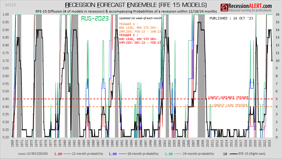
We maintain 15 economic and recession models specialising is labour, housing, and coincident, short-leading, medium leading and long leading generic composites. The charts below show a diffusion counting what percentage of these 15 models are in their respective recession warning territories as at March 2025:
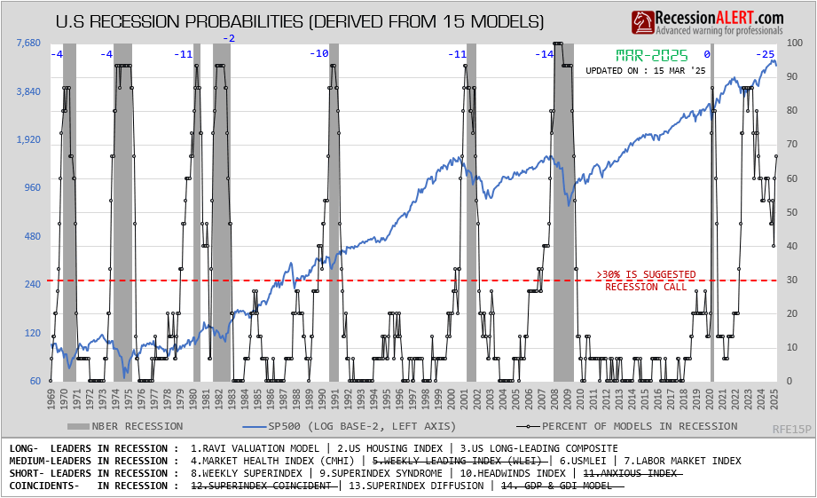
We can see a large jump in March as 4 models fell back into their respective recession territories, taking the total to 10 models in recession. If we imply a recession probability from this chart we can say that US recession odds climbed from 40 to over 66% in March 2025.
8.11 Yield Curve Inversion
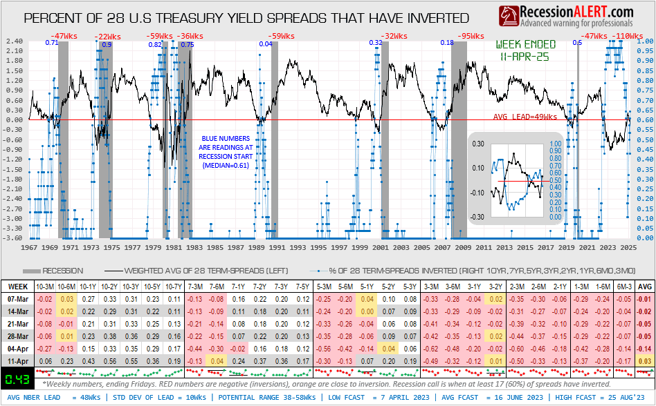
After a near universal yield curve un-inversion on week ended 10 Jan 2025, yield curves have started inverting again. Currently 50% of 28 treasury yield curves are inverted, with it touching 60% (the suggested recession trigger) on week ended 21 Mar 2025. Assuming the percentage of yield curves inverted as a proxy for odds of recession mean we are at 50-60% odds of recession:
8.12 Summary of RecessionALERT data
Section 8 presents a mixed picture. Global indicators suggest recovery and growth potential into mid-2025, supported by rising LEIs and monetary policy easing. However, U.S.-specific data reveals vulnerabilities, with weakening leading indicators, inverting yield curves, stagnant industrial production, and labor market fragility, despite robust payrolls and non-recessionary GDP levels and coincident NBER model. The analysis hints at a cautious outlook, with recession risks present and over 50%, but not yet dominant. With mixed pictures come uncertainty – and markets dont like uncertainty. With this in mind, we have to take cognisance of the fact that we have entered a new period of “expanding volatility” that is likely to persist for a while:

9. Summary
Despite these concerns, the Composite Market Health Index and global trade volumes offer some optimism, not yet confirming an imminent recession. For the U.S., payroll strength, global monetary policy and bullish global LEI correlations support potential stock market gains over the next 6-8 months, though the balance of resilience and vulnerability keeps recession odds above 50% but not yet dominant.
The close to call negatives versus positives and > 50 probabilities of recession paints a mixed picture which will cause uncertainty and more volatility in the stock market.
Current Geopolitical Risks for US
Introduction
The U.S. economy is highly interconnected with global markets, geopolitical events, and domestic policies. A variety of risks—ranging from international conflicts to domestic policy missteps—could negatively impact economic growth, potentially triggering a recession. Below is an analysis of the top geopolitical risks that could negatively impact the US economy and potentially lead to a recession. Each risk includes an estimated likelyhood of occurrence, potential unfolding of negative outcomes, GDP impact, estimated S&P 500 downside, key stock sectors affected, recession probability if the risk is realized, and likely US Federal Reserve (FED) and government responses. These estimates are based on current geopolitical trends, historical data, and economic insights, but they are inherently speculative due to the complexity and unpredictability of geopolitical events. Likelihoods, probabilities and impacts are approximate and grounded in reasoned analysis rather than precise forecasts. The date of February 19, 2025, is assumed as the baseline, with risks evaluated over the next 12-18 months
1. US-China Trade War Intensification
-
Likelihood : 45-55%
-
Unfolding: New tariffs (e.g., Trump’s proposed 10% on all imports) could raise consumer prices, disrupt tech supply chains, and reduce US exports to China, hitting GDP growth. China retaliates, disrupting tech and consumer goods supply chains. US inflation rises, exports decline.
- GDP Impact: -1.2% (trade contraction, higher consumer prices).
-
S&P 500 Downside: 10-15% (trade war fears in 2018 caused ~10% drops).
-
Key Losers: Technology (e.g., Apple, reliant on China); industrials (export-driven firms).
-
Key Gainers: Domestic manufacturers (e.g., steel gaining from reshoring); defense (geopolitical tension boosts spending).
-
-
Recession Probability: 45% (if tariffs escalate and retaliation follows, inflation could persist and consumer spending could falter).
-
FED Response : FED may cut rates to stimulate growth.
-
Government Response: Government might offer tax relief or subsidies to affected sectors.
2. U.S.-Canada Trade Dispute
- Likelihood : 40-45%
- Unfolding :U.S. imposes tariffs on Canadian energy, lumber, and autos; Canada counters with tariffs on U.S. agriculture and machinery. Supply chains (e.g., autos) and energy flows (e.g., 600,000 barrels/day of oil) falter, raising costs and inflation.
- GDP Impact: -1% $112 billion in higher import costs, reduced exports ($350 billion/year), and secondary effects from inflation and lower investment.
- S&P 500 Downside: -10% (Broad sell-off in industrials and consumer sectors; VIX spikes to 30 as markets price in uncertainty.)
- Key Losers: Autos (e.g., Ford, GM): 20-25% stock drop due to disrupted parts supply, Energy Importers (e.g., Valero): 15% decline from pricier crude. Consumer Discretionary (e.g., Home Depot): 10% hit from lumber costs.
- Key Gainers: Domestic Producers (e.g., Nucor): 10-15% gain from reduced competition, Alternative Energy (e.g., NextEra): 5-10% rise as energy shifts
- Recession Probability: 30% (A 1% GDP hit is insufficient for recession unless inflation (e.g., 5%) and spending drops persist, though U.S. resilience limits severity.)
- FED/Government Response: FED holds rates at 4% to balance inflation and growth; may cut to 3.75% if recession looms. Government: Pursues trade talks, offers $50 billion in subsidies for domestic production, and releases SPR oil to cap prices.
3. Escalation of Russia-Ukraine War
-
Likelihood : 35-40%
-
Unfolding: An escalation involving NATO directly (e.g., troop deployment) could disrupt global energy markets, spike oil prices (e.g., Brent crude surpassing $100/barrel), and increase defense spending, straining US budgets. Supply chain disruptions for commodities like wheat and metals could fuel inflation.
- GDP Impact: -1.5% (supply chain disruptions, inflationary pressure).
-
S&P 500 Downside: 15-20% (energy price shocks historically cause sharp corrections, e.g., 1973 oil crisis led to a 13% drop in 90 days).
-
Key Losers: Consumer discretionary (e.g., retail, autos) due to reduced spending power; industrials due to supply chain costs.
-
Key Gainers: Energy (oil & gas firms like ExxonMobil benefit from price spikes); defense (e.g., Lockheed Martin).
-
-
Recession Probability: 60% (persistent inflation and energy costs could overwhelm consumer resilience).
-
FED Response: FED may pause rate cuts or hike rates to combat inflation (4.5-5% range), risking growth.
-
Government Response : Government could increase energy subsidies or release Strategic Petroleum Reserve (SPR) stocks or increase defence spending.
4. Israel-Iran Conflict Widening
-
Likelihood : 30-35%
-
Unfolding: A broader Middle East war involving Iran could disrupt oil supply (Iran produces ~3 million barrels/day), pushing oil prices to $120+/barrel. Regional instability might also hit trade routes like the Strait of Hormuz. US faces energy inflation and export disruptions
-
GDP Impact: -2.0% (energy cost surge, consumer spending drop).
-
S&P 500 Downside: 15-20% (broad selloff, energy-sensitive sectors hit).
-
Key Losers: Airlines and transport (higher fuel costs); consumer goods (inflation hits demand).
-
Key Gainers: Energy (oil majors); utilities (stable demand).
-
-
Recession Probability: 50-60% (depends on duration of oil disruption; short-term manageable, prolonged not).
-
FED/Government Response: FED might delay rate cuts to curb inflation. Government could tap SPR or push local & OPEC for production increases.
5. European Recession (e.g., Germany Collapse)
- Likelihood: 35%
- Unfolding: Germany’s economy contracts sharply due to energy shortages and trade slowdown, pulling the Eurozone into recession. US exports to Europe drop significantly.
- GDP Impact: -1.0% (reduced export demand, global slowdown).
- S&P 500 Downside: -10% (multinationals with European exposure suffer).
- Losers: Industrials (XLI) and materials (XLB) reliant on exports.
- Gainers: Domestic-focused consumer staples (XLP) as a safe haven.
- Recession Probability: 40% (external shock manageable but drags on growth).
- FED/Government Response: FED maintains neutral stance (~3.5%), government supports exporters with trade incentives.
6. Cyberattack on US Critical Infrastructure
-
Likelihood: 25-30%
-
Unfolding: A state-sponsored attack (e.g., from Russia or China) on power grids or financial systems could halt commerce, erode confidence, and cost billions in damages.
-
GDP Impact: -2.5% (direct output loss, recovery costs).
-
S&P 500 Downside: 20-25% (unprecedented but akin to pandemic-scale shocks).
-
Key Losers: Financials (banks like JPMorgan hit by system failures); tech (disrupted operations).
-
Key Gainers: Cybersecurity (e.g., CrowdStrike, Palo Alto Networks); utilities (post-recovery investment).
-
-
Recession Probability: 70% (systemic disruption could freeze economic activity).
-
FED/Government Response: FED could slash rates 2.5-3% and inject liquidity. Government might enact emergency spending and cyber defenses.
7. Global Trade War (e.g., Multi-Country Tariff Escalation)
-
Likelihood: 25-30%
-
Unfolding: US tariffs spark retaliation from EU, China, and others, collapsing global trade. US export sectors and supply chains weaken.
-
GDP Impact: -1.9% (trade contraction, higher input costs).
-
S&P 500 Downside: -15% (broad economic slowdown).
-
Losers: Industrials (XLI) and consumer discretionary (XLY) from trade disruptions.
-
Gainers: Utilities (XLU) as a defensive investment.
-
-
Recession Probability: 55% (trade collapse erodes GDP growth).
-
FED/Government Response: FED cuts rates (~3%) to stimulate demand, government seeks trade negotiations.
8. Climate Disaster (e.g., Hurricane Devastates Gulf Coast)
-
Likelihood: 30%
-
Unfolding: A major hurricane disrupts US oil refining and agriculture in the Gulf, spiking energy and food prices nationwide.
-
GDP Impact: -1.2% (regional output loss, inflationary pressure).
-
S&P 500 Downside: -12% (energy and consumer sectors suffer).
-
Losers: Energy (XLE) and consumer staples (XLP) from supply disruptions.
-
Gainers: Insurance (e.g., Travelers) post-recovery.
-
-
Recession Probability: 40% (temporary shock, but inflation could compound effects).
-
FED/Government Response: FED cuts rates (~3.5%) to support recovery, government funds disaster relief.
9.Taiwan Strait Crisis (e.g., Chinese Blockade)
- Likelihood: 25%
- Unfolding: China blockades Taiwan, disrupting global semiconductor supply (Taiwan produces 60% of global chips.) US tech & auto sector stalls, inflation rises from shortages. Trade with Asia would suffer.
- GDP Impact: -1.7% (tech production halts, higher consumer prices).
- S&P 500 Downside: 15-20% (tech-heavy sell-off, supply chain shocks rival COVID-19’s impact).
- Losers: Tech (XLK) and semiconductors (e.g., Nvidia, AMD) from supply cuts and autos (production halts).
- Gainers: Defense (e.g., Raytheon); domestic chipmakers (e.g., Intel)
- Recession Probability: 50% (supply chain shock slows growth significantly).
- FED/Government Response: FED cuts rates slightly (~3.5%), government subsidizes domestic semiconductor production.
10. Political Instability in the US (e.g., Post-Election Chaos)
-
Likelihood: 20%
-
Unfolding: A contested 2024 election breeds protests and policy gridlock, undermining investor and consumer confidence. Business investment stalls.
-
GDP Impact: -1.3% (uncertainty delays economic activity).
-
S&P 500 Downside: -12% (markets penalize uncertainty).
-
Losers: Financials (XLF) and small caps (IWM) from risk-off moves.
-
Gainers: Consumer staples (XLP) as a safe haven.
-
-
Recession Probability: 45% (confidence shock manageable but risky if prolonged).
-
FED/Government Response: FED holds steady (~4%), government pursues bipartisan stabilization.
11. Mexico Trade Dispute (e.g., 25% Tariff Imposed)
-
Likelihood: 25%
-
Unfolding: US imposes tariffs on Mexico over immigration or trade disputes, disrupting auto and agricultural trade. Inflation rises, exports decline.
-
GDP Impact: -0.9% (regional trade slowdown).
-
S&P 500 Downside: -10% (auto and consumer sectors hit).
-
Losers: Consumer discretionary (XLY) and industrials (XLI) from trade costs.
-
Gainers: Domestic producers (e.g., industrials, XLI) benefit slightly.
-
-
Recession Probability: 35% (regional shock manageable unless escalated).
-
FED/Government Response: FED cuts slightly (~3.5%), government negotiates resolution.
12. Mexico Cartel Violence Spillover
-
Likelihood : 30%
-
Unfolding: Escalation crossing US borders could disrupt trade (Mexico is a top US partner), raise security costs, and hit confidence.
-
S&P 500 Downside: 5-10% (regional trade impact).
-
Key Losers: Industrials (e.g., Ford, Mexico plants); retail.
-
Key Gainers: Defense (e.g., Textron); domestic firms.
-
-
Recession Probability: 30% (limited unless trade collapses).
-
FED/Government Response: FED supports growth. Government enhances border security
13. Eurozone Debt Crisis
-
Likelihood: 30%
-
Unfolding: A default by Italy or Greece could destabilize European banks, reduce US exports to the EU, and trigger global risk-off sentiment.
-
S&P 500 Downside: 12-18% (2011 debt crisis saw ~17% drop).
-
Key Losers: Financials (e.g., Goldman Sachs, EU exposure); industrials (export hit).
-
Key Gainers: Utilities (safe haven); consumer staples (resilient demand).
-
-
Recession Probability: 50% (contagion risk depends on EU response).
-
FED/Government Response: FED eases policy. Government may support trade-exposed firms.
14. Collapse of OPEC Agreement
-
Likelihood: 20%
-
Unfolding: Infighting could lead to oversupply, crashing oil prices to $40/barrel, hitting US shale producers and energy jobs, while deflation pressures emerge.
-
S&P 500 Downside: 10-15% (energy sector drag offsets consumer gains).
-
Key Losers: Energy (e.g., Chevron); financials (loan defaults).
-
Key Gainers: Consumer discretionary (cheaper gas boosts spending); airlines (lower fuel costs).
-
-
Recession Probability: 40% (energy sector collapse could ripple regionally).
-
FED/Government Response: FED cuts rates to spur demand. Government might aid energy firms.
15. North Korea Nuclear Escalation
-
Likelihood: 15%
-
Unfolding: A nuclear test or missile launch over allies like Japan could spike defense spending, disrupt Asian markets, and trigger capital flight to safe havens.
-
S&P 500 Downside: 8-12% (short-term panic, less systemic than others).
-
Key Losers: Consumer discretionary (confidence drop); tech (Asian supply chain fears).
-
Key Gainers: Defense (e.g., Northrop Grumman); gold miners (safe-haven demand).
-
-
Recession Probability: 35% (limited direct economic impact unless war ensues).
-
FED/Government Response: FED holds steady unless markets tank. Government boosts military presence and sanctions.
16. Collapse of US Dollar Hegemony (e.g., BRICS Currency Push)
- Likelihood: 15%
- Unfolding: BRICS nations accelerate de-dollarization, reducing demand for US Treasuries. Borrowing costs rise, dollar weakens, inflation spikes.
- GDP Impact: -1.8% (higher interest rates, import costs).
- S&P 500 Downside: -18% (bond yields spike, equity valuations drop).
- Losers: Financials (XLF) due to higher borrowing costs.
- Gainers: Gold miners (e.g., Newmont) as safe-haven demand rises.
- Recession Probability: 50% (financial instability undermines growth).
- FED/Government Response: FED raises rates to defend dollar (~5%), government negotiates trade deals to bolster dollar use.
Notes on Methodology and Assumptions
-
Probabilities: Derived from current geopolitical tensions, expert analyses, and historical frequency of similar events, adjusted for 2025 context (e.g., Trump policies, ongoing conflicts).
-
GDP Impact: Estimated based on historical economic effects of similar shocks, scaled to current US GDP (~$28 trillion in 2025 projections).
-
S&P 500 Downside: Reflects market reactions to past geopolitical crises, adjusted for sector exposure and investor sentiment in 2025.
- Sector Impacts: Losers tied to cost increases or confidence drops; gainers linked to safe havens or direct beneficiaries (e.g., defense, energy).
-
Recession Probability: Assumes a recession threshold of two quarters of negative GDP growth, factoring in US economic resilience and policy responses. Higher for systemic risks (e.g., cyberattacks, Taiwan) due to broader economic disruption potential; lower for regional risks (e.g., India-Pakistan).
-
FED/Government Response: Based on historical FED actions (e.g., rate cuts during 2008, hikes during 1970s inflation) and plausible government interventions.
What Global Slowdown?
Global Slowdown?
What Global Slowdown?
We can’t see it.
Maybe we are blind.
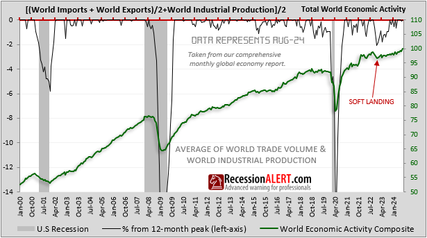
Total world economic activity as measured from the average of world trade volumes and industrial production, saw a soft landing but is clearly on an upward trajectory:
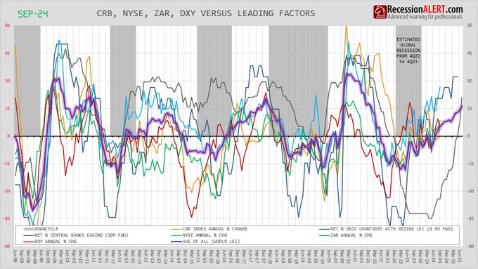
The Global LEI is rising, most notably the far-forward looking net percentage of OECD countries with rising LEI’s and the net percentage of central banks easing rates:
The evidence, both coincident and leading, does not point to a global slowdown. At least not yet.
New Optimum Market timing Page
All the OPTIMUM brand of SP-500 market timing models have been moved under a new page and menu item at https://recessionalert.com/pro-optimum/
These models span various time horizons and have explicit entry/exit rules used in their back testing that can easily be replicated by subscribers into the future. They are defined as Macro models that work across bull and bear markets and bull-market models that are designed and optimized to perform during bull markets only. One of the requirements of OPTIMUM models is they all have standardized performance tables starting from March 2009 (longer for the macro models) that allows you to compare their respective characteristics and risks. More specifically these include total trades, winners, losers, winning %, losing %, points gained on winners, points lost on losers, net points gained (points gained less points lost), reward/risk ratios (points gained divided by points lost), average winning trade size, average losing trade size and total cumulative returns (TRI). The models are briefly described below, but their respective tabs in the OPTIMUM menu will have further detail of their mechanics, and daily updates to more recent trade depictions on a SP500 chart and detailed performance statistics.
It is important to note that most of these models will struggle to outperform a buy and hold strategy during a bull market. This of course assumes the buy & hold investor has perfect hindsight in calling the ultimate top of the market. Most of these models’ trade returns in favour of lower risk of getting caught in the big bear market. The aim is thus not to beat buy & hold but to have frequent favourable entry points offered into the market with a high confidence of a successful outcome and highly respectable cumulative returns whilst protecting against downside risk. In other words, favourable risk adjusted returns. In most cases these models have far less volatile returns and lower drawdown profiles whilst paying a small price in loss of buy & hold returns.
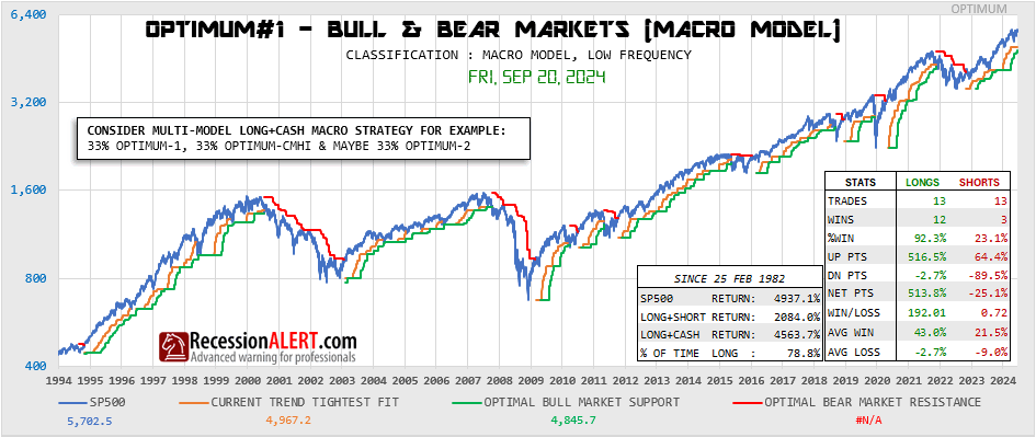
1. OPTIMUM-1 : A long-term low frequency (7 trades since 2009 and 13 trades since 1982) macro-model that aims to capture & avoid as much of the entire extents of bull and bear markets respectively. These bull and bear markets typically are aligned with the economic cycle. This model has such timely accurate signalling of new bull markets that it earns itself a place as one of the seven models in the MEGA tab in the DASHBOARD. Whilst this model has an exemplary long-term macro record, it will under-perform buy-and-hold and the other models in a bull market. Its long term history is depicted below:
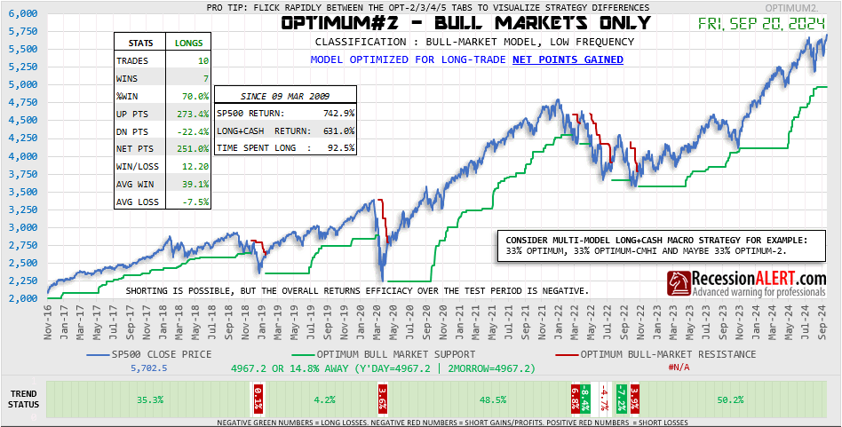
2. OPTIMUM-2 : A low frequency bull market model (10 trades since 2009) optimized for long-trade net winning points gained. Although it has a similar frequency since 2009 to OPTIMUM-1 this model will outperform OPTIMUM-1 in a bull market since it is not stunted with assumptions that need to be made to protect it from bear markets.
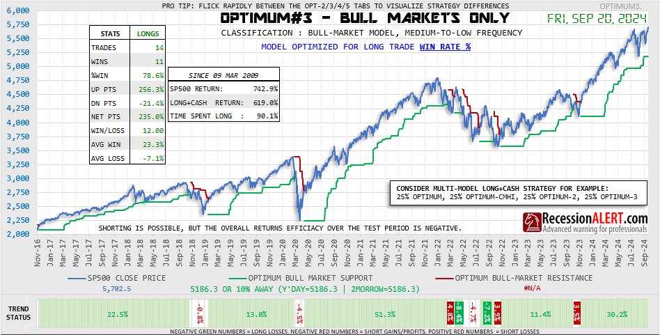
3. OPTIMUM-3 : A low-to-medium frequency bull market model (14 trades since 2009) optimized for long-trade win rate %.
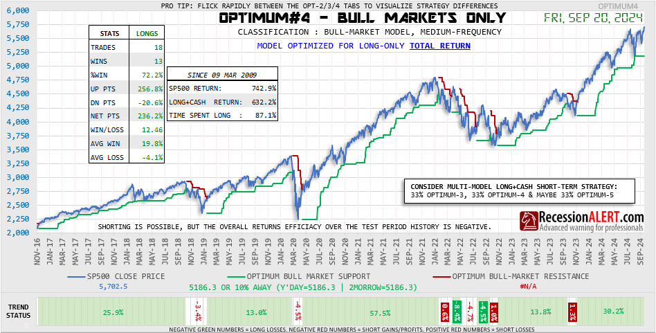
4. OPTIMUM-4 : A medium frequency bull market model (18 trades since 2009) optimized for long trade total accumulated returns (TRI).
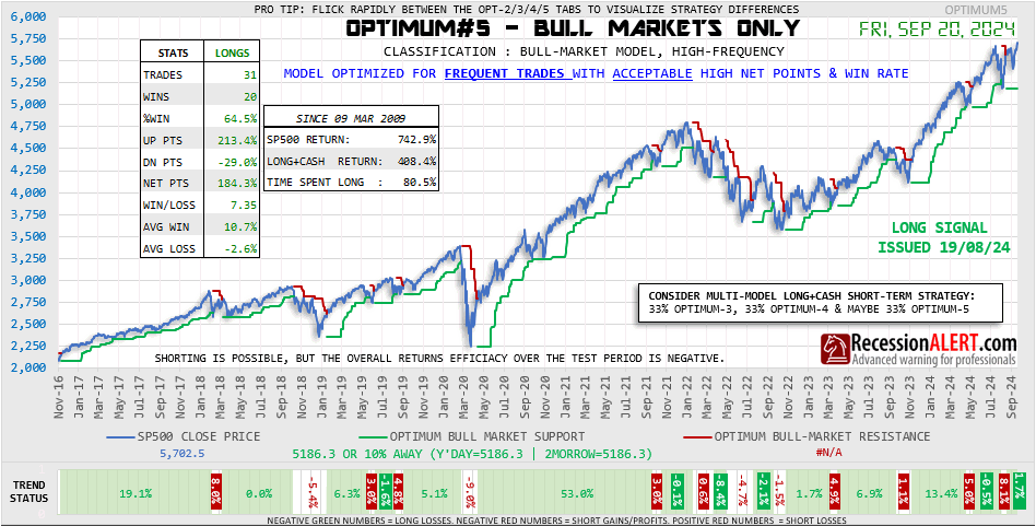
5. OPTIMUM-5 : A high frequency bull market model (31 trades since 2009) optimized for highest trade frequency with acceptable long-trade performance statistics.
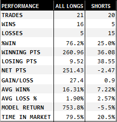
6. OPTIMUM-CMHI : A long-term medium-frequency macro model (21 trades since 2009) built on the back of the CMHI (Composite Market Health Index) engine which has been around for some time now. Whilst its objectives are similar to OPTIMUM-1 it does feature some exceptional intra bull/bear moves to improve alpha which allows it to perform well in bull and bear markets alike. Its performance since 2009 is depicted below showing a virtually non-existent drawdown profile:

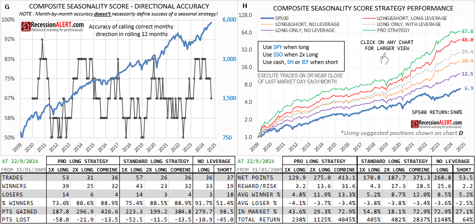
7. STM The standard Seasonality Timing Model (STM) that has been around for many years now and continues to appear in the STM tab in MONTHLY CHARTS but with some enhanced charts and detailed performance statistics. A PRO version that offers significantly enhanced performance joins the OPTIMUM models with some enhanced dashboards and daily updated charts to track trade progress. Whilst both these models have long term bull and bear market history guiding its decisions, its best performance is during bull markets and thus we have classified it as a high-frequency (36 trades since 2009) semi-bull market model. Both STM models have had some stunning out-of-sample performance statistics since 2009 for both longs (91% winning rate), cash holding periods and shorts as depicted below:
8. OPTIMUM-D1: One of the more novel ways to deploy these models is through a diffusion (hence the D), which counts how many of a selected group of models are long and subtracts how many of them are short. In other words, a NET LONG COUNT. This is possible as each of these models’ designs are predicated on differing performance characteristics. This can be used to scale in and out the market to adjust for risk. The reasoning is that by the time the big bear arrives you will be all-out and so the diffusion can be classified as a macro model. One implementation of the diffusion that deploys all 7 discreet models includes the STM PRO seasonality model and does not duplicate with inclusion of the standard STM model. Additionally, when STM PRO is 2x leveraged in very bullish periods, it has the effect of adding two to the diffusion count instead of 1 used for a standard STM long position. Thus the diffusion (D) can range from -7 to +8 and is displayed below:
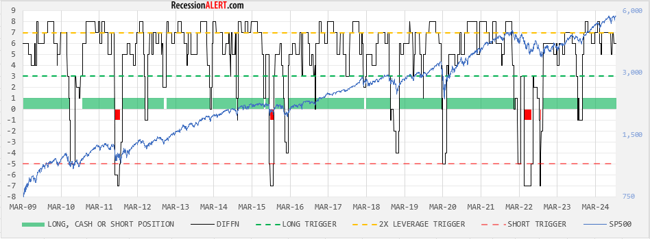
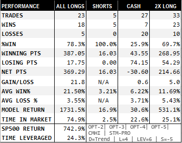
The OPT-D model goes long when DIFFN > 3 (long trigger), goes short when DIFFN <-5 (short trigger), stays in cash when DIFFN between -5 and +3 and goes 2x leverage when DIFFN > 7 (ie when the STM PRO model is leveraged long.) It produced the statistics shown below:
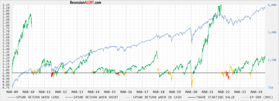
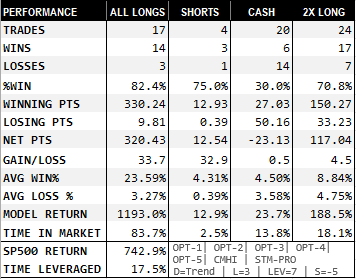
9. OPTIMUM-D2: Another favourite interpretation among users is the same as above but to exclude OPTIMUM-1 from the diffusion and only use 6 models. This can significantly jack up the returns as well as increase the frequency of trades which provides more opportunity for those more active in the market, since the model is less encumbered with the caution with which OPTIMUM-1 deploys to stay out of big bear markets. The DIFFN (D2) count appears below:
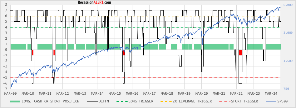
The OPT-D2 model goes long when DIFFN > 4 (long trigger), goes short when DIFFN <-5 (short trigger), stays in cash when DIFFN between -5 and +4 and goes 2x leverage when DIFFN > 6 (ie when the STM PRO model is leveraged long.) It produced the statistics shown below:
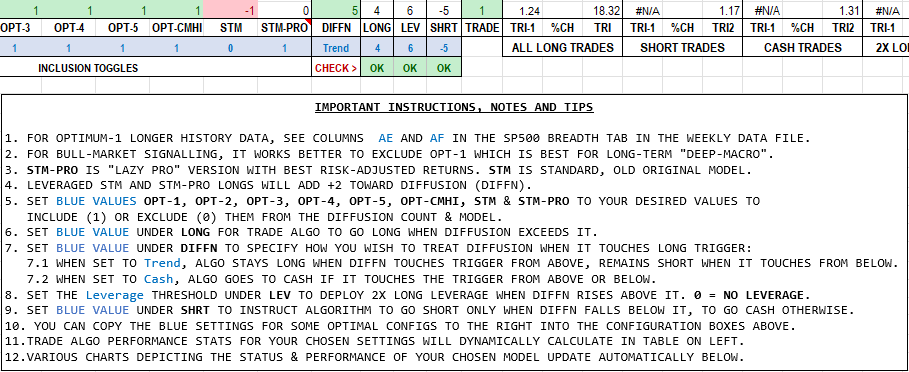
10. OPTIMUM ANALYZER :The OPTIMUM Suite of market timing models now have their own historical data file and companion diffusion model-builder that allows you to configure your preferred combination of 8 OPTIMUM models into a single combined diffusion model with configurable “go long”, “go 2X long”, “go cash” and “go short” diffusion thresholds. You can inspect your models’ performance via detailed trade statistics tables and charts depicting SP500, Diffusion, position taken together with returns and drawdowns profiles. Five top-performing pre-selected combinations are also available for you to use (two of which we discussed in the prior paragraph) The file will be updated monthly and is available in the PRO>DOWNLOADS page. A sample of the instructions taken from the sheet appear below:
Again the idea is not to get the best performing model. If you wanted to do that, just stick with the STM PRO seasonality model. But if you wanted to reduce your risk of relying on a single model that may stop working for a while then its best to go for a multi-model approach through the diffusion to minimise MODEL RISK. You land up with a more diversified strategy that provides you with a signal that allows you to scale risk in and out according to market risks whilst still significantly out-performing the buy and hold investor that has perfect hindsight.
11. ALERTING : Any change in the trade status of any of the OPTIMUM models will result in an ALERT being posted in to the PRO ALERTS tab as well as email alerts. In some instances the alerts will be a day in advance if the rules of the algorithm allow it, or if the rules look like they may trigger in the very near future. Many of the OPTIMUM models also feature end-of-day stops that are projected a day in advance so you can intercept a trade action in a timely manner without relying on alerts.
Upcoming FED rate cuts? Not so fast!
The official data the National Bureau of Economic Research (the arbiters of U.S recession declarations, also known as NBER) are looking at to determine the coincident (current) status of the U.S economy, shows the economy may be slowing, but its not down or even OUT yet:
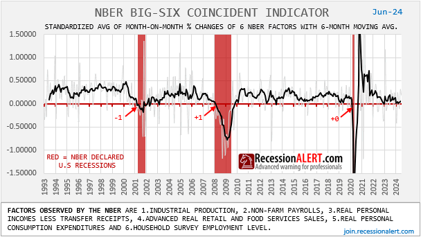
It is hard to imagine the FED are not taking guidance from this either when pondering rate cuts.
Looking at the the month-on-month growth index that the headline index is created from with a six-month average, one could even conclude that things may be starting to look like they are even picking up:
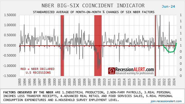
Even a component dissection does not look half bad:
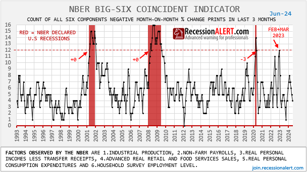
There is no doubt the U.S economy is vulnerable to external shock (with no buffers) when its six-month averaged growth index (black line, first chart above) languishes at the borderline between expansion and contraction.
And despite last weeks mediocre jobs report, and rise in unemployment rate that even triggered the Sahm recession indicator, this mediocrity is yet to show up in the non-farm payrolls and household survey employment data being looked at in this NBER BIG SIX coincident indicator. Not even a blip.
There is no doubt the NBER model is being aided by Non-farm payrolls and Household Survey Employment data that stubbornly refuse to concur with the rising unemployment rate. But lets be honest here, these employment indicators are laggards for the best part. In fact, examining a set of cyclically sensitive leading labor market indicators, we are led to believe that the unemployment rate is set to continue rising in the near future, albeit at a slower pace:
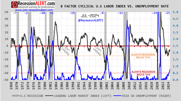
The unemployment rate has been a very reliable real-time indicator of recession through dozens of the last business cycles and even the popular SAHM-Rule and its SCHANNEPP derivative have finally concurred with the 52-state and 400-metro derivatives (as discussed in our research note) and triggered a recession alert:
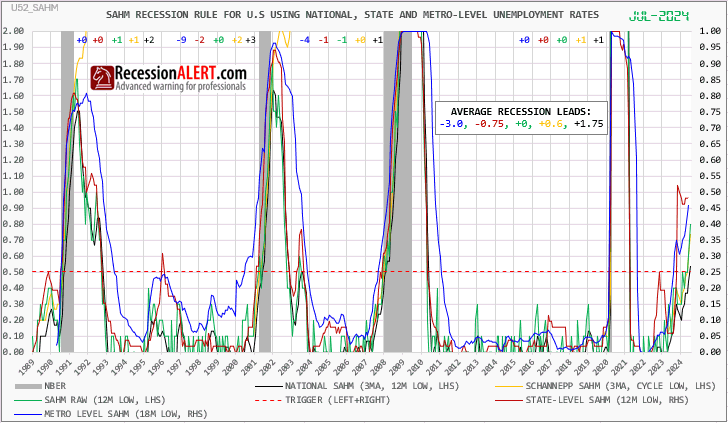
The unemployment rate has been a very reliable real-time indicator of recession through dozens of the last business cycles and even the popular SAHM-Rule and its SCHANNEPP derivative have finally concurred with the 52-state and 400-metro derivatives (as discussed in our research note) and triggered a recession alert:
Our research has shown that if we were to add the unemployment rate as another reliable coincident employment indicator to the NBER model, it would now be in recession territory. The reason the payrolls data and the household survey used in the NBER model are not weakening in sympathy with the rising unemployment rate are not clear, but at this point, historic levels of immigration are being cited. Whilst this may explain things on a national level, its hard to believe that immigration is so widespread that it has resulted in unemployment rates in a wide swathe of US states and even metros to explode higher.
So if we are just looking at the officially accepted coincident monthly data, and ignore leading data, unemployment rate and geopolitical risks – its hard to see why the FED would be compelled to panic into a rate cut cycle right now.
Regardless of the rising unemployment rate at national, state and metro levels, and the leading employment data that hints at continued rising of the unemployment rate, when looking purely at the data the NBER are looking at, which is what the NBER model was designed for, we can conclude that the best way to describe the current coincident measure of the economy from the NBER (and perhaps even the FED) viewpoint is therefore: “VULNERABLE, but NO RECESSION IMMINENT YET.”
SUMMARY:
Are we taking the upcoming rates cuts expectations and prediction markets too seriously since the coincident data doesnt look that bad? Will record levels of immigration eventually be able to explain away the divergence between the unemployment rate and other coincident economic indicators? Or perhaps we are erroneously ignoring or downplaying the rise in the unemployment rate?
Regarding rate cuts, we should be careful what we wish for, since the first rate cut in a hiking cycle is a better and more timely recession indicator than the yield curve. Just something to ponder about.
Complacency about personal finances, stock-market & economy has bottomed.
Composites created from U.S geography limited internet searches for 8 search-terms we have found most aligned to uncertainty and fear regarding personal finances, the stock market and the economy have bottomed and appear to be on the rise:
Both the equal-weighted composite and our preferred measure, the “search-volume weighted” composite bottomed in January 2024. This latter measure weighs each search term by the actual number of searches measured for the month as opposed to using the “relative to its history” standard measure such as that provided by Google Trends.
The utility of these measures is amplified once they exceed a threshold of 30 since this is normally a warning of economic recession and increased market volatility and draw downs.
You can see this chart updated every month in the MONTHLY CHARTS menu, in the GOOGLE tab.
A leading indicator for U.S stocks
The most powerful leading indicators we have found for U.S stocks over the medium-term horizon are the net percentage of 39 OECD countries with rising leading economic indices (LEI’s) and the net percentage of 39 central banks that are easing rates.
They achieve maximum correlation with the NYSE annual percentage change with 7 and 10 months lead respectively.
If we aggregate these two, we derive a leading indicator for U.S stocks, with a 0.57 r-square to NYSE (pretty darn good as these things go) which at this moment is showing a ongoing massive tailwind for stocks since March 2023, just over a year ago.
You can find these indicators at the bottom of the Global Economic Report that is published each month, as well as in the CRB tab in Monthly charts.
The premise then, is that any dips you see now are supposed to be a buying opportunity.
Its incredible that we have to look at metrics outside the U.S to derive future direction for domestic stock markets. It shows that the U.S markets (and indeed the economy) are not an island.
What if we adjusted U.S GDP to account for record “war-time” budget deficits?
NOTE : this is a very simplistic thought experiment, as determining recessions are usually much more multidimensional , nuanced affairs. Its also debatable whether deficits do indeed artificially prop up the economy or not, or even if they are bad or not. There are also potential multiplier effects with budget deficits that are not taken into account with this simple thought experiment.
The current federal budget deficit as % of GDP is at “war-time levels” last seen in WW2
The theory going around is that this is propping up the economy artificially and repealing the business cycle. As a fun exercise to satisfy curiosity let’s try adjust for this. The chart below “removes” the actual dollar budget deficit from real GDP :
As expected, GDP would be worse off without these deficits. But would it be worse off enough to tip us into recession?
The chart below shows both real GDP (red) and the adjusted GDP (blue) on a quarter-on-quarter basis:
There are 3 additional negative GDP prints introduced on top of the 1Q2022 negative print witnessed for both GDP versions, namely 1Q2021, 3Q2022 and 1Q2023.
These are not the “2-consecutive negative quarter” syndrome that is normally associated with recession. But bear in mind a string of 3 negative quarterly prints, sequential or not – has always occurred whilst in recession.
So maybe we would be in recession without the record deficits!
NOTE : this is a very simplistic thought experiment, as determining recessions are usually much more multidimensional , nuanced affairs. Its also debatable whether deficits do indeed artificially prop up the economy or not, or even if they are bad or not. There are also potential multiplier effects on the economy with budget deficits that are not taken into account with this simple thought experiment.
Understanding SP500 Gen2 Persistent Current Trend (PCT) probability model
Background
The Gen2 probability model we maintain for PRO subscribers for the SP500 provides for short, medium, long-term and macro-term probabilities of market troughs/peaks.
It does this by examining current up/down trends across the 4 time-horizons mentioned and compares them to a 30-year historical record of said trends with regards to both duration of trend and gains/losses achieved for the trends. By comparing the duration and gain/loss of the current up/down trend with the historical record, we can impute two probabilities, namely:
- The probability that the current trend will endure longer and
- The probability that the current trend will gain/lose more.
To assess an appropriate probability of a trend reversal for the current trend we find ourselves in, we merely create and average of the two above probabilities. This provides us with a likelihood assessment of a trend-reversal taking place when considering the long-term historical record of past trends with regards to both duration and gains/losses of said trends.
To categorize historical trends into short, medium, long-term and macro buckets we need an algorithm for trend classification across these multiple time-horizons. The algorithm used by the Gen2 probability model considers intraday highs and lows on the daily SP500 candles to determine true tough-to-peak gains or peak-to-trough losses of trends and works simply as follows, which is an alternate spin on the popular “Zig-Zag” technical indicator:
- If we are in a down-trend and there is a higher low within x-days ahead than yesterday’s low, then change to an up-trend.
- If we are in an up-trend and there is a lower high within x-days ahead than yesterday’s high, then change to a down-trend.
The values of x used for our model for our various trend time-horizons were determined through optimization research based on what appeared to work best in general in representing the targeted trends for the nearly three decade historical period, and are currently as follows:
- Short-term trends : 7 days (market sessions) for 211 entries for the historical database
- Medium-term trends : 17 days for 89 entries for the database
- Long-term trends : 34 sessions for 45 database entries
- Macro-term trends : 72 sessions for 24 database entries.
The charts below depict the gains/losses (intensity) and durations for the short and medium-term trends respectively as of Wednesday, 24th January 2024. We note that if we view the current trend we are on as a medium-term up-trend, it has gained 19.49% versus a 11.2% historical average, which is one standard deviation above the mean. It is not shown on the chart, but this transcribes into a 22% probability the trend will continue, or conversely, a 78% probability the trend will reverse based on the gains. We also note that if we view the current trend we are on as a medium-term up-trend, it has lasted 59 sessions versus a 35-session historical average, which is 0.7 standard deviation above the mean. It is not shown on the chart, but this transcribes into a 26% probability the trend will continue, or conversely, a 74% probability the trend will reverse based on the duration.
The useful thing with these ACTUALS charts is if a trend has continued for some time, such as the deemed medium-term trend in the lower two charts above, we can draw a horizontal orange line showing the current gains/losses or duration so we can visually see how often in the past, and when these levels we are currently witnessing have been exceeded. These visual cues sometime are easier to digest and provide more dimensions (when and how many times) when assessing likelihood of reversal than a single dimension probability percentage derived from nonlinear math equations.
Below is the same chart depicting the deemed long-term trends. These translate into probabilities of a trend reversal of 53% according to the current gains and 47% according to the current duration.
Finally, here are the deemed macro-term trends:

Introducing PCT
The selection of x in trend-determination along short, medium and long-term horizons, apart from our optimization research, is fairly arbitrary. It’s never perfect and is designed to capture intended trends for most of the time. But for a short-term up-trend using x=7 that suddenly comes to an end on a given day, what if using x=8 does NOT reverse the trend on the given day and the market pushes a new high after another 8 days? Is x=8 a better value to use than x=7? We can keep on with this argument until x gets sufficiently long enough to eliminate such choices but by then x will be too large to be useful as a “short term” trend latcher. In fact, it is perfectly reasonable that for the prior up-trend, x=7 was best in terms of timeliness but for this current up-trend, x=8 will be better for accuracy.
Let us examine a very recent example of this. On 29th December 2023 we were in an up-trend, and the high for the previous day, the 28th December, was 4,793.3. The high for the 7-day look-ahead was only 4,790.8, below the high of the 28th, so the algorithm marked 29th December as a reversal day, the first day of a new short-term down-trend. On 08 Jan 2024 the low for the 7-day look-ahead (4,714.8 on 17 Jan 2024) was higher than the low of the previous day (4,682.1 on 05 Jan), and thus we had another reversal day and a new short-term up-trend ensued:
On the surface, this looks entirely reasonable and appropriately captures a definition of short-term trends. We see that on the downtrend reversal day of 29 Dec, the probability of a short-term top on the previous day, the up-trend peak, was sitting at 91.4% an entirely appropriate warning of the impending short-term top.
Persistent Current Trend (PCT) attempts to avoid a reversal day by expanding the look-ahead value x by the minimum amount to preserve the current trend. It is a tacit admission from the algorithm that “Hey, this might not actually be a short-term reversal, and since x=7 is a generalized one-size-fits-all parameter, we can provide traders a more comprehensive review of the short-term risks by ignoring the reversal, but we’re going to have to find the smallest, larger value of x that will allow us to do this.” In this particular instance, we were fortunate to only have to increase x to 8 to maintain the current up-trend on 29th December, since the witnessed high 8 days into the future from the 29th was 4,798.5 on 11 Jan – higher than the 4,793.3 witnessed on 28th December:
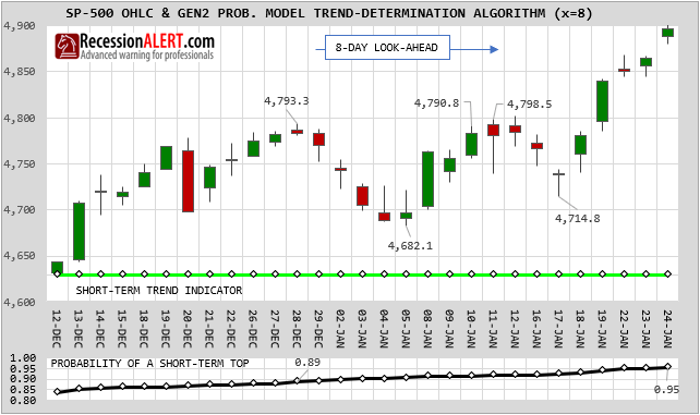
So we are now giving the observer an alternate potential short-term reality – that the current short-term up-trend is ongoing. Note how for x=8, the probability of a market peak on 28th December was 89% as opposed to 91.4% witnessed with the x=7 trend algorithm. Also the PCT model is now flagging a probability of a market top on 24th January as 95% as opposed to the 41% from the x=7 trend algorithm which is now on the assessment that we are in a new, young short-term uptrend.
The chart sets we provide subscribers will include the PCT algorithm assumptions in addition to the standard assumptions, and they are available in the PCT tab in PRO>SP500 Charts . Both the probabilities of the duration and gains/losses are provided in the first two PCT charts, whilst the actual durations and gains/losses are provided in the bottom two PCT charts. Numbers in brackets represent readings for the prior day so we can assess how much the probabilities change from day-to-day:
Using the above example, we look at the top chart and take the PCT rally duration top-probability of 96% and average it with the PCT rally gains top-probability of 95% to derive a two-dimensional average market top probability of 95.5%
At this juncture the PCT algorithm is providing the investor/trader the opportunity to assess multiple potential short-term realities. Looking at the examples we provided above, in hindsight, it appears as if x=8 is indeed providing a more realistic and likely interpretation of the current short-term trend environment than x=7. We do not however use this as a reason to go and modify x to 8 permanently, since traders make heavy use of the short-term algorithm for market-timing and trend-following purposes, and we want the smallest value for x as possible that provides the most accurate generalized long-term results in order to preserve timeliness.
In this particular example shown, x only had to be increased from 7 to 8 to preserve the short-term uptrend, but you should note that on many occasions, x has to increase by quite large numbers to retain the persistent current trend assumption. In many cases x will jump into the mid to high teens to preserve a current short-term trend which means the PCT trend is no longer a viable short-term alternate reality assumption. In fact, large jumps triggered in PCT’s x-variable merely cement that the current x=7 short-term trend is most likely the actual, true short-term trend reality. At that stage, PCT is no longer suited to alternate reality assumptions on the short-term horizon but starts providing alternate realities for the medium-term trends. Thus, once PCT is in the teens it starts looking to reversals in the medium-term trends (x=17) to take its cues for finding alternate realities – this time on the medium-term timeframe.
Pre-empting the look-ahead with ST-ALGO
We provide a specialized market timing chart in the ST-ALGO tab in PRO>SP500 Charts that allows short-term trend followers and market-timers to pre-empt x=7 short-term trends without having to wait for the full 7-days look-ahead to pass. Not only is it around 80% accurate in forecasting what the full look-ahead algorithm will provide as trends, but it does it with a 2-3 day lag as opposed to 7-day lag. Additionally, it also allows us to assess the risks of a future short-term x=7 trend reversal together with target levels for the SP500 that are most likely to trigger said reversals.
ST-ALGO is the process whereby we try make determinations of SP500 short-term trend reversals (directional changes) within the 7-day look-ahead process which the probability model uses for determining non-revisable short-term trends which get finalized, frozen and catalogued into the short-term trend historical database for use in determining current and future short-term trend reversal probabilities used in all the other Gen2 charts. The advantage is we dont have to wait for the full 7 market sessions to transpire to determine what the trend is after it changes.
The new ST-ALGO provides over 80-90% confidence of early trend reversal recognition within the estimation zone. This means trend estimations are made within the estimation zone that have only 20% to 10% probability of eventually turning out wrong and being overwritten by the trend detection algorithm using the full 7-day look-ahead.
The lag this algorithm provides to the actual finalized locked-in non-revisable turning (pivot) points is non-deterministic but ranges from 2 to 4 days, averaging about 3 days. This is still far more desirable than waiting the full 7 days for non-revisable trend lock, which is obviously useless from a market timing perspective. ST-ALGO as before, still determines turning points by the provision of a daily changing high/low STOP that must be breached in order to trigger the trend reversal, but this time it is not some one-size fits all 2.6% number but rather a dynamic number that
1. Takes into account recent support/resistance points,
2. That is till close (small) enough to make timely recognition of turning points and
3. Is still further (larger) enough to have statistically-derived high confidence levels of being accurate (not overwritten by the final full-lookahead algorithm)
The new ST-ALGO chart now also incorporates at least ONE intraday chart update and has been revised as follows with additional on-chart cues, timestamp and more descriptive summary text with citing of confidence levels associated with the chosen stop:
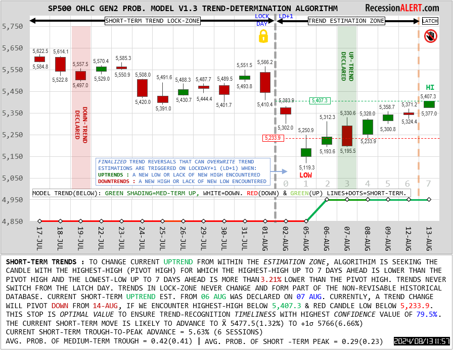
You will see from the above chart that it has already made a trend reversal estimation two days after the 05 Aug intraday lows (a best-case example) and made an accurate downtrend estimation for the previous downtrend within 3 days of the last SP500 all-time high (ATH). It did not make an incorrect uptrend estimation in the 25 July to 01 Aug bull-trap since this rally failed to make highs that set new resistance levels chosen by ST-ALGO.
If the SP500 should print an intraday low below the provided stop, the confidence level of 79.5% means that the historical database of non-revisable short-term uptrends catalogued by the Gen2 algorithm has shown short-term uptrends exceeding a high-low drawdown of 3.21% has only occurred 20.5% of the time, or 42 times in 212 instances in 25 years since 1999.
You should also note that the trend-estimation latch-freeze has been halved more recently from 2 to 1 days. Besides this, the latch is just an extra precaution for the wary timer and you may elect to act on trend changes on latch day, since statistical confidence levels provided ignore any latching holds. It is just that the research team has noted on many occasions that the latch-freeze gets you in at a better price even though it is an extra one-day lag. At this stage we are still debating dropping the latch condition in its entirety to get better timeliness, but for now the algorithm on the chart display will be observing the latch freeze. You may elect to front-run the algorithm therefore by ignoring the latch-freeze.
Update on US & Global Economy
Despite all the traditional leading indicators warning of recession for some time now, the US economy seems “robust” with unemployment stubbornly making new lows.
We touched on the suspected reasons for this in our public note “The Delayed Recession” which offers the most plausible reasoning for this. However, if we dig a little deeper under the hood, the goldilocks situation may be coming to an end.
1. The Global Economy
The U.S economy is no island, with a substantial portion of earnings of stocks in the SP500 coming from abroad. It makes sense then to keep an eagle-eye on the global economy. One of our favored methods to do this, taken from our comprehensive monthly Global Economic Report, is the percentage of countries posting positive annual real-GDP growth:
From the above chart, we can conclude that it’s highly likely the global economy is currently in contraction.
Another way to look at this is to examine global economic activity as the aggregate of imports and exports (total trade volumes):
INCREDIBLE OFFER : Get 50% discount off our annual PRO Subscription, PLUS order before 15 December and get a second year completely FREE. Get your discount HERE
We observe that trade volume peaked exactly one year ago and has been on a steady decline since.
2. The Local Economy
The U.S Labor market has been the “last man standing” among the indicators used to warn of U.S recession, with national unemployment figures stubbornly low and even declining. However, unemployment has ticked up 0.5% from its lows, right on the threshold normally used to trigger a recession warning:
Despite its popularity to measure the labor market, unemployment is largely a coincidentt-to-occasionally-lagging indicator. One of the ways to overcome this is to examine the unemployment rate individually in all 50 U.S states. We have four measures to implement this and NONE of them look promising for the near future of the national unemployment rate:
The reason these unemployment “breadth” metrics work so well is that the US labor market is characterized by large concentrations of labor pools in a few economically powerful & populous states. Since every state counts as a full vote no matter how large or small in these metrics, those larger-in-number, smaller states that are more economically sensitive (or less economically robust) start throwing out early warnings when the economy becomes iffy – something that is masked by the national unemployment aggregate.
Another method to assess the state of the labor market is to focus on cyclically sensitive components of the labor market – those items that are known to have outsized reactions/sensitivity to weaker economic conditions. The traditional candidates of several manufacturing employment metrics such as weekly and overtime hours, hires and job openings together with national part-time employment, initial claims & temporary help services come to mind. As part of our comprehensive US Labor report we combine these together into a single composite as depicted below:
It is interesting to note that this leading indicator has been in contraction territory for 14 months now – identical to the warning it gave before the “Covid Recession” in 2020. Using the average lead times to US Recession and their standard deviations (albeit on a small sample) this suggests a Recession started between May and Sept 2023.
There is a meaningful correlation between the leading index and the unemployment rate. But rather than judging it by eye from the chart we have constructed a probability model that looks at the leading index and the co-movement of its sub-components, to assess the likelihood of a sustained rise in unemployment:
Interesting times indeed with all-eyes on the next set of BLS labor data…
INCREDIBLE OFFER : Get 50% discount off our annual PRO Subscription, PLUS order before 15 December and get a second year completely FREE. Get your discount HERE
The Delayed Recession
The U.S. Bureau of Labor Statistics announced a short while back that US national unemployment rate was 3.8% in August and September, versus the lows of 3.4% witnessed in both January and April 2023. On the surface, the employment situation looks healthy. Against the backdrop of virtually every leading indicator warning of recession (for quite some time now we must add), employment appears to be “the last man standing”:
The national unemployment rate in the United States is skewed by a few large, populous states with robust economies, which is why we are already in recession by the time these states roll-over and we witness national unemployment aggregates suddenly rise. One of the ways to avoid this and get a better “under the hood” view of unemployment is to inspect all 50 U.S state unemployment data. With many more less populous states with more vulnerable (or cyclically sensitive) economies now with equal weightings, we usually witness employment weakness a lot earlier in the cycle as depicted below:
The chart above shows that whilst the simple average of all the individual states’ unemployment rates continues to plumb to new lows, the percentage of US states with increasing month-on-month unemployment has risen for a fifth month in a row and now sits at 50% (some 25 states.) Whilst we only show data since 2005, this metric has been very effective since the 1970’s to get a much earlier heads-up of impending problems in the labor market and hence the economy which is 60% reliant on consumer spending.
With national unemployment averages being coincident at best, lagging at worst, another approach is to look at cyclically sensitive labor components that traditionally deteriorate up to eight months before the labor market national averages. Things that come to mind are tried-and-tested stalwarts such as manufacturing employment (hires, weekly hours & weekly overtime hours), job openings, quits, part-time employment, initial claims, permanent job losses and temporary help services.
Our Cyclical US Labor Market Composite (US-CSLMI) we publish at the beginning of each month for subscribers combines these all together and is shown below, where we can see it is clearly warning of a rise in unemployment for 13 months now – roughly the length of time of the warnings it gave in the 2020 Covid “flash” recession, the 2008 Global Financial Crises, and the 1990’s Gulf War recession.
👉We also see from the above chart that unemployment only needs to exceed 3.9% for its rise from the 3.4% lows to peek above the 0.5% red dotted line threshold which has historically always signaled the start or that we are already in recession. Something else we note from the movement of our Leading Labor Market Index is that it has a median lead-time to recession of 9 months, with a 4 month standard deviation. Given that it has already been camped “below water” in recession territory for 13 months, we can deduce a guestimate start date for recession between May 2023 and September 2023.
INCREDIBLE OFFER : Get 50% discount off our annual PRO Subscription, PLUS order before 15 December and get a second year completely FREE. Get your discount HERE
We have three methods to deduce the probability that we are about to witness a rise in unemployment exceeding 0.5% (and hence a recession).
The first method examines the long-term historical movement of the Leading Labor Index in the lead up to prior recessions and compares that to the current movement. This is called a imputed statistical probability model and appears below:
The second method examines the percentage of eight components that constitute the Leading Labor Market Index that are themselves in recession territory. This is commonly called a Diffusion and is shown below:
The third method is to merely combine the first two methods into an arithmetic average – providing an imputed (we like to call it an “assessed”) probability that is taking both the movement of the composite indicator and its underlying components into consideration:
At this time, due to every conceivable leading indicator with long-term track records warning of a U.S recession, we are making the case for a recessionary-induced bear market in US stocks. This is aptly shown in the DASHBOARD>RFD tab (see research note):
The question that requires answering, is if the 13th October 2022 lows, where the SP500 contracted 27% peak-to-trough over 195 sessions since 4 January 2022, constituted those lows. The table below, available in the DASHBOARD>NEWBULL tab, tracks the common historical signposts of recessionary-induced bear-market bottoms (troughs) in US stocks. For now, we assume the October 2022 stock market lows are a candidate for a recessionary-induced bear market trough:
We see that a small percentage (28.6%) of the traditional pre-trough signposts, which are heavily weighted to macro-economic data, occurred, whilst a much larger percentage (up to 66%) of the traditional post-trough signposts, mostly technical analysis related, occurred.
INCREDIBLE OFFER : Get 50% discount off our annual PRO Subscription, PLUS order before 15 December and get a second year completely FREE. Get your discount HERE
Explaining a delayed recession.
Below is a summary available from the bottom of the DASHBOARD>NBER PROBS tab, which examines 7 of our mainstream leading macro-economic models in relation to their historical mean lead-times to recessions, +/- one standard deviation of these means and the longest witnessed lead and their imputed target dates for U.S recession derived from how long the models have already been in recession territory. On aggregate they suggest a mean of March 2023, with a +1 standard deviation to September 2023 and a worst case Jan 2024. While these suggest a longer than expected lead-time in the appearance of the current expected recession (which has yet to be declared by NBER by the way) they are by no means a statistical anomaly.
Nonetheless, it would be fair to say that this recession is taking longer than usual to manifest in relation to that suggested by the leading economic data.
One theory that explains the absence of traditional recessionary pre-trough macroeconomic signposts, and the robustness of labor data in the face of overwhelmingly bearish leading macro data, hints at extreme excesses (or buffers) built up in the economy through:
- Massive post-Covid stimulus
- Lockdown-induced consumer spending pullbacks (or savings)
- Unprecedented near-zero interest rate environment.
Pandemic-related fiscal support resulted in a sizable increase in disposable income in the overall U.S. economy at a time when health-related economic closures and social distancing led to a significant drop in household spending. As a result, aggregate personal savings rose to $2.1 trillion – far beyond its pre-pandemic trend and much higher than in previous recessions, with Americans currently having nearly $190 billion in excess savings built-up during the pandemic still available. Despite recent large drawdowns of those funds, estimates suggest a substantial stock of excess savings remains in the aggregate economy to prop up spending and hiring to 4th quarter 2023.
As the theory goes, this massive “buffer” has to be whittled away through the current inflationary and monetary policy tightening period before being depleted enough to finally usher in a recession. It explains why this recession is taking so much longer to manifest in employment data after all the long-leading data turned bearish. Excess savings are being spent, which keeps consumer spending (60% of US economy) robust. This naturally leads to continued company profits and continued robust hiring and employment data. But once these excess savings become depleted, spending dries up, profits drop, hiring slows and employment eventually will contract.
This dynamic in excess savings associated with the pandemic period is remarkably unlike any past recessions. The chart below plots the monthly accumulation of excess savings since the onset of past recessions. Data on household assets and checking account balances support the view that households across the income distribution generally have considerably more liquid funds at their disposal compared with the pre-pandemic period:
If this theory plays out as suggested, namely excess savings depleted, then less consumer spending (60% of economy), then less corporate profits, then less hiring – then a recession has been merely delayed but is inevitable and the traditional pre-trough signposts will ultimately start to manifest as a result. This is likely to put pressure on the stock market and could potentially introduce even lower lows than the ones witnessed in October 2022.
There are several methodologies that attempt to capture the extent of Excess savings, its depletion rate and how much is left, with the latter ranging from $190Bn to $500Bn, so one cannot expect an exact science to inform us when it will be depleted or when the economy will slow as a result. All we can assume is that it explains the delayed recession and eventually it will be depleted and the repeal of the business cycle may come to an end. Until then our Cyclically Sensitive Labor Market Index is probably the most important report to watch each month.
INCREDIBLE OFFER : Get 50% discount off our annual PRO Subscription, PLUS order before 15 December and get a second year completely FREE. Get your discount HERE
Our economic research and stock market models are trusted by top Global & US Investment Firms:
Relationship between stocks & FED balance sheet
The chart below shows the size of securities held outright by the US Federal Reserve versus Wilshire Total market index as stock market proxy. We see the various quantitative easing programs that propelled the stock market higher including the massive Covid19 liquidity injection that set stocks on a never-before-seen trajectory
On the surface it appears that when the size of the FED balance sheet is flat or shrinking (tapering) stock returns are either muted/volatile or negative. Similarly when the balance sheet is expanding, stocks inflate in tandem.
Few appreciate the conventional “Don’t fight the FED” anecdote and the correlation between the size of the FED balance sheet and levels of the stock market. Putting the above two data sets into a regression analysis makes things a little clearer:
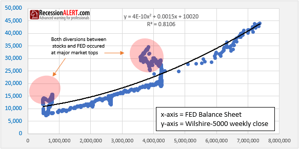
We could posit than the size of the FED balance sheet explains over 80% of the levels of the stock market.
What is interesting to note however, is that on both occasions when stocks diverged significantly from values implied by size of the FED balance sheet, stocks went into major bear markets shortly thereafter.
Stocks are still tightly correlated with the size of the FED balance sheet (right hand data points on the regression chart). It is suspected that as the FED begins to taper and stocks continue to climb, we will see another big regression divergence warning of another major market top.
High-Frequency U.S. Economic Data Shows 3-Speed Recovery
Since the onset of Covid-19, there has been a lot of research (and release) of alternative (non traditional) high-frequency data to measure the extent of the economic collapse brought on by coronavirus lockdowns, as well as to measure the post-lockdown economic recovery.
Think of Google (NASDAQ:GOOG) (NASDAQ:GOOGL), Apple (NASDAQ:AAPL) and SafeGraph geolocation data to track movement of people around workplaces and residential places, foot and transit traffic data, hotel occupancy, movie ticket sales (BoxOfficeMojo), TSA traveler throughput, seated diners (OpenTable) and so forth.
We have assembled a collection of such data into a Weekly Post-Covid Economic Recovery Tracker (WPCERT) consisting of the following:
- Consumer Spending = Change in average consumer credit & debit card spending, seasonally adjusted, indexed to Jan 4-31. Source = Affinity Solutions.
- Small-business revenues = Change in net business revenue for small businesses, seasonally adjusted, indexed to Jan 4-31. Source = Womply.
- Changes in small-business open (defined as having financial transaction activity), seasonally adjusted, indexed to Jan 4-31. Source = Womply.
- Job Postings = Change in unique weekly job postings, indexed to Jan 4-31. Source = Burning Glass Technologies.
- Low-income employment = Change in employment rates, indexed to Jan 4-31. Source = timecard data from Kronos, payroll data from Paychex, Earnin and Intuit.
- Mobility & Engagement = Dallas Fed Mobility and Engagement Index (NYSE:MEI). Source = Federal Reserve Bank of Dallas and geolocation data from SafeGraph
- WLEI = Weekly Leading Economic Index . Mostly financial, credit and labor market leading variables. Source = RecessionALERT.com.
- WCEI = Weekly Coincident Economic Index. 10 indicators of real economic activity, covering consumer behavior, labor market & production. Source = New York Fed.
- Traveler Throughput = TSA checkpoint Total Traveler Throughput numbers. Source = TSA
- Hours Worked = The volume of hours worked by 100,000+ local businesses and their hourly employees. Source = Homebase.
The resulting 10-factor composite is updated weekly and shown below:
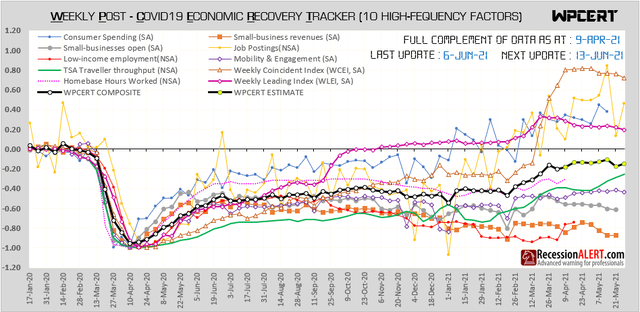
We can make the following observations:
1. The composite index has completed around 80% of a recovery but progress has been agonizingly slow:
2. Small business and low-income categories have failed to adequately recover. Given the many millions of businesses and employees this covers, this is a tragedy:
3. Economic mobility, TSA traveler throughput and hours worked all managed to recover half their losses but have failed to make any meaningful improvement on top of that. It is possible that this is the result of a new remote working or work from home paradigm at play here and that these items may not reach pre-Covid highs any time soon.
4. Traditional broad-based weekly economic indicators such as the RecessionALERT Weekly Leading Economic Index (WLEI) and the New York Fed Weekly Coincident Economic Index have shown robust rebounds to new post-Covid highs. Job postings and consumer spending have also shown robust recoveries:
It goes without saying that a large portion of the US recovery is impacted by the success of coronavirus vaccination programs. On this score, the US seems to be faring a lot better than most developed economies with economic mobility improving whilst daily new infections are plummeting:
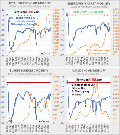
Despite the encouraging (albeit 3-speed) economic recovery, the broad stock market has likely discounted this all in already and remains stretched with major market top probabilities recently having reached levels normally associated with the start of a meaningful correction:
Fundamental valuations according to our RecessionALERT Valuation Index (RAVI) also remain stretched with the 1-year forecasting model (r-square of 0.45 with actual annual future returns) showing negative outcomes that at today’s price levels imply a potential 22% correction:
The more accurate 2-year forecasting model (r-square of 0.56 with actual 24 month future returns) also shows negative outcomes that at today’s price levels also imply a potential 22% correction ahead:
It is also worthwhile noting that the quadrennial market cycle from our STM Seasonality Model, which has been performing exceptionally well with out-of-sample dataset for the last decade is signaling a short position for the month of June:
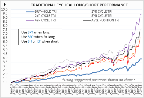
Finally, the last shocking 4.2% CPI print for the US has led to real earnings yields plunging below 0.35% which has normally presaged a major macro level market top:
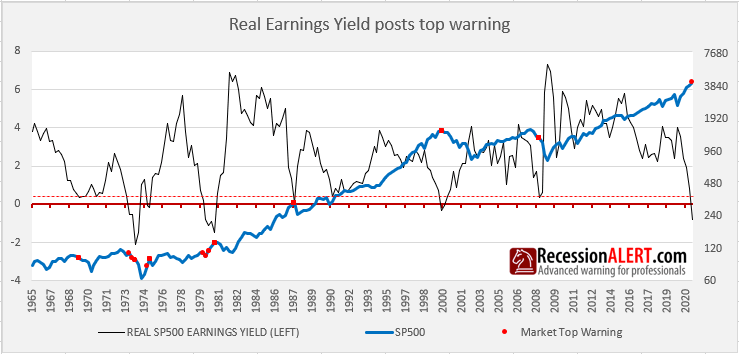
With technical metrics (probabilities of a market top), and valuations/real yields both stretched and seasonality at levels normally associated with muted forward returns, it may be prudent to investigate some measures of portfolio protection for the months ahead.
A new coronavirus wave is starting in USA
One of the most accurate and reliable leading indicators we have discovered for the U.S daily new Coronavirus infections curve is the percentage of 52 US states that have an increasing or decreasing rate of new daily infections being reported. This indicator tops out before the national US infection tally and likewise bottoms before the national US infection tally. It is thus an early warning indicator for change in direction of the daily new infections curve.
The percentage of US states with rising daily infections fell rapidly from 50 (achieved 8 days before national daily infections peaked) to almost zero as lockdowns and stay-at-home orders came into affect. It is even likely that vaccination programs contributed somewhat to the decline. However, over the last few days, this tally has jumped from 4 to an astonishing 23 states with rising daily 7-day average infection rates:
It is highly likely that the third major coronavirus wave in the US has bottomed out and we are set for the start of a new fourth wave of infections. We do not have hard data to assist with determining whether the 4th wave will be as large or larger than the 3rd, but the assumption of ongoing successful vaccination programs likely means that the 4th wave will be a lot smaller.
The chart above shows us that large jumps in the metric are normally when we emerge from lockdowns or major holidays, as depicted by the blue line which is a geolocation based economic mobility index. When economic mobility comes out of a steep dip, the black line rises rapidly as increased human interaction raises infections. As you can see we are emerging from a recent steep dip in economic mobility, created by the Presidents Day holiday that was used as a long weekend. The prior big dip where this phenomenon was witnessed was Xmas/New Year, the one before that was Thanksgiving, and the one before that was Labor Day. In each case, the national tally of daily new cases (brown line) rose dramatically afterwards.
Takeaways:
- The last big coronavirus wave has bottomed out
- Economic mobility is going to rise as we emerge from Presidents day holiday effects
- The number of states with rising daily infections will likely continue to shoot up
- The US national tally of daily new infections is going to rise dramatically, vaccinations notwithstanding.
Launch of Institutional Crypto Advisory
After hundreds of client Zoom consultations over the last 6 months, the request for a fundamentally-driven macro-risk model for cryptocurrency (specifically Bitcoin), similar to the ones we provide for the US economy and SP500, was one of the many topics topics among just under 49% of the calls. The request was highest among high net-worth private investors, family offices and small funds, but we expect company treasurers and larger institutions to become more formally involved with Bitcoin as a possible hedge against dollar depreciation and inflation.
Fortunately we have over five years active experience with Bitcoin and Ethereum, having been involved when BTC was still $900 in late 2016. What was a small 1% exposure built up over late 2016 to early 2017, has ballooned to over 10% during this time, meaning we have a very active interest in monitoring macro-cycles and risk models associated with the cryptocurrency. Whilst we were surprised at how many of our clients have, or are planning exposure to Bitcoin (either in their private or formal capacity) we are delighted to share with them the fruits of our five year journey.
The Crypto Advisory has been designed for large investors, family offices, company treasurers and fund managers who are exposed to Bitcoin (either through direct ownership or Trusts such as Grayscale) and seek institutional-grade macro-level, fundamentally-driven risk and valuation models. The charts and models displayed here are what we have developed over the last 5 years for our own crypto investments and currently deem to be the most important items to track and measure macro risk/opportunity for cryptocurrency.
The models are a mixture of supply/demand metrics, valuation, regression and pricing models, as well as cyclical factors. All data used are a mix of on-chain analytics (data taken directly from the blockchains themselves), futures markets and exchange pricing data.
The Crypto Advisory is provided as standard with our most basic subscription and thus also includes unlimited in-person consultancy (via Zoom) with our crypto analysts to allow any private investors, family offices or institutional clients to jump start their crypto operations or to sanity check their existing ones. Expertise can be provided regarding what wallets and exchanges to use, which crypto-assets to focus on as well as what additional tools may prove useful.
Stage is set for stock market gains in November
The SP500 has put in a 7.4% peak-to-trough correction since 12 October.
In the last 20 years, according to our SP500 probability model, corrections of more than this magnitude have occurred only 11.4% of the time, hinting at a 88.6% probability the worst is over.
The SP500 has also put in lower weekly closes 3 weeks in a row. Additional lower weekly closes have only occurred 15.9% of the time in the past, implying a 84.1% probability the worst is over.
The VIX has jumped to levels only exceeded 8.4% of the time, implying a 91.6% probability the worst is over.
The correction has endured 15 sessions, with longer corrections witnessed only 17% of the time, implying a 83% probability the worst is over.
These 4 measurements imply we are close to having seeing the worst, according to the historical record of price action.
Further conviction for a positive month in November comes from the Seasonality Timing Model (STM) where the Composite Seasonality Score (which examines long-term historical record of monthly gains, positivity rates and gain/loss ratios across 4 different seasonality cycles) is 74.0, just under the extremely bullish threshold that encourages leverage due to high incidence of positive outcomes:
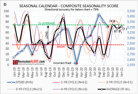
Given the large correction we saw over the last 2 months, this prediction is much more likely to come into play. It is not often we see 2x LEVERAGE levels on the seasonal forecasting models coupled with a prior 2 month or longer correction of 7% or more. In 90% of the cases the seasonal forecasts prove accurate.
Even if we were concerned about the effects of the current election on outcomes, we can examine the 4-year Presidential Cycle model for cues on this particular Novembers’ performance. This model has been out-performing the 1,2 and 3-year cycles over the last decade:
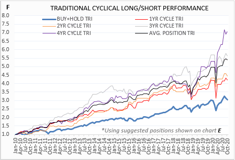
The Presidential Cycle model is bullish for November (1 long position), and even suggests to lever-up in December (2 long positions due the historical 80% win rate for that month):
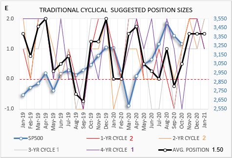
On the whole, across the 1,2,3 and 4-year seasonal cycles, as well as the composite model, the upcoming 3 months of November, December and January are forecast to be statistically bullish.
The easiest way to cue your market entries, if you are following any (or all) of our 12 market timing models, is to simply examine the SIGS signal composite for the first two or three BUY signals to appear. The bottom signal composite line will jump from -12 (all bearish) to a higher reading as the first models start going bullish:
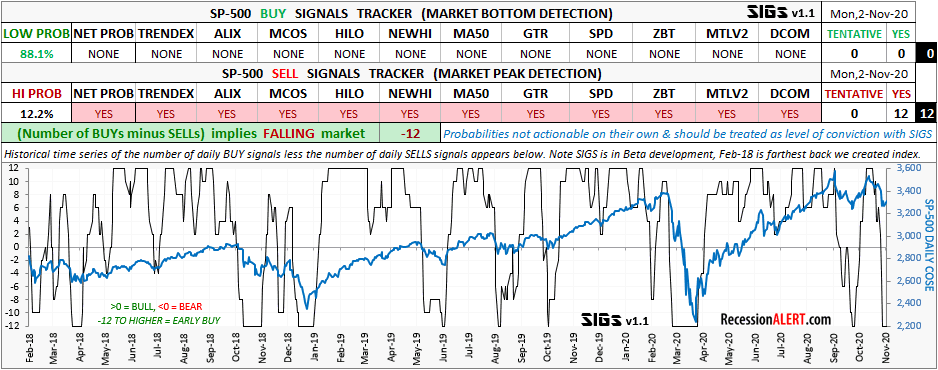
The SIGS composite is available from the “SP500 Signals” tab in the Charts Dashboard.
You can also go and examine further detail for the next 3 months in the Seasonality Timing Model in the “STM” tab in the Monthly Charts menu.
A new, bigger U.S Coronavirus peak now likely
For a while, it seemed we had tamed the coronavirus epidemic in the US. But new daily cases are on the 3rd surge since the epidemic hit US shores:
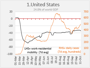
The U.S lags most of Europe’s ‘ countries by about 4-6 weeks on the coronavirus curve. When we saw the infections picking up in Europe after lockdowns had been eased, we wondered if the US might be able to dodge a bullet, but sadly it appears a new wave of infections is now upon America as we follow the same path as those countries in Europe that were ahead of the US curve:
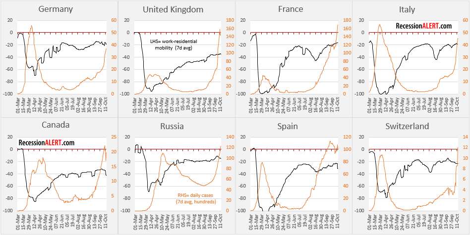
Particularly alarming is Italy – you will remember the horror stories coming out of Italy in the lead up to its peak, and it looks like they are set to shoot past that peak. The United Kingdom has simply blown past the old peak as has Spain.
Given that many developed countries (that had massive waves of infections they managed to suppress) are now surging past their prior peaks, it is wishful thinking to assume the U.S will not follow suit.
The reasoning for this is simple – deep suppression of daily caseloads, leads to relaxation of stay-at-home orders and lockdowns, which leads to increased mobility and social contact, and gradually a slippage in population diligence, caution and due care. Given that not one country is even close to herd immunity, the outcomes are predictable.
The below charts show that among the 40 largest economies in the world, economic mobility as an aggregate has stalled for some time now and almost 40% more countries have rising daily infections than those with falling infections:

To this end we need to prepare to exceed the U.S daily new cases peak of 67,000 and prepare for this to move close to 100,000 new cases per day.
Without a doubt that is going to lead to more stay-at-home orders and lockdowns, even if not as harsh as the initial ones, and it is going to have a huge hit on U.S Economic mobility, which as we have shown, is running comfortably north of 0.9 r-squared to other weekly leading economic indices and is an excellent proxy for measurement of economic conditions.
In a nutshell, we have not seen the worst of the Coronavirus epidemic in the U.S and the “main peak” is yet to come, with the economy likely taking a hit.
The U.S economic rebound has already stalled according to a broad measurement of high frequency data:
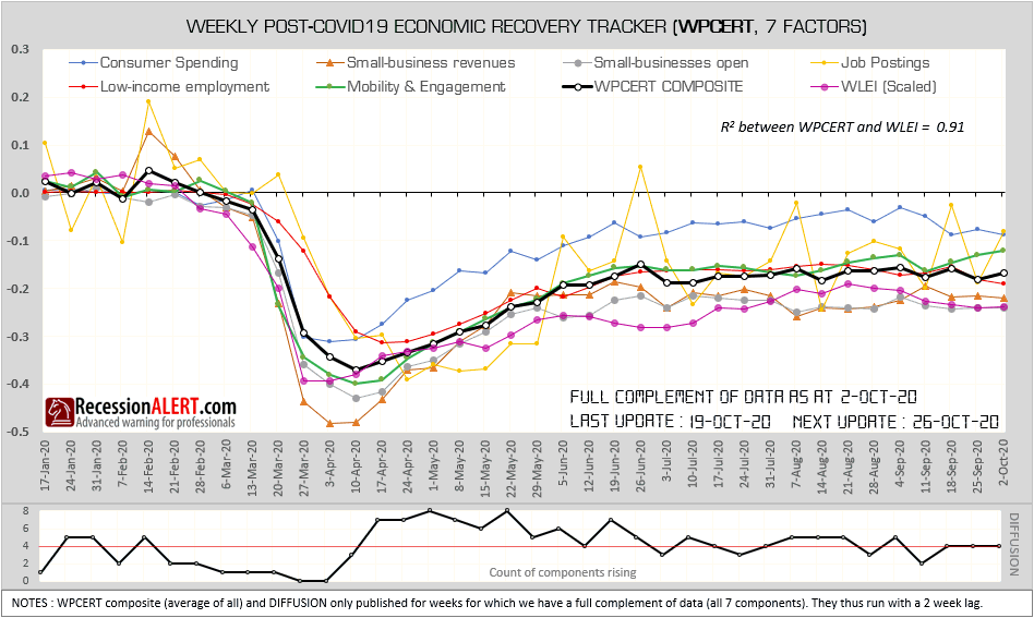
The resurgence in daily new coronavirus cases is not isolated to a few states. We have the number of states in serious trouble (within 20% of their daily peaks) climbing from about 10 to almost 30 now. The number of states that had managed to bring the virus under control (less than 33% of their daily peaks) has dropped from 12 to just 7 now.
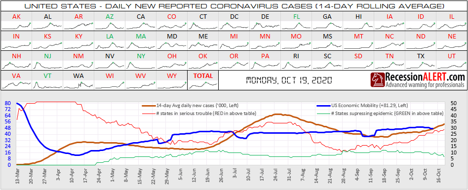
The next U.S president is going to find themselves in uncharted waters shortly after being inaugurated and its difficult to see how economic mobility, and thus the economy, can break out of its current recovery plateau. In the prior (2nd) infection surge, economic mobility flatlined, so we should expect nothing less. In fact, it is not improbable that the recovery pulls back somewhat against a backdrop of a 3rd surge.
The road to immunity, herd or vaccine, is likely to be a rocky ride well into 2021.
Coronavirus Recession likely ended in June
In this exercise, we examine the current behavior of various of our US leading economic indexes to past history to determine a likely recession exit date.
The charts we display below are automatically displayed (depending on your selections) in the monthly data file Analysis Tool that is published for PRO subscribers, and can be found in the new RECOVERY sheet in the Excel workbook.
We start with our oldest and most widely followed index, the Weekly Leading SuperIndex:
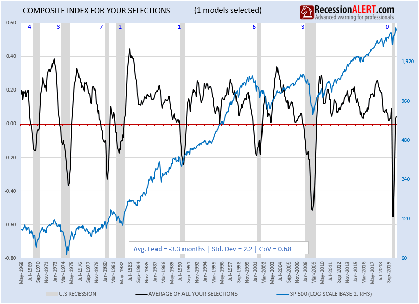
Let us examine the behavior of this index around the prior 7 recessions and then align the current 2020 vintage trough (lowest point) with the trough of the average of the prior 7 vintages to determine the most likely month we exited from recession:
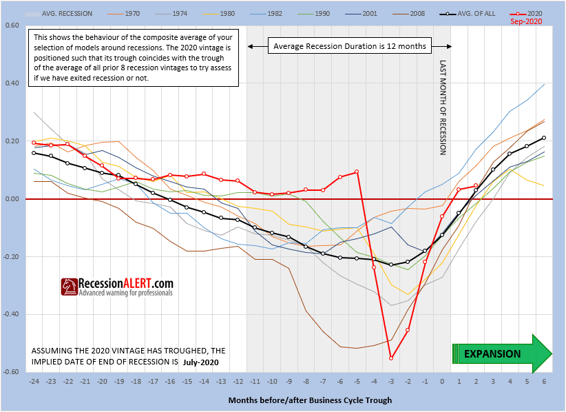
We see from the above chart (taken straight from the one produced in the RECOVERY tab) that the average of the prior 7 SuperIndex vintages troughed 3 months before the first month of the new expansion. The red line in the current SuperIndex vintage (last point representing September 2020) is aligned to this trough. This implies September 2020 represented the 2nd month of the new expansion, meaning the recession likely ended in July 2020.
NOTE : It is important to understand that the current vintage represented by the red line, is time-shifted so that its trough aligns with that of the average of the prior 7 vintages. This means its timing relationship with the current recession and prior vintages is meaningful to the right-hand-side of the trough only, and you cannot use data to the left of the trough to compare the current vintage to prior ones.
Let us repeat the exercise with our 2nd most popular leading economic index, the high-frequency US Weekly Leading Economic Index (WLEI):
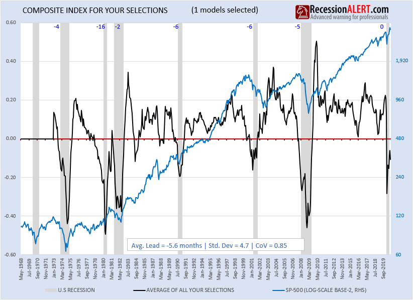
In this case using prior vintages and 2020 trough alignment to average of prior vintages, we see that the suggested last month for the recession was a month earlier, namely June 2020:
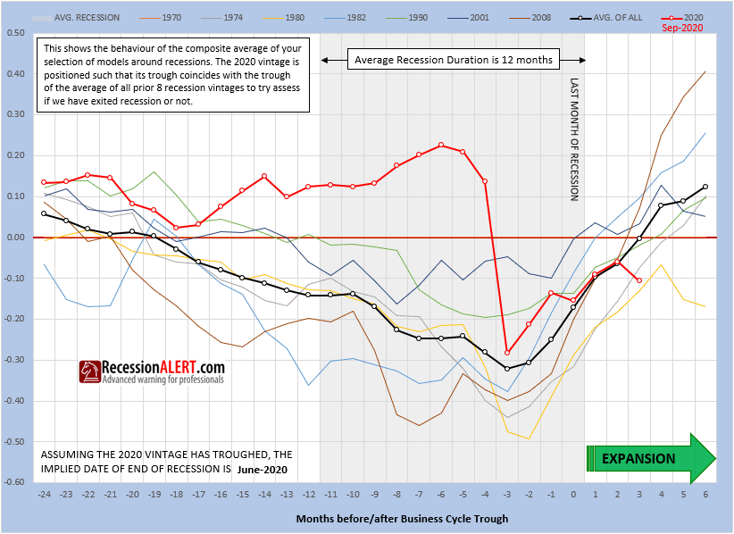
We repeat the exercise again for our third most widely followed index, the 21-factor US Monthly Leading Economic Index (USMLEI):
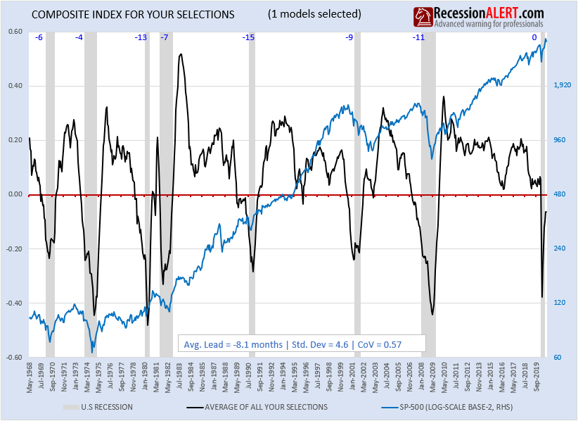
In this case using prior vintages and 2020 trough alignment to average of prior vintages, we see that the suggested last month for the recession was June 2020:

We can use the monthly data file to select any number of our 15 models, to create a composite and repeat the above exercise. For example, our Recession Forecasting Ensemble (RFE-6) consists of six different models taken from the SuperIndex report . The RFE is very widely followed by SuperIndex readers, since it has a zero false positive real-time history when using more than one model in recession as a overall recession trigger, when examined as a ensemble (a count of number of models flagging recession):
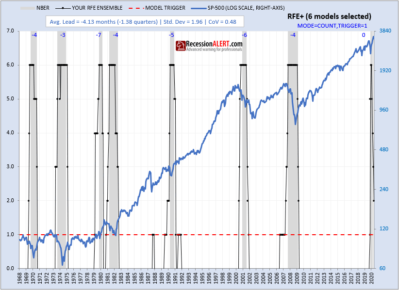
The RFE-6 is arguably our best performing model when one considers its zero false positive rate, ideal “golden” lead-time of 1.5-2 quarters (See Recession: Just how much warning is useful anyway?) and lowest coefficient of variance (high consistency of lead times):
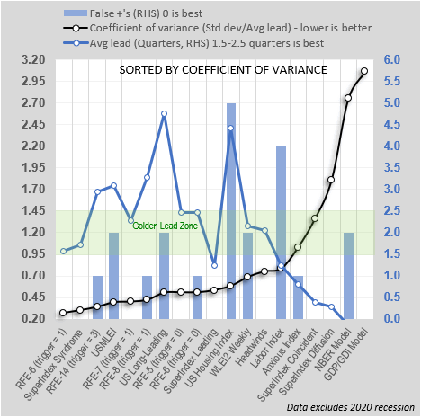
Let’s look at the RFE-6 as a single equally-weighted average of standardized components composite as opposed to an ensemble/diffusion:

In this case using prior pre-recession vintages and 2020 trough alignment to average of prior vintages, we see that the suggested last month of recession is May 2020:
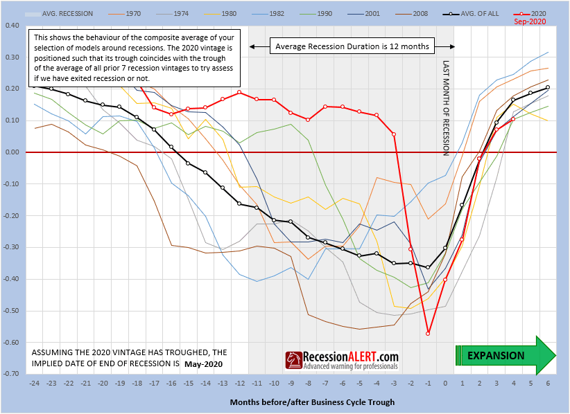
Let us finally mash up all 15 of our models together into a single super-duper composite which we call RFE-15, which encompasses 4 coincident models, 3 short-leading models, 5 medium-leading models and 3 long leading models. Here is the ensemble (or diffusion of models in recession) with optimum trigger of 3 producing the lowest coefficient of variance (CoV)
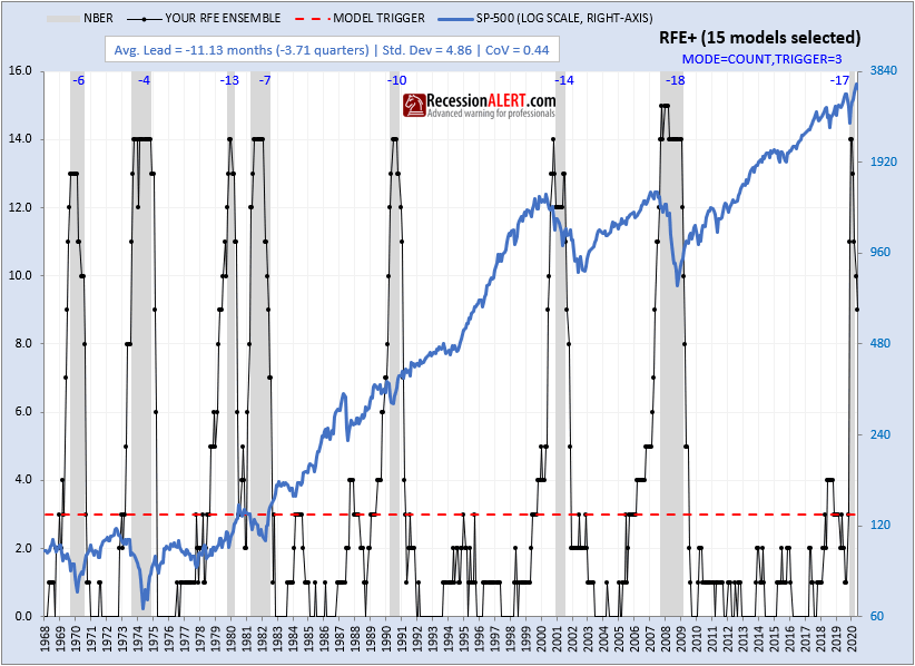
Here is the equally weighted, standardized components composite (as opposed to viewing them as an ensemble):
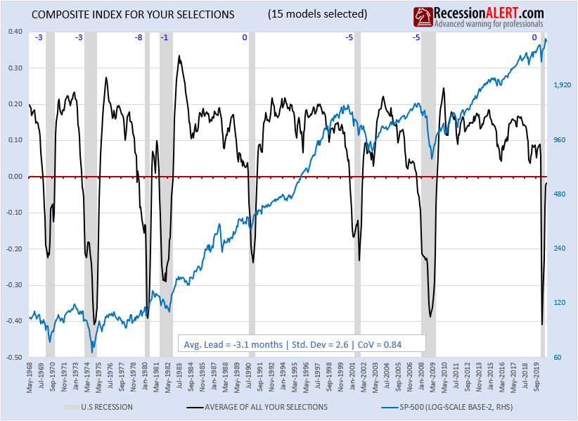
In this case using prior pre-recession vintages and 2020 trough alignment to average of prior vintages, we see that the suggested last month of recession is again July 2020:
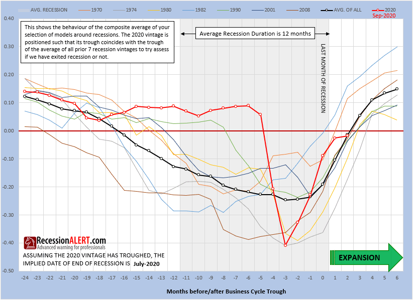
In summary, we have estimates ranging from May 2020 to July 2020 for the end of the current recession, with June 2020 the most likely candidate.
The real issue for us moving forward is not if we have emerged from recession or not, but if the recovery can maintain a steep slope and for how long the recovery can continue without faltering. All signs (here, here and here) point to a softening again of the economy in Q4-2020 and discussions of a double-dip recession may well resurface as a result.
Summary of Service Additions & Improvements
We wish to highlight the following recent additions and improvements since April 2019, to our subscriber deliverables, as well as highlight some older features you may not be aware of.
1.Alerts archive
Many subscribers do not know that you can access a multi-year chronological archive of end-of-day alerts from the REPORTS>ALERTS tab.
2. Stock Market reports
The RecessionALERT Valuation Index (RAVI) quarterly report is published in the STOCK MARKET tab, where the Monthly Composite Market Health Index (CMHI) report is also published:
3. Weekly charts
A new menu page has been created to group weekly updated charts together.
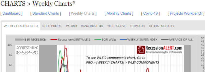
The WEEKLY LEADING INDEX is our highly popular Weekly Leading Economic Index (WLEI) compared with our most popular index, the Weekly SuperIndex and the ECRI WLI for comparison. PRO subscribers can also download the historical data in Excel and view a chart of all six the WLEI components from here:
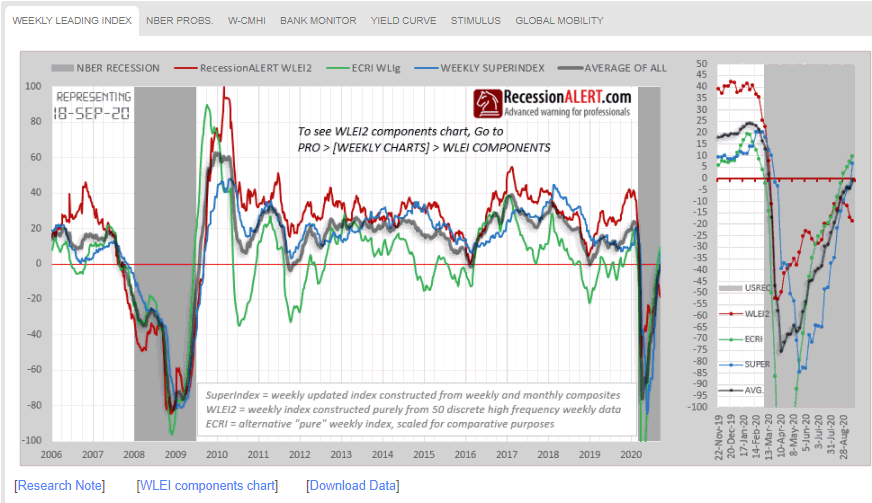
The NBER PROBS chart shows the probabilities of US recession depicted by all 10 of our recession models:
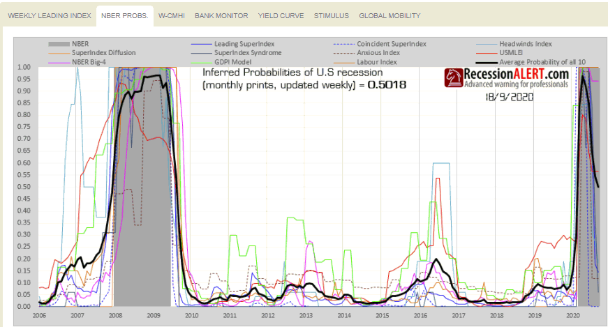
The WCMHI is merely a weekly chart of the Composite Market Health Index:
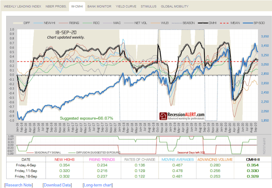
The Central Bank monitor tracks policy rate decisions from 90 central banks around the world:
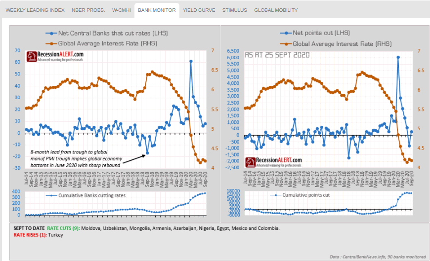
The US Yield curve diffusion is widely followed among our institutional clients:
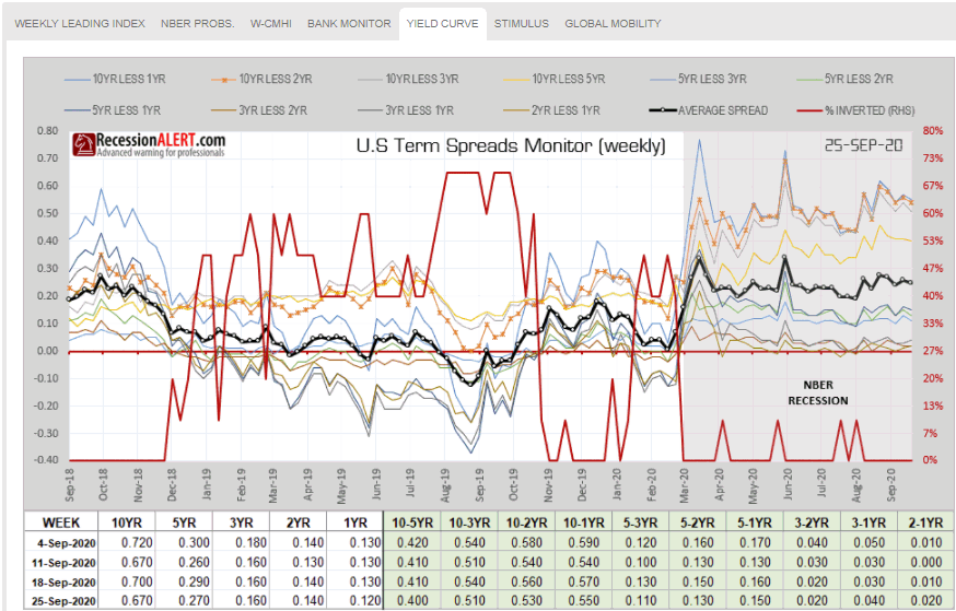
The STIMULUS chart tracks liquidity injected by the Federal Reserve into the US banking system:
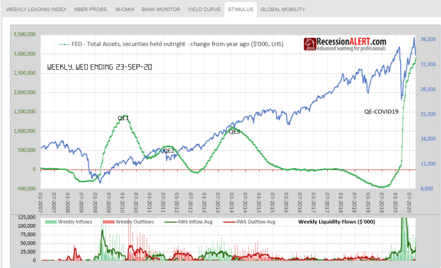
The GLOBAL MOBILITY chart tracks the GDP-weighted economic mobility of the 24 largest economies in the world, to assess the global recovery
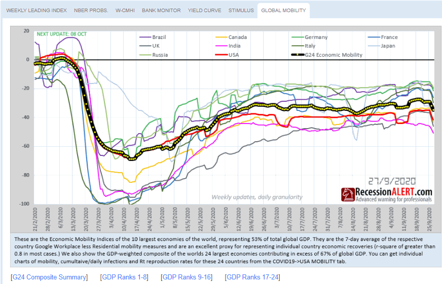
4. Monthly Charts
There is a new menu page that groups all monthly updated charts together.
The GOOGLE chart shows our proprietary multi-factor Google Trends recession monitor:
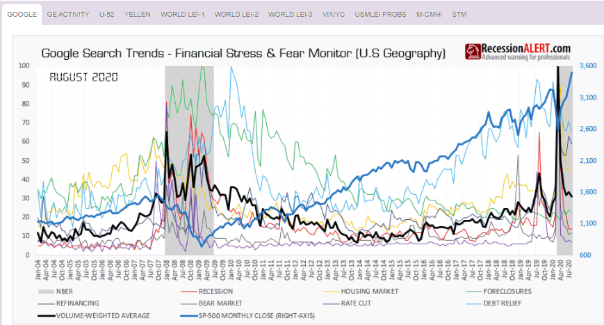
The GE ACTIVITY tab shows the Global Economic Activity index taken from our comprehensive monthly Global Economic Report:
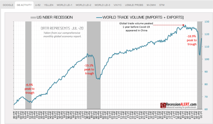
The U52 chart is derived from our Monthly Labor Market Report and shows unemployment rates in all 50 US states from various angles that have proven to be effective in warning of recession:
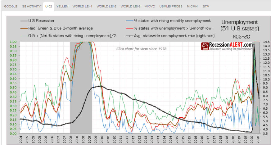
The YELLEN chart, also taken from our monthly Labor Market Report, shows the famous “Yellen Labor Indicator”
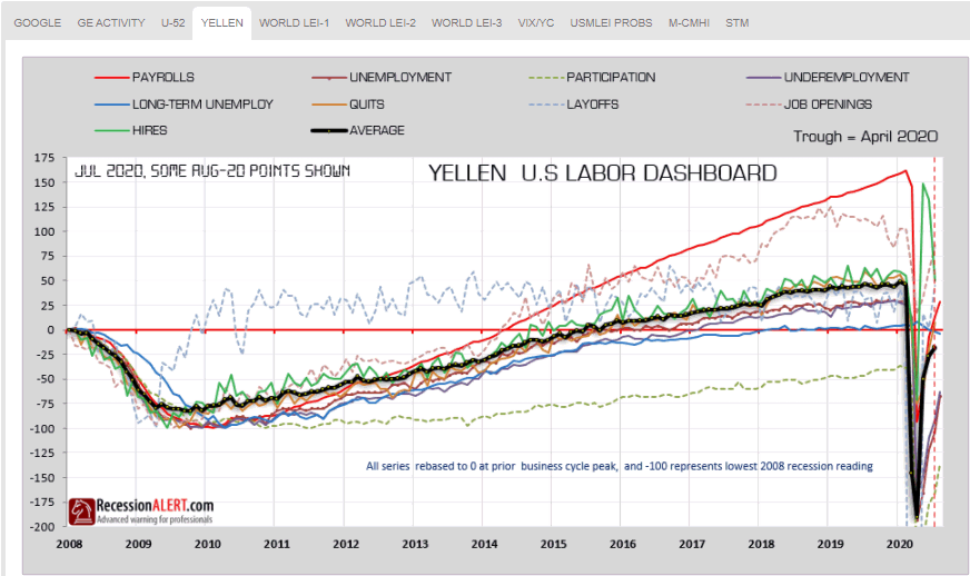
The WORLD LEI-1 tab shows our Global Economic Leading Index together with its preferred leading growth metric, the number of countries with rising LEI’s. This is taken from the comprehensive Global Economic Report:
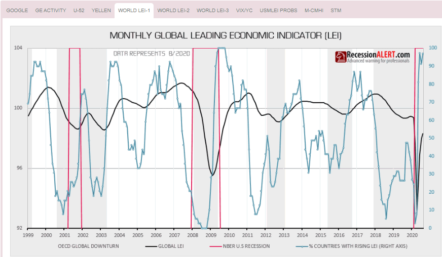
WORLD LEI-2: just shows the 22-factor RecessionALERT Monthly Leading Index (USMLEI) together with the World LEI growth metric. This is very useful as the Global LEI growth metric actually leads the US Monthly Leading Index:
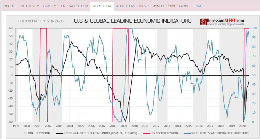
WORLD LEI-3 shows growth of the NYSE together with the Global LEI growth metric as the growth metric also leads the NYSE by 6 months with a not-insignificant long term correlation:
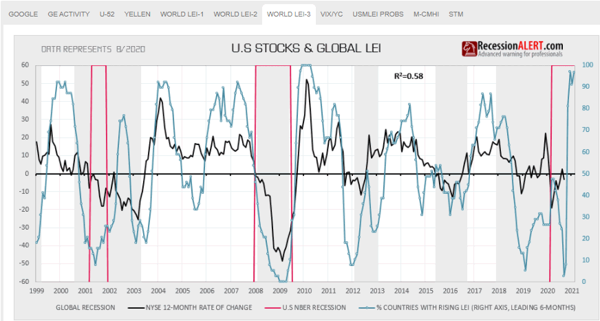
The VIX/YC chart updates a chart produced from one of our most popular 2019 research notes : “Impact of monetary policy & Yield Curve on future volatility” This research note was rather prescient in that it was penned a few days before the VIX exploded upwards, and we continue to track the phenomenon to completion in this chart:
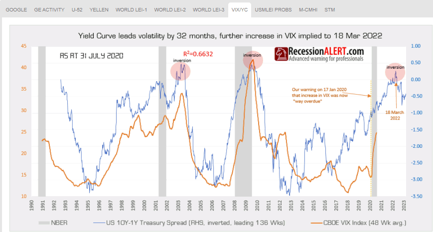
USMLEI PROBS tracks the 4 main probability models derived from the monthly published US Monthly Leading Economic Index (USMLEI). The models are discussed in this research note and provided 7 months warning to the current recession:
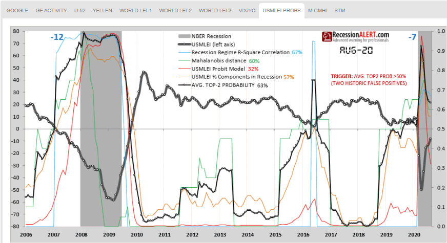
MCMHI is merely a monthly chart of the Composite Market Health Index (CMHI).
STM are all the detailed charts from our Seasonality Model, the performance of which is shown below. We see that the 4-year cyclical model is performing very well, but our proprietary Composite Seasonality Model is performing even better (red line in bottom chart)
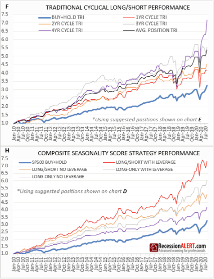
5. Projects Workbench Menu
When spending many months researching and building new models we often reach a point where the model is “nearly good enough” or in “Beta” and we run it out of sample for a few months to see that things are working as they should, or to experience the model live first hand to work out if any improvements are required. Rather than have these models hidden in our laboratory, we post them here so that clients can share the final testing and refining process with us. Once models have undergone this “live testing”, improvements and client feedback, we normally then embark on the full documentation before making it available as a production model. As these are Beta models, you are advised extreme caution in using them. Note that the models could change at any time as we make refinements during this process.
Most notable here are our new daily updated 4-factor Medium Term Liquidity Index:
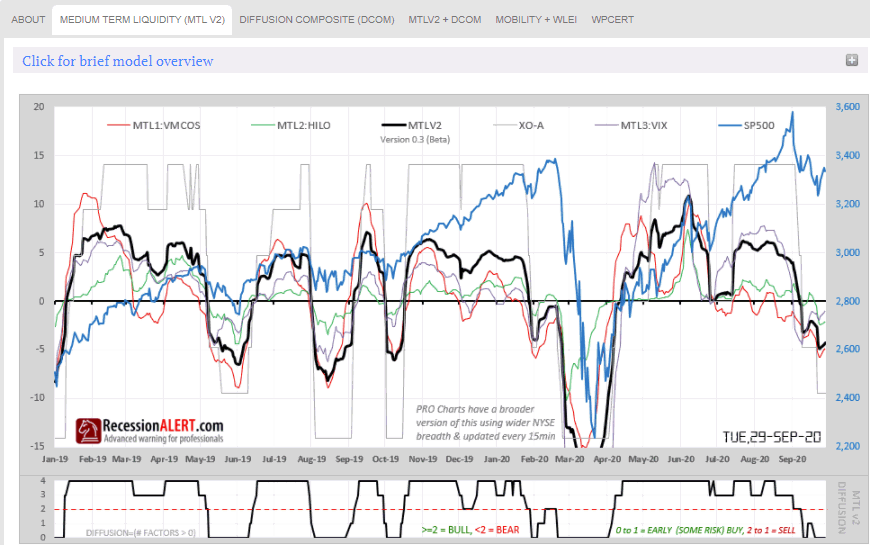
…and our 7-factor weekly updated WPCERT which you can read about here:
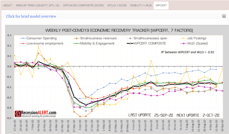
6. COVID-19 & Economic tracking enhancements
The USA MOBILITY-1 tab tracks economic mobility and daily infection rates in the 16 largest states in the US, contributing some 70% to US economic output (8 largest shown below):
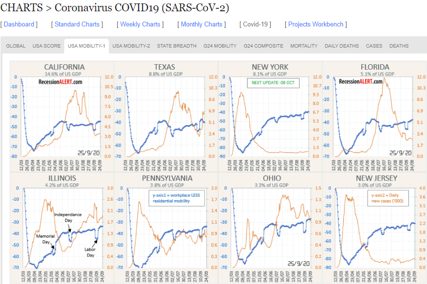
The USA MOBILITY-2 tab tracks the same states using this innovative alternate methodology that uses total infections on the x-axis (instead of date) and also shows Rt (reproductive rate) figures:
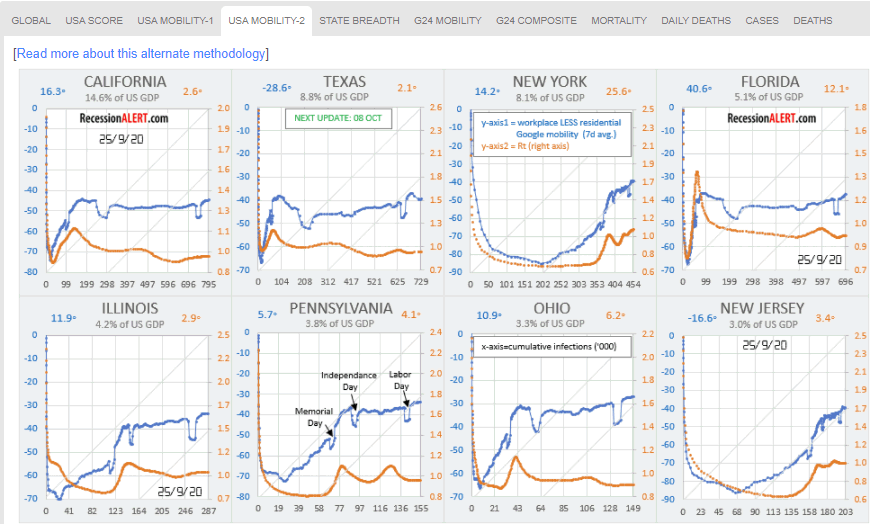
STATE BREADTH tracks US state daily infections and mobility as well as breadth metrics of these (number of states with increasing daily infections and number of states with decreasing economic mobility):
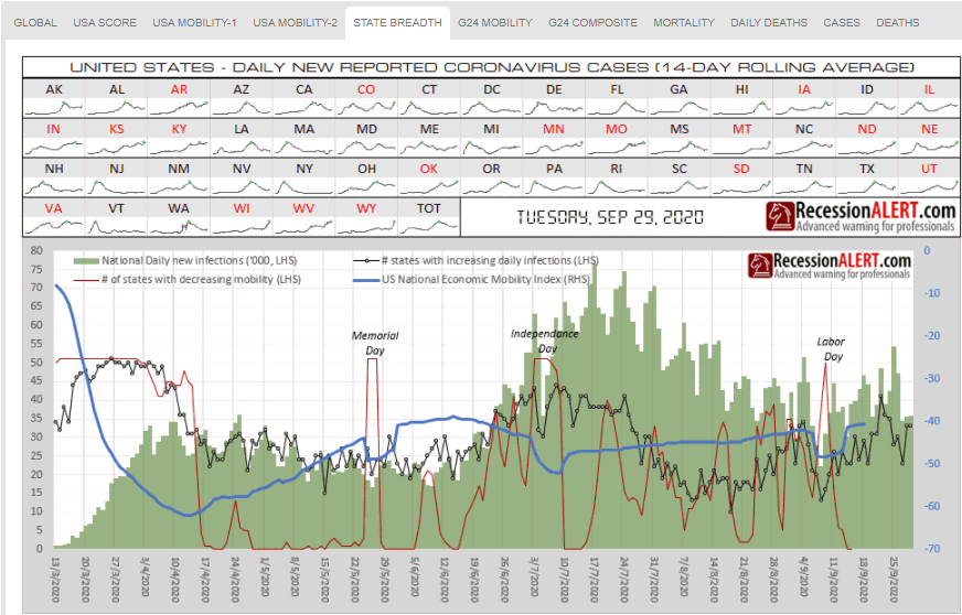
G24 MOBILITY tracks economic mobility and daily infection rates in the 24 largest economies in the world, contributing over 67% to global economic output (8 largest shown below):
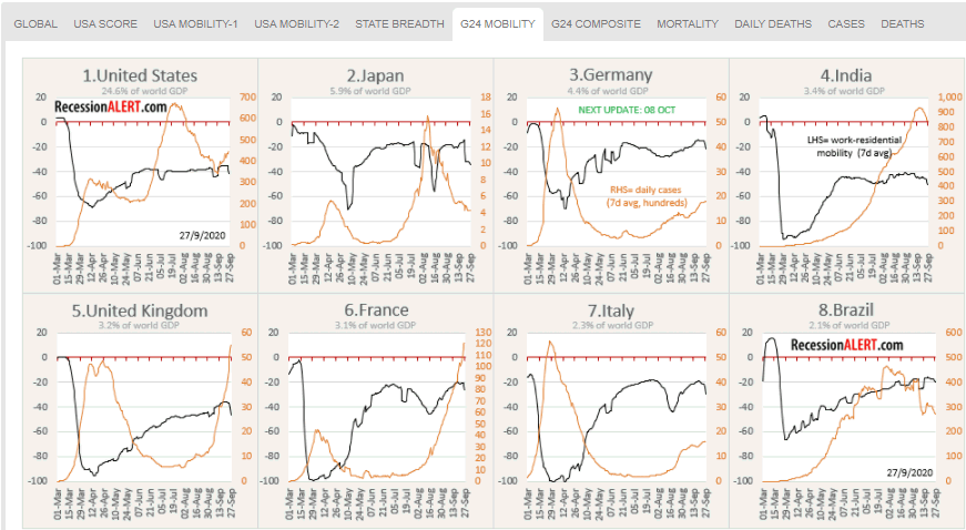
G24 COMPOSITE tracks the 24 largest economies as a single global GDP-weighted economic mobility composite together with daily infections and some interesting breadth metrics, to allow us to gauge how the overall world economy is shaping up:
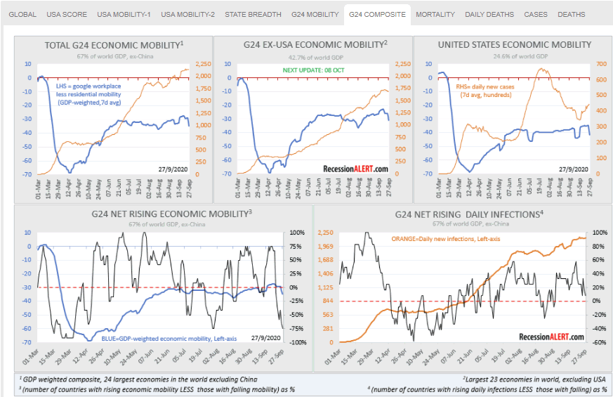
7. QQQ Probability Model
PRO subscribers now also have access to detailed, daily updated market trough and market peak probability models for the highly popular Nasdaq-100. The methodology used to compute these probabilities is the same as the one used for SP500, VTI, EFA, EEM, IJH and AGG – described in this research note:
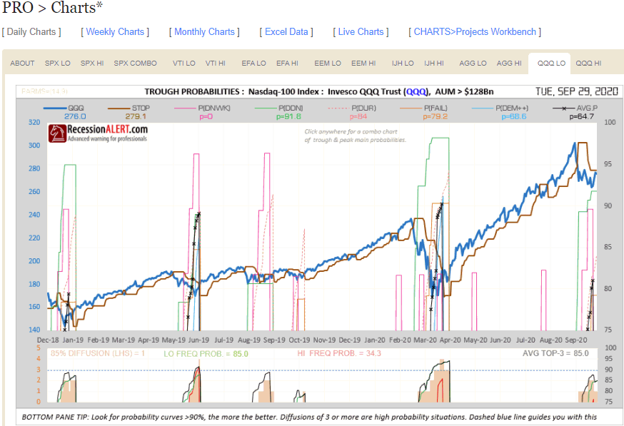
8. Dashboard
There is now a DASHBOARD menu that summarizes many poplar market timing and macroeconomic models in our stable. The SP500 SIGNALS tab tracks the current status of our market timing models. It also provides direct links to the detailed charts (as pop-up images) we maintain on each of the models:
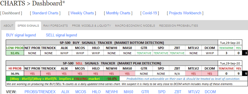
RAVI FORECASTS shows how much headroom we have to various SP500 future targets based on the forecasts made by the RecessionALERT Valuation Index (RAVI)
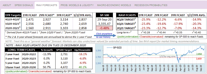
The next two tabs track many of our models via easy-to-use gauges. You can view the details about these gauges here, but we do a brief summary below.
PROB MODELS & LIQUIDITY on the top-row shows the state of the peak/trough probability models for the various ETF’s together with direct pop-up links (B=Bottom, T=Trough and C=Combo Chart) to the various charts if your subscription level allows it:
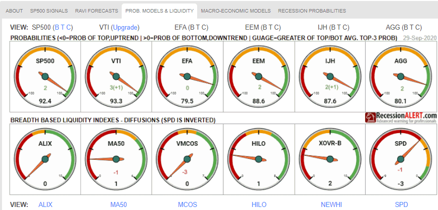
On the bottom row it shows the status of 6 of our most popular liquidity indexes together with direct pop-up links to their various charts.
MACRO ECONOMIC MODELS shows the status of our main US economic & recession prediction models:
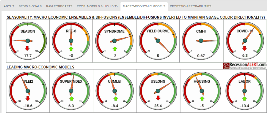
Direct pop-up links to charts for each of the above models will be provided shortly.

