
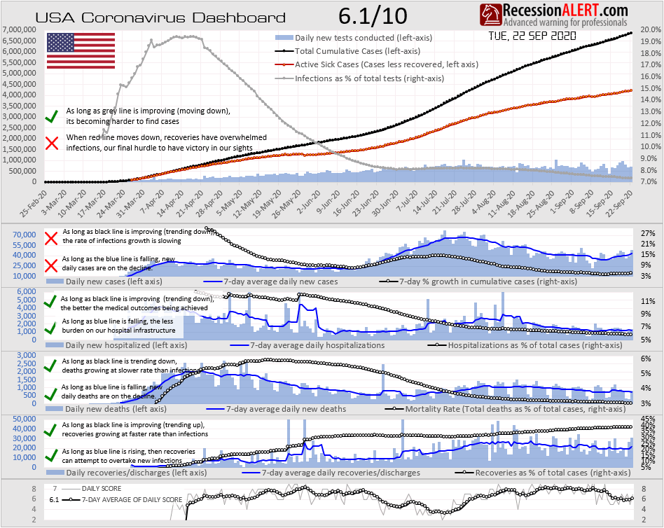
NOTE : All the charts displayed below are updated daily/weekly and available for subscribers from the various chart menus.
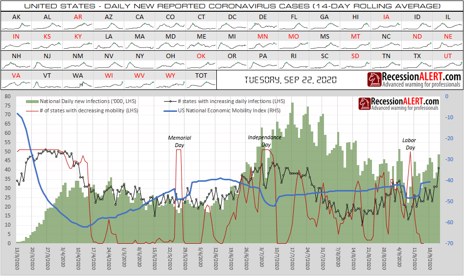
Since the peak daily infection rate of over 75,000 achieved on 17 July 2020, daily infections fell consistently to a trough of just over 20,000 on 8 September 2020. During this period, US national economic mobility (Google workplace less residential mobility indices) climbed slowly as the economy attempted to get back to work. Since just after Labor Day however, the daily infection rate has picked up steadily to just under 50,000 across a broad swathe of US states, with over 40 states reporting increasing infection rates from a low of just 14 at the trough. Some 17 of these states are in serious trouble, as highlighted in red below:
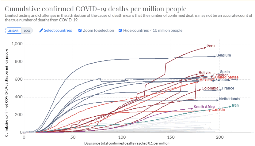
Whilst the US’s large population size has resulted in her reporting the most infections and deaths among all countries, the actual death rate per capita is smack bang in the middle of the top-twenty countries by mortality (with populations more than 10-million) as depicted below:
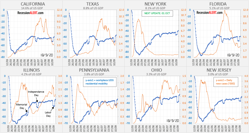
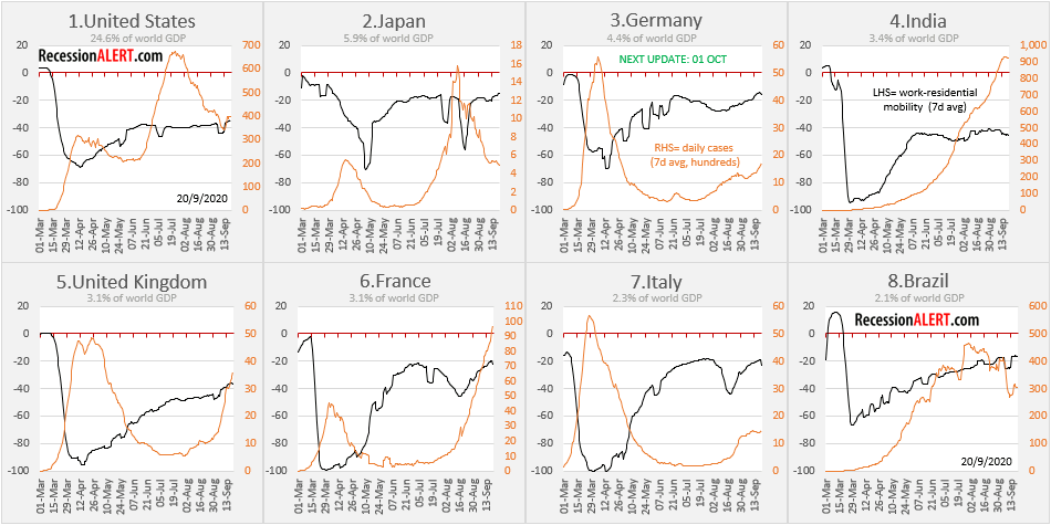
Taking a peek under the hood at the eight largest US states by economic contribution, with over 51% of US national output, reveals that all but Illinois, Pennsylvania and Ohio have got their daily infection rates nicely under control and all states in this group seem to have increasing economic mobility:
The states ranked nine through sixteen by economic output, contributing some 18.4% of total national GDP, show that North Carolina, Virginia, Michigan and Maryland are struggling to convincingly bring down daily new infection rates:
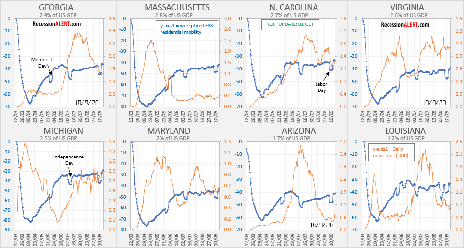
Again, all states seem to be improving their economic mobility, some better than others. The difference however appears to be among how this is expensed against increased infection rates.
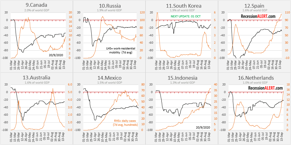
We can roll-up all the statewide data into a national US view, and compare among the eight largest economies in the world (excluding China whose numbers are highly suspect and for which no mobility data is available anyway), contributing some 49% to total world economic output:
Again, most countries are experiencing improved economic mobility, but with huge variances in costs in terms of infection rates. India is clearly the worst off with stagnating economic mobility and exponential increase in daily infections to just under 1-million der day! France and United Kingdom seem to be well into their second waves, with Germany and to a lesser extent Italy potential problem areas developing.
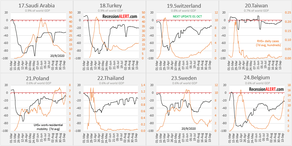
Here are the world economies ranked nine through seventeen, contributing some 12.8% to global economic output:
Spain and the Netherlands are clearly in the grips of ugly 2nd waves of infection which have exceeded prior peaks, whilst Canada is in the early stages of a second wave, yet to exceed her prior peak. Indonesia is still in her first wave with the daily infections looking suspiciously like a exponential curve candidate. South Korea nipped her second wave in the bud whilst Australia has all but defeated her second wave. Russia appears on the cusp of a second wave whilst Mexico appears to be fighting to get her first wave under control.
Here are the world economies ranked seventeen through twenty-four, contributing some 5.7% to global economic output, where pain seems to be isolated to Poland, Belgium and Switzerland. Taiwan and Thailand seem to have infections tightly under control and their economic mobility is almost at pre-covid levels as a result:
We can now finally roll up the data for all 24 of the worlds’ largest economies, contributing over two-thirds of global economic output. Note that we produce a GDP-weighted economic mobility index in this exercise, to match current global economic conditions the closest:
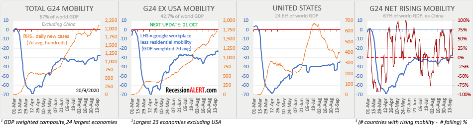
Following a June to early August “economic flatline” it appears that the global economy is picking up her skirts to run again, posting decent gains since mid-August, and posting new all time highs above -30% from pre-covid levels. It is interesting to note that the G24 group excluding US appears to have a slightly more improved economic mobility curve than the US, but that this is coming at the expense of daily infections, since US daily infections are decreasing from the 2nd wave whilst the other 23 countries, as an aggregate, have their infections still increasing in what appears to be the first initial wave.
Whilst there is always room for improvement when it comes to lives lost, it appears the US may not be faring as bad as some of the media is making out. There are certainly a lot of populous countries and even some developed ones that are faring worse. There are a lot of things moving in the right direction with the US pandemic response, and as depicted below there is still some room for improvement on a few metrics:
We can look beyond just mobility metrics and geolocation data when tracking the current US economic recovery. Here is a U.S 7-factor high-frequency economic recovery tracker we maintain for clients:
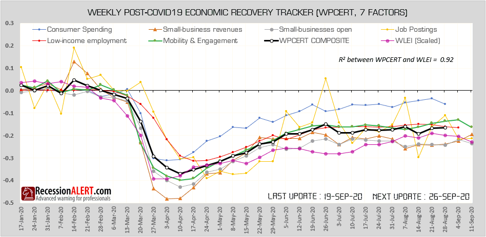

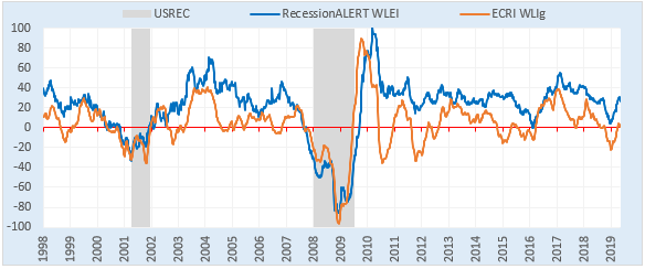
What has been interesting to observe is the surprisingly high (for us at least) correlation of 0.75 to 0.94 (aggregate 0.92) between these “alternative high frequency measurements” and the more traditional RecessionALERT Weekly Leading Index (WLEI). Using all seven of these high-frequency factors together as opposed to just looking at economic mobility, shows a slightly more pessimistic assessment of the US economic recovery. The WPCERT composite is still below the peak registered on 26 June and some of the prints of the earlier available components hint at a slight decrease in the WPCERT composite in the ensuing two weeks.
It is safe to say we are likely to see a surge in daily infections in the US and some corresponding weakness in the economy in the coming few weeks. This lack of forward visible momentum is likely to present some tailwinds to the local stock markets and perhaps extend the duration of the current correction.
Our multi-factor trough probability model for the SP500 is showing that the current drawdown has only been exceeded 9.3% of the time in the last 20 years(implying a 90.7% probability of the worst being over), whilst the current duration has been exceeded 19.7% of the time (implying a probability of 80.3% of the worst being over.) The VIX has room to expand (having exceeded current levels more than 56% of the time) and we have some room for more support failures to shake investor confidence, with a probability of only 69%. However, we have seen 3 down-weeks in a row which has only been exceeded less than 10% of the time in the last 2 decades. The Demark Buy-setup count model is indicating a probability of only 79.9% of a bottom. All-in-all the average probability of a bottom from all six factors we track is just over 75:
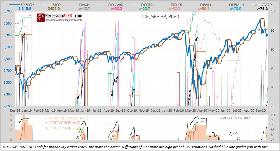
Experience has shown that it is more prudent to assess the average of the top-3 highest probabilities from the six presented, together with a diffusion of the number of six models above 90% probability, when assessing buy-the-dip trading opportunity. These are both shown in the bottom pane. The current correction is approaching interesting levels but is not quite there yet.
NOTE : All the charts displayed above are updated daily/weekly and available for subscribers from the various chart menus.
Comments are closed.