
Introduction
NOTE : Subsequent to this research note, we also launched an SP-500 Probability Model that measured probability of market tops (peaks). The MARKET-TOP probability model uses the inverse logic of the MARKET-BOTTOM probability model discussed in this research note. In other words, we look at low volatility instead of high volatility from the VIX component, we look at gains instead of drawdowns, consecutive up-weeks instead of consecutive down weeks, we look at duration of rally as opposed to duration of correction, we look at breakouts instead of support failures and so forth. The methodology is the same – we count six factors that measure the extent , velocity , duration, volatility etc. of a rally (as opposed to a correction) and for each compare the long term history as to how often these metrics have exceeded current values we are witnessing to infer probabilities.
The SP-500 Probability Model (SPM) is a quantitative model that attempts to measure implied unconditional probabilities that a market correction is over. In order to derive the probability that we have seen the worst of the current correction, the model examines six (6) loosely-correlated characteristics of SP-500 corrections going back to 1995, namely:
(1). CBOE 3-month SP-500 VIX – VIX
(2). Consecutive Down-Weeks (Fri-to-Fri closes) – DWK
(3). Extent of maximum draw-down in % points – DDN
(4). Duration of the correction in trading sessions – DUR
(5). Amount of established support failures (dead cat bounces or bull-traps) – FAIL
(6). Proprietary modified De Mark BUY-Setup counts – DEM++
Over the 8 months of this research project we have identified many useful metrics of SP-500 corrections that can be used to derive the required probabilities, but many of them are highly correlated, making their inclusion in a multi-factor model less useful. These six metrics stand out in both their diversity and their loose correlations. By using multiple loosely correlated characteristics, we can determine optimum probabilities, since corrections are often characterized by extremes in different metrics depending on the reasons and varying personalities and psychological behaviors for the corrective market action. For example, a sharp, sudden collapse and a long drawn out price-bleed will display different extreme characteristics. By monitoring different characteristics we can match extremes in the broadest set of corrections possible.
With respect to attempting to identify statistically rare extremes in the market, we have found this approach more constructive than the use of traditional technical indicators since it is (1) using long-term history to (2) imply comparable probabilities using (3) multiple loosely correlated correction characteristics which are diverse and expressive of market psychology and (4) more intuitive than “a 14-day RSI below 30” for example.
The model is useful for short to medium-term traders looking for tools to asses buy-the-dip opportunities/risks as well as funds and asset managers seeking favorable points in time for regular deployment of funds into the stock market.
Methodology
For each SP-500 market correction since 1995 the above 6 metrics are catalogued for the historical record. Each day the value of each metric is compared to the historical record to see how often metrics exceeded current values (how often things got worse.) This is the implied unconditional probability, for that specific metric, that things could get worse and we can subtract this from 1 to imply unconditional probabilities the correction is over.
If the current maximum draw-down being witnessed shows a P(DDN)=85% (0.85) it means that the historical record of ALL draw-downs since 1995 has only got worse than current witnessed levels 15% of the time, hence the implied probability of (1-0.15)=85% that we have seen the worst.
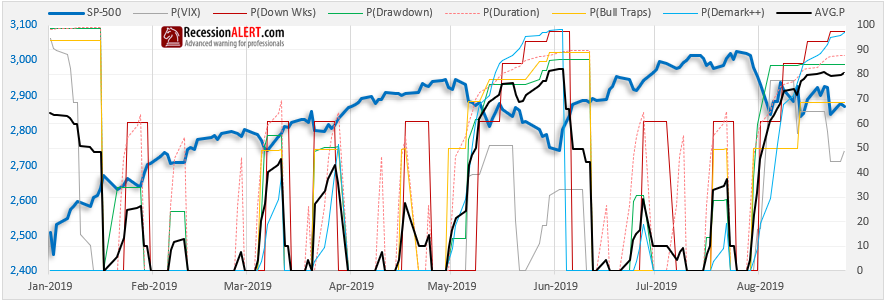
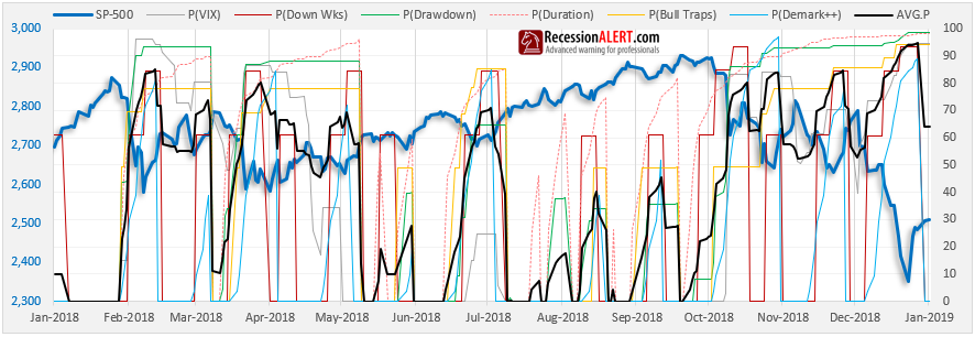
We also monitor the average of all 6 probabilities to obtain a combined reading. Thus if you see a combined reading over 90% you have very good risk/reward ratios stacked in your favor for a market entry that will lead to favorable outcomes. Ideally one would want to see all 6 probabilities over 90% but this by design can be rare due to the loose correlations of the chosen metrics. Our favorite use of the system is to seek out any set of 3 probabilities over 90% as cues for highly suitable market entry considerations.
The model only provides real-time observed probabilities since 2005 since it requires at least 10 years of historical data to cover a full business cycle and provide probabilities that are statistically meaningful. Whilst the historical record grows and is continuously updated with data from every new correction, this does not affect real-time observations in the past since observations are based on the historical record only. Thus numbers are never revised and represent in real-time what market participant would have observed at the time. This does mean however that probabilities assigned to any of the 6 metrics may fluctuate over time as the historical record is continually appended with newer sample data to form the basis of the statistical calculations.
Correlations
The Pearson coefficients between the probabilities provided by the six correction metrics used since 2005 are displayed below. Red numbers are low correlations and green shaded numbers are high correlations:
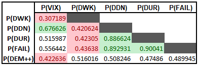
Draw-down, duration and dead-cat bounces have the highest correlations with each other whilst VIX and consecutive down weeks have the lowest overall cross-correlations:
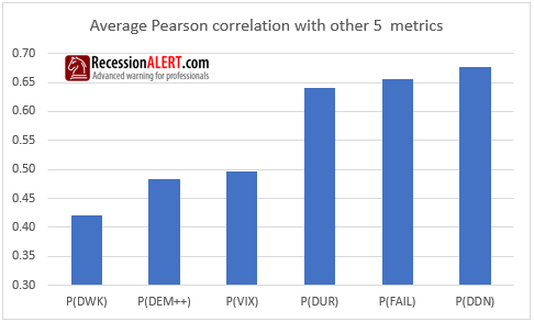
We can conclude that there is more than enough diversity in the metrics we are using to measure extremes in SP-500 corrections.
Average Probability and Diffusion
Before we get into the individual performance of each of the metrics, let us examine the history of the overall average probability.
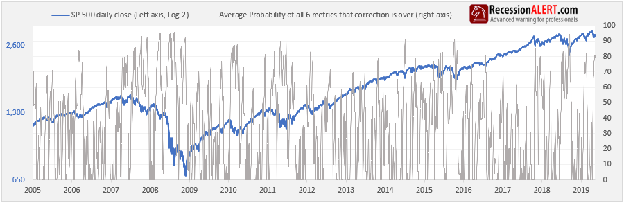
The average is too much of an “average of diverse readings” and apart from when it rises above 90%, we feel it is less useful. What is more useful however, is the Diffusion, which shows how many of the six metrics are currently flagging a probability of 90% or more:
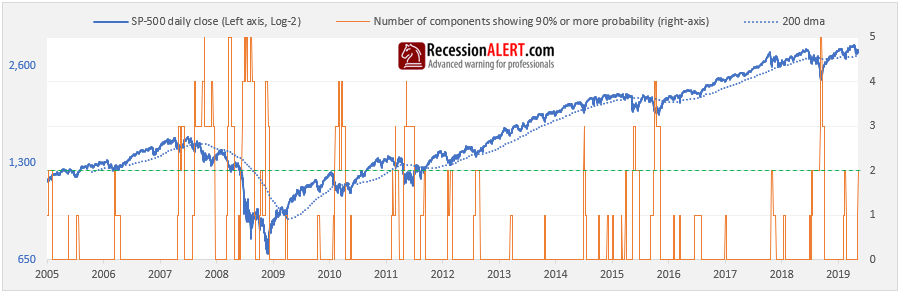
Interestingly, we have never seen all six models over 90% concurrently, most likely due to their purposely chosen loose correlations. Obviously the higher the reading the better, but it appears a reading of at least 2 offers the best general practical use, even though many readings of 1 correctly identified some great trough entry points.
A useful technique is to read the diffusion in conjunction with the SP-500 prevailing long-term (macro) trend.
- If the market is trading above the 200-day moving average then readings of 1 or 2 can provide very constructive market entry points.
- If the market is below the 200-day moving average then readings of 4 or more may prove more prudent.
Probabilities as Selling Pressure
In theory, when a correction is deemed over by any metric, the probability should revert to 100, since there is a 100% probability we have seen the worst.
However in our case, we tear the probability down to zero.
This not only makes the charts much easier to read but it also serves useful for another interpretation of the probabilities, namely that of Selling Pressure. Since the probabilities are based off selling metrics (draw-down, duration, support failures, VIX etc.) they can be used to measure current selling pressure in the context of the historical record.
For example, if the draw-down probability is at 90% it basically means we are at the 90th percentile of extreme draw-down ever witnessed. This allows for a natural assumption that selling pressure (as measured by draw-down) is at the 90th percentile.
So when you witness the probability of a metric plunging to zero, it merely implies that the metric in question deems the correction to be over according to its algorithm.
Accessibility
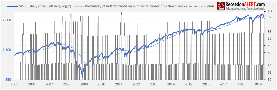
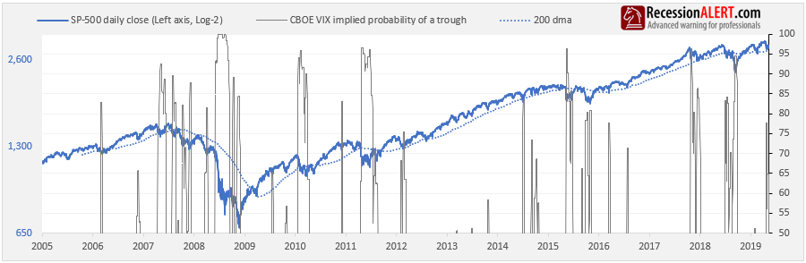
The model is updated daily and is available from the CHARTS>Daily Charts menu:
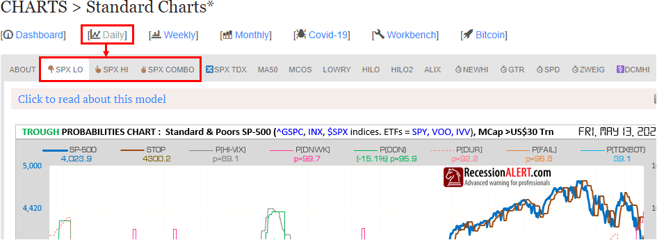
The chart shows the current probability reading of each of the six metrics together with the average probability of all six.
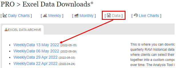
The six individual probabilities, together with the SP500 closes, average probability and the diffusion are updated once per week in the PRO Weekly Data File with their full histories, should you want to incorporate the data into your own back-testing, models or spreadsheets:
1.Draw-down
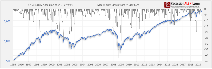
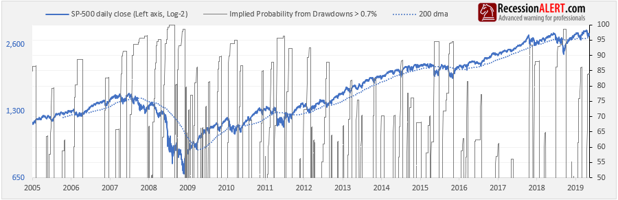
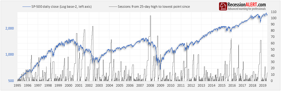
This is the most common metric used to gauge the extent of a correction. The real trick is the definition used for a correction – for example do we view the entire December 2007 to March 2009 crash as one correction or as multiple discrete ones punctuated by huge bear-market rallies? Since our objective was to determine probabilities for trading significant bounces in the market, we chose the latter, and for this we have found the percentage from the 25-session closing high to be the most useful demarcation tool to define the start and end of corrections:
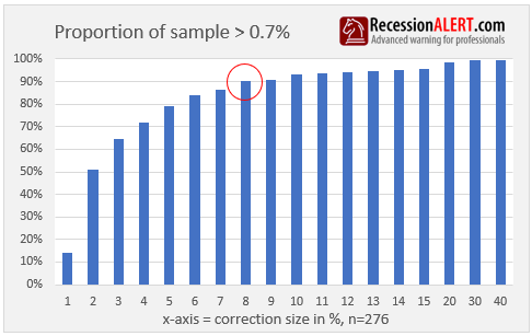
There were 549 corrections according to this definition since 1995, with over half of them less than -0.7%. It was prudent to eliminate this “long tail” from the sample set to reduce noise and thus we ignore any corrections smaller than 0.7% in size. The historical data set distributions are shown below, where we can see the “sweet spot” is a draw-down of 8% which represents over 90% of the sample set. This implies that less than 10% of the sample represents corrections larger than 8%
Here is the probabilities history derived from the sample distribution :
2. Duration
The length of a correction provides a surprising amount of useful information to assessing odds of a correction reversal. In this instance we count the number of stock market trading days from the 25-day closing high to the lowest point witnessed so far.
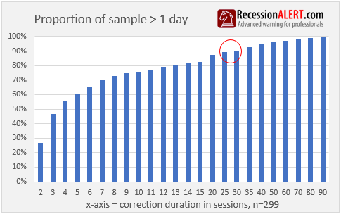
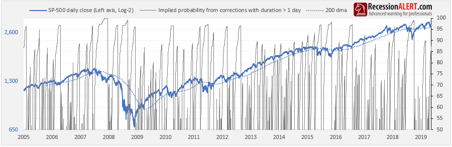
Of the 549 total corrections catalogued, over 45% of these had a duration of 1 session. Again, it was prudent to eliminate this “long tail” from the sample set to reduce noise and thus we ignore any corrections with a duration of 1 day. Here is the sample distribution currently in the historical data file that are used to impute probabilities. It appears the “sweet-spot” is when a correction has been going on for at least 30 sessions, for according to the history, in 90% of cases, the worst was over by then:
Here is the corresponding inferred probability chart:
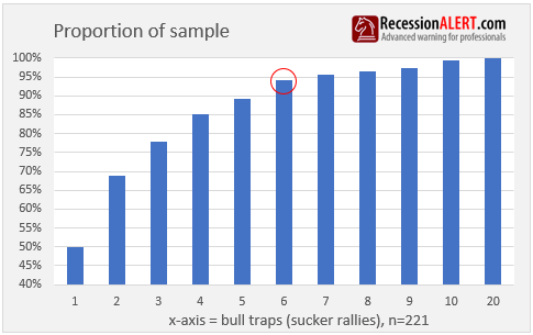
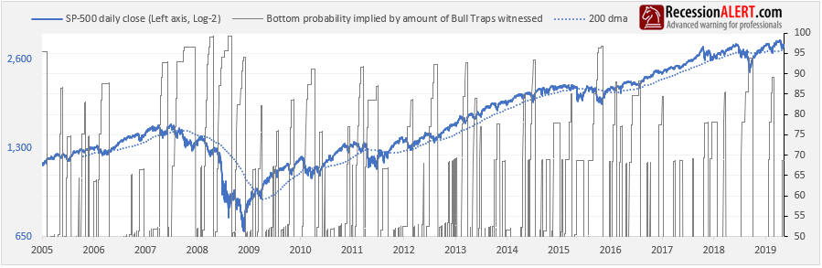
3. Bull Traps
These are also known as “support failures”, hence the tag “FAIL”. In stock market trading, a Bull trap is an inaccurate signal that shows a decreasing trend in a stock or index has reversed and is now heading upwards, when in fact, the security will continue to decline and make a lower low in the future. We like to measure this since each bull-trap shakes investor confidence further, especially those that have been repeatedly coaxed into the failed “sucker rallies”. When enough of these occur, everyone gives up in desperation and that’s what defines market bottoms – extreme pessimism
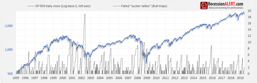
Not every correction encounters bull traps, hence there is a much smaller sample set. It appears that the “sweet-spot” is 6 sucker rallies, as values higher than this are very rare:
Here is the corresponding derived probabilities chart:
4. Consecutive down-weeks
These are calculated from the close of the prior Friday to this Friday’s close – as most charting programs do when displaying weekly candles. Single or even double down weeks in a row may be common but more than 3 or 4 are very rare, and so when they are witnessed it can give us some excellent clues as to the odds of us having seen the worst.
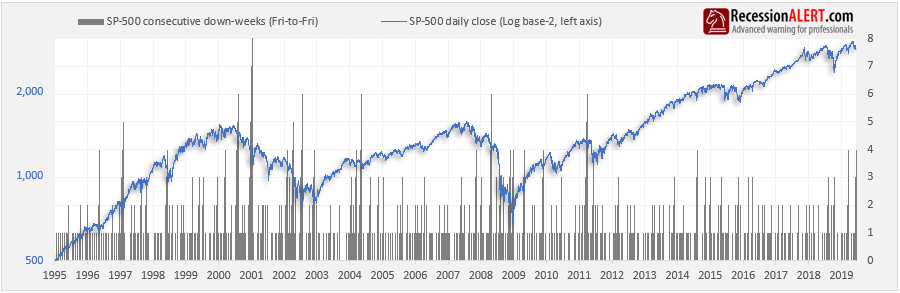
Here is the sample distribution, which shows that the “sweet spot” is when you have witnessed at least 3 consecutive down weeks:
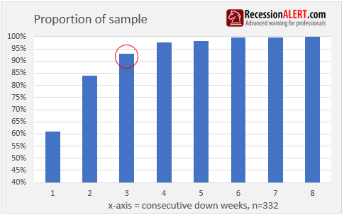
Here are the corresponding probabilities:
5. CBOE 3-month Volatility (VIX)
Created by the Chicago Board Options Exchange (CBOE), the Volatility Index, or VIX, is a real-time market index that represents the market’s expectation of 30-day forward-looking volatility. Derived from the price inputs of the S&P 500 index options, it provides a measure of market risk and investor’s sentiments. It is also known by other names like “Fear Gauge” or “Fear Index.” Investors, research analysts and portfolio managers look to VIX values as a way to measure market risk, fear and stress before they take investment decisions. [Source : Investopedia]
The VIX is shown below in grey. Since there has been noticeable changes in the long term trend of VIX, we de-trend it accordingly (call it DVIX) with a proprietary algorithm as shown in orange, to enable like-for-like comparisons across the whole history:
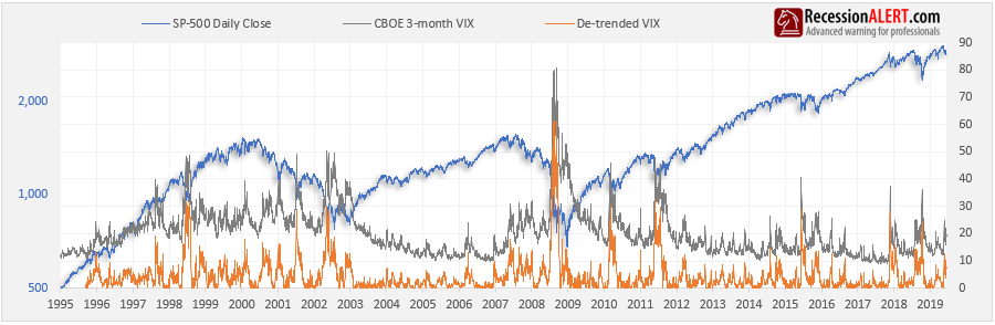
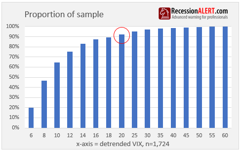
We ignore DVIX values below +5 since these are low volatility situations uncharacteristic of corrections. This leaves us with 1,724 trading sessions where DVIX was greater than 5, representative of when volatility was climbing. As a matter of interest, that corresponds with a VIX reading of about 17 today. As we can see in the sample distribution below a DVIX of around 18-to-20 is your “sweet spot” which is equivalent today of a VIX print of 30 and above:
The chart below shows the corresponding probabilities of a bottom implied by the de-trended VIX readings above 5. Note that we use the maximum probability seen over the last rolling 5-days since VIX is such a volatile series, especially near market bottoms:
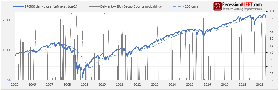
6. Modified De Mark BUY Setup count (DEM++)
This is a further enhancement of our original enhancement (DEM+) of the De Mark BUY setup count (DEM). The algorithm remains proprietary but in essence its purpose is the same – to identify periods of up-trends and down-trends and measure the duration of these trends to assess likelihood of market tops and bottoms.
Whilst it is not the purpose of this research note to discuss the merits of the DEM++, it is useful to quickly show the improvement and also give a feel for the trend following nature of the indicator. The DEM++ looks at support and resistance levels as opposed to the original classic De Mark that just examines the close 4 day prior to determine the count. The chart below shows the respective BUY setup counts (that attempt to count the number of sessions we are trending down) and the superiority of the DEM++ in avoiding “whipsaws”. It is instructive to examine the more recent period where the original De Mark has been whipsawed 3 times whilst the DEM++ still remains latched on a downtrend with a count of 18.
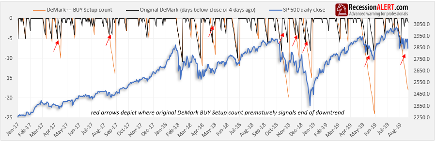
As you can see in the above chart there is a tiny price to pay for this huge increase in accuracy and that is the DEM++ on occasion can be a day or two late in signalling a trend reversal.
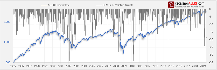
Here is the history of the DEM++ BUY Setup counts:
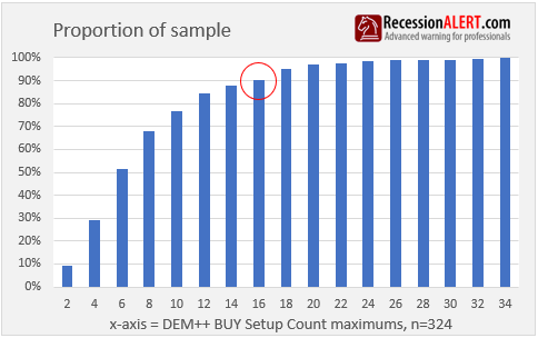
Below is the distribution of the BUY Setup counts for the 324 “down-trends” identified since 1995. It appears the “sweet spot” is a count of 16:
The corresponding probabilities of a stock market bottom inferred from the DEM++ BUY Setup counts appears below:
The new Demark counting methodology is so improved over the old that we have even launched a short-term SP-500 market timing model with it, which you can read about over here.
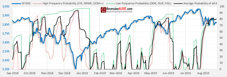
High/Low Frequencies
In general, the six metrics can be divided into faster, higher-frequency ones and slower, lower-frequency ones.
- The faster, higher frequency metrics are VIX, DEM++ and DNWK.
- The slower, lower frequency metrics are DDN, DUR and FAIL
It is useful to have this since the higher frequency metrics could point out short-term horizon opportunities within a larger correction horizon. The more recent behavior of the average probability of these two groupings is shown below:
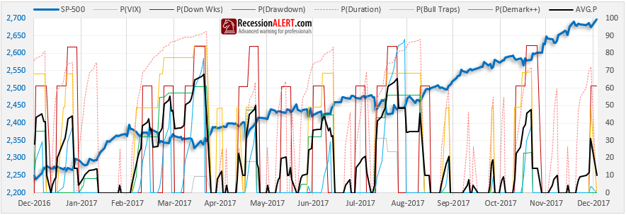
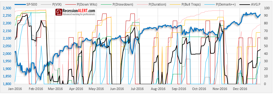
Historical Catalogue
Here we show the implied probabilities from all the metrics together on an annual basis for the past four years, to give you a better idea of how things work, and to demonstrate how different corrections are represented by extremes in different sets of measurement metrics.
Again, do not read too much into the average probability, focus on the highest two or three probabilities rather, when assessing your opportunity:
NOTE : Subsequent to this research note, we also launched an SP-500 Probability Model that measured probability of market tops (peaks). The MARKET-TOP probability model uses the inverse logic of the MARKET-BOTTOM probability model discussed in this research note. In other words, we look at low volatility instead of high volatility from the VIX component, we look at gains instead of drawdowns, consecutive up-weeks instead of consecutive down weeks, we look at duration of rally as opposed to duration of correction, we look at breakouts instead of support failures and so forth. The methodology is the same – we count six factors that measure the extent , velocity , duration, volatility etc. of a rally (as opposed to a correction) and for each compare the long term history as to how often these metrics have exceeded current values we are witnessing to infer probabilities.
Comments are closed.