
We wish to highlight the following recent additions and improvements since April 2019, to our subscriber deliverables, as well as highlight some older features you may not be aware of.
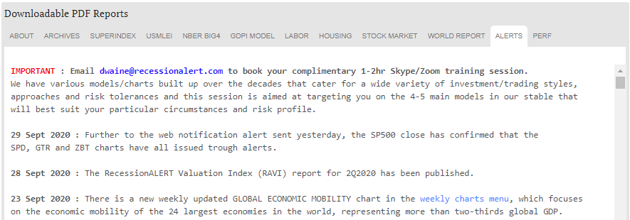
1.Alerts archive
Many subscribers do not know that you can access a multi-year chronological archive of end-of-day alerts from the REPORTS>ALERTS tab.
2. Stock Market reports
The RecessionALERT Valuation Index (RAVI) quarterly report is published in the STOCK MARKET tab, where the Monthly Composite Market Health Index (CMHI) report is also published: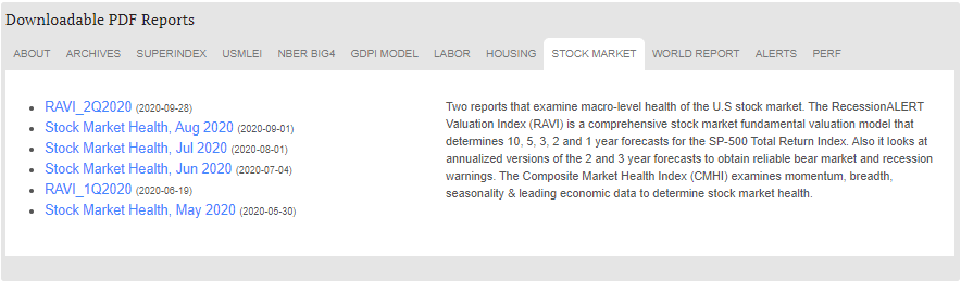
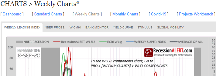
3. Weekly charts
A new menu page has been created to group weekly updated charts together.
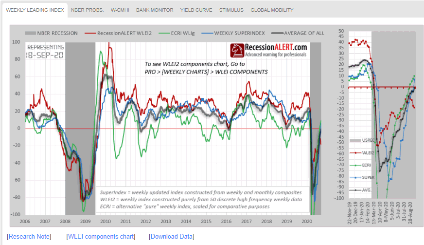
The WEEKLY LEADING INDEX is our highly popular Weekly Leading Economic Index (WLEI) compared with our most popular index, the Weekly SuperIndex and the ECRI WLI for comparison. PRO subscribers can also download the historical data in Excel and view a chart of all six the WLEI components from here:
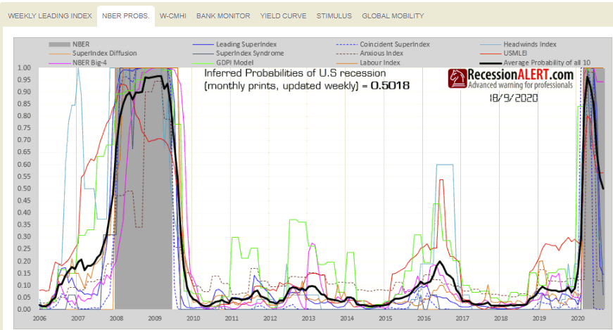
The NBER PROBS chart shows the probabilities of US recession depicted by all 10 of our recession models:
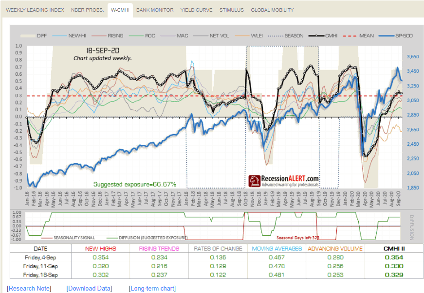
The WCMHI is merely a weekly chart of the Composite Market Health Index:
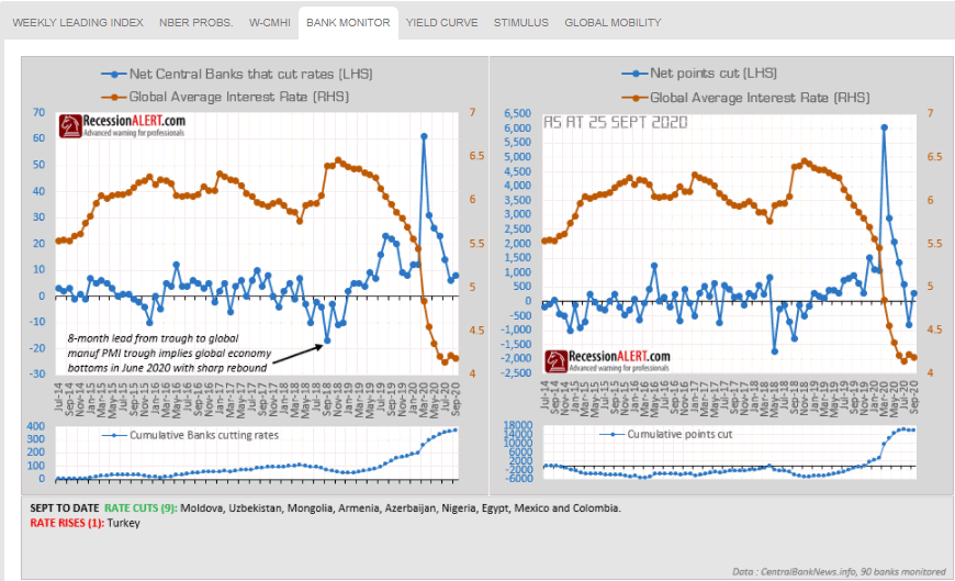
The Central Bank monitor tracks policy rate decisions from 90 central banks around the world:
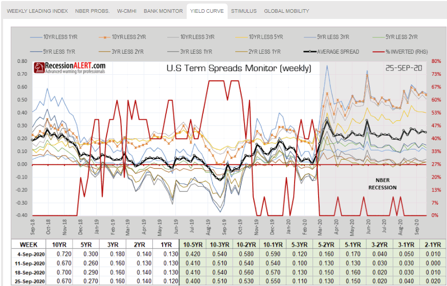
The US Yield curve diffusion is widely followed among our institutional clients:
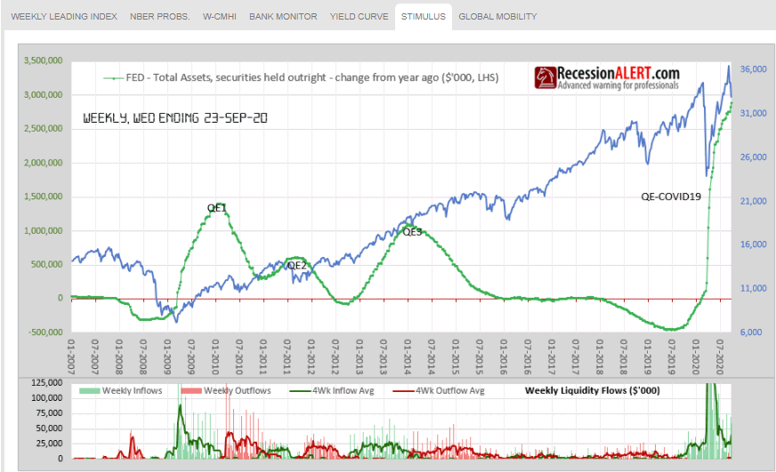
The STIMULUS chart tracks liquidity injected by the Federal Reserve into the US banking system:
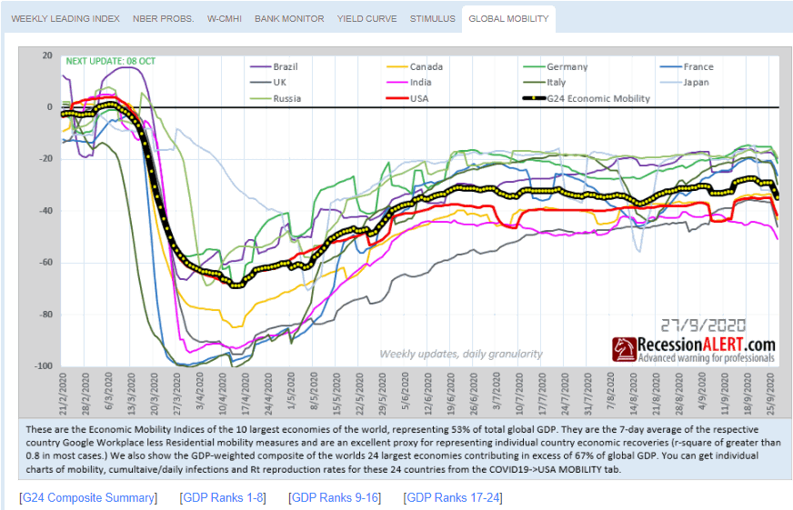
The GLOBAL MOBILITY chart tracks the GDP-weighted economic mobility of the 24 largest economies in the world, to assess the global recovery
4. Monthly Charts
There is a new menu page that groups all monthly updated charts together.
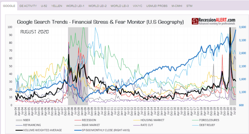
The GOOGLE chart shows our proprietary multi-factor Google Trends recession monitor:
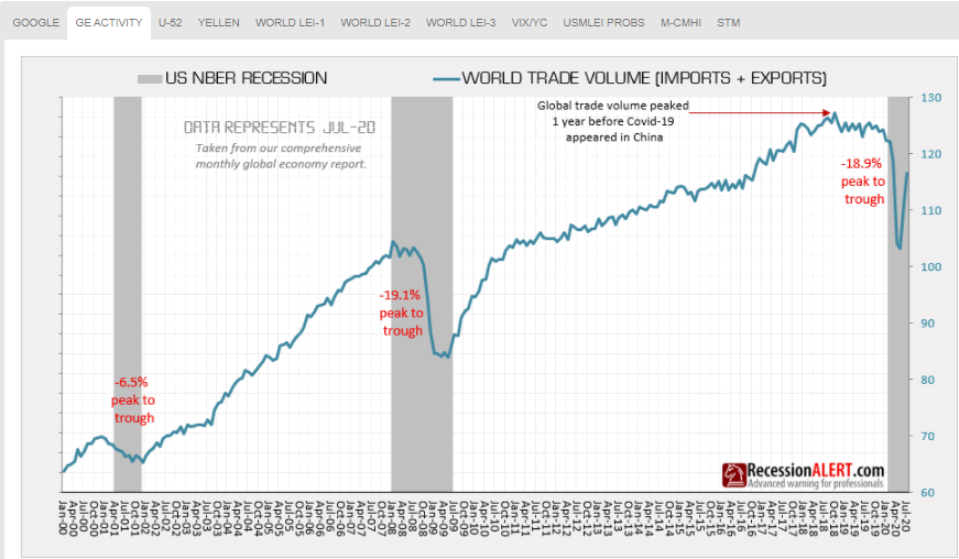
The GE ACTIVITY tab shows the Global Economic Activity index taken from our comprehensive monthly Global Economic Report:
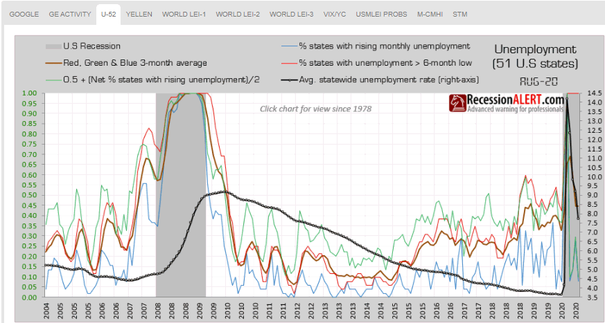
The U52 chart is derived from our Monthly Labor Market Report and shows unemployment rates in all 50 US states from various angles that have proven to be effective in warning of recession:
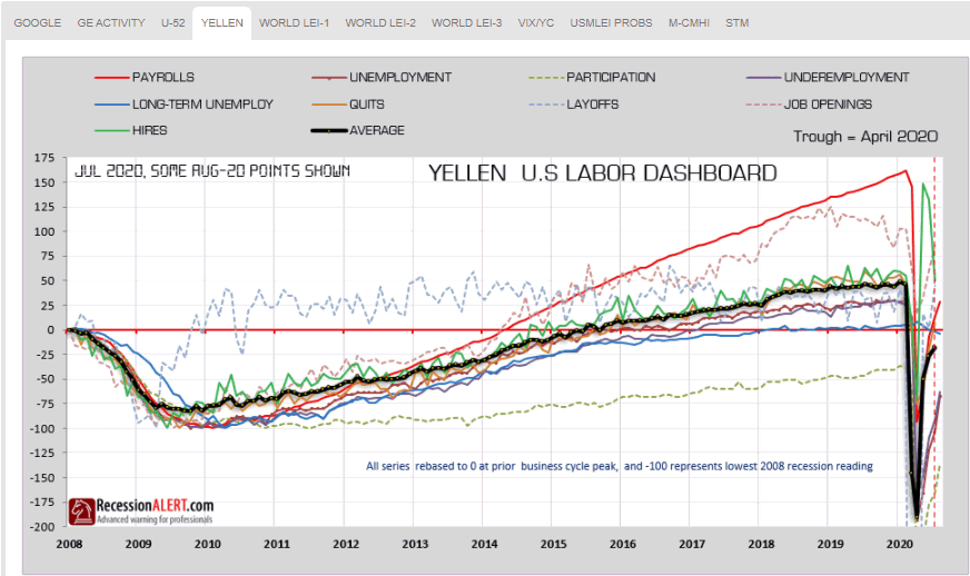
The YELLEN chart, also taken from our monthly Labor Market Report, shows the famous “Yellen Labor Indicator”
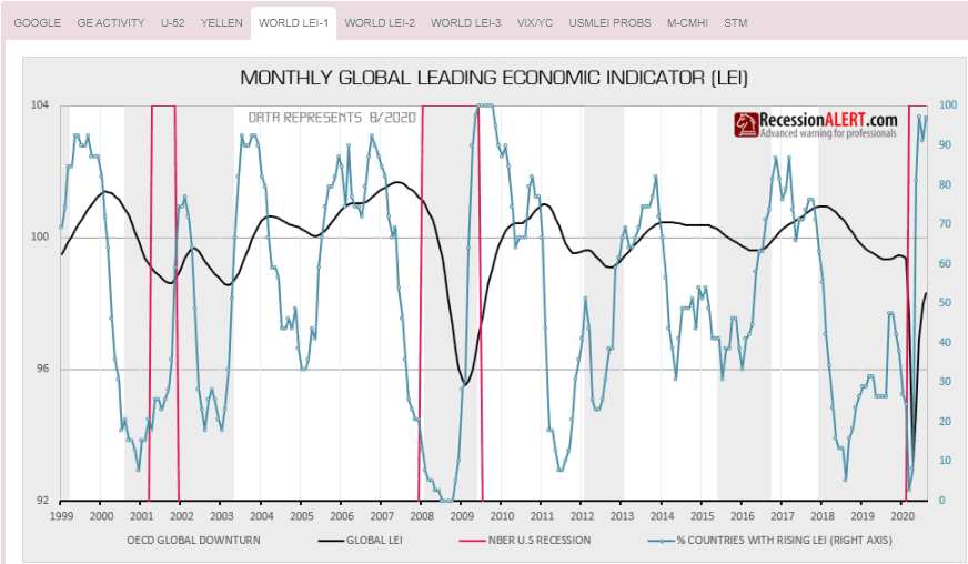
The WORLD LEI-1 tab shows our Global Economic Leading Index together with its preferred leading growth metric, the number of countries with rising LEI’s. This is taken from the comprehensive Global Economic Report:
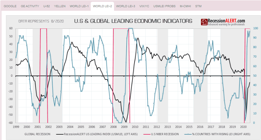
WORLD LEI-2: just shows the 22-factor RecessionALERT Monthly Leading Index (USMLEI) together with the World LEI growth metric. This is very useful as the Global LEI growth metric actually leads the US Monthly Leading Index:
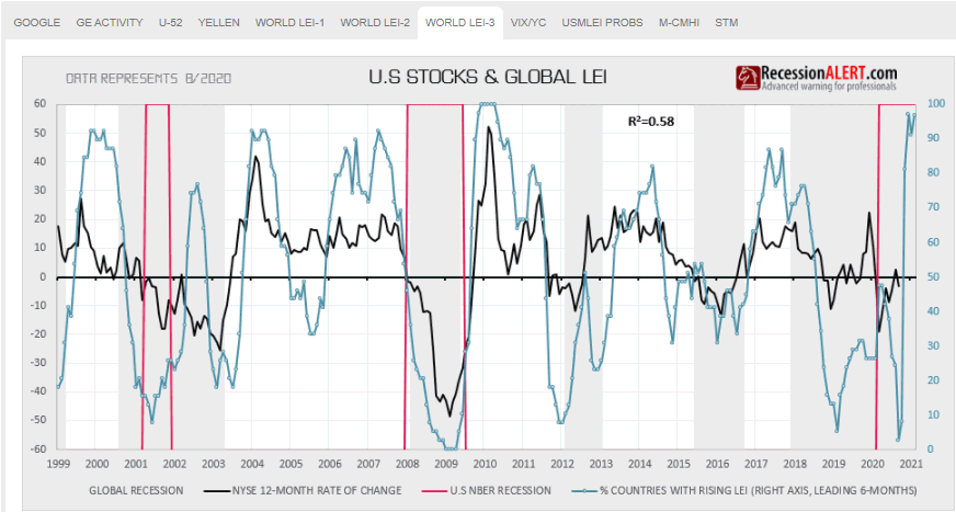
WORLD LEI-3 shows growth of the NYSE together with the Global LEI growth metric as the growth metric also leads the NYSE by 6 months with a not-insignificant long term correlation:
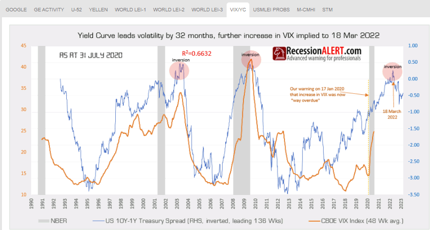
The VIX/YC chart updates a chart produced from one of our most popular 2019 research notes : “Impact of monetary policy & Yield Curve on future volatility” This research note was rather prescient in that it was penned a few days before the VIX exploded upwards, and we continue to track the phenomenon to completion in this chart:
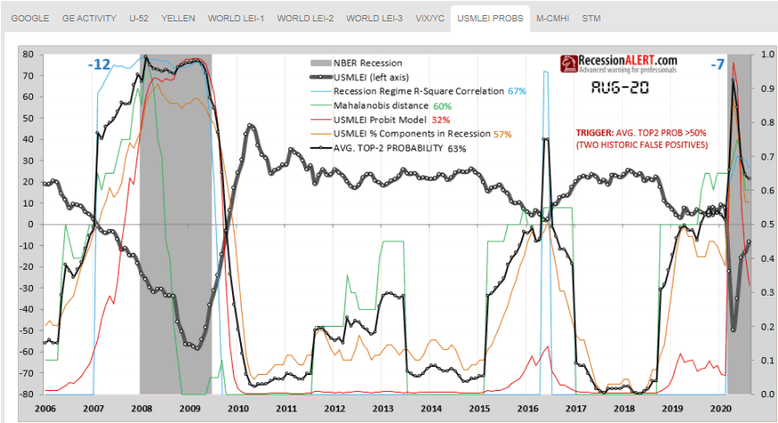
USMLEI PROBS tracks the 4 main probability models derived from the monthly published US Monthly Leading Economic Index (USMLEI). The models are discussed in this research note and provided 7 months warning to the current recession:
MCMHI is merely a monthly chart of the Composite Market Health Index (CMHI).
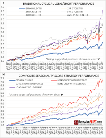
STM are all the detailed charts from our Seasonality Model, the performance of which is shown below. We see that the 4-year cyclical model is performing very well, but our proprietary Composite Seasonality Model is performing even better (red line in bottom chart)
5. Projects Workbench Menu
When spending many months researching and building new models we often reach a point where the model is “nearly good enough” or in “Beta” and we run it out of sample for a few months to see that things are working as they should, or to experience the model live first hand to work out if any improvements are required. Rather than have these models hidden in our laboratory, we post them here so that clients can share the final testing and refining process with us. Once models have undergone this “live testing”, improvements and client feedback, we normally then embark on the full documentation before making it available as a production model. As these are Beta models, you are advised extreme caution in using them. Note that the models could change at any time as we make refinements during this process.
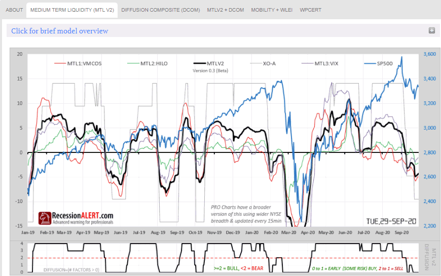
Most notable here are our new daily updated 4-factor Medium Term Liquidity Index:
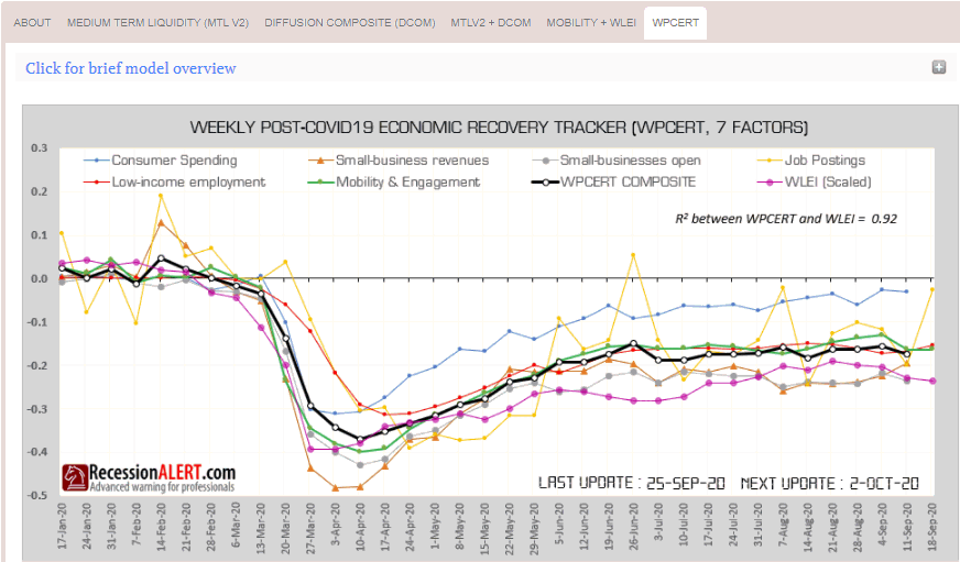
…and our 7-factor weekly updated WPCERT which you can read about here:
6. COVID-19 & Economic tracking enhancements
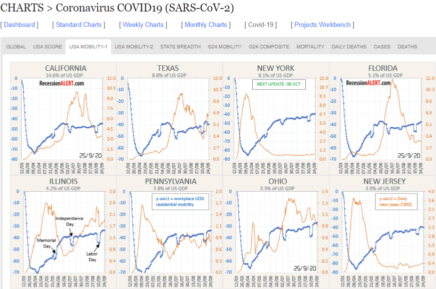
The USA MOBILITY-1 tab tracks economic mobility and daily infection rates in the 16 largest states in the US, contributing some 70% to US economic output (8 largest shown below):
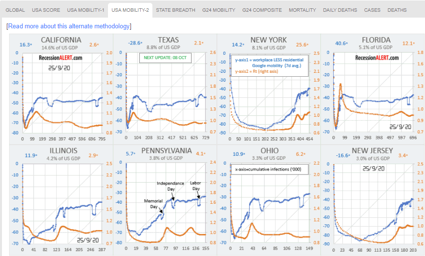
The USA MOBILITY-2 tab tracks the same states using this innovative alternate methodology that uses total infections on the x-axis (instead of date) and also shows Rt (reproductive rate) figures:
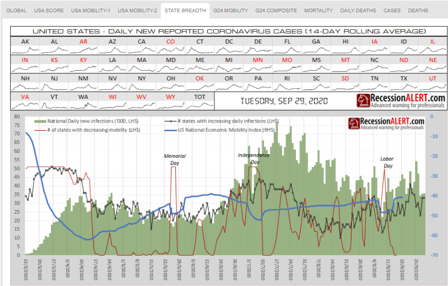
STATE BREADTH tracks US state daily infections and mobility as well as breadth metrics of these (number of states with increasing daily infections and number of states with decreasing economic mobility):
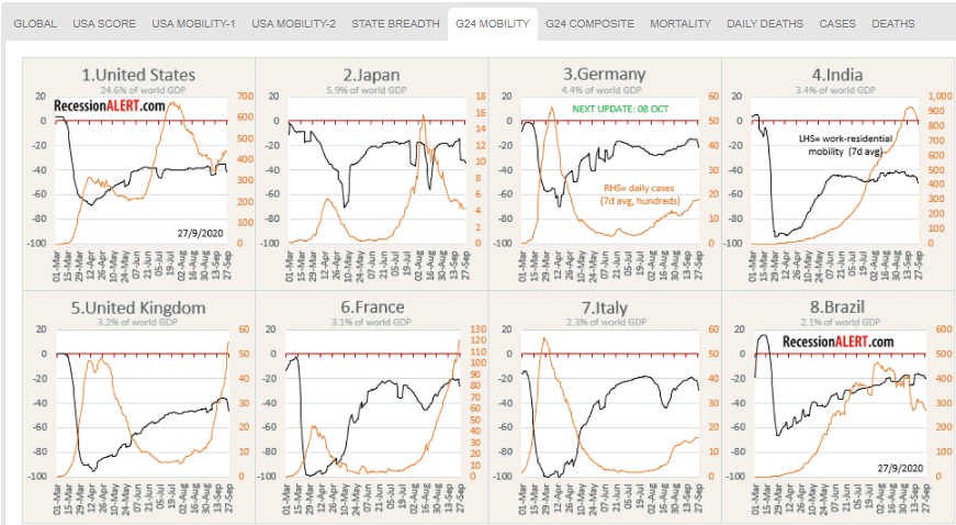
G24 MOBILITY tracks economic mobility and daily infection rates in the 24 largest economies in the world, contributing over 67% to global economic output (8 largest shown below):
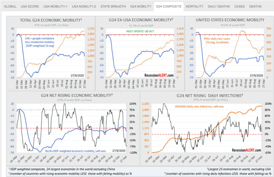
G24 COMPOSITE tracks the 24 largest economies as a single global GDP-weighted economic mobility composite together with daily infections and some interesting breadth metrics, to allow us to gauge how the overall world economy is shaping up:
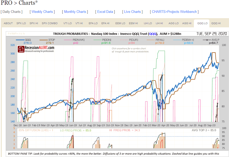
7. QQQ Probability Model
PRO subscribers now also have access to detailed, daily updated market trough and market peak probability models for the highly popular Nasdaq-100. The methodology used to compute these probabilities is the same as the one used for SP500, VTI, EFA, EEM, IJH and AGG – described in this research note:
8. Dashboard
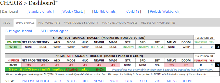
There is now a DASHBOARD menu that summarizes many poplar market timing and macroeconomic models in our stable. The SP500 SIGNALS tab tracks the current status of our market timing models. It also provides direct links to the detailed charts (as pop-up images) we maintain on each of the models:
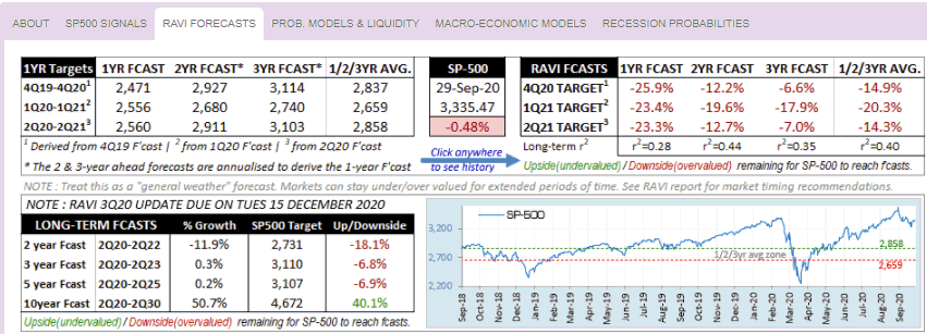
RAVI FORECASTS shows how much headroom we have to various SP500 future targets based on the forecasts made by the RecessionALERT Valuation Index (RAVI)
The next two tabs track many of our models via easy-to-use gauges. You can view the details about these gauges here, but we do a brief summary below.
PROB MODELS & LIQUIDITY on the top-row shows the state of the peak/trough probability models for the various ETF’s together with direct pop-up links (B=Bottom, T=Trough and C=Combo Chart) to the various charts if your subscription level allows it:
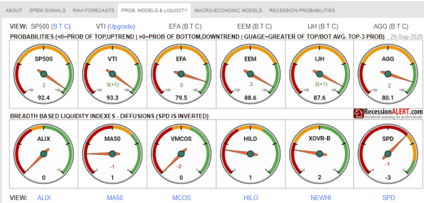
On the bottom row it shows the status of 6 of our most popular liquidity indexes together with direct pop-up links to their various charts.
MACRO ECONOMIC MODELS shows the status of our main US economic & recession prediction models:
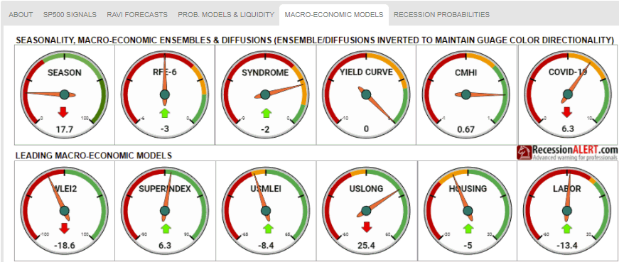
Direct pop-up links to charts for each of the above models will be provided shortly.
Comments are closed.