
The Dashboard provides an all-in-one at-a-glance “pilots view” of all the important short-term market liquidity indicators and the long-term US macroeconomic situation.
It consists of radial gauges where Green areas imply no danger (or bullish) and red areas denote danger zones (or bearish). Orange areas denote neutral (neither bullish nor bearish). The gauges all move clockwise. Note that gauges are very one-dimensional and don’t depict trend so for better understanding of the readings you are encouraged to view the actual charts of all the respective models/indices from the REPORTS menu.
LOCATION
The Dashboard is available from the DASH tab in the CHARTS menu:
PROBABILITIES
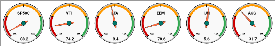
These represent the Trough and Peak probabilities of the various indices we track with our multi-factor probability models. Negative numbers imply top probabilities (market in uptrend, top probabilities > trough probabilities, more negative = increasingly bearish) and positive numbers imply trough probabilities (market in downtrend, trough probabilities > top probabilities, more positive = increasingly bullish buying opportunity). The probabilities displayed are the HIGHER of the average of the TOP-3 Trough or TOP-3 Peak probabilities.
Probabilities greater than 50% are represented by the red and green zones respectively whilst the orange zone represents probabilities less than 50%, which do not provide enough of a statistical extreme to enable market action or risk deduction.
BREADTH BASED LIQUIDITY INDEXES
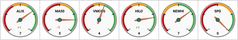
These are the respective Diffusion Indexes taken from the various liquidity models (see Average Liquidity Index and McClellan Liquidity Indices for example.) Neutral readings are all at the 12-o-clock position whilst Orange zones represent slightly bullish/bearish readings. Some diffusions have larger orange zones than others depending on the long term effectiveness of the diffusions to accurately capture full bearish and bullish SP500 trends. Apart from the readings of the diffusion displaying on the gauge there are also smaller green or red numbers showing how much the gauge moved since the last reading the prior day. Since higher diffusions on the Selling Pressure Diffusion (SPD) are bearish, we invert this diffusion so the gauge readings still makes sense.
MACROECONOMIC ENSEMBLES
Ensembles are a collection of discreet macroeconomic models depicting how many of the collection are currently flagging a recession. These gauges work in opposite directions to the rest (non-bearish left, increasingly bearish clockwise) since ensemble readings of 0 are bullish and increasingly rising numbers are increasingly bearish.
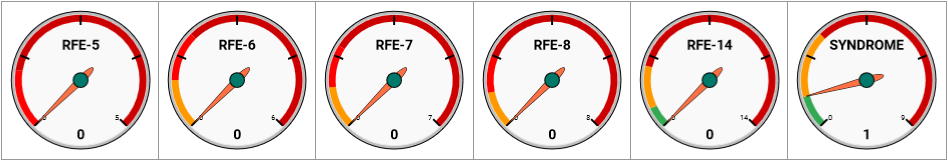
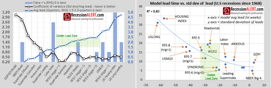
- RFE-5 is SuperIndex Diffusion + SuperIndex Co-incident + SuperIndex Leading + SuperIndex Syndrome + Headwinds index
- RFE-6 is RFE-5 + Anxious Index (our oldest and most popular ensemble – see research note)
- RFE-7 is RFE-6 + 21-factor US Monthly Leading Index (USMLEI)
- RFE-8 is RFE-7 + US Long-Leading Index
- RFE-14 is RFE-8 + GDP/GDI Model + NBER Model + Labor Index + CMHI + WLEI2 + US Housing Index and is basically all our models bar the RAVI.
- SYNDROME is the six-factor SuperIndex Syndrome model from weekly SuperIndex PDF report.
The gauge shadings are interpreted as follows:
- 0 + Green zones = “Never led to recession since 1968”
- Orange zones = “Led to recession with 2 false positives in past”
- Light red zones = “Led to recession with 1 false positive in past”
- Dark red zones = “Always led to recession since 1968”
The chart below shows the performance characteristics of our various ensembles compared to their discreet components:
LEADING MACROECONOMIC MODELS
These depict the status of our most powerful U.S leading economic indices:
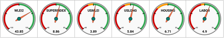
- WLEI2 is the “pure” Weekly Leading Index (only weekly components)
- SUPERINDEX is the pseudo-weekly leading Index (weekly + monthly components)
- USMLEI is the 21-factor US Monthly Leading Index (monthly components only)
- USLONG is the US Long-Leading Index
- HOUSING is the US Housing Market Index
- LABOR is the US Leading Labor Market Index
The gauge shadings are interpreted as follows:
- Red zones = “these readings always led to, or were in a recession since 1968″
- Orange zones= “these readings mostly led to, or were in a recession since 1968 (some false positives)
- Green zones = “these readings never led to nor were in a recession since 1968″
Comments are closed.