
We note from the view logs that there is consistent, considerable interest in the ALIX charts, presumably as traders try to get a read on the market’s direction during this current phase.
Without taking away from the utility of the much older ALIX, we recommend you also watch the newer BREADTH-C tab in Daily PRO Charts We designed this as a “Super ALIX” — the marriage of ALIX and the old, also popular, NEWHI XOA indicator — and it has the same intent: to warn of weakness that eventually collapses the index, or strength that bolsters its rise. We have been watching this index closely “out of sample” for several months since its launch and it is proving to have high utility.
It is a very interesting chart, unlike anything we have ever seen. What makes it unique is that it tracks the net new 2-, 4-, 13- and 26-week highs for the SP500 Index (XOA style), but also tracks them for the SP500 sectors. Now, anybody in the know understands that the rise and fall of the SP500 is initiated by one or two sectors first, and then the rest follow if the move is durable. So this index is very interesting in that it gives you a view through THREE breadth lenses: new highs and lows for the SP500 index, for the sectors themselves, as well as the sector XOA breadth.
The chart appears below and is probably one of the most under-rated charts on our site. We are probably at fault for not making much fanfare about it — but that’s the nature of launching something new and watching how it behaves out of sample. There are undoubtedly many uses for this chart we have not uncovered yet, but I can tell you what WE watch daily with particular interest to gauge technical market health. It’s the three panes below the main chart.
1. XOA COUNT (SP500) — the close cousin of the old XOA index. You know how to use this already, but this one is constructed from different pairings than XOA. Above the red line = healthy; below the red line = watch out!
2. NUMER OF SECTORS WITH THEIR XOA > 3 — basically a breadth reading on sector-wide XOA bullishness.
3. NUMBER OF NET NEW HIGH INDEXES > 0 — the granddaddy index. Nice and slow, very few whipsaws, later on the way down and later on the way up but watch out below the dotted line. A great high confidence confirmation signal. That confidence comes at a cost -call it an insurance premium. Later signals.
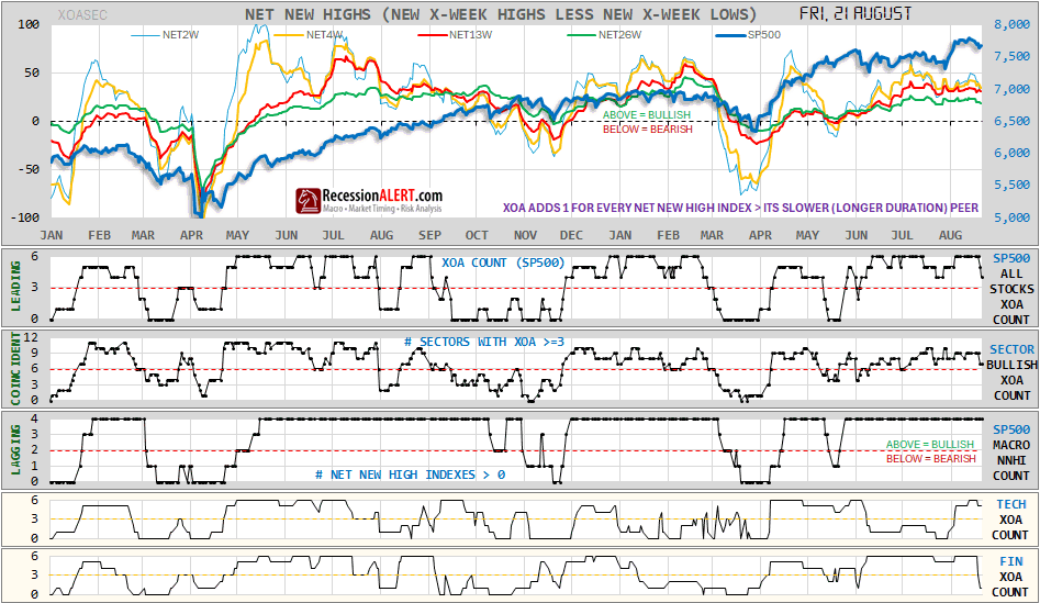
The normal deterioration into a correction, or build-up into a rally sequence, is 1, then 2, then 3. But remember, your ultimate leading signal will be one or two sectors making the big moves first with their XOA. For now, TECH is the sector to watch. If you look at the other new sector charts in tab BREADTH-B, you will note that the tech stocks signal the drawdowns first and the rallies first — consistently, for the last four non-trivial corrections at least On the eve of the 29th July trough, Tech’s XOA count jumped up smartly and remains elevated.
The reading now? Promising solid BULL but VULNERABLE to short-term pullback. Watch those first 2 panes – they are weakening and that’s the pullback warning. Panes below show FINANCIALS, INDUSTRIALS, CONSUMER, UTILITIES and REAL ESTATE have rolled over (XOA counts < 3) and eventually may overwhelm the TECH drive. But the MACRO NNHI (net new hi) COUNT is firmly in the longer term bull camp. His reading is that pullbacks are a buying opportunity for now.

Comments are closed.