We keep getting good news about employment and the labor market. But we rarely see the less optimistic numbers.
THE GOOD
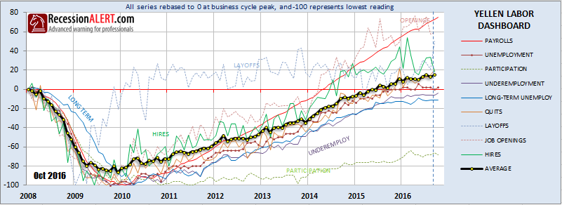
Yellen’s Labor Dashboard (see here) is looking strong with all but 3 of the 9 components above pre-recession levels:
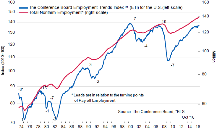
The Employment Trend Index briefly wavered but now seems to be picking up steam again
Weekly unemployment claims are recovering from a recent near-miss recession call:

MIXED SIGNALS
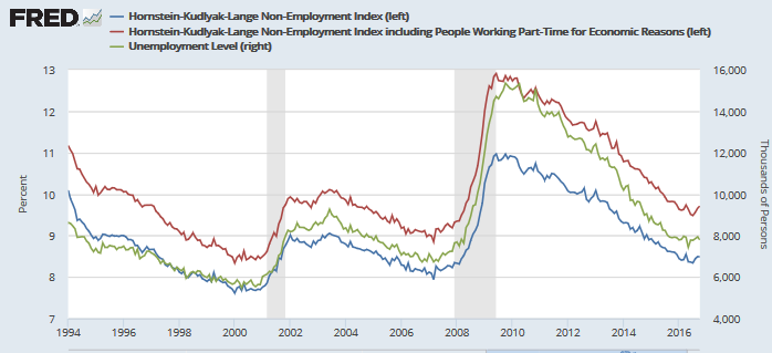
The popular unemployment numbers, by many different measures, seem to be bottoming-out but no cause for alarm yet
The Federal Reserve Board of Governors Labor Market Conditions Index is looking iffy. The broadness of this index makes its current levels worrying

Overtime is looking weak, but attempting to raise head above water:

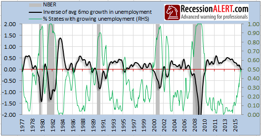
An index derived from the percentage of U.S states with rising unemployment looks worrying. Whilst the national unemployment figures seem fine, the population demographics of some large states seems to be masking underlying weakness at a state-level. Again, the broadness of this index makes for worrying numbers:

THE BAD
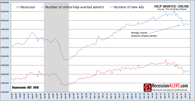
Help-wanted online looks to be recovering from a really protracted bad spell:
Here is another way of looking at the state-level unemployment numbers. The black line is derived from simply averaging up the unemployment rate from each individual state whilst the green line is the actual % of states with unemployment rates that are rising.
THE UGLY
Another useful way to look at the state-level unemployment is to count how many states have unemployment rates higher than the lowest (best) value seen in the expansion to date:
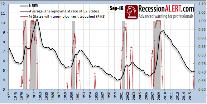
That means 75% of US States have unemployment levels higher than the best (lowest) numbers yet witnessed.
In summary, it would appear that several large-population states may be enjoying employment gains, but large swathes of the U.S are not.
NOTE : The state-level unemployment metrics shown above are excellent early-warning signals and are included in our highly comprehensive U.S Long-Leading Economic Index

Comments are closed.