The recent run in the major U.S stock indices has resulted in Shiller-PE charts being trotted out showing how far we are off the historical mean, implying a nasty pullback is in the works. The problem with a historical mean is that it is a single horizontal value on a chart that fails to take cognisance of any long-term trending the underlying valuation series may be experiencing. The static mean implies there is no valid reason stock market participants would be prepared to pay more over long periods of time for earnings, which is of course ridiculous. Long-run interest rates have been structurally declining for decades (and this is a denominator for most valuation metrics) whist industrial and technological advancements have enabled companies to be more efficient and/or productive.
Thus we prefer to use the linear regression mean as opposed to the simple average mean when it comes to looking at these kinds of charts. The simple average of the Shiller P/E is now 16.5, implying the current reading of 26.7 is alarmingly off-base. However the regression mean is 22.1 which paints a far less alarming picture:
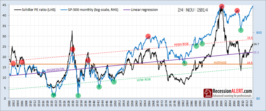
If we draw parallel lines one standard-deviation either side of the regression mean, then we get a better indication of what constitutes “nose-bleed” levels, represented by the red and green shaded circles. These represent once-in-a-decade extremes of over-valuation (red circle) or under-valuation (green circle).
Whilst there is no denying that the Shiller PE is showing we are currently in “historically expensive territory”, the regression lines show we are not yet in nose-bleed territory and there is easily more upside available in the stock market, at least according to this model everyone is trotting out.
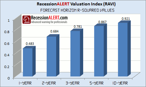
We have a far better stock market valuation model to manage investment risk and forecast SP500 returns across various horizons and which is surprisingly adept at warning of bear markets and recessions. This we will cover for subscribers in our December research note in the Research main menu. For now, we show the correlations achieved by the model for various forecast horizons since 1970. All these models forecast positive returns for their respective time horizons which would simply not be possible if we were at nose-bleed levels. Expensive? Maybe, but not nosebleed levels.