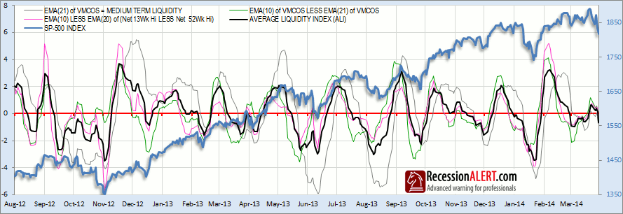
Losses on the SP-500 on Friday 11th saw all our measures of breadth-liquidity fall into contraction, warning of a highly vulnerable market subject to further liquidity tightness and raised volatility. To many of my staff that actively trade the SP-500, this is treated as a bona fide correction warning.

If you are scratching your heads as to where to find this chart updated on a daily basis in our charts menu, we will only be launching it in the coming week on the back of the existing breadth charts roll-out. But the data is in clear sight for you to inspect on a daily basis. The thin grey line is the Medium-term liquidity index “21EMA” displayed in the BREADTH->MCOS chart. The green thin line is the Short-term liquidity index discussed in the information text for the BREADTH->MCOS chart and represents the difference between the “10EMA” line and the “21EMA” line displayed on the MCOS chart. The thin pink line is another innovative representation of short-term liquidity flows discussed in our “Hi-Lo Breadth Indexes for the SP-500” research note, and is merely the difference between the “HiLo Fast” and “HiLo Breadth” indexes displayed on your BREADTH->HILO chart.
The thick black line above is merely the aggregate of the Medium-term liquidity index and the two short-term liquidity indexes, which we have chosen to dub the “Average Liquidity Index” or ALI for short. In many ways, the ALI is more useful for market timing or risk assessment purposes than any of its individual components, since it brings together the magnificent early-warnings of market tops provided by the short-term liquidity indexes coupled with the low whipsaw-rate of the Medium-term liquidity index. As you can see from the above chart, it is currently very closely tuned into the SP-500 market cycles.
Going back to 1990, the synchronization of the ALI to the cyclical fluctuations of the SP-500 have varied from “strong” to the “very strong” relationship it has now displayed for the last 3 years. For this reason, we must enjoy the current strong relationship and the predictability it provides for the SP-500 movements but always bear in mind the relationship may weaken at any time. Our research has revealed that the stronger relationships usually manifest when high selectivity is in play on the stock market (when fewer shares than normal are contributing to the SP-500 gains), which of course is a characteristic of bull markets entering their late mature phases.
The ALI is merely the representation of liquidity risk. It is no guarantee that the stock market will plunge further. Likely, yes, but certainly, no. It is quite feasible that the current sequence of events is an analogue of that displayed in mid-March to early-April 2013 on the above chart. In that instance, the ALI dipped sharply below zero and for 2 weeks volatility jumped and the SP-500 went sideways. There was then a short-lived rally that lifted the ALI above zero before it collapsed again, warning of further declines which duly materialized in the setting of lower lows- if only for a short moment before the market resumed her rally. In the 2014 scenario, we saw a convincing liquidity warning on 12th March which was followed by raised volatility and a 12-day sideways market. A short-lived rally ensued that lifted the ALI above zero momentarily before it fell below zero again on Friday.
It is prudent to augment the market-risk information being provided by the ALI with that of the SuperCycle seasonality model (STM), when trying to assess risk. We all know what the STM is saying for the next 4 months and we all know what one of the important components of STM is saying (see “Seasonality approaching its worst point“) so right now, we are inclined to favor the assumed negative outcomes suggested by the ALI rather than give the assumed positive outcomes the benefit of the doubt.

Comments are closed.