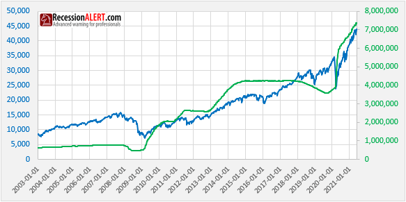
The chart below shows the size of securities held outright by the US Federal Reserve versus Wilshire Total market index as stock market proxy. We see the various quantitative easing programs that propelled the stock market higher including the massive Covid19 liquidity injection that set stocks on a never-before-seen trajectory
On the surface it appears that when the size of the FED balance sheet is flat or shrinking (tapering) stock returns are either muted/volatile or negative. Similarly when the balance sheet is expanding, stocks inflate in tandem.
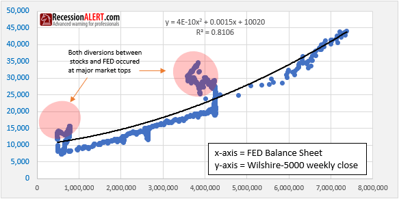
Few appreciate the conventional “Don’t fight the FED” anecdote and the correlation between the size of the FED balance sheet and levels of the stock market. Putting the above two data sets into a regression analysis makes things a little clearer:

We could posit than the size of the FED balance sheet explains over 80% of the levels of the stock market.
What is interesting to note however, is that on both occasions when stocks diverged significantly from values implied by size of the FED balance sheet, stocks went into major bear markets shortly thereafter.
Stocks are still tightly correlated with the size of the FED balance sheet (right hand data points on the regression chart). It is suspected that as the FED begins to taper and stocks continue to climb, we will see another big regression divergence warning of another major market top.


Comments are closed.