
Note : Most charts shown below are available to subscribers in the COVID19 analytics section.
Summary
- Economic mobility in US increasing at a slower pace than Covid-19 infections, contrary to rest of G7.
- At a state level, New York, New Jersey, Massachusetts & Michigan are leading economic mobility recovery vs infections.
- US has moved from a peaked scenario to join a host of second-wave countries struggling to contain infections after lockdowns.
- Stock market is going to struggle to post new highs until daily infections decrease again or FED resumes stimulus.
US versus rest of G8
Instead of using traditional economic indicators (most of which have a month or more delay) we can examine high frequency (weekly) data from the Google community mobility indices to try and figure out how economies are recovering. These indices use Android smartphones and Google maps requests to anonymously track movement trends over time by geography, across different categories of places such as retail and recreation, groceries and pharmacies, parks, transit stations, workplaces, and residential.
During lockdown, residential movement typically goes up and workplace movement trends down. To adequately track traditional economic activity, we can subtract residential movement from workplace movement to derive an Economic Mobility Index and represent this as a % of the pre-lockdown trend.
Instead of plotting the Economic Mobility Indices versus time, we can plot them versus cumulative infections to achieve a two dimensional view to gauge mobility improvement versus infections, as we have done below in charts comparing the US to the G8 developed economies which represent over 50% of global economic output.

The charts have been designed so that we can use the 45-degree angle line as a guide for how well we are doing. If the mobility curves are trending above 45-degrees, mobility is improving at a faster pace than infections, which is a desirable outcome. If the curves are trending below 45-degree angles then infections are outpacing mobility improvements which is a less desirable outcome.
We can see from the above chart that the US mobility curve is at a 19.4 degree angle which means we are not getting bang for our buck with the lifting of restrictions, as infections are outpacing mobility improvements. The UK at 43.1 degrees is faring much better, with infections marginally outpacing mobility improvements whilst Canada at 46.7 degrees angle has mobility marginally outpacing infections.
France, Italy and Germany are doing very well with angles in excess of 73 degrees. They are getting great bang for their buck by relaxing restrictions and there appears to be no post-lockdown “2nd waves” of infections.
US States
Whilst the national US figures are interesting, we can see that outcomes on a state-wide level vary significantly:

Some explanations on the charts above will prove useful. These weekly charts of the 12 main US statewide epicenters contributing 70% of total US infections and 60% of total US GDP are designed to measure the pace of economic re-opening and recovery as well as provide early warning of a potential 2nd wave of infections that could derail the recovery in question and send the stock market into another tailspin.
- The LEFT vertical y-axis = 7-day average of workplace less residential Google mobility indices as % relative to pre-lockdown baseline.
- The RIGHT vertical y-axis = Rt reproductive rate – the average number of people who become infected by an infectious person. If Rt is < 1.0, virus will stop spreading.
- The horizontal x-axis = cumulative Covid-19 reported infections (in thousands, measured daily).
FOR THE BLUE Mobility curve:
- Flatter slopes < 45-degrees are less desirable outcomes and indicative of slow mobility recovery and/or increasing infection rates (infections rise faster than mobility)
- Steeper slopes > 45-degree angles are better outcomes characterized by rapid mobility recovery and/or decreasing infection rates (mobility rising faster than infections)
FOR THE ORANGE Rt curve:
- Flatter slopes less than 1 are more desirable outcomes and indicative of lower growth in disease infectiousness (less likely 2nd wave of infections)
- Steeper slopes more than 1 are worse outcomes indicative of higher growth in disease infectiousness (more likely 2nd wave of infections)
- Rt Slopes < Mobility slopes are highly desirable, meaning mobility is increasing faster than infectiousness.
ABOUT THE SLOPES:
- Slopes for mobility & Rt curves are represented as angles in degrees, with horizontal being 0-degrees and vertical being 90-degrees. Angles below horizontal are negative
- Angles are calculated as the slopes of the trajectories of the curves as defined by the last 14 days data points.
OBSERVATIONS
US states seem to be either doing really well or really bad. There are very few in-between.
New York, New Jersey, Illinois, Massachusetts & Pennsylvania are all performing exceptionally well with:
- mobility outpacing infections,
- mobility outpacing Rt and
- Rt less than 1
Michigan is performing reasonably well with mobility outpacing infections, mobility outpacing Rt but Rt greater than 1. This could fall back into a 2nd wave of infections.
Maryland & Virginia are performing “OK”, with Rt less than 1 but infection growth still outpacing economic mobility improvements.
All the other 4 states are performing badly with daily infections outpacing mobility improvements, mobility improvements marginal and Rt > 1.
Overall US Covid19 Scorecard
Apart from a few large states mentioned above, the US National Covid19 performance peaked a week ago and appears on the decline as it enters a 2nd-wave status. We track 10 metrics daily to score the US National Covid19 situation, with the latest status below:

Our highest 7-day average of daily score of 8.1 was achieved on 28 May 2020 and has been on a steady decline since as various metrics deteriorated.
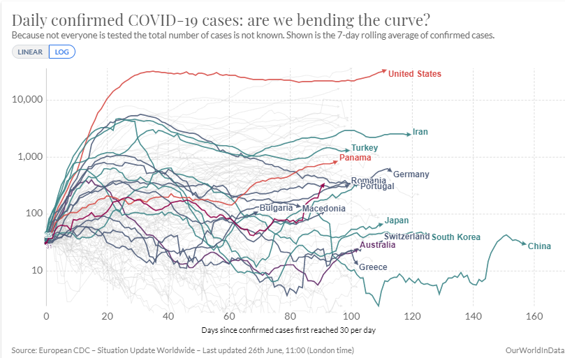
Second Wave
The US now joins the “second-wave” club – countries where daily infections peaked, but then started growing again as lockdowns were lifted:
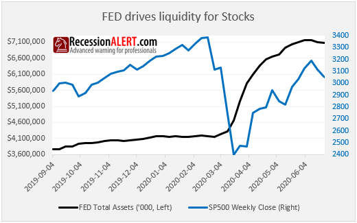
Regardless if you consider this wave still being the first wave or part of a second wave, the result is the same – US stock markets will struggle to continue posting higher highs and volatility will increase until one of two things happen:
- Daily infections peak again nationally or at least in the big 12 states we monitor
- FED responds to increased infections with more stimulus
Comments are closed.