
The Setup
We’ve been maintaining the Fed balance sheet component charts on our weekly page for many years. For most of that period they’ve been decorative — the headline number told the whole story and the components moved with it. The components chart only earns its keep at inflection points: moments when the headline starts disagreeing with what’s happening underneath, when one part of the balance sheet is doing something the total alone can’t reveal. We’re at one of those moments now, and the charts have finally found their job.
The headline overlay of the Fed’s year-over-year change in total assets against the S&P 500 captures eighteen years of an inconvenient truth: every major equity advance since 2008 has tracked, with eerie fidelity, a Fed liquidity injection labelled QE1, QE2, QE3, or QE-COVID. The latest tick higher in the green line — sitting just off a multi-year trough we’ve labelled “QE5” — has the chart commentariat insisting the printing press is back on. The companion components chart tells a more nuanced story, and the gap between the two readings is where the actionable insight lives.
Our short answer for subscribers: the Fed is expanding its balance sheet, but this is not traditional QE in any meaningful sense. The composition is wrong, the intent is wrong, and — most importantly — the transmission mechanism into financial conditions is fundamentally different from the four prior episodes the chart benchmarks against. Investors who position around an assumed QE5 cycle risk mispricing duration, the dollar, and the cyclicals that historically lead under genuine stimulus.
What the Headline Chart Shows
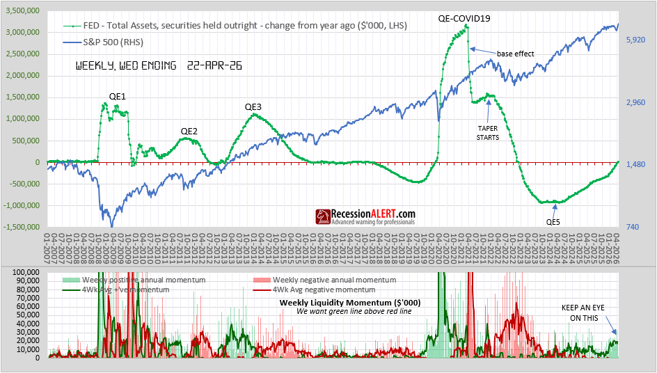
IMAGE #1: Fed Total Assets YoY change vs S&P 500, weekly through 22-APR-26 — green dotted line shows YoY change in Fed securities held outright (LHS, $’000) overlaid on S&P 500 (RHS, log scale). Historical liquidity episodes labelled: QE1, QE2, QE3, QE-COVID19, “TAPER STARTS”, and the current “QE5” trough. Every prior trough in the green line preceded a fresh equity advance — the question this article asks is whether the current uptick deserves the same interpretation.
The first chart plots the year-over-year change in Fed total assets (green dotted line, LHS) against the S&P 500 (blue line, RHS, log scale). The historical labels are precise:
- QE1 (2008-2010): The crisis-response flood — heavily MBS plus longer Treasuries
- QE2 (2010-2011): The follow-on, focused on long-duration Treasuries
- QE3 (2012-2014): The open-ended programme combining MBS with long Treasuries
- QE-COVID (2020-2022): The everything-everywhere expansion, peaking above $3 trillion YoY
- Taper / QT (2022-2024): The deepest balance-sheet contraction in Fed history, bottoming around -$1 trillion YoY
- The current episode (the QE5 candidate): A reversal off the floor that has now pulled the YoY change back toward zero
The pattern is unmistakeable. Every prior cycle saw the S&P trace the green line’s slope with only a modest lag. The current uptick is therefore taken — by a meaningful cohort of market participants — as confirmation that QE5 is underway and that equity markets have permission to keep grinding higher.
The components chart is where that interpretation gets interesting.
The Components Chart: What’s Actually Driving the Expansion
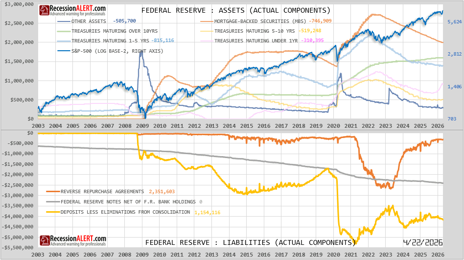
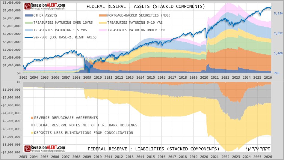
IMAGE #2: Federal Reserve Assets and Liabilities — ACTUAL components, dated 4/22/2026. Top panel: individual asset lines (MBS, Treasuries by maturity bucket, Other Assets) with YoY change values printed. Bottom panel: individual liability lines including Reverse Repurchase Agreements (orange, currently 2,351,603), Federal Reserve Notes (grey), and Deposits less Eliminations (yellow, currently 1,154,116). S&P 500 overlaid on right axis (log base 2). Note that every securities category shows a negative YoY change — the portfolio is still in net run-off, despite the headline balance sheet ticking higher.
The second chart breaks the Fed’s balance sheet into its actual asset and liability constituents. Looking at the actual-components asset panel (not the stacked view), every securities category shows a negative year-over-year change as of the 22-APR-26 reading:
These are the building blocks of historical QE — and every one of them is still contracting. The securities portfolio, in aggregate, remains in run-off. Whatever is pushing the headline number higher is not deliberate purchases of long-duration bonds.
What is growing sits in operational and short-duration items: short-term repo lending, technical liquidity facilities, and the Reserve Management Purchases (RMPs) of Treasury bills and coupon bonds the Fed authorised at the December 2025 FOMC meeting at up to $40 billion per month. The labelling matters. The Fed explicitly called these reserve management, not QE — a semantic distinction that becomes very real when you look at what they actually buy.
This is the first key insight. The current uptick in the headline chart is composed of plumbing, not stimulus. Bills don’t suppress long-duration yields. Repo operations don’t expand bank reserves the way bond purchases do. The transmission mechanism into financial conditions is dramatically weaker than the four episodes the chart labels.
Why the Balance Sheet Had to Tick Up
The deeper question is why the Fed had to step in at all. The answer involves five reinforcing drivers:
1. Reserve Depletion (the structural driver). After withdrawing over $2.4 trillion from the financial system since mid-2022, bank reserves hit their floor. The Fed’s own modelling distinguishes between abundant, ample, and scarce reserves; once conditions tipped from abundant to merely ample, money market frictions began to appear. Reserves stopped being a costless cushion and started being a binding constraint.
2. Repo Stress (the early warning). On 31 October 2025, the Fed executed its largest single-day repo operation in over twenty years — a $29.4 billion injection triggered by reserves falling to their lowest level since 2019. SOFR was breaching the Fed’s administered rates, creating arbitrage opportunities and signalling that banks were beginning to hoard reserves. The system had moved from comfortably liquid to operationally tight.
3. End of QT and the RMP Authorisation. At the December 2025 FOMC meeting, the Fed approved bill and coupon purchases at up to $40 billion per month, originally to run through April 2026. Officially labelled reserve management; explicitly not QE. The composition — heavily weighted toward Treasury bills — is the giveaway. QE buys duration. Reserve management replaces drained reserves with the cheapest, shortest paper available.
4. Tax Season Amplification. April adds a seasonal kicker. Tax payments cause large swings in the Treasury General Account, draining reserves as money moves from commercial banks to the TGA at the Fed. Reserves were projected to trough in late April — exactly when this chart is dated.
5. Tariff and Geopolitical Backdrop. Treasury market liquidity worsened markedly after the April 2025 tariff announcement, and the conflict with Iran kept the Fed in a defensive posture. Even with partial tariff rollbacks since, the Fed has been reluctant to declare the all-clear on funding stress.
The RRP Story Nobody Talks About
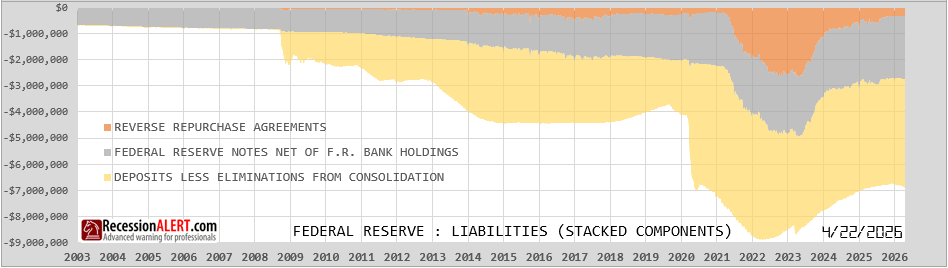
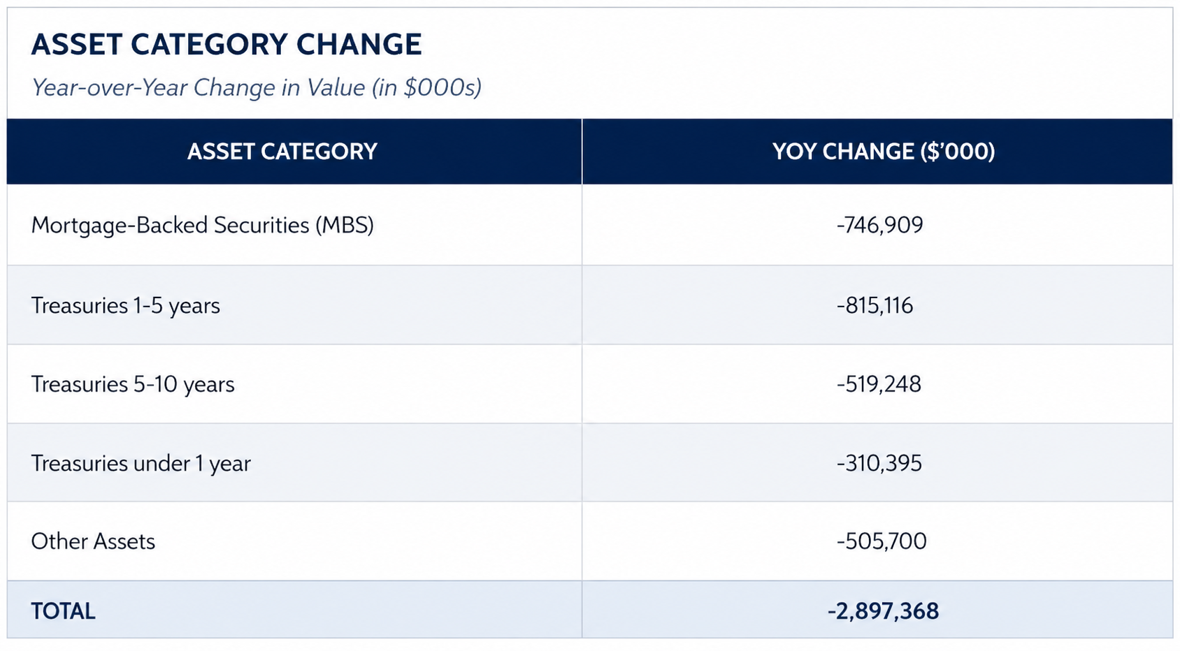
IMAGE #3: Federal Reserve Liabilities — stacked components, 2003-2026, isolated view. The orange Reverse Repurchase Agreements layer fills rapidly from near-zero in 2021 to roughly $2.5 trillion by 2022-2023, then drains steadily through 2024-2026 to near-zero by the 22-APR-26 reading. Federal Reserve Notes (grey) and Deposits less Eliminations (yellow) shown for context. While the Fed’s securities portfolio was contracting under QT, the RRP drain was quietly releasing cash back into the banking system — the hidden easing of the post-COVID cycle.
The orange line in the liabilities panel — Reverse Repurchase Agreements — is the missing piece in most analyses, and it changes the interpretation of everything above.
Post-COVID, the Fed parked roughly $2.5 trillion in the overnight reverse repo facility. This was a liquidity reservoir: money market funds and other counterparties stashed cash with the Fed overnight at a guaranteed rate, effectively sterilising it. From 2023 onward, that facility drained steadily as money market funds rotated back into T-bills. By the chart’s 22-APR-26 reading, the RRP cushion is essentially gone.
That drain has been the actual easing force of the last three years, not the Fed’s bond purchases. The Fed didn’t need to buy a single long-duration security — the migration of cash from the RRP back into the banking system did the heavy lifting. Reserves stayed adequate even as QT continued, because the RRP buffer was masking the underlying tightness.
This reframes the current expansion entirely. The Fed isn’t injecting new liquidity — it’s replacing liquidity that was always going to disappear once the RRP drained to zero. The balance sheet expansion was mathematically inevitable the moment the FOMC committed to the ample-reserves framework in 2019. QT was always going to hit a wall once the RRP cushion was exhausted, and the Fed was always going to have to refinance a temporary buffer (RRP) into a permanent one (reserves).
This is structural plumbing maintenance, not stimulus.
Why This Episode Differs from QE1, QE2, QE3 and QE-COVID
 <
<
IMAGE #4: Federal Reserve Assets and Liabilities — STACKED components, 2003-2026. Each prior QE episode has a distinct visual signature in the stacked layers — MBS (orange) bulges in QE1 and QE3, the long-duration Treasury layers (green/yellow) thicken in QE2 and QE3, uniform expansion across all maturities defines QE-COVID. The current episode will show as a thin pink (under 1yr Treasuries) and Other Assets layer — fundamentally different in shape from any of its predecessors. Bottom panel shows the rise and drain of Reverse Repos (orange) post-2021. S&P 500 overlaid on right axis.
The contrast with prior expansions clarifies the call. Looking at the stacked asset components panel for each episode, the visual signature is unmistakeable:
Three patterns separate the current episode from its predecessors:
Composition. Every prior QE episode is visible on the components chart as a fattening of the long-duration layers — the green band (10yr+) and the yellow band (5-10yr). QE-COVID also fattened the MBS (orange) layer dramatically. The current episode, by contrast, will show as a thickening of the pink (under 1yr) layer and the “Other Assets” category. That’s a fundamentally different shape.
Intent. QE1 through QE-COVID were all announced policy actions with stated objectives around financial conditions, employment, and inflation. The current expansion is being conducted under the explicit label of reserve management — operational policy, not monetary policy. The Fed has gone out of its way to insist this is not QE, and the composition supports that claim.
Transmission. The duration of what the Fed buys is what determines its impact on the broader yield curve. Buying 10-year Treasuries pulls 10-year yields down via portfolio balance effects. Buying 4-week bills doesn’t. This matters enormously for risk assets: the equity-multiple expansion that historically accompanied QE was driven through the discount-rate channel, and that channel is largely inactive in a bills-and-repo expansion.
Is It QE5?
The honest answer is: not yet, but the label may eventually fit if the cycle persists and migrates up the curve.
True QE has three defining characteristics:
- Deliberate purchases of long-duration securities
- Explicit intent to suppress long-term yields and ease financial conditions
- Programmatic, persistent expansion of the securities portfolio
None of these are unambiguously present today. What’s expanding is overwhelmingly operational. The securities portfolio is still in net contraction. RMPs are concentrated in bills.
The watch-item — and this is what we’ll be tracking for subscribers in the coming months — is whether reserve management purchases roll into longer maturities. That would mark a genuine policy pivot rather than a plumbing exercise. Until then, the “QE5” label on the chart is best read as marking the trough of the prior contraction rather than the start of a new expansion programme on equal footing with QE1-COVID.
Where This Goes From Here
The question that matters for positioning isn’t whether today’s expansion is QE — it isn’t — but whether tomorrow’s becomes QE. Four scenarios warrant probability weights, with the conditional probabilities mattering as much as the unconditional ones.
Base Case: Bills-Only Through 2026 (60%)
The Fed extends RMPs past the April 2026 sunset and continues at $40B/month or thereabouts, weighted heavily toward bills with modest coupon participation. Reserves stabilise around the new “ample” floor. The securities portfolio stops contracting and gradually grinds higher, but composition stays short. This is the structural plumbing maintenance interpretation playing out as advertised. Equity transmission is muted relative to historical QE — the S&P can grind higher on AI capex, earnings resilience, and the absence of QT, but not on the same multiple expansion that QE1-COVID delivered.
Migration Scenario: RMPs Move Up the Curve (25%)
Triggered by either a growth scare, a credit event in private credit or regional banks, or political pressure heading into 2027 fiscal cliffs, the Fed quietly extends RMPs into the 2-5yr and eventually 5-10yr buckets. The composition shift may not be announced as a policy change — it might surface as a “calibration of the operational framework.” This is when the QE5 label becomes earned. Watch for: any RMP purchase >5yr maturity, FOMC commentary about “calibrating composition,” or any public discussion of long-yield “term premium” by Fed governors.
Tail Scenario: Emergency QE Triggered by a Funding Event (10%)
A repo blowup larger than October 2025, a regional bank run, a Treasury auction failure, or a sovereign debt event forces the Fed to expand decisively across the curve. This would mirror the speed of March 2020 and would absolutely warrant the QE5 label — but the trigger would be a crisis, not a policy choice. Equity-market response would be the classic risk-off-then-risk-on whiplash, with credit spreads doing most of the early signalling.
Hawkish Tail: RMPs End on Schedule (5%)
Reserve management succeeds, the Fed declares victory at the floor, RMPs sunset cleanly, and natural runoff resumes. The headline YoY change rolls back over and the “QE5” label gets retired. The lowest probability scenario because the structural reserve requirement persists — without continued purchases, reserves drain again as currency in circulation grows and the TGA fluctuates around tax dates and debt-ceiling episodes. The Fed would have to want this enough to risk another repo event, and there’s no constituency on the FOMC for that fight.
The Asymmetry
The unconditional probabilities understate the case for being long duration as a hedge. The Migration Scenario probability rises sharply if growth weakens or credit cracks open. The Tail Scenario probability rises sharply if money market plumbing shows further stress. The Hawkish Tail collapses to near-zero the moment any of those stresses appear.
For positioning, this matters: the Base Case is benign for current pricing, the Migration and Tail Scenarios are aggressively bullish for duration and equity multiples, and the Hawkish Tail is the only scenario that hurts current pricing — and it’s also the least likely. The risk-reward in long-duration exposure is therefore better than headline rates suggest, but as a hedge against Migration/Tail rather than as a high-conviction core trade.
Bottom Line for Clients
The Fed’s balance sheet is expanding, but this is not the cycle the bulls are pricing.
- Duration positioning. Don’t extrapolate yield suppression from this expansion. Bills and repo do not push the 10-year or 30-year lower in the way bond-buying QE did. Long-duration trades reliant on a QE5 narrative are exposed.
- Equity transmission. The S&P has historically tracked balance sheet expansion, but the slope of that relationship reflects the strength of the underlying transmission mechanism. A reserve-management cycle should generate a much weaker tailwind than the historical chart implies.
- The real easing already happened. The RRP drain from $2.5 trillion to near-zero was the actual liquidity easing of this cycle, and it ran its course largely without commentary or fanfare. That well is now empty, which is precisely why the Fed has had to step in operationally.
- Watch for the composition shift. If RMPs migrate from bills into 5-10 year and longer Treasuries, the QE5 label becomes earned rather than asserted. That’s the signal that genuinely matters — and it’s the trigger for re-pricing duration, the dollar, and long-duration equity factors.
The Fed’s role as the market’s ultimate backstop is unmistakeable across both charts. Whether the current expansion constitutes genuine stimulus or inevitable plumbing is almost beside the point for short-term price action — the S&P has shown a habit of not caring about the label, only the direction of the line. But for those of us positioning across cycles rather than across weeks, the distinction is the difference between a tactical trade and a strategic call.
Today’s reading is plumbing. Tomorrow’s might be stimulus. The composition of the next $40 billion will tell us which.
Comments are closed.