Animation : The incredible US employment recovery

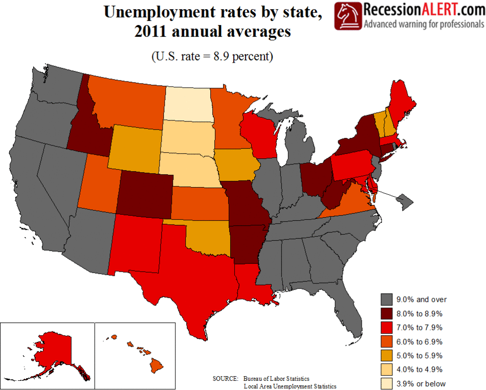
Below is an animation of the annual average unemployment rate per U.S state from 2011 onward. It’s quite incredible to see how unemployment was erased state-by-state over the years:

RecessionALERTAnim

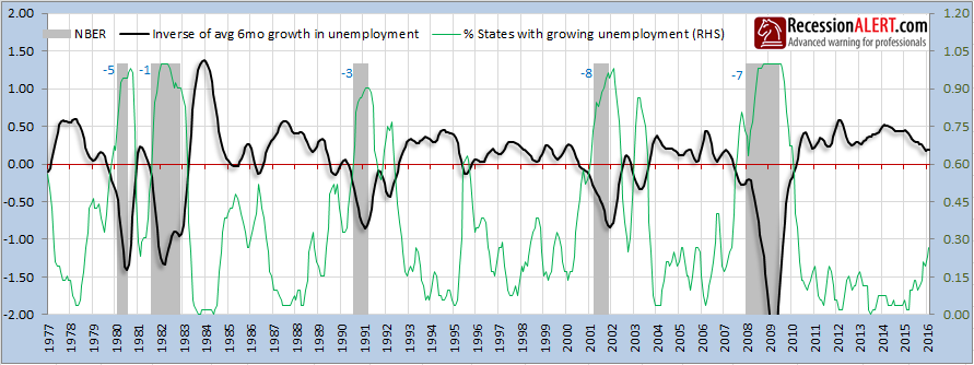
However statewide improvements in employment have probably peaked-out as shown in the chart below, which depicts the aggregate (equal weighted) inverse 6-month unemployment rate growth for each of the 52 U.S States together with a diffusion showing the percentage of 52 U.S states with increasing unemployment. You can see that recently the diffusion has been rapidly rising showing that unemployment is starting to increase again in the 52 U.S states.

2016-04-07_1655


About RecessionALERT

Dwaine has a Bachelor of Science (BSc Hons) university degree majoring in computer science, math & statistics and is a full-time trader and investor. His passion for numbers and keen research & analytic ability has helped grow RecessionALERT into a company used by hundreds of hedge funds, brokerage firms and financial advisers around the world.

,

Comments are closed.

 IMPORTANT : IN ORDER TO SYNCHRONIZE WITH PUBLICATION EVERY 2ND AND 4TH WEEK OF A MONTH, THE NEXT SUPERINDEX REPORT DATED FRIDAY 9TH FEBRUARY WILL BE PUBLISHED ON MONDAY 12TH FEB 2024. THE REPORT AFTER THAT WILL BE MONDAY 26TH FEBRUARY, THEN MONDAY 11TH MARCH, THEN MONDAY 25TH MARCH THEN MONDAY 8 APRIL.