Since the bull market that commenced in 2009 there have been around 10 major rapid advances in the SP-500 that ended in not-insignificant market tops. In our ZOOM calls with clients over the last year, a lot of interest has been expressed in how to detect for preemptive warning signs of these major tops. By pre-emptive we mean warnings that are issued before any significant declines set in. A problem with many traditional technical SELL models is that conditions or metrics have to deteriorate significantly enough to trigger a SELL signal, often leading to not-insignificant sacrifice of peak-profits before you exit.
If you recall we have always stated that accurately pinpointing significant bull market tops (peaks) is always a lot harder than pinpointing significant bottoms (troughs). Market tops are drawn-out affairs associated with FOMO and greed as opposed to market bottoms that are violent, sharp fear-driven events. The old adage “The Bull climbs the staircase, the Bear comes down the elevator” comes to mind. To wit, metrics used to measure market tops are less inclined to reach useful enough extremes than similar metrics used to measure market bottoms.
Accurately and consistently pinpointing bull-market major-tops is an ongoing process of research and improvement for us, however we can report on several promising methods that can be used to good effect deploying existing probability models we maintain. Over the last 6 years, low interest rates and high FED liquidity have driven several outsized rapid advances in the SP500 which were reasonably accurately detected by these models, and the purpose of this note is to highlight them to you, just as we have been highlighting them to clients on our calls.
Please note that the process of detecting intra-bull-market major tops is not to be confused with the process of detecting macro-level (business cycle or valuation driven) tops that precede bear markets and recessions.
1. SP500 Low-Frequency Probability Model
If you recall, the SP500 market top and market bottom probability models examine six discrete metrics in a rally or correction to assess likelyhood of a top or bottom. For market tops specifically we examine the current rally and measure the gains made, the duration, the VIX (specifically low volatility) the count of resistance breakouts to new highs, the number of consecutive up-weeks and time spent above short-term support levels. For each of these metrics we take a measurement and compare to how often (what percentage of the time) in the 20-year historical record these measurements were exceeded. The reciprocal of this provides us with an implied probability of a market top. For example, the duration of the current rally we find ourselves in has been exceeded only 8% of the time in the last 20 years, so we conclude that the probability of a market top must be (100%-8% = 92%).
The SP500 probability model charts provide each of the six probabilities on a daily basis for both market tops and market bottoms, with the PEAK PROBABILITIES daily chart shown below:
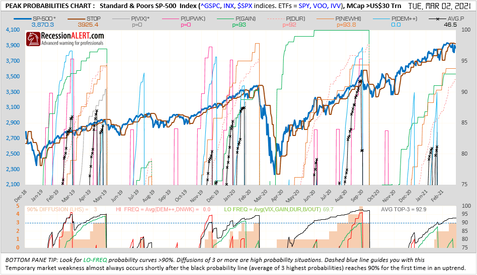
You will notice in the bottom pane of the PEAK PROBABILITY model that there is a metric called LO FREQ = Avg(VIX,GAIN,DUR,B/OUT). This is a slow (or low frequency) probability average consisting of the VIX, gains made, duration of rally and breakouts count metrics. This has detected the last six major rapid advances quite successfully when probabilities exceed 90%:
2. SP500 Probability Model Diffusion
This metric is also available in the bottom pane of the SP500 PEAK PROBABILITY chart and is a daily count of how many of the six metrics we are measuring are implying more than 90% probability of a market top. Readings of 3 are fair warning of high likelyhood of a major top but readings of 4 or 5 are even better:

An issue with the diffusion model is that it can be quite blunt at times and often reaches its warning threshold too early in the game.
3. SP500 TOP-3 Probabilities average
Also available in the lower pane of the SP500 PEAK PROBABILITY chart is the TOP-3 metric which is the average probability of the highest three peak probabilities currently showing from the six metrics. This is instructive at the 92.5% level but can be more premature such as the July 2020 example below. Levels above 95% work well but do not detect all major tops:

4. Trendex Slow-Stop probability
The TRENDEX chart in the charts module shows three different suggested support levels (when market is trending up) and three different resistance levels (when market is trending down). These are taken over a short, medium and long-term time horizon and are used by some clients as STOPS for their long or short trades respectively. The TRENDEX models are a proprietary mechanism we deploy using support and resistance levels to ascertain most likely levels of support and resistance that would serve best as trading stops.
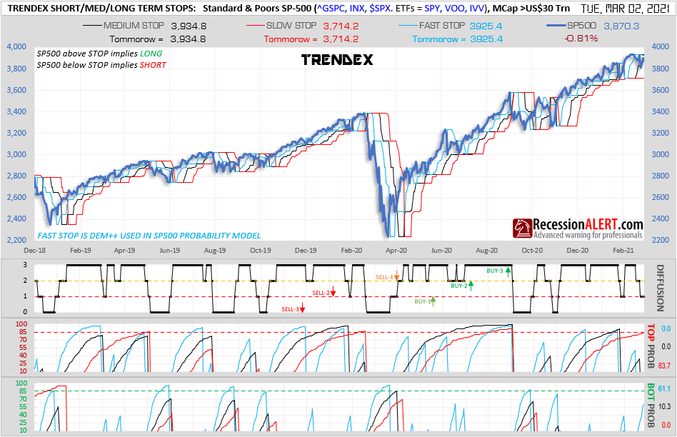
Of particular interest here is the market-top probability shown for the red SLOW STOP in the 3rd pane. This just counts how many trading sessions we have been above the current slow-stop and compares this to the long-term historical record to assess how often (in percentage terms) in the past we have managed to remain above the slow stop for a longer period. The reciprocal of this is deemed to be the implied probability of a market top shown by the red line in the 3rd pane in the above chart. This is instructive at the 85% level and above (higher the better) for warning of major market tops:

5. Medium-Term Liquidity Index (MTL)
This multifactor indicator is currently a project in the WORKBENCH menu where we test new models with out-of-sample data for a year or two before releasing them into production. It attempts to build a more robust multi-factor model for medium-term market timing using 5 factors:
MTL1 : MCOS = EMA(21) of VMCOS (from McLellan Oscillator chart)
MTL2 : HILO = EMA(10) of Net 13-week less 52-week highs (from HILO chart)
MTL3 : XO-A = Diffusion from bottom of HILO intraday chart
MTL4 : VIX = CBOE VIX Medium Term Volatility Index
These 4 factors have all demonstrated similar medium-term market timing abilities for the SP-500. All factors are standardized in order to be included in the composite :
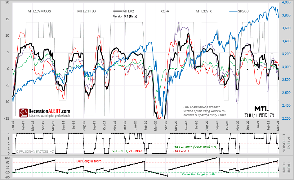
What is of interest to us for the purposes of this project is derived from the bottom pane “TREND COUNT” which counts the number of sessions the MTL Diffusion (from the pane above it) remains in bullish or bearish territory. When the MTL Diffusion is >=2 we deem to be in an uptrend and count the number of days accordingly. When the MTL Diffusion falls below 2 we switch to downtrend (bearish) mode and reset the counter to zero and start counting the number of sessions we are in a downtrend until the diffusion manages to rise above 2 again, after which we repeat the whole process. It is important to understand that a diffusion of 2 in this context can take on two meanings. When we arrive at 2 from a lower number, the connotation is still bearish until the diffusion rises above 2. When we arrive at 2 from a higher number, the connotation is deemed to be still bullish until the diffusion falls below 2.
History has shown that up-trends longer than 60 sessions can be deemed to be “long in the tooth” as well as down-trends longer than 20 sessions:

In order to incorporate the above into our multi-factor peak detection model we merely convert the MTL up-trend session counts above to implied probabilities of a market top as shown below, where we can see that using probabilities greater than 85% are deemed instructive for detection of major peaks:

6. Probability Models Thresholds Diffusion
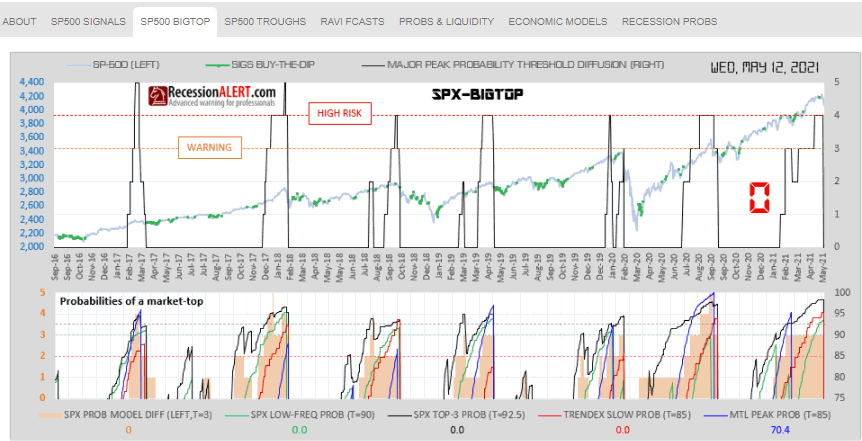
Using the above findings we can create a diffusion count that adds one every time one of the 4 above models reaches its major warning threshold. This occurs when:
- The SP500 LOW-FREQ model is 90% or more
- The SP500 Probability Model Diffusion is 3 or more
- The SP500 TOP-3 Probabilities average is 92.5% or more
- The SP500b Trendex Slow-Stop probability is 85% or more
- The MTL up-trend session count implied peak probability is 85% or more
In this instance we find that a count of 3 remains instructive as a warning whilst counts of above 3 are useful for serious warnings, as shown by the chart now available in the SP500 BIGTOP tab in CHARTS>DASHBOARD
With regards to the above chart, we need to re-iterate the following: This is an intra-bull-market strategy and not a macro-top strategy. Bull market runs that are much longer than those of the historical past are theoretically probable meaning top signal warnings could be triggered way before market actually tops out (see Dec-2017 and Aug 2020 examples). Although a diffusion threshold of 3 is set for optimal timing, any readings of 2 or more hint of high-risk of a potential market top. Thresholds (T=xxx) being met are not in of themselves actionable SELL triggers, they are merely risk backdrop warnings and you need to seek out other actionable exit signals from traditional technical analysis to further optimize your market timing and reduce risk of premature exits.
7. Using with BUY-THE-DIP signals
The “warning” and “high risk” areas discussed in the previous section are particularly useful when combined with our buy-the-dip signals generated in the SP500 TROUGHS tab in CHARTS>DASHBOARD as shown below:
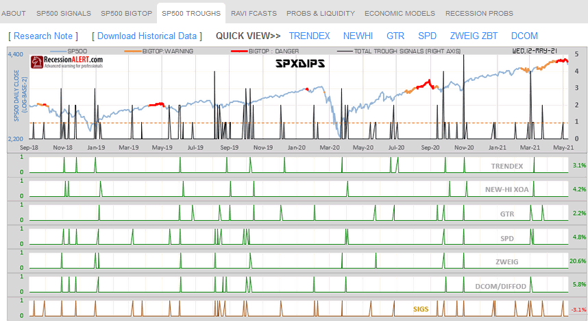
In the above instances, you would do very well when allocating equity during the buy-on-the-dip signals and using the respective buy-on-the-dip models’ exit strategies, but only during the orange or red shaded areas on the SP500, to ensure maximum time in the market for each trade. Invariably this leads to far less premature exits and maximum trade gains.


Comments are closed.