This project uses a composite approach to constructing a broad representation of selling pressure on the SP-500 Index, for the purposes of gauging intensity of corrections, identifying ideal buying points for “buy on the dip” opportunities and provision of warnings of oncoming corrections. The motivation behind using many measurements for selling pressure (as opposed to say how much % the index has corrected for example) is that no single measurement provides safety from false positives(bad signals) and a consensus model can significantly reduce false positives. There are currently six components to the model, which are discussed below.
1. Percentage Correction
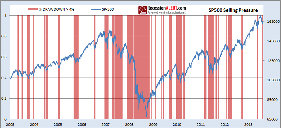
This is the classic criterion used by most stock market participants to gauge intensity of a correction and give an indication of the scope of the opportunity offered by the correction. Whilst it does a good job of this it leads to many false positives and also becomes a blunt instrument at best during bear markets. The best threshold we have determined for this metric is 4% and the red shaded areas below depict times when the SP-500 has corrected by more than 4% from a prior peak. You can see its use is more constructive during bull markets than bear markets or extended corrections.
2. Relative Strength
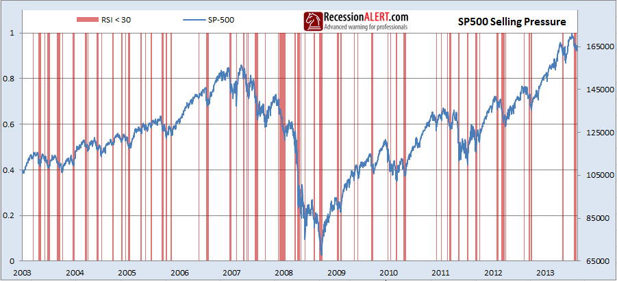
This is another reliable favorite with the investment audience and more useful during bear markets and extended corrections as shown below:
3. Rate of Change
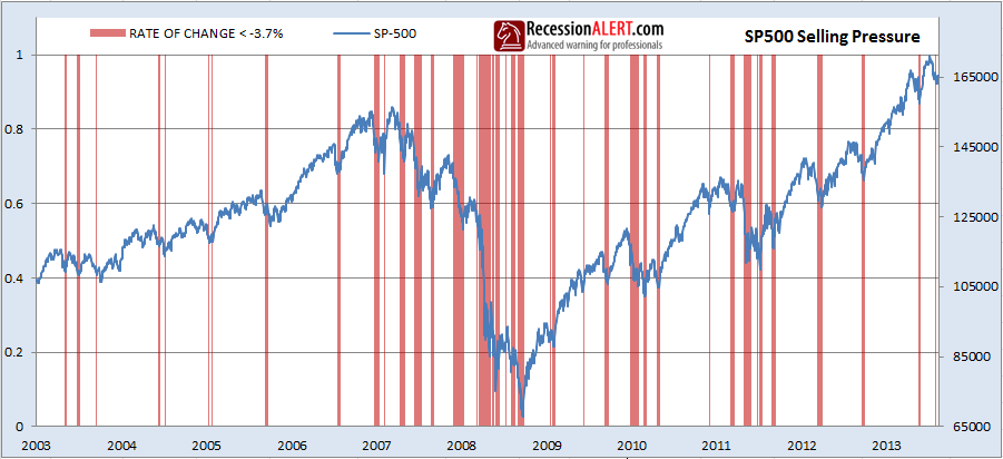
Yet another favorite with the investment audience, this measures the short term (2-6 weeks) % rate of change. If you are asking why one would deploy this metric and the first metric, it is quite possible for the short term rate of change to have not met the desired threshold, but the first has. So by using both we capture elements of both short and medium term draw-downs.
4. Prevalence of Down-Days
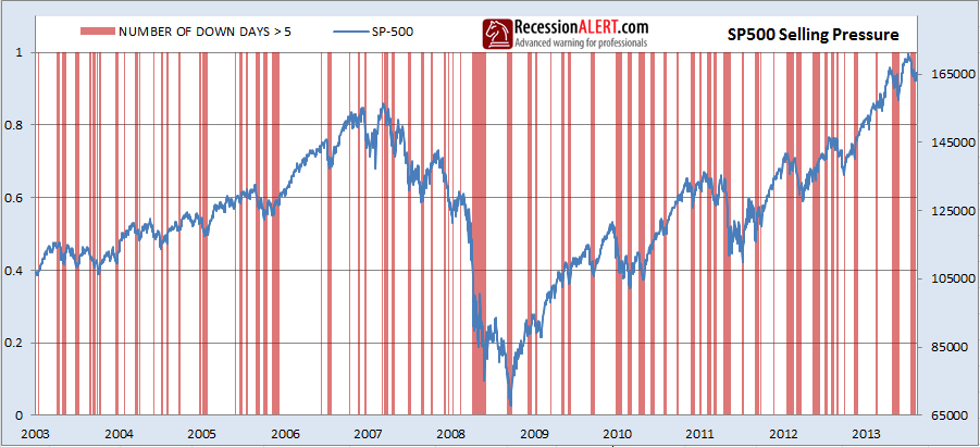
We now get onto the lesser-known metrics to measure intensity of selling pressure. This one measures the number of down days (red candles) on the SP-500 over a specified rolling period:
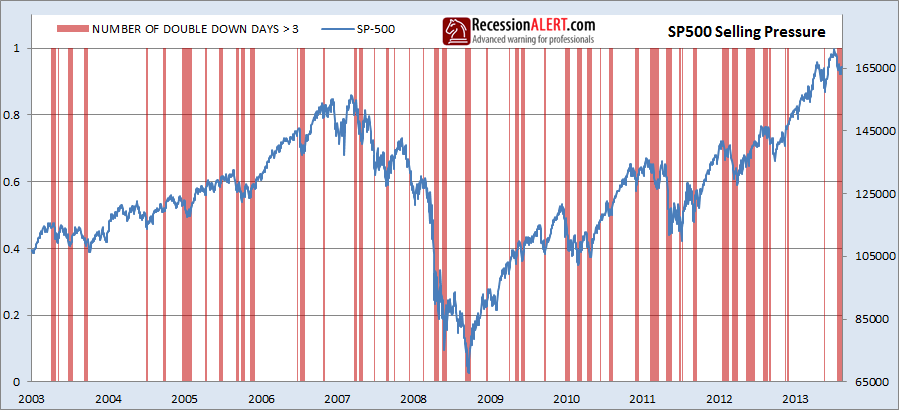
5. Prevalence of Double Down-Days
This tracks the number of back-to-back down days on the SP-500 over a specified rolling period and is a representation of a more intense type of selling than the prior metric with fewer signals:
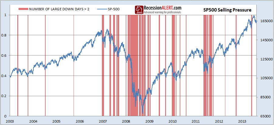
6. Prevalence of Large Down-Days
This tracks the number of large one-day movements over a specified rolling period:
7. Composite Selling Pressure Diffusion
Whilst all the six metrics shown above provide for good measurement of selling pressure under various market conditions, we can do better by building a Diffusion Index that adds one every time one of the indicators has exceeded their respective optimal thresholds shown in the above charts:
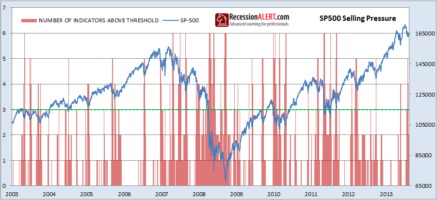
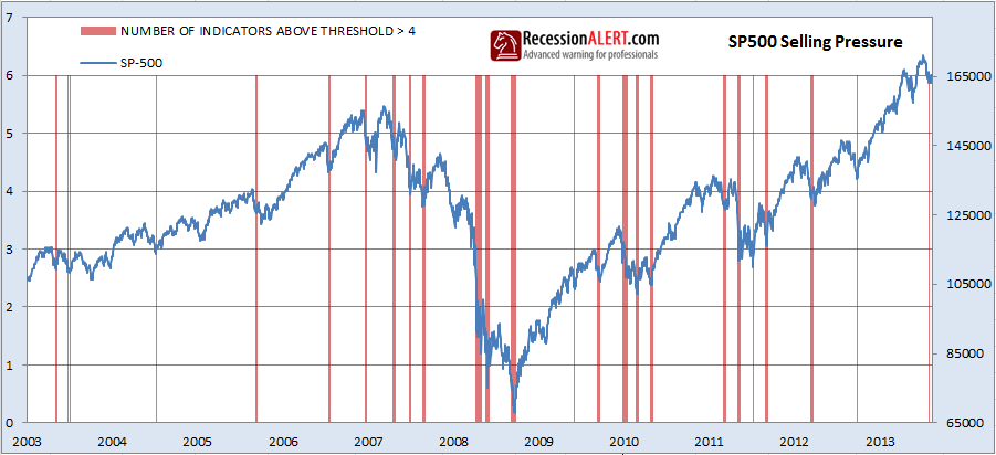
As indicated by the green dotted line above, when more than 3 indications are above their respective optimal thresholds, we can call proximity to a market buying opportunity:
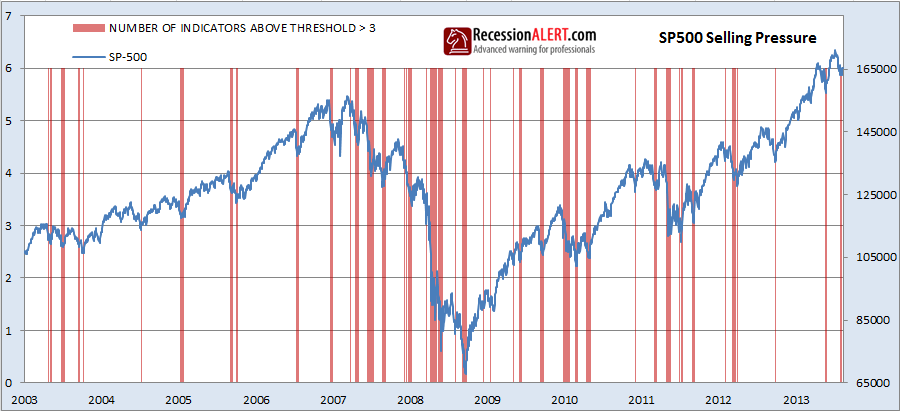
The results are even more impressive for more than 4 indications being above their optimal thresholds. You know you are onto a rare not-to-be-missed opportunity:
8. Tracking the Selling Pressure Diffusion Index
We display the Selling Pressure Diffusion and its various components on the CHARTS menu for subscribers as shown below. Data will be updated every 5 minutes when the markets are open:
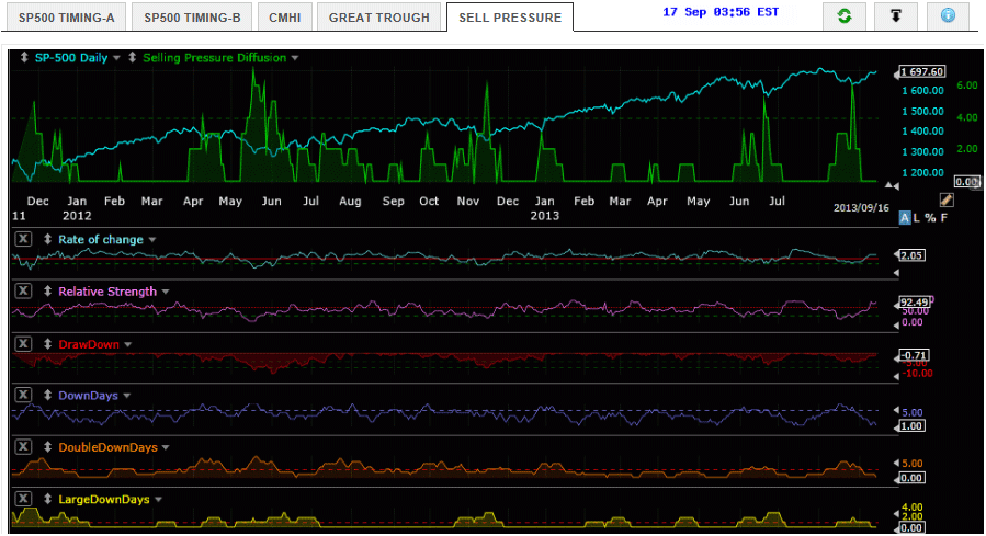
There are some things to note about the above signal chart. Your BUY signals occur when the Selling Pressure Diffusion touches and/or rises above the dotted line (measuring 4) and then falls below it again. This ensures you are at less risk of catching a falling knife since it forces you to buy when selling pressure is waning. At most this means you sacrifice 2-3 days from ground zero of the trough. Obviously the higher the Selling Pressure Diffusion the better the opportunity being presented to you.
Your first selling warnings arrive when the Selling Pressure Diffusion rises from zero to 1 or more. You can see from the above chart that periods characterized by zero selling pressure are low volatility persistent up-trends on the SP-500. You may elect to sell 50% of your positions on a rise in the green line from 0 to 1 and a further 50% when the line rises from 1 to 2 for example. This splits your trading strategy into two legs, namely a short term leg and a medium-term leg which gives you some diversification. Note also how the “LargeDownDays” signal provides for excellent warnings of market tops when it rises from 0 to 1.
You may elect to use the above signal chart when assessing the opportunities being afforded to you by the SP-500 Market Timing Model. For example, the SP-500 Timing Model-A went long a few weeks back which was stopped out for a 2% loss. If you had consulted the Selling Pressure Diffusion Index at that time you would have noted that it was below the green dotted line and perhaps you would have given the trade a miss altogether or you would have gone in with a smaller than normal position-sizing. But the following signal we had was accompanied by the diffusion exceeding the dotted green line which means we have a high-confidence event. Additionally you may be in a long trade, flirting with one of your profit targets that have not quite been met yet, and you see the Selling pressure Diffusion (or the Large down Days component) rising which warns of a impending correction. This may prompt you to take some money off the table.
9. What about Market Breadth?
There is a seventh component we would like to include which we can’t due to charting software limitations of combining market breadth and standard indicators onto a single chart. It is the SP-500 Great trough Detector breadth signal which we are showing separately on another chart. Thus when consulting this Selling Pressure chart, it would be prudent to examine what the yellow breadth signal is showing on the Great Trough Detector chart. In the context of the Selling Pressure Diffusion Index, you can assume the New Hi/Lo Breadth signal is at its optimal threshold for a market bottom when it is less than 8% as shown below:
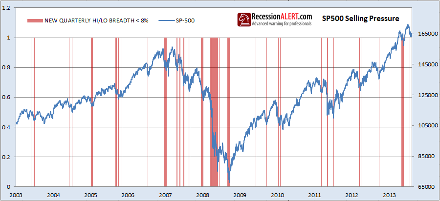
The inclusion of breadth into the Selling Pressure Diffusion Index makes some small differences and introduces about 3 extra good buy signals that the original Diffusion missed, but on the whole the lack of a breadth component is not material enough to be concerned about. It seems the six price-based indicators we have chosen capture 98% of what needs to be to make a solid risk assessment on market entry. However, if you have a BUY signal from the Selling Pressure Diffusion Index and the Great Trough Detector chart, then you should have a winner on your hands.
10. Incorporating the DeMark Trough signals
On August 2014 we conducted research that showed that introduction of the DeMark Buy-Setup counts as a 7-th components adds useful content and additional BUY signals. You can read the research over here : “Improved SP-500 Selling Pressure Index“.
