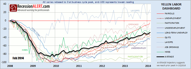
Federal Reserve Chair Janet Yellen recently used her “jobs data dashboard” to justify the Fed’s easy money policies and to argue there’s still considerable slack in the labor market five years after the recession’s end. Seven of the nine gauges on this dashboard have not recovered to levels reached before the last recession, reinforcing her belief that the economy will need “extraordinary support” from the Federal Reserve for “some time to come.” It appears the Federal Reserve has changed emphasis from their singular focus on the unemployment rate to a broader labor market approach, which is the right thing to do. The Federal Reserve went so far as to state that policy would remain accommodative well beyond the prior target threshold of 6.5% for the unemployment rate since the new guidance objectives are “Full Employment” and “2 % inflation.”
The recent FOMC conference below is worth the 1 hour investment to watch, but specifics that cover the reasons for the change in Labor Market metrics used for future guidance are available in the 4 minutes from 15:00 to 19:00 and specifics on the actual labor market components (“the dashboard”) being monitored are available from 42:30 to 48:00
Whilst we have been regularly publishing a Labor Market Report for clients since October 2012 to gauge exactly what we thought the Federal Reserve ought to be looking at, the collection of indicators in Yellen’s dashboard have some interesting additions to our one. More specifically we feel there is a risk that several of the components she has chosen may paint a picture of more slack in the market than realistically exists, but maybe its a good thing to look at the worst case scenario. Nonetheless, since we now have specific details on exactly which nine labor components the Federal Reserve will be examining on a monthly basis it would be prudent for investors to keep their eyes on the exact same things the Federal Reserve is using to gauge the conditions of the economy.
Below we have compiled a “Yellen Dashboard” which we will now be including as an addition to our standard monthly Labor Market Report for subscribers. All the indices have been re-based to zero at the peak of the last business cycle and normalized so that they touch -100 at their worst point reached since then. It is very clear from the chart that most components are struggling to regain prior best points.

We see that Layoffs, Job Openings and Payrolls are showing the most recovery whilst Participation Rates, Underemployment and Long-Term unemployment are showing much more slack. There are several demographic and cyclical arguments to explain the struggling participation rates and this is certainly where the “Yellen Dashboard” is being the most conservative. However, even the complete removal of Participation Rates and Under Employment from the average composite we have constructed will only move it to half-way between its current position and the Payrolls line.
The trajectory of the black composite line we have constructed has been fairly consistent since 2010 and assuming it remains consistent and the requirement is that it needs to reclaim all its losses since the last business cycle peak to justify rate tightening, we can peg a timeline late 2015 or early 2016 for the rate tightening argument. This is not an overtly optimistic assessment, since for the average line to reach zero only requires four or five of the nine components to rise above zero. It is thus quite conceivable for a tightening cycle to be initiated against the backdrop of a few of the labor indicators still camped below their prior peaks.
Note that all data above represents up to and including the month of February 2014.

Comments are closed.