
On 26th February 2002, Paul F. Desmond from Lowry’s Research published a seminal paper titled “Identifying Bear Market Bottoms & New Bull Markets” ( download) This concept measured market breadth, namely daily advancing stocks as a % of advancing and declining stocks as well as points gained as a % of points gained and lost.
The research posited that during significant market declines, panic would manifest itself as one or more days when declining stocks exceeded advancing stocks by more than 9-to-1 (declining stocks made up more than 90% of stock movement) and when points lost made up more than 90% of total points movement. Shortly after such a sequence of panic measurements, a stock market bottom reversal would be signified by a day when advancing stocks exceeded declining stocks by more than 4-to-1 (advancing stocks made up more than 80% of stock movement) and similarly for points gained.
This “rush buying” following one or more days of “panic selling” is normally a manifestation of those short the market having to buy stocks to cover their short positions. Once most of the short positions had been liquidated, the rest of the buyers would follow suit to propel the stock market on a new bull run.
Whilst the concept was illustrated in the paper, it was focused on major stock market declines (bear markets) and did not give any specific guidelines on how many “panic days” were suitable to observe before taking 80% up-days seriously enough to call a market bottom. Without such clear guidelines it was difficult for the layman to formulate a general rule with enough efficacy to suit a profitable stock market trading strategy.
In our research we explore the Lowry concepts further for the SP500, but for isolating frequent and accurate buy-the-dip signals in bull market up-legs as opposed to those signaling the end of bear markets. Our aim was to find a signal to complement the other 5 major buy-the-dip signals we have been providing subscribers for near on a decade.
For the purposes of our research, we focused on two breadth metrics freely available for the SP500, namely daily advancers & decliners (issues) and daily advancing/declining volume. We then measure six-day rolling counts of the following events which are all expressions of either panic selling or rush buying:
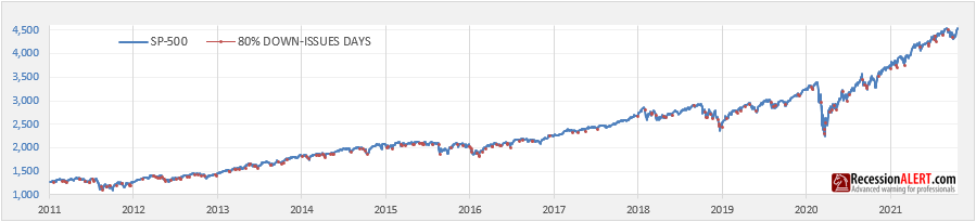
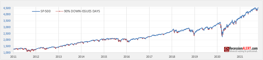
- Advancing issues exceed declining issues by at least 9-to-1 (advancers >= 90% of movement)
- Advancing issues exceed declining issues by at least 4-to-1 but less than 9-to-1 (advancers are 80-90% of movement)
- Declining issues exceed advancing issues by at least 9-to-1 (decliners >= 90% of movement)
- Declining issues exceed advancing issues by at least 4-to-1 but less than 9-to-1 (decliners are 80-90% of movement)
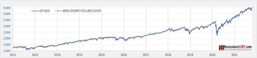
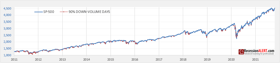
- Advancing volume exceed declining volume by at least 9-to-1 (up-volume >= 90% of movement)
- Advancing volume exceed declining volume by at least 4-to-1 but less than 9-to-1 (up-volume is 80-90% of movement)
- Declining volume exceed advancing volume by at least 9-to-1 (down-volume >= 90% of movement)
- Declining volume exceed advancing volume by at least 4-to-1 but less than 9-to-1 (down-volume is 80-90% of movement)
It makes sense that 9-to-1 (90%) events are more powerful than 4-to-1 (80%) events, but our research has shown that back-to-back 4-to-1 events are equally as powerful as 9-to-1 events, thus we measure both for optimum results over a rolling 6-session window to determine the appropriate selling or buying pressure inherent in the market. Whilst our research examined sizes of various rolling windows with which to tally all the counts, we found the use of the six-session window most instructive for the decade of the 2011 to 2021 bull market period.
Stacked Counts Indicator
We introduce the concept of a “stacked count” for measuring both panic intensity and buying intensity.
The Panic/Selling Stacked Count is merely the rolling six-session counts of 90% down-volume days plus 90% down-issues days (“90% DN-DAYS”) stacked with 80% down-volume days plus 80% down-issues days (“80% DN-DAYS”). This is represented as light and dark red shaded stacked negative bars in the second pane in the below signal-chart we publish daily for subscribers.
The Buying Stacked Count is merely the rolling six-session counts of 90% up-volume days plus 90% up-issues days (“90% UP-DAYS”) stacked with 80% up-volume days plus 80% up-issues days (“80% UP-DAYS”). This is represented as light and dark green shaded stacked positive bars in the second pane in the below signal-chart we publish daily for subscribers:

The top pane of the chart shows the actual daily advance/decline ratios for issues and volume as well as an average for both.
In this instance, if advancing issues exceed declining issues then the advance/decline issues ratio is advancing issues divided by (advancing + declining issues). A 4-to-1 ratio implies 4/(4+1) = 4/5 = 80% issues are advancing. A 9-to-1 ratio implies 9/(9+1) = 9/10 = 90% issues are advancing. These advancing issues ratios are depicted by light green circles measured against the left y-axis. If, however, declining issues exceed advancing issues, then the decline/advance issues ratio is declining issues divided by (advancing + declining issues). Again, a 4-to-1 ratio implies 4/(4+1) = 4/5 = 80% issues are declining. A 9-to-1 ratio implies 9/(9+1) = 9/10 = 90% issues are declining. These declining issues ratios are depicted by light red circles measured against the left y-axis.
For issues (number of shares advancing or declining) related events, on any given day there is either a light red or light green circle and we only show ratios exceeding 3-to-1 on the chart to avoid clutter and to focus on the notable events only.
Similarly for volume, if advancing volume exceeds declining volume then the advance/decline volume ratio is advancing volume divided by (advancing + declining volume). A 5-to-1 ratio implies 5/(5+1) = 5/6 = 83.33% volume is advancing. A 12-to-1 ratio implies 12/(12+1) = 12/13 = 92.3% volume is advancing. These advancing volume ratios are depicted by dark green squares measured against the left y-axis. If, however, declining volume exceeds advancing volume, then the decline/advance volume ratio is declining volume divided by (advancing + declining volume). Again, a 4-to-1 ratio implies 4/(4+1) = 4/5 = 80% volume is declining. A 9-to-1 ratio implies 9/(9+1) = 9/10 = 90% volume is declining. These declining volume ratios are depicted by dark red squares measured against the left y-axis.
For Volume events, on any given day there is either a dark green or dark red square and we only show ratios exceeding 3-to-1 on the chart to avoid clutter and to focus on the notable events only.
The shaded area on the top pane merely depicts the average ratio reading from the issues and volume ratio to encapsulate an “overall reading”. For example, should advancing issues exceed declining issues by 10-to-1 and advancing volume exceed declining volume by 20-to-1 on a day, then the shaded area will be green and measure (10+20)/2 = 15-to-1. This average ratio is converted to a percentage and depicted on the third pane at the bottom of the chart with 80% events represented with light green or red dots and 90% events represented by dark green or red dots. For example, the 15-to-1 average ratio we calculated by example is converted to a percentage of 15/(15+1)=0.9375, a 90% event (dark green dot.)
Our final indicator to round out the signaling system is the black line in the second pane, the NET UP-DAYS indicator, which is 80% + 90% UP-DAYS minus 80%+90% DOWN-DAYS. It depicts by how much buying intensity is exceeding selling intensity.
High confidence signal
The high confidence BUY-THE-DIP SIGNALS are generated when all the following conditions are simultaneously met:
- The Net Up-Days (Black line) is negative and rises
- The Panic stacked count is -3 or less
- The Buying stacked count is > 0
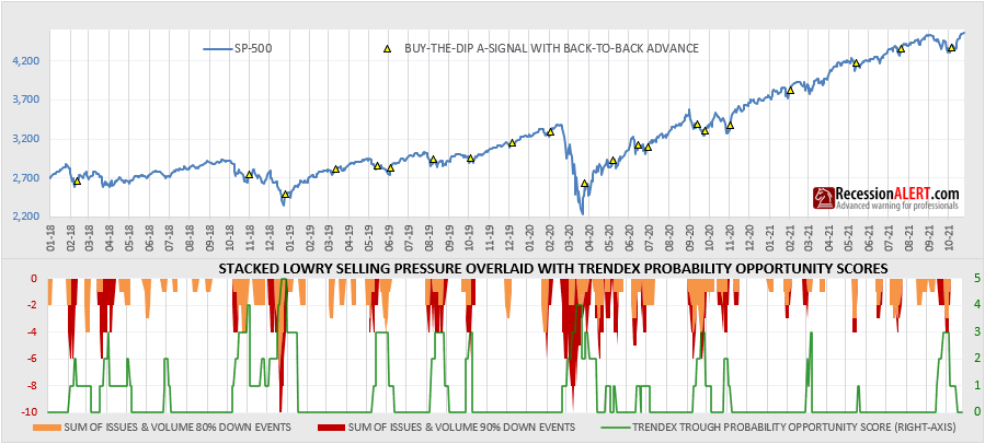
- The SP-500 made a back-to-back advance (Class-A) or advanced in price (Class-B)
The theory is that we only trigger buy-the-dip signals when we have seen enough sustained panic selling (Condition #2) followed by rush buying (Condition #3) and the rush buying was sufficient to start alleviating the selling pressure (Condition #1) against a backdrop of positive price action (Condition #4.)
The yellow triangles overlaid on the SP500 price graph below depict when these signals are generated. We also show the Panic stacked counts present at the time (where we stack 80%-down events on top of 90% down events to achieve a rendition of the total selling pressure) in the lower pane (lower is better). In addition, we provide the Trendex Trough Probability Opportunity Score in the lower pane as a cross reference (green line, right-axis, higher is better)
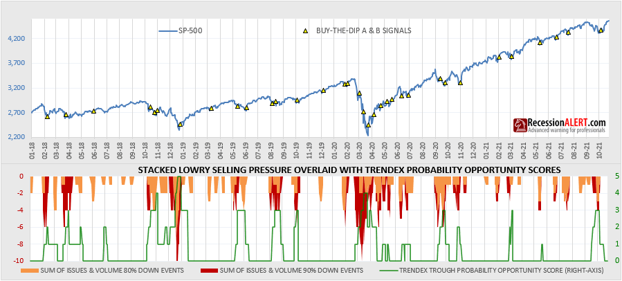
Theoretically the panic stacked counts can get to a maximum of 6 x 2 = -12 but we have not witnessed more than -10 in the period under review. It is also interesting to note that panic stacked counts of -3 or less can often appear in the absence of Trendex Trough Opportunity scores, which means it’s a good diversifier as a trough detector in our arsenal.
There is a higher quality buy-the-dip signal if it is accompanied by a back-to-back advance of the SP500. In this instance the day before the signal, the SP500 rose and the SP500 also rose on the day of the signal. These “Class-A” signals are depicted below and whilst they offer some protection from false signals in a large downturn (Nov 2018 and March 2020 as examples), there are far fewer signals. The 21 Class-A signals are shown below versus the 21 Class-A and 13 Class-B signals in the previous chart.
The generation of all these A and B-class signals (“LOWRY”, fourth pane below) in relation to the other older trough reversal models we have been using over the years is shown below as taken from the DASHBOARD > SP500 TROUGHS tab:
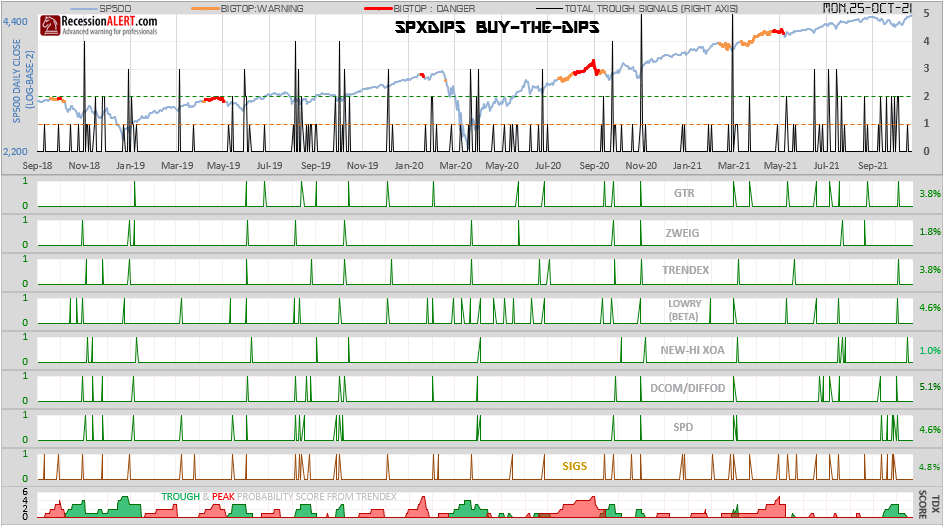
We note that in addition to confirming many signals from other models the LOWRY model introduces extra signals into the mix to allow for more frequent signal generation (and hence more trading opportunities).
Finding the daily Lowry charts
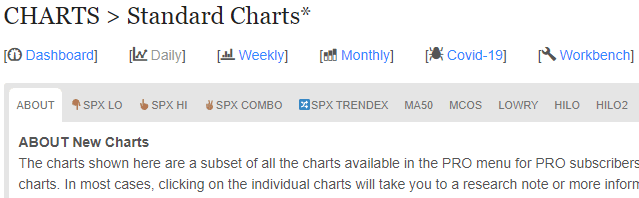
Subscribers can find the daily updated Lowry charts in the standard DAILY CHARTS menu at https://recessionalert.com/charts/
Once you are there, click on the LOWRY tab as shown below:
Appendix-1: Other buy-the-dip models
For just under a decade, RecessionALERT has been providing traders, investors, and institutions alike with reliable buy-the-dip signals for the SP500. You can read more in research notes about our oldest and most popular models below:
- Zweig Breadth Thrust Redux (ZBT)
- Great Trough Detector (GTR V1, GTR V2)
- Trendex Multifactor Probability Model (TDX)
- Selling Pressure Diffusion (SPD V1, SPD V2)
Appendix-2: Lowry Panic Selling Catalogue


Comments are closed.