The HILO breadth index was developed by RecessionALERT for detecting short and medium-term SP-500 stock market peaks in advance. It deploys the following daily breadth data taken from the SP-500 index:
- New 13-week (quarterly) highs
- New 13-week (quarterly) lows
- New 52-week (annual) highs
- New 52-week (annual) lows
The above data is then used to construct two daily components as follows:
- Net new 13-week highs% = (New 13-week highs LESS New 13-week lows)/issues traded*100
- Net new 52-week highs% = (New 52-week highs LESS New 52-week lows)/issues traded*100
A proprietary smoothing is then applied to the two results to produce the indexes as follows:
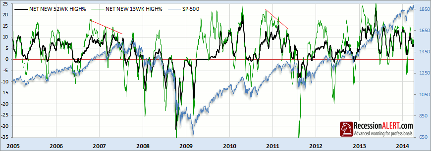
When more shares are making respective 13-week lows than 13-week highs, then this is bearish for the market and is obviously represented as the net new 13-week highs being a negative number, with the green line camping below zero. Similarly, when more shares are making highs than are making similar-period lows, this is bullish for the market and the respective index will be camped above zero in positive territory. It is also prudent to observe multi-month divergences (shown with slanted red lines above) when the breadth indexes are not confirming new highs with the stock market, as this invariably implies severe selectivity is in play with fewer and fewer shares propping up the market which inevitably leads to a large correction.
Additionally, in order to be printing new 52-week highs, a share must by definition also be printing new 13-week highs at the same time. This makes the 13-week index a leading indicator for the 52-week index. Due to its shorter measuring period for determining highs and lows, the 13-week index is more volatile and responsive to stock market moves than the 52-week index. Thus, whilst the levels of the 13 and 52-week breadth indices themselves are of interest regarding the relative medium term (13-week) and long-term (52-week) health of the market, the DIFFERENCE between the 13-week and the 52-week index is of even MORE interest, providing leading indications as to the direction of the SP-500 itself:
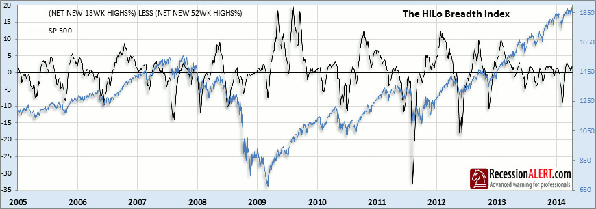
Whilst the above index is very responsive for short to medium-term market timing objectives, it is more useful for market exits than re-entries, since the exits give something most technical indicators do not, namely forewarning. Most price-action technical systems based on moving averages, moving average crossovers, RSI’s or any price momentum for that matter, require some non-trivial damage to set in on the SP-500 index itself before they trip their relative sell thresholds. But the HiLo index, measuring underlying breadth momentum, detects weakness in the SP-500 internals before it manifests itself in non-trivial price corrections. It is therefore not uncommon to have the HiLo index cross below zero and the SP-500 rise shortly thereafter in a final “blow-off” rally. There is one further useful observation to be made about the HiLo index and that is when it is below -5 and starts reversing direction, this offers excellent entry opportunities for investors wishing to “buy the dips”
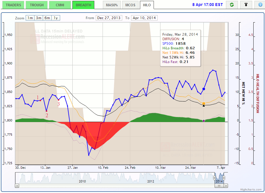
The daily chart we maintain for subscribers consists of the Net New 52-week highs (black solid line), the net new 13-week highs (orange solid line) and a green/red shaded area-chart to represent the difference between the two (the HiLo Breadth Index). We also display a “HiLo Fast” index, which is a purple dotted line. This is merely a HiLo index created in the same way, but using a shorter period smoothing constant on the net new 13-week and 52-week highs. It is an excellent, more aggressive variant of the standard HiLo index and in fact when the HiLo Fast index crosses under the standard HiLo index, this is your first warning that breadth momentum is fading. Similarly when the HiLo Fast crosses above the standard HiLo this is your first clue that breadth momentum is recovering. Obviously as the HiLo Fast is more aggressive it is subject to a few more (but not many!) false alarms and/or whipsaws than the standard HiLo index, but this in no way detracts from its usefulness. In fact, the difference between the HiLo Fast index and the standard HiLo index is an excellent representation of short term liquidity which gives excellent forewarning of stock market corrections, as you can see below:
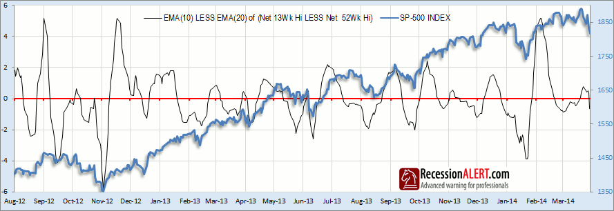
A typical sequence of escalating warnings that could accompany a non-trivial SP-500 correction normally progresses as follows, from least bearish to most bearish:
1. HiLo Fast crosses under HiLo
2. HiLo Fast crosses under zero
3. HiLo crosses under zero
4. Net 13-week highs crosses under zero
5. Net 52-week highs crosses under zero
Whilst not every first and second warning leads to continually escalating warnings, the SP-500 is likely to suffer volatility or even move sideways following the first two warnings, before resuming its upward march again. We can represent the appearance of the above five conditions through a Diffusion Index which reads 5 (most bullish) when none of the conditions are present and 0 (most bearish) when all of the conditions are present:
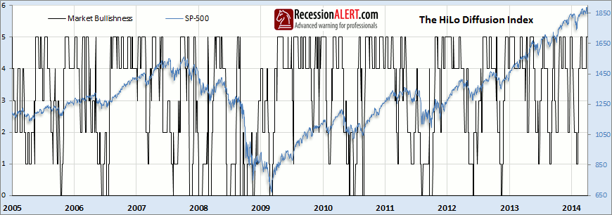
Whilst the Diffusion is a useful measure of relative market breadth “health” we note that readings of zero (most bearish) are very rare and occasions where the Diffusion rises from 0 to 1 make excellent “Great Trough” signals which offer magnificent buying opportunities. Similarly, instances when the diffusion rises from 1 to 2 offer even more frequent buying opportunities for lesser correction sizes. Buying when the diffusion rises from 1 to 2 and selling again when it falls down to 3 provides for a respectable trading regime that allows you to capture the bulk of the bullish movements on the SP-500. The HiLo Diffusion is shown as a transparent light-brown shaded area on the daily chart, ranging on its own vertical axis from zero (most bearish) to 5 (most bullish.)
The daily updated chart we maintain for subscribers is available in the HILO tab in the BREADTH chart group in the CHARTS main menu. Just hover your mouse over any day to see a tool-tip box showing the values for the day in question. You can use the bottom slider to examine over six years of historical data starting in 2008. The example below shows a typical approach to a correction with warnings “1”, “2” and “3” from the typical sequence discussed above provided several days before the SP-500 commenced its slide downwards. Also notice how once the HiLo index fell below -5, its first rise upwards signaled a not-uncommon near-perfect re-entry point into the market, 3 days from ground-zero.

Comments are closed.