
Unprecedented divergence between U.S forward and coincident data raises questions about post-pandemic indicator reliability
Research Analysis PREVIEW | RecessionAlert.com | December 2025
About This Analysis: RecessionAlert.com has been tracking the divergence between U.S. leading and coincident indicators since late 2021. Throughout this period, we consistently advised clients to weigh U.S. Leading Economic Index weakness against several countervailing signals: resilient U.S. coincident data, global trade metrics, the percentage of OECD countries with rising LEIs, the percentage global Reserve Banks easing interest rates and our stock market internals health gauge. This multi-indicator approach—rather than mechanical reliance on any single metric—helped our clients give equity markets the benefit of the doubt during a period when many recession forecasters and bearish analysts were proven wrong. This report synthesizes our analysis of why traditional indicators diverged and what it means for future leading indicator reliability.
0. The Symptoms
Before examining the structural distortions that broke traditional forecasting models, we must first document the scale of the indicator failures themselves. Three of the most reliable recession predictors in modern economic history—the Conference Board’s Leading Economic Index, our own RecessionAlert U.S. Monthly Leading Economic Index, and the Treasury yield curve—all signaled imminent recession for over three years. Yet the economy continued to expand. Understanding why requires separating the symptoms (failed predictions) from the causes (the structural distortions that made those predictions unreliable). These failures weren’t random noise—they represent the most spectacular breakdown of leading indicators in the post-war era.
0.1 The Conference Board LEI
The Conference Board’s U.S Leading Economic Index (LEI) is widely followed and has been in persistent decline for over three years – a pattern that historically would signal imminent recession. Yet the U.S. economy continues to expand, creating an unprecedented divergence that’s forcing economists to reconsider the reliability of some of Wall Street’s most trusted forecasting tools.
The LEI has fallen consistently since late 2021, yet the Coincident Economic Index has continued to rise—a disconnect without parallel in modern economic history.1 The LEI registered its largest monthly decline in April 2025 since March 2023, when many feared the U.S. was headed into recession, which did not ultimately materialize.2
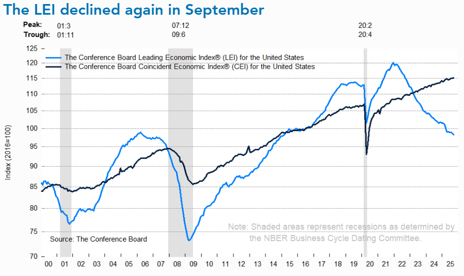
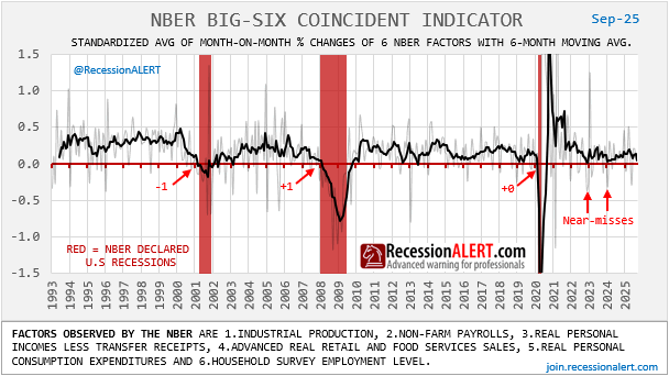
We need not rely solely on the Conference Board’s Coincident Economic Index to measure the current economy. We can examine the same indicators the National Bureau of Economic Research (NBER)—the official arbiter of U.S. recession dating—monitors to determine business cycle turning points, as shown in our interpretation below. Whilst there were two “near misses”, and the low growth metric implies the economy remains vulnerable, it is nowhere near the contraction levels implied by the leading data for the last two years:
0.2 RecessionALERT USMLEI
The RecessionAlert U.S. Monthly Leading Economic Index (USMLEI)—one of the broadest measures of U.S. leading economic data with 27 discrete components compared to the Conference Board’s 8—proved equally vulnerable. This breadth is critical: while distortions in a narrow 8-component index might reflect methodological quirks or over-weighting of specific sectors, synchronized failure across 27 independently sourced components demonstrates how pervasive the structural breaks have become. When an index three times broader captures vastly more economic dimensions yet still signals recession incorrectly for three years, it confirms the distortion extends across the entire leading indicator universe, not just isolated metrics. The analogue of recession probability measurements derived from the USMLEI and past recessions appears below to emphasise this fact:
0.3 The Yield Curve: 70 Years of Perfection, Then Failure
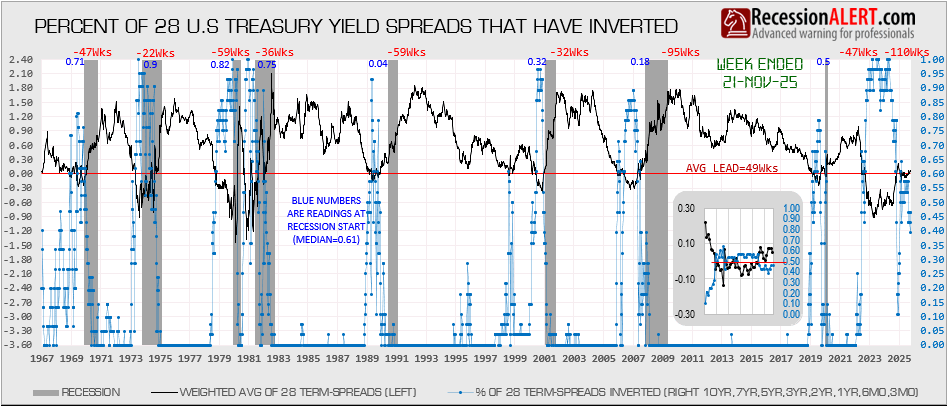
The Treasury yield curve inversion stands apart as perhaps the single most significant indicator failure of this cycle—and demands special attention given its historical infallibility. The 10-year/2-year yield spread inverted in July 2022 and remained inverted for over 27 months until September 2024, marking the longest inversion in modern history.75 Prior to this cycle, the yield curve had a perfect predictive record—every inversion since the 1950s was followed by recession, with zero false positives over seven decades.76 When the curve inverted in July 2022, financial media began recession countdown clocks, and by mid-2023 consensus recession forecasts reached 70%+ probability.77 Yet the recession never came. We prefer to track the percentage of 28 US Treasury Spreads that have inverted rather than arbitrarily picking any single spread, with 60% providing reliable historical signals, and this showed 100% of all spreads inverted at least on 5 occasions in 2023/4:
Normally, yield curve inversion signals recession because it creates a credit crunch—when short rates exceed long rates, banks can’t profitably borrow short and lend long, forcing credit contraction. But this cycle’s structural breaks prevented the traditional transmission mechanism from engaging. Banks entered with unprecedented $4.9 trillion in pandemic-era deposit glut (February 2020 to April 2022 peak), eliminating their need to borrow at elevated short rates.12, 78 Meanwhile, the Federal Reserve’s $5+ trillion QE programs artificially suppressed long-term yields through persistent “portfolio balance channel” effects and “buyer of last resort” expectations, compressing term premiums to historically low levels.80, 81 The global savings glut—over $7 trillion in foreign Treasury holdings driven by aging populations and reserve accumulation—kept long-term yields artificially low regardless of Fed policy.83
Post-2008 forward guidance also changed market dynamics—with the Fed signaling readiness to cut rates at first sign of weakness, long-term yields incorporated expected future cuts even without genuine recession risk, while media amplification created a paradox where widespread recession preparation (labor hoarding, consumer saving, Fed dovish signaling) helped prevent the very recession the indicator predicted.85, 86 The curve un-inverted in September 2024, yet through December 2025—over three years since initial inversion—the anticipated recession still hasn’t materialized, raising profound questions about whether this was a one-time false signal due to unique pandemic distortions or whether structural changes (persistent QE overhang, global savings glut, deposit behavior changes) have permanently altered the curve’s predictive power.87
But perhaps the most revealing symptom isn’t found in any single indicator—it’s in the growing disconnect between what the aggregated data shows and what the average American experiences.
0.4 Beyond Leading Indicators: The Bifurcated Economy
The indicator failures documented above might suggest the problem is purely technical—a matter of flawed forecasting models or outdated weightings. But the symptoms extend beyond leading indicators into the lived economic reality itself. Today’s economy presents a paradox: GDP surged 4.3% in the third quarter (July-September 2025) while consumer confidence declined to 89.1 in December—the lowest since April and approaching recessionary levels.116 This isn’t a measurement error—it’s evidence of fundamental bifurcation.
Wall Street is in expansion while Main Street experiences contraction. The headline economy avoids recession while the median household feels trapped in one. This K-shaped divergence appears starkly in the data: strong aggregate consumption driven by the wealthy few coexists with weak sentiment reflecting the struggling many. The top 10% of U.S. households (earning $250,000+) now account for 49.7% of consumer spending—a record high since data collection began in 1989, up from roughly 36% over the past three decades.117
When the Conference Board’s consumer expectations index—the largest single drag on the LEI—registers deep pessimism even as retail sales grow, it’s not that consumers are irrational. It’s that different consumers inhabit different economies. This bifurcation helps explain why traditional indicators have struggled. Leading indices were designed for an economy where the median household’s experience roughly tracked the aggregate. When the top 10% drive 50% of spending and hold the majority of financial assets, aggregate indicators no longer capture what most people experience. The “recession” many Americans feel isn’t showing up in the data because the data is increasingly dominated by those insulated from economic stress—a structural distortion we’ll examine in detail.
0.5 “This Time Is Different”?
This classic phrase—made infamous by Reinhart and Rogoff’s analysis of financial crises—typically serves as a warning against complacency. 3 Those who claim “this time is different” are usually proven wrong, often spectacularly. Yet occasionally, structural changes genuinely do render historical patterns obsolete. The challenge lies in distinguishing between wishful thinking and legitimate regime shifts. The post-pandemic economy presents exactly this dilemma: are we witnessing temporary distortions that will eventually validate traditional indicators, or have fundamental structural changes permanently altered the relationships these indicators were designed to measure? The answer determines whether the past three years represent a brief anomaly or herald a new economic regime. If the latter, old forecasting tools require wholesale recalibration.
0.6 Prior Commentary on the Divergence
The indicator failures have not gone unnoticed—both the LEI-coincident divergence and the yield curve’s unprecedented false signal drew extensive commentary throughout 2023-2025. The Speculative Investor noted in October 2023 that “with respect to the LEI’s messaging the economy is now in uncharted territory,” observing that the LEI had never suffered a 10.5% peak-to-trough decline or declined for longer than 20 months without recession ensuing.4 Acropolis Investment Management observed in January 2024 that the divergence signal was “worse now than a year ago, despite the current conventional wisdom that we’ll avoid a recession.”5
The yield curve’s failure proved even more confounding given its historically perfect track record. When the 2-year/10-year spread inverted in July 2022, the American Institute for Economic Research (AIER) reminded readers that “all eight US recessions since 1968 were preceded (12-18 months) by such an inversion (with no false signals),” confidently predicting “another US recession would likely begin in 2024.”118 By May 2024, CAIA’s Portfolio for the Future noted the yield curve “has remained inverted for nearly 500 days” yet “no recession has come. Instead the US economy is on track to experience its 7th quarter at or above potential growth and the S&P 500 has risen nearly 40%.” They concluded bluntly: “For investors it was precisely the wrong signal.”119 YCharts analysis in October 2025 acknowledged the predicament: the 16-month inversion from July 2022 to November 2023 was “the longest inversion in modern history” yet “remarkably hasn’t produced a recession,” representing an unprecedented challenge to “traditional interpretation frameworks.”120
U.S. Bank’s Rob Haworth offered structural explanations in early 2025, noting “at least in this cycle, the U.S. economy was less interest rate sensitive than was the case previously” because “many homebuyers already locked in low mortgage rates before the Fed raised interest rates” and “larger corporations had sufficient financing in place, also at lower rates.”121 JPMorgan Asset Management similarly pointed to “stronger-than-expected economic data such as robust labor markets, consumer spending, business investment and industrial production” suggesting “the economy has shown it can withstand higher policy rates.”122
Investment strategist Mark Hackett of Nationwide captured the broader problem in December 2024: “The unusual impact of COVID-19 on the economy has likely resulted in data inconsistencies, policy distortions, and cycle anomalies, which have, in turn, affected the LEI components.” He noted the structural mismatch: “the LEI is impacted more by manufacturing data and less by services, which drive 70% of the U.S. economy.”123 The exasperation was palpable: U.S. News reported in February 2024 that leading indicators were “no longer forecasting a recession” after years of warnings,124 while Wolf Street captured the sentiment with their November 2023 headline: “‘Leading Economic Index’ Predicts Recession for Early 2024, after Having Predicted a Recession for Late 2022, Early 2023, Mid-2023, Late 2023.”125
These observations appeared in investment commentary, blog posts, market analyses, central bank research, and financial media—valuable real-time assessments documenting *what* was happening. Some offered partial explanations: locked-in mortgage rates, corporate financing buffers, manufacturing-services mismatch, pandemic distortions. But these remained fragmented insights rather than systematic analysis.
What has been missing is a comprehensive examination of why this divergence occurred across multiple indicators simultaneously, which specific structural factors are responsible, and what it means for the future reliability of traditional forecasting models.
This analysis aims to fill that gap by systematically documenting the dozen structural factors contributing to the divergence, assessing the strength of evidence for each, and providing actionable guidance for different stakeholders. Rather than simply noting that indicators have been “diverging,” we examine the specific mechanisms by which post-pandemic structural changes violated the assumptions embedded in traditional forecasting models.
The symptoms are clear. Now we turn to the causes.
1. Understanding the Analysis Framework
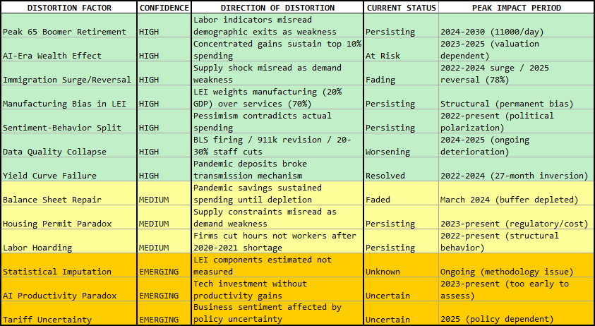
This analysis identifies a dozen structural factors that may be distorting traditional leading indicators. To help readers assess the strength of evidence behind each explanation, we’ve organized these factors using a two-dimensional framework: Confidence in Distortion Effect.
This metric synthesizes both the likelyhood that a factor is causing distortion and the probable magnitude of its impact.
A factor can be high confidence because it’s well-documented with large impact, or medium confidence because it has solid theory but uncertain magnitude. This is not a simple ranking of “importance”—it’s an assessment of how confident we can be that each factor is materially distorting indicators.
- HIGH CONFIDENCE factors have strong empirical evidence, clear transmission mechanisms, and quantifiable impacts that explain major portions of the indicator divergence. These are documented, measurable, and broadly accepted by economists as significant distortions.
- MEDIUM CONFIDENCE factors have solid theoretical foundations/supporting evidence, but are harder to quantify precisely or may be sector-specific rather than economy-wide. These likely contribute to the divergence, but with greater uncertainty about exact magnitude or persistence.
- LOWER CONFIDENCE factors are plausible and logical but lack robust data, are too recent to assess fully, or have divided expert opinion. These may become more important over time but currently rest on thinner evidentiary foundations.
This two-dimensional framework allows readers to weight explanations appropriately—leading with the strongest evidence while acknowledging areas of genuine uncertainty. The goal is not to dismiss traditional indicators entirely, but to understand why they may be less reliable during periods of profound structural change. Critically, many of these distortions are temporary or transitional—some supports have already faded (pandemic savings depleted March 2024), others are reversing (immigration normalized), and still others may persist for years (Peak 65 through 2030). As these structural factors normalize or fade, traditional indicators may regain their historical reliability. Understanding which distortions are temporary versus permanent helps assess when and how indicator frameworks will return to predictive accuracy.
2. Executive Summary
The Core Problem: The Conference Board’s U.S. Leading Economic Index—along with many other commercial and public alternatives—has declined for over three years, a pattern that historically precedes recession. Yet the economy continues to expand. This unprecedented divergence suggests traditional recession indicators may be systematically misreading the post-pandemic, or perhaps even the post-Global Financial Crisis (GFC), economy.
In simple terms: The warning lights are flashing red—falling manufacturing orders, negative consumer sentiment, inverted yield curve—yet employment, income, and spending keep growing. It’s like the check engine light is on, but the car runs fine. Why? The economy’s structure changed in ways that make traditional indicators misleading. Immigration surges, mass boomer retirements, AI-driven wealth concentration, and pandemic savings buffers created conditions (“distortions”) these indicators weren’t designed to handle.
2.1 Key Findings
HIGH CONFIDENCE Distortions:
- Peak 65 Boomer Retirement — 11,000 Americans/day turning 65; labor participation fell to 62% yet boomers’ $78.5T wealth (50%+ of total) sustains spending. Demographics misread as recession.6
- AI-Era Wealth Effect — Stock wealth effect quadrupled to 34¢ per dollar. Magnificent Seven (35% of S&P 500) concentration means top 10% drive 50% of spending, masking broader weakness.7
- Immigration Surge Reversal — 2022-2024 surge added 70-100k jobs monthly, triggering Sahm Rule via supply shock not demand. Now reversing 78%, may validate bearish signals.8
- Manufacturing Bias — LEI weights manufacturing (<20% GDP) over services (70% economy), misreading sectoral rebalancing as systemic decline.9
- Sentiment-Behavior Split — Consumer expectations (largest LEI drag) pessimistic while spending robust, suggesting sentiment reflects political mood not economics.10
- Data Quality Collapse — Statistical agencies lost 20-30% staff, BLS commissioner fired, 911k-job revision reveals measurement crisis.11
MEDIUM CONFIDENCE Contributors:
- Balance Sheet Repair — $2.1T pandemic savings (now depleted March 2024) plus low debt service (11.2%) created unusual resilience 2021-2024.13
- Housing Permit Paradox — Permits down 20% due to regulatory/cost constraints while completions rise; supply not demand problem.14
- Labor Hoarding — Firms cut hours not workers after 2020-2021 shortage, distorting average hours data.15
EMERGING/LOWER CONFIDENCE Factors:
- Statistical Imputation — LEI components estimated not measured during structural change.16
- AI Investment Paradox — Tech spending drove 92% of H1 2025 GDP growth with minimal productivity gains.17
- Tariff Uncertainty — Too recent to assess if distortion or genuine signal.18
Why These Factors Emerged Together: These aren’t random coincidences—they stem from three interconnected root causes that created cascading measurement failures. The COVID-19 pandemic and policy response triggered pandemic savings, deposit glut, immigration whipsaw, and sectoral disruption. The Peak 65 demographic transition (11,000 Americans/day turning 65) collided with pandemic effects, amplifying labor distortions. The AI boom created concentrated wealth effects through Magnificent Seven market dominance, specifically masking broader weakness. Each root cause cascaded across economic measurement systems—this is systematic structural change, not coincidence.
2.2 Market Implications
Mechanical reliance on LEI signals may have caused investors to miss substantial gains over three years. However, immigration normalization and fading pandemic distortions could restore indicator reliability—potentially at a moment of maximum complacency. The LEI was restructured in 1996 and 2012; another update may be overdue for the post-pandemic economy.19
Bottom Line: Traditional indicators aren’t “broken”—they’re measuring an economy that violates their core assumptions. Supply shocks, demographic disruptions, sectoral rebalancing, and compromised data collection have created false recession signals. Investors must look beyond headline readings to understand underlying drivers during structural transitions.
2.3 The Value of Comprehensive Indicator Frameworks
Throughout the 2021-2025 period of unusual indicator divergence, single-metric forecasting proved particularly hazardous. Investors who anchored to the historically perfect yield curve or the Conference Board’s LEI—both flashing recession warnings for years—faced a difficult choice: trust indicators with seven-decade track records, or dismiss them based on speculation about “this time being different.”
A Portfolio Approach to Recession Analysis: RecessionALERT.com’s methodology draws on portfolio theory principles: just as diversification reduces risk in investment portfolios, diversification across indicator types, geographies, and time horizons improves recession forecasting reliability.
Our Analytical Framework: For U.S. market assessment, we track multiple leading indicator categories—labor market signals (initial claims, job openings, employment surveys), housing indicators (permits, mortgage applications, builder sentiment), and composite leading indices. These are continuously cross-referenced against three validation layers: (1) U.S. coincident indicators measuring actual economic activity (employment, production, income, sales), (2) stock market internals and health metrics, and (3) global leading and coincident indicators including international trade volumes. This portfolio is contextualized within our Global Economic Report, which tracks indicators across different time horizons: short-leading (3-6 months), medium-leading (6-9 months), and long-leading (9-12+ months). This spectrum helps distinguish near-term volatility from genuine cyclical turns. When U.S. leading indicators diverge from global patterns, it raises a critical question: Do U.S. signals reflect idiosyncratic distortions or genuine weakness not yet captured globally?
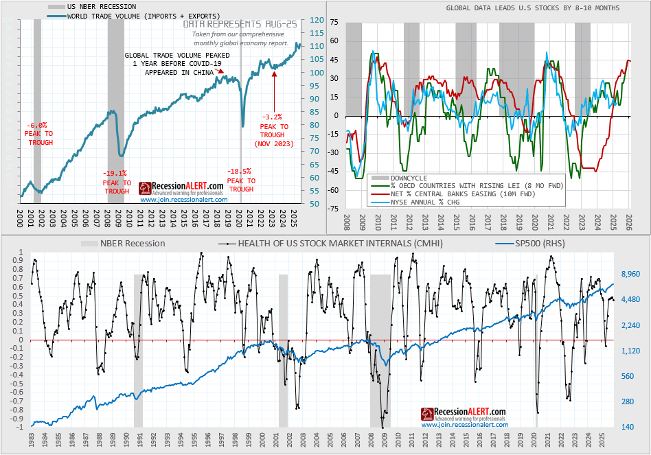
Finally, we integrate market-based signals through stock market health and timing frameworks. Markets aren’t perfect forecasters, but they process vast amounts of information daily. When fundamental economic indicators and market internals tell conflicting stories, the tension itself becomes informative.
The 2021-2025 Experience: This framework proved valuable during the prolonged indicator divergence. When the Conference Board LEI declined persistently while:
- U.S. coincident indicators (actual employment, production, income) remained solid
- Labor and housing leading indicators showed uniformly negative signals
- Global leading indicators across various time horizons stayed constructive
- International trade volumes remained resilient
- Stock market health models showed internal strength despite volatility
The weight of evidence suggested structural distortions in specific indicators rather than imminent recession across the board.
This wasn’t about dismissing warning signals—it was about assessing whether the preponderance of evidence supported the bearish interpretation of isolated (though historically reliable) indicators. When 60-70% of a diversified indicator portfolio signals expansion while 30-40% signals contraction, the aggregate assessment differs from mechanical reliance on any single metric.
Why This Matters Going Forward: The structural factors documented in this report—immigration volatility, demographic shifts, sectoral rebalancing, AI measurement challenges, statistical agency pressures—aren’t likely to resolve quickly. Each adds noise to specific indicators while affecting others less severely.
A diversified framework helps distinguish signal from noise: if labor leading indicators weaken due to immigration normalization but housing indicators and composite indices remain stable, that suggests labor market idiosyncrasy rather than broad-based deterioration. If U.S. leading indicators diverge from global patterns, it raises questions about U.S.-specific distortions versus genuine weakness.
The complexity documented in this report isn’t an argument against using indicators—it’s an argument for using them more sophisticatedly. No single indicator, regardless of historical track record, should be followed mechanically during periods of structural change. Portfolio diversification across indicator types and geographies, combined with understanding of the structural factors affecting each component, provides a more robust foundation for economic assessment.
3. High Confidence Distortions
The following seven factors have strong empirical evidence, clear transmission mechanisms, and quantifiable impacts on indicator performance. Each represents a fundamental break from historical economic patterns that traditional forecasting models were not designed to accommodate.
3.1 Peak 65 Boomer Retirement Wave
The baby boomer generation is hitting mass retirement at unprecedented scale—11,000 Americans turning 65 every day from 2024-2027, totaling 4.1 million annually. By 2030, all 73 million boomers will be 65 or older.20 This creates an economic paradox that breaks traditional recession indicator logic.
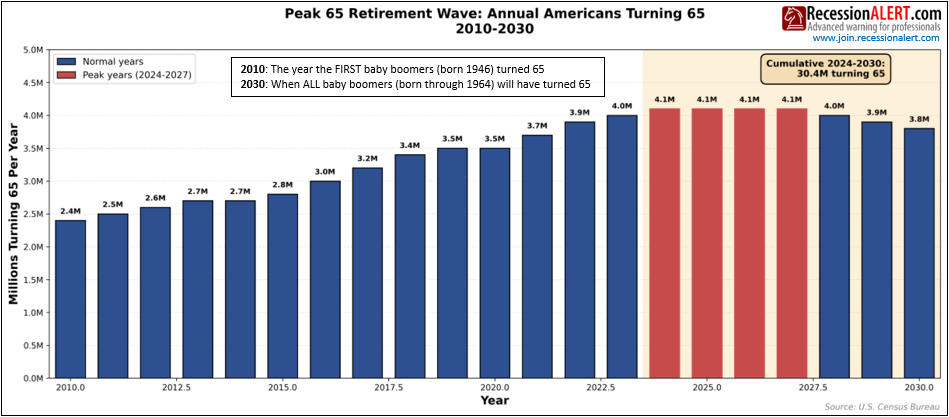
From 2010-2030, America experiences an unprecedented 20-year retirement wave as 73 million baby boomers turn 65. After building steadily for 14 years (2.4M→4.1M, +71%), the wave crests at its absolute peak in 2024-2027 with 4.1M Americans turning 65 annually—11,000 per day. Boomers control 50% of U.S. wealth ($78.5T) and continue spending robustly even after retiring, which sustains consumption and coincident economic indicators even as their mass retirement causes labor-focused leading indicators to flash false recession warnings.
3.1.1 Why Labor Indicators Flash False Warnings
The LEI heavily weights labor market metrics (initial jobless claims, average weekly hours, consumer job expectations). But when millions exit the workforce through retirement rather than job loss, these indicators flash negative signals even though the economy isn’t experiencing demand-driven weakness. Labor force participation has fallen from 67% (2000) to 62% (2025), with aging demographics explaining virtually the entire decline according to New York Fed research.21
3.1.2 The Wealth Effect Paradox
Meanwhile, boomers hold $78.5 trillion in wealth—over 50% of total U.S. household wealth—and are spending it. For every $1 increase in financial wealth, Americans 65+ spend an additional 11 cents.22 This wealth effect keeps consumer spending robust even as labor-based indicators deteriorate. Americans 65+ accounted for 22% of consumer spending in 2022, the highest share on record.23
The Goldilocks Paradox: Traditional recessions feature simultaneous declines in employment AND spending. But Peak 65 creates the opposite: falling labor participation alongside resilient consumer demand. The LEI assumes fewer workers equals weaker economy, but when those “missing” workers are affluent retirees traveling, dining out, and accessing healthcare, GDP keeps growing.
3.1.3 The Replacement Challenge
Between 2024-2030, employers must replace 10.8-14.8 million Peak Boomer employees. Healthcare alone will lose 2.1 million workers—precisely when boomer healthcare demand surges.24 This creates labor shortages appearing as falling average hours and rising job openings, which the LEI interprets as weakness rather than supply constraint.
3.1.4 Confidence Justification
HIGH. Demographics are mathematical fact: 30.4 million turning 65 between 2024-2030 is certain. The New York Fed found adjusting for population aging eliminates the entire post-pandemic labor force participation gap.25 Wealth and spending patterns are documented by Visa, Federal Reserve flow of funds, and multiple research institutions. This demographic shift fundamentally alters the relationship between labor market metrics and economic health, creating the foundation for understanding why multiple other indicators have similarly malfunctioned.
3.2 Immigration Surge and Subsequent Reversal
The most dramatic structural change affecting labor market indicators has been an unprecedented immigration surge that fundamentally altered dynamics. Census estimates roughly doubled net migration figures from 1.1 million to 2.3 million for 2022-2023, with 2.8 million estimated for 2023-2024.37 Higher immigration boosted payroll job growth by 70,000 jobs monthly in 2022 and 100,000 monthly in 2023-2024.38
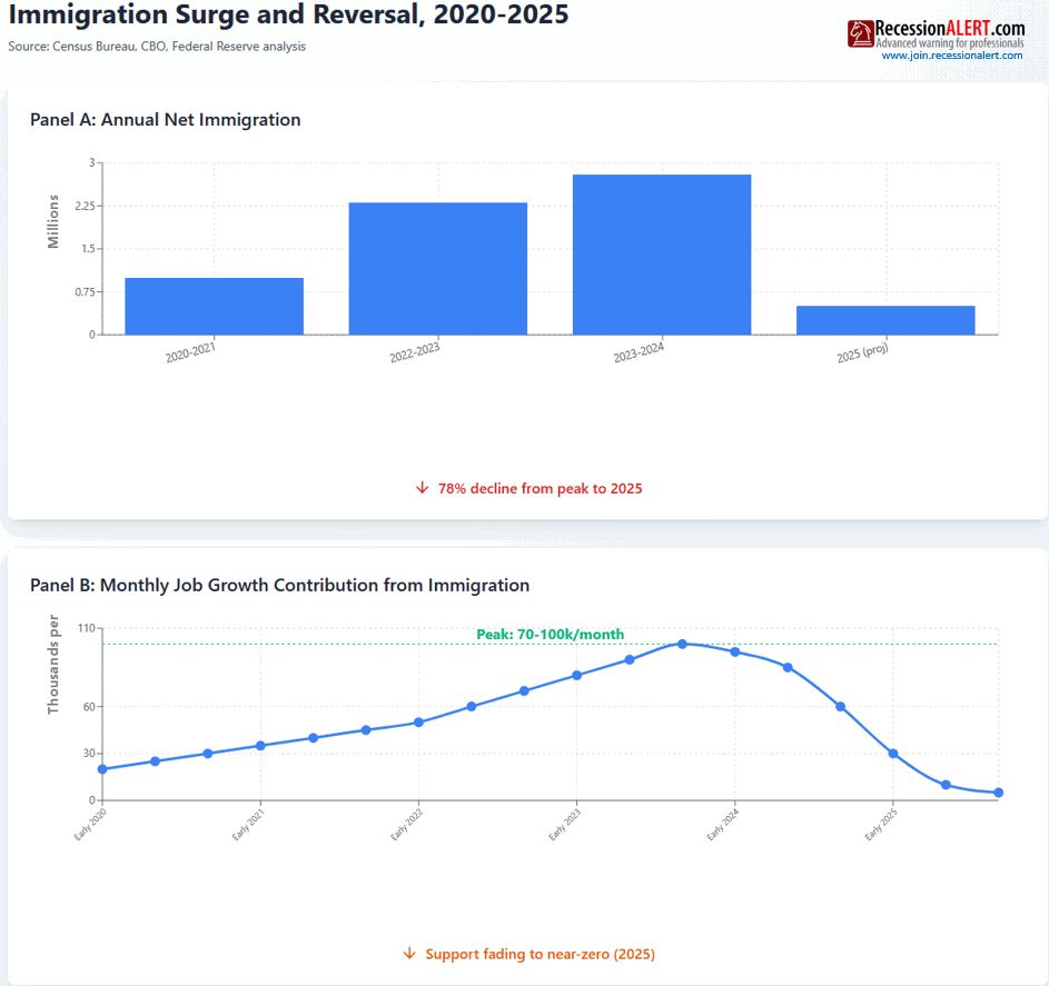
This created a positive supply shock that confounded traditional recession indicators built for demand-driven downturns. An increase in labor supply due to immigration can lead to higher unemployment if the market can’t absorb new workers immediately—meaning payrolls could grow robustly while unemployment simultaneously rose.
The effect was particularly pronounced on the Sahm Rule, a historically perfect recession indicator that triggered in mid-2024. The Sahm Rule was designed for declining labor demand, not rising immigration—it doesn’t distinguish between these dynamics. Claudia Sahm herself acknowledged “this time really could be different” because of swings from labor shortages to immigrants arriving.40
Measurement problems compound this distortion. Recent immigrants are often undercounted in the Current Population Survey due to reluctance to participate (especially among those without legal status), language barriers, and CPS sampling limitations—potentially understating both labor force expansion and employment growth in official statistics.39
The Critical Reversal: This factor is now unwinding. Around half of the decline in monthly payroll growth is attributable to declining net immigration, with estimates ranging 40-60%.41 Net migration is projected at 500,000 in 2025, down from 2.2 million in 2024—a 78% collapse.42 This helps explain why labor market indicators weakened beginning mid-2024.
Paradoxically, as this distortion fades, it may validate the bearish indicators it previously contradicted. The immigration surge masked genuine labor market weakness; its reversal removes that support, potentially exposing vulnerabilities that were always present but hidden.
Confidence Justification: HIGH. Census data revisions are documented fact. The Congressional Budget Office doubled population estimates from 1.1M to 2.3M for 2022-2023.43 The payroll impact (70-100k jobs monthly) is calculated by multiple research institutions. The reversal to 500k projected for 2025 is CBO forecast.44 Claudia Sahm’s own acknowledgment of the Sahm Rule being triggered by supply not demand is on record.45
3.2.1 The Labor Convergence: Peak-65 Meets Immigration
The unemployment chart below reveals the combined power of two supply-side labor distortions. The November 2025 spike in unemployment rises since cycle-low is way over 0.5%—yet no recession occurred. This captures Peak-65 retirements (11,000/day reducing participation) and immigration normalization (reversing 2022-2024 surge) converging.
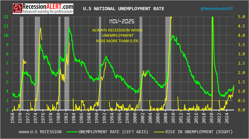
The Sahm Rule triggered because unemployment rose >0.5 percentage points from its low—historically a perfect recession signal. But this rise reflected SUPPLY SHOCKS (demographics, immigration reversal) not demand weakness. Retirements and immigration changes mechanically raise unemployment without signaling economic distress. This is why labor leading indicators screamed recession while the broader economy hummed—two major supply-side distortions amplified and converged, creating false signals that traditional frameworks weren’t designed
to distinguish from genuine demand-driven weakness.
3.3 AI-Era Stock Market Wealth Effect Amplification
The traditional wealth effect has dramatically intensified during the AI boom, creating an unprecedented link between stock market performance and consumer spending that disguises economic weakness in traditional indicators. The wealth effect—where rising asset values boost consumer confidence and spending—has nearly quadrupled from 9 cents per dollar (2002-2017) to 34 cents (2022), according to Visa research.26 Oxford Economics estimates it’s now 5 cents per dollar for stocks specifically, more than double the 2010 rate.27
3.3.1 The Concentration Problem
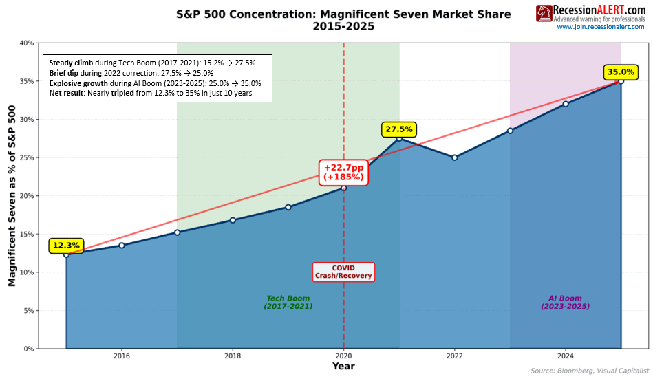
The Magnificent Seven tech stocks (Apple, Microsoft, Nvidia, Amazon, Alphabet, Meta, Tesla) now represent 35% of the S&P 500’s market capitalization, up from 12.3% in 2015.28 These seven companies achieved 698% returns from 2015-2024 while the broader S&P 500 returned 178%.29 Nvidia alone added over $4 trillion in market cap. The top 10 stocks account for 31.6% of total index weighting, generating nearly 70% of the index’s economic profit.30
3.3.2 Why This Creates Distortion
The AI boom has created extreme wealth concentration benefiting primarily high-income households who hold the vast majority of equities. The richest 10% hold approximately 87% of corporate equities and mutual fund shares.30 As the top 10% now account for roughly half of all consumer spending,31 the economy has become unusually dependent on a narrow stock rally benefiting a narrow slice of households.
Oxford Economics estimated stock gains from tech alone in the past 12 months will boost annual consumption by nearly $250 billion—accounting for over 20% of cumulative spending increases.32 JPMorgan found households gained over $5 trillion in wealth from just 30 AI-linked stocks, raising annualized spending by about $180 billion.33 The economy appears healthy (spending remains strong) even while broader indicators weaken, because a highly concentrated stock rally props up consumption through wealth effects on affluent households.
3.3.3 The Valuation Risk
The Magnificent Seven have an average P/E ratio exceeding 50, more than double the S&P 500’s average.34 This concentration creates asymmetric risk—the same mechanism supporting spending could reverse sharply. In 2022, the Magnificent Seven fell 41.3% while the broader S&P 500 declined 20.4%,35 demonstrating concentration cuts both ways. If AI valuations correct, the wealth effect could reverse dramatically, potentially triggering the recession traditional indicators have been predicting but the stock market wealth effect has been preventing.
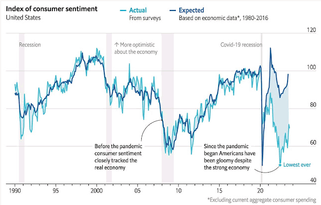
3.3.4 The K-Shaped Economy
University of Michigan data reveals a stark split: sentiment among stock market participants has been rising, while sentiment for non-stockholders continues declining to post-pandemic lows.36 This bifurcation means aggregate consumer sentiment indicators blend two very different economic experiences—the asset-owning class benefiting from market gains versus everyone else facing inflation without offsetting wealth gains.
3.3.5 Confidence Justification
HIGH. Magnificent Seven weighting in the S&P 500, valuation multiples, ownership concentration by income decile, and wealth effect magnitude changes are all well-documented by Federal Reserve, Visa, Oxford Economics, and academic research. The mechanism is clear: concentrated stock gains → wealth effect on affluent → sustained spending despite weak labor indicators.
Having examined how demographics, wealth concentration, and immigration have distorted labor and spending indicators, we now turn to a more fundamental structural issue: the LEI’s outdated sectoral composition.
3.4 Manufacturing Bias in the Leading Economic Index
A structural issue centers on the LEI’s heavy manufacturing bias. The LEI skews toward manufacturing and goods-producing industries, which comprise less than 20% of U.S. GDP.46 Much of the LEI’s weakness stems from falling manufacturing new orders and declining work hours, while the services economy—including consumer spending, healthcare, technology, and financial services—continues to hold up solidly.
The pandemic created an artificial goods boom as stimulus checks flooded into physical purchases during lockdowns. As demand normalized back toward services, manufacturing indicators plummeted—but this reflected reversion to trend rather than genuine economic distress. Fisher Investments noted manufacturing new orders subtracted 1.09 percentage points from the LEI over six months amid the global manufacturing slump, driving much of the index’s decline even as the broader economy hummed along.47
In a 70% services economy, manufacturing weakness no longer carries the systemic signal it once did. When manufacturing comprised 25-30% of GDP in the 1970s-1980s, its weakness reliably predicted economy-wide downturns. Today, manufacturing can contract while services expand, yet the LEI interprets manufacturing contraction as harbinger of broader recession.
The sectoral rebalancing from goods to services represents a long-term structural shift accelerated by the pandemic. E-commerce, remote work, and digital services have permanently increased services’ share of the economy. Yet the LEI’s composition—established in its last major restructuring in 2012—hasn’t fully adjusted to this reality.
Confidence Justification: HIGH. The sectoral composition of GDP (services 70%, manufacturing <20%) is BEA data.48 Manufacturing new orders’ contribution to LEI weakness is documented by Fisher Investments and Conference Board reports.49 The pandemic-driven goods boom and subsequent normalization is evident in durable goods orders data. This is a measurement issue, not speculation about economic relationships.
While the manufacturing bias represents a compositional flaw in the LEI itself, the next distortion involves a fundamental disconnect between what indicators measure and what they signify.
3.5 The Sentiment-Behavior Split
Perhaps most puzzling has been the divergence between what consumers say and what they do. Consumer expectations have been continuously pessimistic, contributing significantly to LEI weakness—it has been the single largest negative contributor to the index for multiple consecutive months.50 Yet actual consumer spending has remained robust throughout—a gap between forward-looking sentiment indicators and coincident activity measures.
This disconnect reflects multiple overlapping factors that have transformed what consumer sentiment measures:
The “Missing Inflation” Problem. Official CPI doesn’t capture the “cost of money”—interest rates and borrowing costs. Research by Summers et al. (2024) demonstrates that if mortgage interest costs were included in CPI (as they were historically), inflation would have peaked at 18% rather than 9.1%, and current inflation would measure around 8% rather than 3%.51 TD Economics economist Shernette McLeod notes that “where people on the ground are feeling it in terms of rising house prices and rising interest rates, the official data doesn’t capture that.”52 When economists see 3% inflation, consumers genuinely experience something closer to 8% when accounting for borrowing costs. Sentiment reflects reality; the measurement is incomplete.
Cumulative Price Levels vs. Inflation Rates. Even as inflation moderates, consumers fixate on elevated absolute prices. McLeod observes: “even though we say inflation is coming down, they’re still seeing higher price levels. They remember back in 2019, when prices were this much, and now they’re 20 percent higher.”53 Grocery prices—experienced weekly—receive disproportionate psychological weight. Research shows consumers form inflation expectations primarily from frequently observed prices, keeping sentiment depressed even as aggregate inflation falls.54
K-Shaped Economy Paradox. The top 10% of households—who own 87% of equities and drive 50% of consumer spending—experienced soaring wealth from the stock market rally. Their spending remained robust. The bottom 50% saw minimal wealth gains and bore inflation’s full brunt on necessities. TD Economics estimates over 60% of remaining excess savings are held by the top 10%, with less than 5% held by the bottom 50%.55 Aggregate sentiment reflects the majority’s pain; aggregate spending reflects the affluent minority’s resilience. Both signals are accurate—they measure different populations.
Political Polarization. University of Michigan data shows dramatic sentiment splits by political affiliation. Following the 2024 election, Republican sentiment surged while Democratic sentiment plummeted, despite identical underlying economic conditions.56 Consumer confidence has become more correlated with partisan affiliation than personal financial circumstances.57 The LEI component measuring consumer expectations reflects political tribalism rather than economic assessment.
Implications: These factors mean consumer expectations—a key LEI component—now measures a complex mix: unmeasured inflation (interest costs), frequency-biased observations (grocery prices), distributional conflict (K-shaped experiences), and political identity. The LEI interprets this pessimism as predicting economic weakness. But if sentiment primarily reflects measurement gaps, psychological biases, legitimate lower-income anxiety offset by upper-income resilience, and partisan expression, its predictive power for actual aggregate outcomes breaks down. The indicator measures something different from what it was designed to measure.
Confidence Justification: HIGH. Consumer expectations’ contribution to LEI weakness is documented in Conference Board reports.58 Spending strength is evident in BEA data.59 The Summers et al. (2024) research is peer-reviewed NBER analysis.60 TD Economics analysis is based on official data.61 Academic research on political polarization effects is extensive.62 This represents a well-documented, multi-dimensional shift in what consumer sentiment measures.
While political polarization and measurement gaps complicate sentiment indicators, an even more fundamental threat has emerged: the degradation of the statistical infrastructure itself.
3.6 Data Quality and Statistical Infrastructure Decay
Beyond specific indicator distortions, the deteriorating quality of underlying data represents a potentially significant factor—compounded by unprecedented political interference. President Trump fired Bureau of Labor Statistics Commissioner Erika McEntarfer on August 1, 2025, hours after a weak jobs report, claiming without evidence the data was “rigged” and “manipulated for political purposes.”63
McEntarfer was confirmed to her post in January 2024 by a broadly bipartisan 86-8 vote, including a yes vote by then-Senator JD Vance. William Beach, a 2017 Trump appointee and McEntarfer’s immediate predecessor at BLS, sharply criticized the firing, calling it “totally groundless” and warning it “sets a dangerous precedent and undermines the statistical mission of the Bureau.”64
The firing sent shockwaves through the statistical community. One BLS employee warned that “the neutrality of the agency has been eliminated,” questioning “who will trust the data going forward, without concern that it is being skewed to favor an administration’s agenda or political talking points?”65
This political interference compounds long-standing resource constraints. Most statistical agencies lost 20-30% of their staff this year, and the Trump administration is pursuing further workforce cuts.66 The BLS survey sample is becoming less representative—perhaps because of slower net immigration and business creation in 2024.
This sampling issue contributed to the Bureau effectively erasing 911,000 jobs thought to have been added between March 2024 and March 2025—one of the largest benchmark revisions in recent decades, which the White House then used as justification for McEntarfer’s firing.67
The 43-day government shutdown from October to November 2025 suspended data collection operations across multiple agencies. The Department of Education’s statistics office was reduced to three employees.68 Federal budgets have shortchanged statistical agencies for years, with these agencies suffering losses of 16%+ in real dollars since 2009.69
The American Statistical Association warned that “bedrock statistics that the financial world, and in general, the world looks to” are being compromised, and that “this is an immediate kind of crisis situation.”70
Confidence Justification: HIGH. The firing of Commissioner McEntarfer is documented public record.71 Staffing cuts at statistical agencies are confirmed by agency budget documents and ASA testimony.72 The 911,000-job benchmark revision is official BLS data.73 The 43-day shutdown suspending data collection is documented fact.74 When political pressure can result in firing career statisticians for producing unfavorable data, the independence of the entire statistical system is compromised.
Political compromise of data collection represents an existential threat to indicator reliability. But perhaps no single indicator’s failure has been more spectacular—or more widely anticipated—than the yield curve inversion that predicted the “most anticipated recession in history.”
4. Medium Confidence Distortions
While the high confidence factors above rest on strong empirical foundations, the following distortions have solid theoretical support but are harder to quantify precisely or may be sector-specific rather than economy-wide. These likely contribute to the indicator divergence but with less certainty about magnitude.
The high confidence factors established how demographics, wealth concentration, immigration, sectoral bias, political polarization, data quality, and financial market distortions have each independently contributed to indicator failures. The medium confidence factors below examine additional mechanisms that, while less precisely quantifiable, represent important pieces of the puzzle.
4.1 Household Balance Sheet Repair and Leverage Headroom
The combination of post-GFC deleveraging and pandemic-era forced savings created an unprecedented household balance sheet position that traditional recession indicators were not calibrated to detect. This structural improvement gave consumers unusual resilience to economic shocks, allowing spending to persist even as traditional warning signals flashed red.
4.1.1 The Post-GFC Foundation
Following the 2008 financial crisis, American households underwent the most dramatic deleveraging in modern history. The household debt service ratio—the share of disposable income devoted to debt payments—fell from a peak of 13.2% in Q4 2007 to roughly 10% by 2015, before settling around 11-12% pre-pandemic.88 This represented a fundamental shift in household financial behavior away from the excessive leverage that characterized the 2000s housing bubble.
4.1.2 The Pandemic Savings Surge
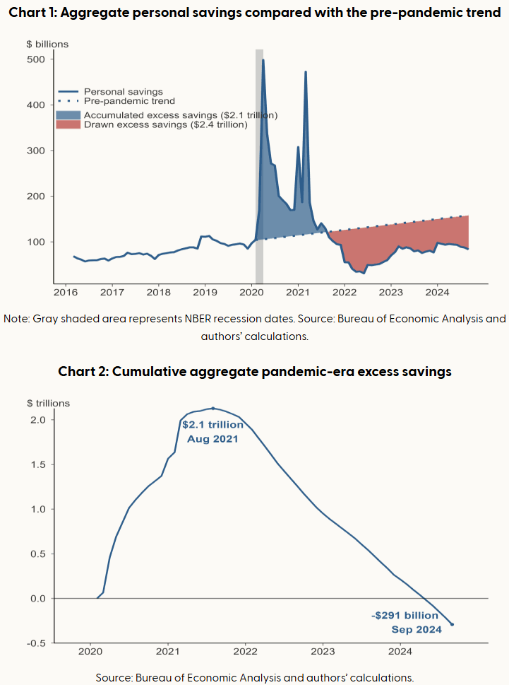
The COVID-19 recession added a second layer of balance sheet repair. Government fiscal support ($5 trillion+ in pandemic relief including stimulus checks, enhanced unemployment benefits, PPP loans, child tax credits) combined with forced reduction in consumption (lockdowns, travel restrictions, closed businesses) to create unprecedented savings accumulation. From March 2020 to August 2021, American households accumulated $2.1 trillion in “excess savings”—defined as savings above the pre-pandemic trend—according to San Francisco Fed estimates.89
4.1.3 The Multi-Year Buffer and Its Depletion
This $2.1 trillion buffer funded consumer spending from late 2021 through early 2024, even as real wages struggled with inflation and traditional indicators weakened. The drawdown was gradual: $34 billion monthly initially (September-December 2021), then accelerating to $100 billion monthly throughout 2022, before moderating to $85 billion monthly in early 2023.90 By March 2024, San Francisco Fed estimates show aggregate excess savings were fully depleted—turning negative by September 2024 to -$291 billion below pre-pandemic trend.91
4.1.4 Current State and Ongoing Support
While excess savings are gone, structural balance sheet improvements persist. As of Q2 2025, the household debt service ratio remains at 11.2%—still below the 12% long-term average and far below the 13.2% pre-crisis peak.92 Debt-to-income ratio stands at 81%, well below pre-pandemic levels.93 Critically, 92% of outstanding mortgages are fixed-rate, with many locked in at ultra-low rates of 2020-2021 (2.5-3.5% on 30-year mortgages).94 This means rising interest rates haven’t triggered the payment shock that would normally accompany Fed tightening.
4.1.5 Why This Distorted Indicators
The LEI and other recession models were built on historical patterns where deteriorating employment led quickly to falling consumption as households lacked buffers. But from 2021-2024, consumers had massive savings cushions allowing them to maintain spending even as labor market indicators weakened. Traditional models expected recession when payroll growth slowed and jobless claims rose—but those signals were overwhelmed by balance sheet strength.
Additionally, the low debt service burden means consumers are relatively insensitive to interest rate changes. Normally, Fed rate hikes quickly impact consumer spending through higher credit card rates, auto loan costs, and adjustable mortgages. But with debt service already low and mortgages locked at fixed rates, the transmission mechanism was muted. The LEI’s financial components couldn’t capture this insulation effect.
4.1.6 The Transition Risk
The depletion of excess savings in March 2024 may explain why economic data softened in mid-2024 and recession fears intensified. The buffer that prevented recession for three years despite negative indicator signals has now disappeared. However, the persistently low debt service ratio means households still have more leverage headroom than in pre-2008 periods. JPMorgan Chase Institute data shows all but the lowest-income households are now below historical cash balance expectations, but most groups haven’t yet turned to debt to maintain spending.95
4.1.7 Confidence Justification
MEDIUM (leaning HIGH). The data on excess savings accumulation and depletion is well-documented by multiple Fed banks. Debt service ratios are official Fed statistics. The mechanism is clear: unprecedented savings buffer → sustained consumption despite weak indicators → buffer depleted March 2024 → vulnerability returns. The uncertainty is around how much the remaining structural improvements (low debt service, fixed-rate mortgages) continue to provide support now that excess savings are gone. This is a transitional factor—highly impactful 2021-2024, less clear going forward.
While balance sheet repair explains how consumers maintained spending despite weak labor indicators, supply-side constraints in housing have created their own set of false signals.
4.2 The Housing Permit Paradox
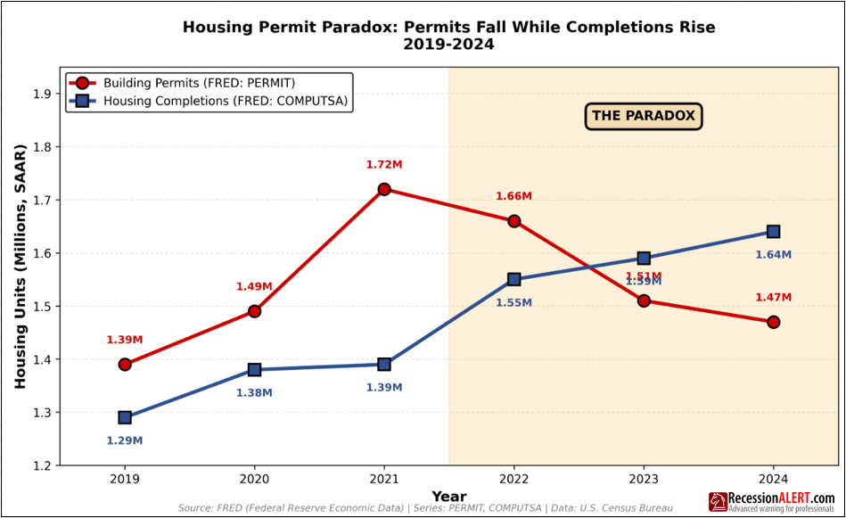
Building permits, a key LEI component, have been declining sharply—yet this may be one of the most misleading signals in the index. Building permits in the United States fell to 1.330 million in August 2025, the lowest level since May 2020, and single-family permits decreased 5.6% year-over-year through June 2025.96
However, this decline doesn’t reflect weak housing demand. Instead, it reflects severe supply-side constraints. Arizona’s housing shortage stands at over 121,000 units despite permits declining 20% in 2025.97 Los Angeles housing permits dropped 23% in 2024 even as the city needs to build nearly 500,000 units by 2029 under state housing goals.98
The reasons for declining permits have nothing to do with recession risk:
- High interest rates making projects financially unviable for developers—deals that “penciled” in 2022 no longer work in 2025
- Construction cost inflation driven by tariffs on materials
- Regulatory constraints and zoning restrictions adding up to one-third of construction costs99
- Permitting delays averaging over 300 days in some jurisdictions100
- Labor shortages in construction trades
Critically, housing completions actually rose in 2024, up from prior years, indicating builders are finishing existing projects even as they pull back on new permits.101 This is the opposite pattern from a demand-driven recession, where permits would fall because consumers don’t want houses. Here, permits fall because developers can’t make the economics work—a supply shock, not a demand problem.
When building permits decline due to regulatory friction and financing costs rather than consumer demand weakness, they become a false recession signal. The LEI is interpreting a supply-side constraint as demand weakness.
Confidence Justification: MEDIUM. The decline in building permits is documented data. The supply-side explanations (regulatory delays, cost inflation, labor shortages) are well-documented by industry sources. However, disentangling how much is supply constraint versus genuine demand weakness is difficult. Some demand weakness likely exists alongside supply constraints, but the relative magnitudes are unclear.
Supply-side housing constraints represent one form of transmission mechanism failure. The labor market has seen a different kind of breakdown in traditional signaling.
4.3 The Labor Hoarding Phenomenon
Average weekly hours in manufacturing—another consistently negative LEI component—may also be sending misleading signals. Companies learned painful lessons from the 2020-2021 labor shortages, when finding qualified workers became nearly impossible and wage inflation accelerated.
As a result, firms are now “hoarding” labor even as demand softens. Rather than laying workers off during temporary slowdowns, they’re reducing hours and accepting lower productivity. This shows up as declining average weekly hours and weak productivity growth, both of which depress the LEI.102
But this isn’t the traditional recession pattern where firms cut workers in response to collapsing demand. Instead, it’s a strategic response to structural labor market tightness. Initial claims for unemployment remain relatively low because companies are reluctant to let workers go, knowing they’ll struggle to rehire when conditions improve.103
This dynamic is reinforced by demographic trends—an aging workforce means fewer workers entering prime working years. Companies that release workers today may never get them back. The labor hoarding effect makes hours-worked and initial-claims data less reliable as forward indicators, since they now reflect supply-side labor market constraints rather than pure demand signals.
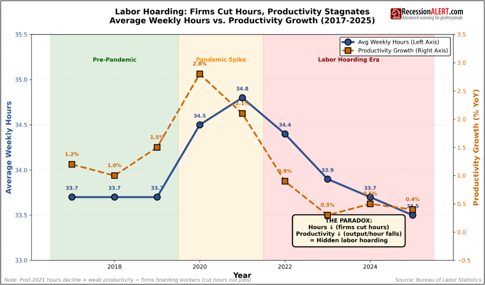
Confidence Justification: MEDIUM. The concept of labor hoarding is well-established in economics. Anecdotal evidence from company earnings calls and business surveys supports the hypothesis. However, quantifying exactly how much of the decline in average hours is labor hoarding versus genuine demand weakness is challenging. The effect is real but its magnitude is uncertain.
5. Emerging and Lower Confidence Factors
Having examined the high and medium confidence distortions, we now turn to three emerging factors that represent potential additional sources of indicator unreliability, though the evidence base remains thinner. The following factors are plausible and rest on logical foundations, but lack robust data, are too recent to assess fully, or have divided expert opinion. These may become more important over time but currently rest on thinner evidentiary foundations. They deserve monitoring as additional data becomes available.
5.1 Statistical Imputation and Model Breakdown
A technical but potentially critical issue: multiple LEI components aren’t actual data—they’re statistical estimates. The Conference Board acknowledges that “series in The Conference Board LEI for the US based on our estimates are manufacturers’ new orders for consumer goods and materials and manufacturers’ new orders for nondefense capital goods excluding aircraft.”104
When data isn’t available in time for monthly releases, the Conference Board uses autoregressive models to estimate missing components. During normal times with stable patterns, these imputation models work reasonably well. But during periods of structural change—like post-pandemic supply chain disruptions, immigration surges, and manufacturing-to-services rebalancing—the historical relationships these models rely on break down.
If the imputation models are systematically biased (for instance, if they assume manufacturing orders will follow historical recession patterns when the actual driver is sectoral rebalancing), the LEI could be generating false signals purely from statistical artifacts rather than genuine economic data.
This compounds the data quality issues discussed in Section 3.6, creating a situation where both the underlying data collection and the statistical processing of that data may be compromised simultaneously. However, the magnitude of this bias is unclear and the Conference Board hasn’t disclosed detailed information about model performance during this period.105
Confidence Justification: EMERGING. That imputation occurs is documented fact. That imputation models can break down during structural change is theoretically sound. But we lack transparency into the Conference Board’s specific models, their performance metrics, or quantification of bias. This is a hypothesis supported by logic and precedent, not empirical verification.
5.2 The AI Productivity Paradox
While likely premature to claim artificial intelligence productivity gains is distorting traditional indicators today, early measurement challenges bear watching. Investment in information-processing equipment and software was only 4% of U.S. GDP for the first half of 2025, yet it accounted for fully 92% of GDP growth over that period—suggesting AI infrastructure investment is propping up headline GDP figures even as broader economic activity stagnates.106
Yet measured productivity gains remain minimal. Through mid-2025, 26.4% of U.S. workers report using AI in their jobs,107 but Total Factor Productivity has increased by only 0.01 percentage points attributable to AI.108 Employment in occupations classified as “fully automatable” has declined 0.75%,109 consistent with AI displacing workers, yet economy-wide productivity hasn’t visibly accelerated.
MIT economist Daron Acemoglu estimates AI might contribute 0.7% to productivity growth over the next decade—meaningful but not revolutionary.110 This suggests either: (1) AI benefits are genuinely modest, (2) productivity gains are being offset by implementation costs and disruption, or (3) statistical agencies aren’t adequately measuring AI’s contribution to output.
If the latter, then GDP growth may be understated, making the economy stronger than indicators suggest. Alternatively, if AI investment represents malinvestment in unproductive technologies, then GDP growth is overstated and recession risk is higher than it appears. Either way, AI creates measurement uncertainty.
Confidence Justification: EMERGING. The concentration of GDP growth in tech investment (92% from 4% of GDP) is BEA data. Worker usage of AI and minimal TFP impact are documented. Acemoglu’s estimates are peer-reviewed research. However, it’s too early to assess whether this represents genuine indicator distortion or simply early-stage technology adoption with delayed productivity payoff. Historically, major technologies (electricity, computers) took decades to show up in productivity statistics. The AI productivity paradox may simply be replaying this familiar pattern.
5.3 Tariff Uncertainty
The Conference Board has cited tariff uncertainty as a factor weighing on the LEI, particularly affecting manufacturing new orders and business expectations.111 President Trump’s “Liberation Day” tariffs announced in April 2025 created significant volatility in forward-looking business indicators.112
However, it’s unclear whether this represents an indicator distortion or a genuine leading signal. If tariff uncertainty is causing businesses to genuinely pull back on investment and hiring in anticipation of weaker demand, then the LEI is correctly signaling future economic weakness—not being distorted by false signals.
Alternatively, if tariff fears prove overblown and businesses adapt without significant economic damage, then the LEI’s tariff-induced weakness will have been a false signal. This factor is too recent and too policy-dependent to assess with confidence.
Confidence Justification: EMERGING. That tariff uncertainty exists and affects business sentiment is documented. However, whether this represents signal or noise depends on future policy outcomes and economic adaptation, which remain unknown. This factor requires more time and data before confident assessment is possible.
6. Summary: The 13 Distortion Factors
Having examined all 13 structural distortions in detail—6 HIGH confidence, 3 MEDIUM confidence, and 3 EMERGING confidence—this section provides a comprehensive visual summary and cross-cutting analysis.
6.1 Key Patterns Across All Factors
Persistence Analysis:
- Currently Persisting (6 factors): Peak 65 Boomer Retirement (through 2030), Manufacturing Bias (structural/permanent), Sentiment-Behavior Split (political polarization), Data Quality Collapse (worsening), Housing Permit Paradox (regulatory constraints), Labor Hoarding (post-2020 behavior)
- Fading or Resolved (3 factors): Immigration Surge (78% reversal in 2025), Balance Sheet Repair (pandemic savings depleted March 2024)
- At Risk (1 factor): AI-Era Wealth Effect (valuation dependent—if correction occurs, wealth effect could reverse sharply)
- Uncertain/Unknown (3 factors): Statistical Imputation (methodology issue), AI Productivity Paradox (too early to assess definitively), Tariff Uncertainty (policy dependent)
Temporal Dynamics:
The timeline reveals distinct phases of distortion emergence and resolution:
- Long-term structural (through 2027-2030): Peak 65 demographic certainty (11,000/day through 2027), Manufacturing Bias embedded in LEI methodology (permanent until index restructured)
- Pandemic-era effects now fading (2024-2025): Savings buffers depleted (March 2024), deposit glut normalizing, immigration surge reversed (2025)
- New distortions emerging or worsening: Data quality deterioration (BLS commissioner fired August 2025, 911k job revision, 20-30% staff cuts), AI-driven market concentration (sustainability uncertain), policy uncertainty (tariffs)
Implications for Indicator Reliability:
The pattern reveals a transition in progress. Temporary pandemic-era distortions that artificially sustained economic activity (savings buffers, immigration surge, deposit glut supporting lending) have largely faded by 2024-2025. However, three categories of distortion continue to impair indicator reliability:
- Structural long-term factors that will persist for years: Peak 65 demographic wave (through 2030), Manufacturing Bias in index construction (until methodology updated), Wealth concentration effects (as long as AI boom sustains valuations)
- Deteriorating measurement infrastructure: Data quality collapse represents an ongoing and worsening problem—political interference, budget cuts, and staffing reductions compound rather than resolve over time
- Uncertain new dynamics: AI productivity effects, statistical imputation accuracy during structural change, and policy uncertainty require continued monitoring as evidence accumulates
This suggests traditional indicators may partially regain reliability as temporary pandemic-era factors fade, but structural adjustments remain necessary to account for demographic shifts (aging population), sectoral composition (services-dominated economy), wealth concentration effects (K-shaped spending patterns), and compromised data collection that will persist for years.
The question of when indicators fully regain historical reliability depends critically on: (1) how long Peak 65 effects persist (certain through 2030), (2) whether AI valuations correct (uncertain), (3) whether data quality can be restored (requires political will and budget restoration), and (4) whether the Conference Board updates LEI methodology to reflect the modern economy (possible but not yet scheduled).
7. Synthesis: The Interconnections and Root Causes
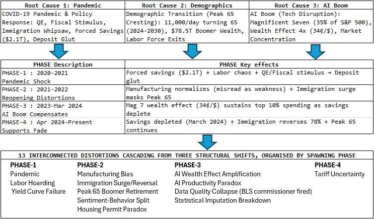
At first glance, identifying 13 distinct distortion factors might seem like a “shotgun approach”—an implausibly large number of unrelated problems manifesting simultaneously by coincidence. This reasonable skepticism deserves a direct response.
These factors aren’t independent random events. Rather, they represent interconnected consequences of three fundamental structural shifts that created cascading effects across the economic measurement system. Understanding these root causes transforms the narrative from “11 random things broke” to “three seismic shifts created predictable cascades of measurement failures.”
7.1 The Three Root Causes
ROOT CAUSE 1: The COVID-19 Pandemic and Policy Response (2020-2021)
This single event triggered a cascade of distortions that are still unwinding:
Direct Effects:
- Pandemic Savings Accumulation ($2.1T buffer) → sustained consumption despite weak indicators for years
- Labor Market Disruption → labor shortages → firms learned “never let workers go again” → labor hoarding
- Pandemic Deposit Glut → banks flush with deposits → yield curve transmission mechanism broke
- Forced Sectoral Shift → goods boom during lockdowns → manufacturing indicators misread normalization as weakness
Policy Response Effects:
- Massive QE (Fed balance sheet expansion) → term premium compression → yield curve structurally distorted
- Fiscal Stimulus ($5T+) → created excess savings → extended buffer period through March 2024
- Immigration Policy Whipsaw → border restrictions (2020-2021) then surge (2022-2024) then reversal (2025) → massive labor supply volatility
Result: 6 of the 13 factors trace directly to the pandemic event or policy response. Not coincidental—they’re causally linked to the same shock.
ROOT CAUSE 2: Long-Term Demographic Transition (Decades in Development, Cresting 2024-2030)
Baby boomer retirement isn’t a 2021 phenomenon—it’s been building for decades. But it reached critical mass precisely as pandemic distortions hit, creating compound effects:
Direct Effects:
- Peak 65 Retirement Wave (11,000/day 2024-2027) → labor force participation falling for demographic not cyclical reasons
- Wealth Concentration ($78.5T in boomer hands, 50% of total wealth) → spending resilient despite labor market weakness
- Labor Shortages in Critical Sectors → healthcare losing 2.1M workers → reinforces labor hoarding (firms can’t replace workers)
Critical Interactions with Pandemic:
- Early retirements during COVID accelerated the demographic trend
- Immigration surge (2022-2024) temporarily masked boomer retirements in payroll data
- When immigration reversed (2025), the demographic reality became starkly visible
- Labor hoarding intensified because replacing retired skilled workers became nearly impossible
Result: Peak 65 isn’t just “another factor”—it amplifies and interacts with pandemic-driven labor market distortions. The timing isn’t coincidental; demographic inevitability collided with pandemic disruption.
ROOT CAUSE 3: Technological Disruption (AI Boom 2023-Present)
The AI boom created extreme market concentration and wealth effects that specifically compensated for weaknesses created by the first two causes:
Direct Effects:
- AI-Era Wealth Effect Amplification (9¢→34¢ per dollar) → consumption sustained by stock gains even as real wages lagged
- Magnificent Seven Concentration (35% of S&P 500) → narrow rally supporting broad spending through top 10%
- AI Productivity Paradox (92% of GDP growth from 4% of economy) → aggregate GDP misleading about broad health
- Sectoral Rebalancing → manufacturing weakness (old economy) vs. tech infrastructure boom (new economy)
Critical Interactions with Other Factors:
- AI boom created wealth effects primarily for top 10% who hold 87% of equities and drive 50% of spending
- This specifically masked the impact of pandemic savings depletion (March 2024) for lower-income groups
- Stock gains compensated for real wage pressures → created sentiment-behavior split (people pessimistic but spending)
- Tech infrastructure investment explained why GDP looked healthy despite manufacturing/services weakness
Result: AI boom isn’t separate from other distortions—it specifically compensated for weaknesses elsewhere, creating the appearance of broad strength when reality was concentrated fragility.
7.2 The Four-Phase Cascade Shows Clear Causation
Understanding the sequence reveals these aren’t coincidental—each phase’s distortions built on the previous:
Phase 1: Initial Pandemic Shock (March 2020-August 2021)
- COVID-19 → lockdowns → forced savings accumulation ($2.1T) → Pandemic Savings distortion
- Goods boom (can’t spend on services) → manufacturing indicators temporarily strong, setting up false baseline
- Labor market chaos → massive disruptions → firms traumatized → determined “never again” → Labor Hoarding begins
Phase 2: Reopening Creates Misleading Signals (September 2021-December 2022)
- Services resume → demand normalizes from goods back to services
- Manufacturing indicators plunge → LEI reads normalization as recession signal (FALSE) → Manufacturing Bias distortion becomes visible
- Immigration surge begins (2.3M in 2022) → masks Peak 65 retirements → payrolls look artificially strong → Immigration and Peak 65 distortions interact
- Savings buffer starts depleting ($100B/month) → but buffer so large it sustains spending for years
- Inflation anxiety rises → Sentiment-Behavior Split emerges (pessimism contradicts actual spending)
- Supply-side constraints → Housing Permit Paradox develops (permits fall despite strong demand)
Phase 3: AI Boom Compensates (January 2023-March 2024)
- AI boom begins → Magnificent Seven surge → wealth effect quadruples to 34¢ per dollar → AI Wealth Effect distortion
- Top 10% spending sustained by stock gains → precisely compensates for pandemic savings depletion
- GDP looks robust (tech infrastructure investment) → but only 4% of economy driving 92% of growth → AI Productivity Paradox
- Manufacturing stays weak → but AI rally masks it → aggregate indicators misleadingly positive
- Political pressure intensifies on statistical agencies → culminates in BLS commissioner firing (August 2025) → Data Quality Collapse accelerates
- Structural changes break historical relationships → Statistical Imputation models fail during regime shift
Phase 4: Supports Simultaneously Fade (April 2024-Present)
- Pandemic savings fully depleted (March 2024) → three-year buffer disappears
- Immigration reverses 78% (2024→2025) → labor supply boost evaporates
- Peak 65 continues relentlessly → 11,000/day through 2027 with no offset
- AI valuations at extreme levels → if correction occurs, wealth effect could reverse sharply
- All three compensating factors (savings, immigration, AI wealth) now fading or at risk
- Tariff Uncertainty emerges as new policy-driven distortion
The Pattern Is Clear: Each phase’s distortions weren’t random—they were predictable consequences of the previous phase’s structural changes. The cascade built systematically over five years.
Which Factors Emerged from Which Phase:
The systematic emergence of distortions demonstrates clear temporal causation:
PHASE 1 (2020-2021): Pandemic Shock Created 3 Distortions
- Pandemic Savings (Balance Sheet Repair)
- Labor Hoarding
PHASE 2 (2021-2022): Reopening Created 5 Distortions
- Manufacturing Bias (normalization misread as weakness)
- Immigration Surge/Reversal
- Peak 65 Boomer Retirement (revealed as immigration masked it)
- Sentiment-Behavior Split
- Housing Permit Paradox
PHASE 3 (2023-Mar 2024): AI Boom Created 4 Distortions
- AI Wealth Effect Amplification
- AI Productivity Paradox
- Data Quality Collapse (BLS commissioner fired)
- Statistical Imputation Breakdown
PHASE 4 (Apr 2024-Present): Policy Uncertainty Added 1 Distortion
- Tariff Uncertainty
This systematic emergence—2 factors from pandemic shock, 5 from reopening, 4 from AI boom, 1 emerging currently—demonstrates clear temporal causation rather than random coincidence. Each phase created specific conditions that spawned predictable distortions in measurement frameworks designed for a different economic structure.
The Pattern Is Clear: Each phase’s distortions weren’t random—they were predictable consequences of the previous phase’s structural changes. The cascade built systematically over five years.
7.3 The Unified Theory: Why Measurement Frameworks Failed
The Key Insight: It’s not that 12 random things broke simultaneously. Rather:
- Three fundamental structural shifts occurred (pandemic/policy, demographic cresting, AI disruption)
- Each shift violated specific assumptions embedded in indicator frameworks built for different conditions
- The violations cascaded and compounded through four distinct phases
- The measurement apparatus itself was compromised (political interference, budget cuts, staffing collapse)
What the Measurement Tools Were Designed For:
- Demand-driven business cycles → Got supply shocks (immigration, Peak 65, pandemic disruptions)
- Manufacturing-heavy economy (30% of GDP in 1970s) → Got 70% services economy
- Stable labor force participation → Got demographic-driven mass exits (Peak 65)
- Normal wealth effects (9¢ per dollar historically) → Got 4x amplification (34¢) from extreme concentration
- Independent statistical agencies → Got political pressure, commissioner firing, 20-30% staff cuts
- QE as temporary emergency tool → Got permanent post-QE regime with $4.5T balance sheet
What Actually Happened:
- Multiple supply shocks (immigration volatility, Peak 65 retirements) misread as demand weakness
- Services economy where manufacturing-heavy LEI doesn’t capture 70% of activity
- Demographic labor force exits misinterpreted as cyclical weakness rather than structural change
- Extreme wealth concentration (top 10% driving half of spending) creating bifurcated K-shaped economy
- Political compromise of measurement apparatus at precisely the moment accurate data was most critical
- Permanent regime change in how yield curve, credit transmission, and financial conditions operate
The Unifying Theme: All 12 factors represent different manifestations of the same underlying reality—the post-pandemic economy operates under fundamentally different structural conditions than the pre-pandemic economy for which our measurement tools were calibrated.
7.4 Why This Matters: Implications for Understanding
This Is a Systems Problem, Not a Coincidence Problem:
1. Not 12 Separate Problems Requiring 12 Separate Fixes → Design frameworks to account for three structural shifts and their interactions
→ Build adaptability into frameworks rather than assume stable relationships
2. Not Temporary Noise That Will Fade
→ Some factors fading (pandemic savings, immigration normalizing)
→ Some persisting (Peak 65 through 2030, QE regime likely permanent)
→ Some uncertain (AI boom sustainability, data quality trajectory)
3. Not “Indicators Are Broken”
→ Indicators measuring what they were built to measure
→ Problem: The structure changed, not the indicators
→ Solution: Update frameworks for new structural conditions
4. Pattern Recognition for Future
→ Future shocks will create similar cascades
→ Build frameworks with regime-detection capability
→ Expect compound measurement distortions during major transitions
The Bottom Line:
This isn’t a shotgun approach listing a dozen coincidental failures. It’s systematic documentation of how three seismic structural shifts created predictable, cascading measurement distortions across every dimension of economic analysis.
The 12 factors are the symptoms. The three root causes are the disease. Understanding the causal relationships transforms this from a collection of observations into a unified theory of indicator failure during structural regime change.
8. Market Implications
8.1 Indicator Breakdown: Risk and Opportunity
For investors and strategists, the breakdown of traditional indicators creates both risk and opportunity. Markets that mechanically followed LEI signals may have missed substantial gains over the past three years. Conversely, the eventual normalization of immigration flows and the fading of pandemic distortions could mean these indicators regain their predictive power—potentially at a moment when complacency has set in.
The LEI has been restructured multiple times in the past (1996, 2012) as the economy evolved, and another update may be overdue.113 The Conference Board’s Employment Trends Index peaked two or three years ago and has been falling ever since, where the decline likely captured normalization of the distorted post-pandemic labor market, not weakness.114
The lesson for market participants: in periods of major structural change—particularly unprecedented immigration surges, sectoral rebalancing, financial system disruptions, and emerging technologies—traditional indicators require deeper analysis rather than mechanical application. The post-pandemic economy has violated nearly every assumption embedded in recession forecasting models built over prior decades, suggesting the toolbox itself may need reconstruction before reliability returns.
8.2 The Fading vs. Persisting Pattern
The timeline of distortion resolution has critical implications for indicator reliability going forward. Understanding which factors are fading versus persisting helps assess when traditional forecasting frameworks may regain their historical accuracy.
Already Faded or Resolved (2024-2025):
Three major supports that sustained economic activity despite weak leading indicators have now disappeared. Pandemic excess savings were fully depleted by March 2024, eliminating the $2.1 trillion buffer that funded consumption for three years. The immigration surge that added 70-100k jobs monthly during 2022-2024 has reversed 78%, with net migration projected at just 500k in 2025 down from 2.2 million in 2024. The yield curve un-inverted in September 2024 after 27 months, suggesting this particular distortion has resolved—though the question remains whether its transmission mechanism will function normally going forward.
Persisting Through 2030:
Several structural factors will continue distorting indicators for years. The Peak 65 demographic wave continues relentlessly at 11,000 Americans per day turning 65 through 2027, with all 73 million boomers reaching 65 by 2030. This demographic certainty means labor force participation will continue falling for structural rather than cyclical reasons. The LEI’s manufacturing bias remains embedded in its methodology until the Conference Board undertakes another restructuring (last done in 2012). Most concerning, the data quality collapse is worsening rather than improving—statistical agencies face ongoing budget cuts, political pressure persists, and the precedent of firing commissioners for unfavorable data undermines the entire measurement apparatus.
At Risk:
The AI wealth effect that sustained top-10% spending despite broader economic pressures remains valuation-dependent. With Magnificent Seven stocks trading at average P/E ratios exceeding 50—more than double the broader market—a correction could eliminate the wealth effect that has masked weakness. The 2022 precedent (Mag 7 fell 41% vs. 20% for broader S&P 500) demonstrates concentration cuts both ways.
Uncertain:
Three factors require more time and data to assess. Statistical imputation accuracy during structural change lacks transparency from data providers. AI productivity effects remain ambiguous—is the 92% of GDP growth from 4% of the economy (tech investment) genuine value creation or statistical artifact? Tariff uncertainty depends on future policy decisions that remain unknowable.
The Critical Implication:
As temporary pandemic-era distortions fade, traditional indicators may partially regain reliability. However, structural adjustments remain necessary to account for demographic shifts, sectoral rebalancing, wealth concentration, and compromised data collection that will persist for years. The central question: will the disappearance of buffers (savings, immigration, potentially AI wealth) expose the vulnerabilities leading indicators detected all along, or has the economy successfully navigated the transition to sounder footing? The answer determines whether the next phase vindicates traditional indicators or requires permanent framework updates.
8.3 Alternative Interpretation: What if the Leading Indicators Were Right?
The preceding analysis assumes leading indicators produced false signals due to structural distortions. However, a contrarian perspective deserves consideration: What if the leading indicators were essentially correct, and it’s the coincident data that’s been distorted?
8.3.1 The “Hidden Recession” Hypothesis
Some analysts have suggested the LEI accurately signaled economic weakness that occurred but went undetected by traditional measurement frameworks. St. Onge Company’s analysis (September 2025) articulated this view: “It’s also possible that the LEI has been accurate all along, and the Index’s negative readings signaled a recession during Q1 of 2023. Still, the National Bureau of Economic Research (the official arbiter of U.S. recessions) didn’t pick up on it because of the unorthodox nature of the post-pandemic business cycle.”115
This interpretation suggests we experienced a “technical recession” that current methodology missed—not because the recession didn’t happen, but because the tools for detecting recessions (the coincident indicators) were themselves compromised.
8.3.2 Evidence Supporting This View
Several factors could support the argument that coincident indicators overstated economic strength:
1. Immigration-Inflated Employment: If 70-100k jobs monthly (2022-2024) came from immigration surge, then employment growth reflected labor supply expansion, not genuine economic strength. When immigration reversed, the apparent “strength” evaporated—suggesting it was artificial all along. The LEI, being less sensitive to labor supply shocks, may have correctly identified underlying demand weakness masked by the immigration boost.
2. Pandemic Savings Masking Weakness: The $2.1 trillion excess savings buffer allowed consumers to maintain spending through early 2024 despite deteriorating fundamentals. Coincident indicators (consumption, income, employment) looked healthy because households were drawing down accumulated savings. But this was consumption funded by past accumulation, not sustainable current income—a distinction leading indicators might have correctly identified.
3. Statistical Measurement Compromises: The 911,000-job benchmark revision, 20-30% statistical agency staff cuts, BLS commissioner firing, and 43-day government shutdown all suggest coincident data quality deteriorated significantly. If the data measuring current economic activity is compromised, we might mistake measurement error for actual strength. Leading indicators, being more market-based (stock prices, credit spreads, yield curve) and less dependent on compromised government statistics, may have provided cleaner signals.
4. Wealth Effect Temporarily Offsetting Real Weakness: The AI boom created unprecedented wealth effects (34¢ per dollar vs. historical 9¢), particularly for the top 10% who drive 50% of spending. This artificially propped up consumption even as underlying labor market conditions, credit conditions, and manufacturing activity deteriorated. Coincident indicators captured the spending but missed that it rested on unsustainable stock market concentration. Leading indicators, sensing credit tightening and manufacturing weakness, may have correctly identified the fragility.
5. GDP Measurement Issues: If 92% of H1 2025 GDP growth came from just 4% of the economy (tech infrastructure investment), with minimal productivity gains, perhaps GDP itself became a misleading measure during this period. The LEI’s manufacturing and orders components correctly identified most of the economy was weak; it was only the narrow tech investment boom that created an aggregate GDP growth illusion.
8.3.3 The Counter-Argument
However, several factors argue against the “hidden recession” interpretation:
Employment Breadth: Job gains weren’t limited to one sector. Even excluding immigration-sensitive industries, employment growth remained positive across most sectors through 2024. A genuine recession typically features broad-based job losses, which didn’t materialize.
Corporate Earnings: S&P 500 earnings grew through the period, albeit concentrated in tech. In genuine recessions, corporate profits decline broadly. The fact that earnings held up—even outside the Magnificent Seven—suggests real economic activity continued.
Final Sales to Domestic Purchasers: This measure (which excludes inventory swings and trade) remained positive throughout, suggesting genuine demand growth rather than statistical artifacts.
Consumer Delinquencies: Credit card and auto loan delinquencies rose modestly but never reached recessionary levels. If consumers were truly in distress (as a recession would imply), default rates would have spiked more dramatically.
Business Formation: New business applications remained elevated through 2023-2024. Recessions typically feature sharp declines in entrepreneurship; that didn’t occur.
8.3.4 The Most Likely Reality: Partial Truth in Both
The truth likely lies between the extremes. The economy probably experienced:
- Genuine weakness in manufacturing and goods sectors (LEI correctly identified this)
- Artificial strength in services and consumption (propped up by pandemic savings, immigration, AI wealth effects—coincident indicators captured this but couldn’t distinguish sustainable from temporary)
- No traditional recession in the NBER sense (no broad-based contraction in employment, income, and production)
- But significant fragility that traditional coincident indicators failed to capture
This suggests both leading and coincident indicators had partial validity. Leading indicators correctly identified vulnerability and deteriorating fundamentals. Coincident indicators correctly measured that current activity hadn’t contracted. But neither framework was designed for an economy where massive temporary buffers (savings, immigration, concentrated stock gains) could sustain consumption for years despite underlying weakness.
8.3.5 Implications for Investors
If Leading Indicators Were Partially Right:
- The “resilience” of 2022-2024 may have been more fragile than coincident data suggested
- With buffers now depleted (pandemic savings gone March 2024, immigration reversed 78%), the weakness LEI identified may now materialize
- Investors who dismissed LEI warnings entirely may face greater downside risk than appreciated
If Coincident Indicators Were Partially Distorted:
- The strength apparent in employment, consumption, and GDP may have been artificially inflated
- As distortions fade (immigration normalizes, savings depleted, AI valuations potentially correct), coincident indicators may weaken
- The lag between leading and coincident indicator deterioration could be longer than historical 7-month average
The Prudent Approach: Don’t assume either set of indicators was completely right or wrong. Leading indicators identified genuine vulnerabilities that temporary factors masked. Coincident indicators captured genuine activity that temporary supports sustained. The key question now is whether, with those supports fading, the vulnerabilities leading indicators detected will finally translate into coincident weakness—or whether the economy has successfully navigated the transition and emerging on sounder footing.
This uncertainty argues for:
- Diversification rather than concentrated bets on either “recession” or “soft landing”
- Active monitoring of which distortions are fading versus persisting
- Scenario planning for multiple possible paths rather than single forecast conviction
- Focus on fundamentals (company-specific earnings, cash flows, competitive positions) over macro calls during periods of high indicator uncertainty
8.4 Three Scenarios for 2026-2027
Understanding which distortions are fading versus persisting enables probability-weighted scenario planning. Rather than anchoring to a single forecast during periods of high uncertainty, investors can track which scenario is becoming more likely based on incoming data.
8.4.1 Scenario A: “Delayed Recession” (40% probability)
The Thesis: Traditional leading indicators were essentially correct about underlying vulnerabilities. Massive temporary buffers (pandemic savings, immigration surge, AI wealth effects) masked genuine weakness for three years. With these supports now faded or fading, the recession traditional indicators predicted will finally materialize in 2026.
Key Triggers:
- Immigration reversal removes 70-100k monthly job support, exposing labor market fragility
- Pandemic savings depletion (March 2024) leaves consumers vulnerable without buffer
- AI valuation correction eliminates wealth effect supporting top-10% spending
- Cumulative effect: all three supports disappear simultaneously
Watch For:
- Unemployment rate rising above 4.5% (currently ~4.0%)
- Credit card delinquency rates spiking above 6% (currently ~3.5%)
- Magnificent Seven stock correction exceeding 30% from recent peaks
- Corporate earnings declining for 2+ consecutive quarters across broad sectors
- Labor hoarding breaking down with layoffs replacing hours cuts
- Consumer spending growth decelerating below 1% annualized
What This Means:
The LEI was right, just early. The economy experienced what St. Onge Company called a “hidden recession” that coincident indicators missed due to measurement distortions. As those distortions resolve, traditional recession dynamics finally appear.
Portfolio Positioning:
- Defensive sectors (consumer staples, utilities, healthcare)
- Quality over growth (companies with pricing power, strong balance sheets)
- Cash buffers and short-duration bonds
- Reduce exposure to highly leveraged companies
- Hedge concentration risk in AI-related technology
Probability Rationale (40%): This is the highest-probability scenario because three major supports have definitively faded (savings, immigration) or are at risk (AI valuations at extremes). Historical patterns suggest recessions often follow with 6-18 month lags after supports disappear. The 40% weighting reflects genuine vulnerability.
8.4.2 Scenario B: “Muddle Through” (40% probability)
The Thesis: Structural balance sheet improvements offset fading temporary supports. Low debt service ratios, fixed-rate mortgages locked at 2-3%, and Peak 65 boomer wealth ($78.5T, 50% of total) sustain spending despite some labor market softening. The economy grows slowly but avoids recession—a true “soft landing” where the Fed successfully engineered disinflation without collapse.
Key Supports:
- Household debt service ratio remains at 11.2%, well below 12% historical average
- 92% of mortgages are fixed-rate at ultra-low pandemic-era rates (insulated from Fed hikes)
- Boomers’ $78.5T wealth continues supporting consumption (11¢ spending per $1 wealth)
- Labor hoarding persists—companies reluctant to lay off workers they struggled to hire
- Services economy resilience (70% of GDP) offsets manufacturing weakness
Watch For:
- Unemployment staying in 3.5-4.5% range without spiking
- Consumer spending growth maintaining 1.5-2.5% annually
- Corporate profit margins remaining stable (not collapsing)
- No broad-based earnings recession across sectors (tech concentration acceptable)
- Debt service ratios staying below 12%
- Credit delinquencies rising modestly but staying below recessionary levels (sub-5%)
What This Means:
Traditional indicators were distorted by structural changes. The economy genuinely adapted to post-pandemic conditions. While growth may be slower and more uneven (K-shaped), aggregate contraction doesn’t materialize. Indicator frameworks need updates, not recession calls.
Portfolio Positioning:
- Balanced allocation reflecting mixed signals
- Focus on company-specific fundamentals over macro themes
- Sector rotation based on evolving economic mix (services over manufacturing)
- Quality companies with durable competitive advantages
- Healthcare (Peak 65 demographic tailwind)
- Modest equity overweight if risk tolerance allows
Probability Rationale (40%): Equal to delayed recession because the structural supports (low debt service, fixed mortgages, boomer wealth) are real and measurable. The economy has shown surprising resilience for three years. The 40% weighting acknowledges we may have successfully navigated the transition despite bearish indicator signals.
8.4.3 Scenario C: “Policy Shock” (20% probability)
The Thesis: Neither traditional recession dynamics nor soft landing—instead, policy-driven disruption creates sudden deterioration. Tariff escalation, further statistical agency politicization, or fiscal/regulatory shocks trigger confidence collapse and abrupt economic weakening that wasn’t predictable from traditional indicators.
Key Triggers:
- Major tariff escalation beyond April 2025 “Liberation Day” announcements
- Further politicization of economic data (more commissioners fired, data manipulation)
- Debt ceiling crisis or government funding deadlock
- Geopolitical shock (trade war, energy disruption)
- Financial market accident from concentration risk
Watch For:
- Trade policy announcements and implementation
- Statistical agency leadership changes or methodology alterations
- Data quality deterioration (more 900k+ benchmark revisions)
- Consumer and business confidence sudden drops despite stable fundamentals
- Market volatility spikes (VIX >30)
- Credit spreads widening rapidly
- Dollar strengthening sharply (flight to safety)
What This Means:
The economy was vulnerable but stable until policy created instability. Traditional leading indicators can’t predict policy shocks—they measure economic fundamentals, not political risk. This scenario represents “fat tail” risk—low probability but high impact.
Portfolio Positioning:
- Hedges against tail risks (options strategies, volatility exposure)
- Optionality over directional bets (preserve flexibility)
- Liquidity premium (ability to act quickly as situation develops)
- Geographic diversification (reduce U.S. policy concentration)
- Safe haven assets (gold, Treasuries, high-quality credits)
Probability Rationale (20%): Lower probability than other scenarios because it requires specific policy actions that may not occur. However, the precedent of firing the BLS commissioner and 43-day government shutdown suggests elevated political risk. The 20% weighting acknowledges genuine tail risk without overweighting unpredictable events.
8.4.4 How to Use This Framework
Scenario Tracking: Monitor the specific indicators listed under each scenario’s “Watch For” section. As incoming data accumulates, assess which scenario’s predictions are being validated.
Probability Updates: If unemployment spikes above 4.5% and credit card delinquencies surge, increase Scenario A probability and reduce Scenario B. If spending stays resilient and labor markets stabilize at 3.8-4.2% unemployment, increase Scenario B and reduce Scenario A. If major tariff announcements or political crises emerge, increase Scenario C.
Portfolio Adjustments: Don’t position for a single scenario. A 40/40/20 split suggests moderate equity exposure with defensive hedges. As probabilities shift, rebalance accordingly. If Scenario A increases to 60%, move more defensive. If Scenario B increases to 60%, add equity exposure.
The Key Insight: During periods of structural transition with indicator breakdowns, scenario planning beats single-point forecasts. The distortions documented throughout this report create genuine uncertainty about which path the economy follows. Acknowledge that uncertainty, track multiple paths, and position portfolios for multiple outcomes rather than making concentrated bets on any single forecast.
For RecessionAlert.com Clients: Our multi-dimensional indicator framework tracks these scenarios in real-time. Our monthly reports assess which scenario probabilities are shifting based on the complete mosaic of U.S. leading/coincident indicators, global data, trade volumes, and market internals. Contact us for access to our scenario probability dashboard and customized portfolio positioning guidance.
9. Recommendations for Stakeholders
9.1 For Data Providers (Conference Board and Other Index Publishers)
The Challenge: The experience of 2021-2025 demonstrates that single-indicator reliance—even on historically perfect indicators—can lead investors astray during periods of structural change. Data providers must evolve their methodologies to account for a more complex economic landscape.
9.1.1 Immediate Actions Recommended
- Transparency on component performance — Publish regular assessments of which LEI components are behaving abnormally and why. Explicitly flag when imputed data represents a large portion of the index.
- Alternative weighting schemes — Develop and publish “adjusted” indices that account for known distortions. For instance, an LEI variant that reduces manufacturing weight and increases services indicators, or adjusts for immigration-driven labor force changes.
- Confidence intervals — Report LEI readings with explicit uncertainty bands during periods of structural change, rather than point estimates that imply false precision.
- Component-level analysis — Provide more granular breakdowns showing which components are driving index movements and why. Help users distinguish between supply-side constraints and demand-side weakness.
9.1.2 Longer-Term Reforms
- Index modernization — The 2012 restructuring may be overdue for an update. Consider adding:
- Services sector indicators (healthcare employment, professional services orders)
- Immigration-adjusted labor market metrics
- Remote work indicators
- Real-time payment data from fintech sources
- Scenario-based forecasting — Rather than a single index, publish multiple scenarios: “If immigration normalizes…”, “If manufacturing rebalances…”, etc.
- Machine learning enhancements — Use modern techniques to identify regime changes and automatically adjust component weights during structural transitions.
9.1.3 Industry Progress
Toward More Robust Frameworks: Several analytic platforms, including RecessionAlert.com, have adopted diversified indicator portfolios that implement some of these principles:
- Tracking multiple U.S. leading indicator categories (labor, housing, composite indices) rather than single-index dependency
- Distinguishing between short-, medium-, and long-leading timeframes to better assess recession proximity
- Providing component-level transparency on what’s driving composite index movements
- Cross-referencing domestic indicators against international data and trade statistics
- Integrating market-based signals as independent validation
As the Conference Board and other index publishers modernize their methodologies, broader adoption of such multi-dimensional frameworks will help the industry move beyond mechanical single-indicator reliance.
9.2 For Institutional Investors
9.2.1 Risk Management Practices
- Multi-indicator approach — Don’t rely solely on LEI. Cross-reference with sector-specific data, regional indicators, and high-frequency alternative data (credit card spending, freight volumes, online job postings).
- Disaggregation discipline — Always decompose headline indicators into components. Ask: “Is this manufacturing or services? Supply-side or demand-side? Sentiment or behavior?”
- Demographic adjustments — When analyzing labor market data, adjust for Peak 65 retirement wave. Falling labor force participation through 2030 may reflect demographics not weakness. Monitor employment-to-population ratios for prime-age workers (25-54) separately from headline participation rates.
- Wealth concentration awareness — Track Magnificent Seven concentration and valuation metrics. When top 10 stocks represent 30%+ of S&P 500, consumer spending may be more fragile than aggregate data suggests due to extreme wealth effect concentration. Monitor equity ownership distribution and spending patterns by income quintile.
- Immigration flow tracking — Since immigration added 70-100k jobs monthly (2022-2024) then reversed, labor market indicators require adjustment. Follow Census/CBO migration estimates and adjust payroll/unemployment interpretations accordingly. Immigration normalization means one major support is fading.
- Excess savings depletion monitoring — With pandemic savings depleted March 2024, consumers now more vulnerable to shocks. Track debt service ratios, credit card delinquencies, and spending-to-income ratios for early recession signals that were masked by savings buffers 2021-2024.
- Yield curve interpretation — Don’t mechanically follow yield curve signals given structural breaks (QE overhang, deposit glut, global savings). Cross-check against credit spreads, lending standards surveys, and actual credit availability. The transmission mechanism may remain impaired.
- Source data verification — During periods of political pressure on statistical agencies, cross-check official data against private sources (ADP, Indeed, credit bureaus, real-time payment processors). Watch for unusual revisions or methodology changes.
- Sentiment vs. behavior split — Discount consumer expectations surveys (heavily influenced by political partisanship). Focus on actual spending, credit usage, and employment behavior over stated intentions.
- Structural change monitoring — Maintain watchlists for factors that could invalidate traditional models: demographic shifts, regulatory changes, technology adoption curves, policy interventions, sectoral rebalancing.
9.2.2 Portfolio Positioning
- Avoid mechanical signals — Recession indicators that have been “wrong” for three years may eventually be right, but timing based on index levels alone is hazardous. Wait for confirmation across multiple indicator categories and global data.
- Sector rotation insight — The manufacturing vs. services divergence suggests opportunities in service-sector stocks that traditional recession plays might miss. Healthcare particularly benefits from Peak 65 demographics (rising demand, labor shortages).
- Concentration risk hedging — If positioning assumes continued consumer strength, hedge against Magnificent Seven correction risk. The AI wealth effect supporting spending could reverse sharply if tech valuations normalize (41% Mag 7 decline in 2022 vs 20% broader market).
- Housing supply vs. demand — Falling building permits may reflect regulatory/cost constraints rather than demand weakness. Housing-related investments should analyze local regulatory environments, not just headline permit data.
- Labor hoarding implications — Companies cutting hours not workers suggests they expect rebound. Initial jobless claims may remain low even as hours-based indicators weaken. Differentiate between productivity-driven hours cuts vs. demand-driven layoffs.
- Immigration-sensitive sectors — Sectors that benefited from immigration surge (construction, hospitality, services) face headwinds from 78% decline in net migration. Those that faced labor shortages may see relief.
- Volatility expectations — When indicators break down, expect higher volatility as market participants disagree about economic trajectory. Maintain liquidity buffers and option-based hedges.
9.3 For Private Investors
9.3.1 Practical Guidance
- Ignore headline fear — Media coverage of “recession indicators flashing red” should prompt investigation, not panic, especially when coincident data (actual employment, spending, production) remains solid. Many traditional indicators are being distorted by structural factors, not signaling genuine recession.
- Focus on fundamentals — Company earnings, cash flows, and competitive positioning matter more than macro indicators during periods of structural transition. A firm with strong fundamentals can thrive even if macro indicators flash warning signals.
- Understand the wealth concentration effect — If you don’t own stocks (especially tech stocks), the “strong economy” headlines may not reflect your experience. The AI boom created a K-shaped economy where stockholders benefit while non-stockholders face headwinds. Personal financial planning should reflect this reality rather than aggregate data.
- Beware tech concentration risk — If your portfolio is heavily weighted to Magnificent Seven stocks, recognize the concentration risk. These stocks can fall 2x faster than the broader market (41% vs 20% in 2022). Consider whether gains from AI boom represent permanent value or speculative excess.
- Housing market nuance — Falling building permits don’t necessarily signal housing crash. Many markets face supply constraints (regulations, costs) not demand weakness. Local market analysis matters more than national headlines.
- Consumer debt monitoring — With pandemic savings depleted (March 2024), households are more vulnerable. If you’re carrying credit card debt or have variable-rate loans, prioritize paying down debt. The buffer that prevented recession 2021-2024 is gone.
- Retirement planning for boomers — If you’re 65+ with substantial investments, you’re part of the demographic supporting consumer spending despite weak indicators. However, recognize that stock market corrections would impact your wealth effect and may require spending adjustments.
- Don’t trust consumer sentiment surveys alone — Sentiment surveys increasingly reflect political mood rather than personal finances. Ask yourself: “Am I actually cutting back spending, or just pessimistic about the broader economy?” Your actions matter more than your opinions.
- Diversification value — When forecasting uncertainty is high, traditional diversification becomes more valuable. Don’t make concentrated bets based on macro calls, especially given indicator unreliability.
- Time horizon matters — Short-term traders face higher risk when indicators are unreliable and volatility is elevated. Long-term investors (10+ year horizon) can afford to look through the noise and focus on quality businesses at reasonable valuations.
9.4 For Policymakers
9.4.1 Data Infrastructure Priorities
- Emergency funding for statistical agencies — The 20-30% staff cuts and political interference (BLS commissioner firing) represent a crisis for evidence-based policymaking. Restore BLS, Census, and other agency budgets immediately. The 911,000-job benchmark revision demonstrates measurement is already compromised.
- Statutory independence — Protect statistical agency heads from political retaliation. Consider fixed terms that span administrations, similar to Fed governors. When commissioners can be fired for releasing unfavorable data, the entire evidence-based framework collapses.
- Modernization investment — Update survey methodologies for the digital economy, remote work, gig employment, and AI-era jobs. Current frameworks were built for 1960s economic structures and struggle with modern sectoral composition (services 70%, manufacturing <20%).
- Immigration data coordination — The divergence between Census, CBO, and CPS estimates of migration is unacceptable. Harmonize methodologies and share administrative data more effectively. Immigration’s 70-100k monthly job impact (2022-2024) then 78% reversal represents a major economic driver that must be measured accurately.
- Imputation transparency — Require statistical agencies to disclose when data is estimated rather than measured. During structural change periods, imputation models can break down. Users deserve to know when figures are model-based vs. survey-based.
9.4.2 Policy Implications
- Humility in real-time assessment — Acknowledge that traditional recession indicators may be unreliable guides during structural transitions. Avoid overreacting to single data points. The yield curve’s 27-month inversion without recession demonstrates even perfect historical indicators can fail.
- Supply-side focus — Many current “warning signals” reflect supply-side constraints not demand weakness:
- Building permits down 20%: regulatory/cost constraints, not demand collapse
- Manufacturing hours declining: sectoral rebalancing + labor hoarding, not recession
- Labor force participation falling: Peak 65 retirement, not job losses
Policy responses should target these constraints (regulatory reform, workforce development, infrastructure, immigration policy) rather than demand stimulus.
- Demographic policy urgency — Peak 65 wave (11,000/day through 2030) requires immediate action:
- Healthcare workforce expansion to replace 2.1M retiring workers
- Immigration policies that address labor shortages in critical sectors
- Retirement security programs that account for extended lifespans
- Labor force participation incentives for workers 55-70
- AI productivity measurement — Current statistical frameworks can’t adequately measure AI’s economic impact (92% of H1 2025 GDP growth from 4% of economy). Invest in research to understand whether AI represents genuine productivity gains or statistical artifacts.
- Financial stability monitoring — Wealth concentration in Magnificent Seven (35% of S&P 500) creates systemic risk:
- Consumer spending dependent on narrow stock rally
- Potential wealth effect reversal if valuations correct
- Monitor for signs of speculative excess in AI-related sectors
- Prepare policy responses for potential tech-led downturn
- Monetary policy implications — The yield curve failure demonstrates traditional transmission mechanisms may be impaired:
- Pandemic deposit glut, QE overhang, global savings alter how rate changes affect economy
- Fed should monitor actual credit conditions, not just yield curve shape
- Forward guidance effectiveness may be reduced if long-end yields don’t respond to policy signals
- Communication clarity — When official data is revised significantly (like the 911,000-job benchmark adjustment), explain why rather than defend initial estimates. Transparency builds trust. Use revisions as opportunities to discuss measurement challenges openly.
- Scenario planning — Develop policy frameworks for multiple economic scenarios given indicator uncertainty:
- Scenario A: Immigration normalization + savings depletion = recession ahead
- Scenario B: Structural improvements persist, indicators eventually normalize
- Scenario C: New regime where old relationships permanently broken
Don’t lock into single forecasts when evidence is mixed.
9.5 For Academics and Researchers
9.5.1 Research Priorities
- Quantify distortions — Develop rigorous estimates of how much each factor contributes to indicator divergence:
- What portion of LEI decline is attributable to manufacturing bias vs. genuine weakness?
- How much did immigration surge (70-100k jobs/month) mask underlying labor market softness?
- Quantify the wealth effect amplification: how much of consumer spending resilience came from Magnificent Seven gains?
- Estimate impact of Peak 65 retirements on labor force participation vs. cyclical factors
- Demographic-adjusted indicators — Create versions of traditional indicators that control for Peak 65:
- Labor force participation rates adjusted for population aging
- Employment-to-population ratios for prime-age workers only
- Consumer spending metrics segmented by age cohort
- Healthcare demand forecasting models incorporating boomer demographics
- Wealth distribution effects — Research how extreme wealth concentration affects indicator reliability:
- Does the wealth effect differ when driven by 7 stocks vs. broad market?
- At what concentration levels do aggregate indicators become misleading?
- How to measure K-shaped economy dynamics in real-time?
- Alternative consumer sentiment measures that adjust for ownership distribution
- Yield curve structural breaks — Investigate whether yield curve remains viable:
- Quantify impact of QE overhang on term premium
- Model how deposit glut altered bank lending behavior
- Test whether forward guidance permanently changed curve’s predictive power
- Develop alternative credit market indicators for monetary policy assessment
- Immigration impact models — Build frameworks to assess immigration’s economic effects:
- Real-time migration tracking methodologies (administrative data, cell phone mobility, remittances)
- Decompose labor market changes into immigration vs. demand vs. demographics
- Forecast economic impacts of immigration policy changes
- Understand why CPS undercounts recent immigrants
- AI productivity measurement — Solve the AI productivity paradox:
- Why does 92% of GDP growth from 4% of economy show minimal TFP gains?
- Develop new productivity metrics for AI-augmented work
- Measure intangible benefits (time savings, quality improvements) missed by GDP
- Distinguish AI malinvestment from genuine productivity gains
- Sentiment vs. behavior modeling — Understand the sentiment-behavior split:
- Quantify political polarization’s impact on consumer confidence surveys
- Develop sentiment measures that filter partisan bias
- Test whether behavior-based indicators (credit card spending, foot traffic) outperform survey-based
- Research when sentiment leads behavior vs. when it’s uncorrelated
- Balance sheet effects — Study household financial resilience:
- Trace the complete lifecycle of pandemic excess savings ($2.1T accumulation → March 2024 depletion)
- Model how fixed-rate mortgages at 2.5-3.5% insulate consumers from rate hikes
- Identify thresholds where low debt service ratios predict spending resilience
- Forecast when depletion of buffers translates to recession vulnerability
- Statistical imputation bias — Investigate when estimation models break down:
- Compare imputed vs. actual data during structural change periods
- Quantify bias in LEI components that are estimated not measured
- Develop regime-detection algorithms that flag when imputation likely fails
- Create alternative indices using only direct measurements
- Labor hoarding dynamics — Understand firms’ reluctance to lay off workers:
- Measure prevalence of hours cuts vs. layoffs in current cycle
- Model conditions under which labor hoarding persists vs. breaks down
- Distinguish productivity-driven hours reductions from demand-driven
- Forecast when hoarding ends and layoffs begin
- Supply-side housing constraints — Separate demand from supply in housing:
- Quantify how much of permit decline is regulatory vs. financing vs. demand
- Measure impact of 300+ day approval timelines on construction activity
- Model housing supply elasticity by metro area
- Develop permits-adjusted-for-regulatory-burden indicators
- Alternative indicators — Create new composite indices designed for the post-pandemic economy:
- Services-weighted leading index (70% of GDP, not manufacturing-heavy)
- Immigration-adjusted labor market indices
- Wealth-distribution-aware consumer indicators
- Real-time data sources (payment processors, freight, online activity)
- Regime detection — Build models that identify when economy has shifted into new regime where historical indicator relationships no longer hold. Test against 2021-2025 period.
- Political interference impacts — Study how statistical agency budget cuts and political pressure affect data quality and economic decision-making. Document the consequences of the BLS commissioner firing.
10. Conclusion
Is This Time Really Different? We return to the question posed at the outset. The answer is both yes and no.
No, the fundamental laws of economics haven’t been suspended. Recessions still occur when aggregate demand falls short of supply, when credit contracts, when shocks overwhelm the economy’s capacity to adjust. The business cycle hasn’t been abolished, and indicators predicting its turns haven’t become permanently obsolete.
But yes, this time genuinely is different in specific, documentable ways. The economy has undergone structural changes that violate nearly every assumption embedded in traditional forecasting models: unprecedented immigration surges creating supply shocks rather than demand shocks, demographic shifts producing falling labor participation alongside rising consumption, AI-driven wealth concentration where a narrow stock rally supports broad consumer spending, and political compromise of the statistical infrastructure itself.
The unprecedented divergence between leading and coincident economic indicators isn’t simply a forecasting failure—it’s a signal that the economy itself has fundamentally changed in ways that traditional measurement frameworks struggle to capture. Supply shocks rather than demand shocks, immigration surges rather than stable demographics, services growth rather than manufacturing cycles, and compromised data collection rather than independent statistical agencies—each violation of historical norms compounds the others.
For Our Clients: This period reinforced the value of comprehensive frameworks over single-indicator anchoring. While many forecasters committed to aggressive recession calls based on the yield curve or Conference Board LEI—both with historically impeccable track records—a broader evidence base spanning U.S. labor, housing, and composite indicators, validated against global data across multiple leading timeframes, international trade patterns, and market internals, suggested greater caution about imminent recession.
The structural complexities documented in this report—synthesized in Section 7 as three fundamental shifts creating cascading measurement distortions—will persist: immigration volatility, Peak 65 demographic transitions through 2030, uncertain AI productivity effects, political pressures on statistical agencies, and ongoing sectoral rebalancing. Each adds noise to specific indicators while affecting others differently. Distinguishing signal from noise across this landscape requires continuous synthesis rather than mechanical rules—which is what makes professional economic analysis valuable during periods of structural change.
The Path Forward: For market participants, the lesson is clear: in periods of major structural change, traditional indicators require deeper analysis rather than mechanical application. The post-pandemic economy has violated nearly every assumption embedded in recession forecasting models built over prior decades, suggesting the toolbox itself needs continuous recalibration.
For data providers, the crisis demands both immediate transparency about current limitations and longer-term modernization of methodologies built for a different economic era.
For policymakers, protecting the independence and capacity of statistical agencies is not a technocratic concern but a prerequisite for effective governance. When the head of the Bureau of Labor Statistics can be fired for releasing accurate but politically inconvenient data, the entire evidence-based policymaking framework is at risk.
The phrase “this time is different” should neither be reflexively dismissed nor casually embraced. Instead, it demands rigorous examination of specific mechanisms by which current conditions differ from historical patterns, clear-eyed assessment of evidence supporting each claim, and honest acknowledgment of remaining uncertainties. Only through such disciplined analysis—integrating evidence across multiple indicator types, time horizons, and geographies—can we distinguish between dangerous complacency and legitimate regime change.
The indicators that signaled recession for three years without one materializing may yet prove prescient—or they may have been correct about vulnerabilities that were temporarily masked. Understanding why they diverged from reality, which distortions are fading versus persisting versus already resolved, and how to weight conflicting signals across a comprehensive framework—these remain essential questions as we navigate an economy that has fundamentally changed in ways traditional measurement tools struggle to capture.
Crucially, as documented in Section 7, many of these distortions are temporary or transitional. Pandemic savings have been depleted (March 2024). Immigration has reversed from its 2022-2024 surge. AI valuations may normalize. If and when these temporary supports and distortions fade, traditional indicators may regain much of their historical reliability. The question isn’t whether indicators are “permanently broken”—it’s whether we’re still in the transitional period where structural shifts dominate, or whether we’re approaching a new equilibrium where traditional relationships reassert themselves. That remains the critical uncertainty facing forecasters today.
11. References and Endnotes
About RecessionAlert.com
RecessionAlert.com provides institutional-grade recession forecasting through a comprehensive indicator portfolio approach. Rather than relying on any single index, we synthesize U.S. labor, housing, and composite leading indicators alongside coincident data, integrate short-, medium-, and long-leading global economic indicators, track international trade volumes, and employ proprietary stock market health and timing models. This multi-dimensional framework—treating recession analysis as a diversification problem across indicator types, geographies, and time horizons—provides clients with contextualized analysis that goes beyond mechanical indicator readings.
Contact: research@recessionalert.com | www.recessionalert.com
Disclaimer: This analysis is provided for informational purposes only and does not constitute investment advice. Past performance of indicators is not indicative of future results. Investors should conduct their own research and consult with financial advisors before making investment decisions.
Document Version: 2.0 | Publication Date: December 2025 | © 2025 RecessionAlert.com
Footnotes
-
Conference Board, “Leading Economic Index,” monthly press releases 2021-2025. ↩
-
Conference Board, “US LEI Declined Again in April,” Press Release, May 17, 2025. ↩
-
Reinhart, Carmen M., and Kenneth S. Rogoff. This Time Is Different: Eight Centuries of Financial Folly. Princeton University Press, 2009. The phrase has become shorthand for dangerous overconfidence in markets, though the authors acknowledge genuine structural breaks do occasionally occur. ↩
-
The Speculative Investor, “US recession to start before year-end,” TSI Blog, October 2023. ↩
-
Acropolis Investment Management, “Amid Soft-Landing Talk, Leading Indicators Still Signal Recession,” January 9, 2024. ↩
-
U.S. Census Bureau, “2020 Census Demographic Data Product,” 2021; Visa Business and Economic Insights, “It’s Retirement Time in America,” November 2024. ↩
-
Visa Business and Economic Insights, “The Sudden Increase in the Wealth Effect and Its Impact on Spending,” June 2023; Oxford Economics, “The Wealth Effect and Consumer Spending,” November 2024. ↩
-
U.S. Census Bureau population estimates; Congressional Budget Office, “The Demographic Outlook: 2024 to 2054,” January 2024. ↩
-
Bureau of Economic Analysis, GDP by Industry data; Conference Board LEI methodology documentation. ↩
-
Conference Board Consumer Confidence Survey, monthly releases; Bureau of Economic Analysis, Personal Consumption Expenditures data. ↩
-
U.S. Bureau of Labor Statistics employment situation reports; White House press statements, August 1, 2025. ↩
-
Federal Reserve Bank of St. Louis, FRED database, 10-Year/2-Year Treasury Spread; Federal Reserve, H.8 Assets and Liabilities of Commercial Banks. ↩
-
Federal Reserve Bank of San Francisco, “Pandemic Savings Are Gone: What’s Next for U.S. Consumers?” May 3, 2024; Federal Reserve, Household Debt Service Ratio. ↩
-
U.S. Census Bureau, “New Residential Construction,” monthly releases; National Association of Home Builders research. ↩
-
Bureau of Labor Statistics, “Average Weekly Hours of Production and Nonsupervisory Employees”; Federal Reserve Beige Book, 2024-2025 releases. ↩
-
Conference Board, LEI methodology documentation and technical notes. ↩
-
Bureau of Economic Analysis, GDP by Major Type of Product; McKinsey Global Institute, “The Economic Potential of Generative AI,” June 2023. ↩
-
Conference Board, “US LEI Commentary,” various 2025 releases mentioning tariff uncertainty. ↩
-
Conference Board, “Revisions to the Leading Economic Index,” 1996 and 2012 methodology papers. ↩
-
U.S. Census Bureau, “Demographic Turning Points for the United States,” 2020; Pew Research Center, “Baby Boomers Approach 65,” December 2010. ↩
-
Federal Reserve Bank of New York, Liberty Street Economics, “What Has Driven the Labor Force Participation Gap since February 2020?” March 2023. ↩
-
Visa Business and Economic Insights, “It’s Retirement Time in America,” November 2024. ↩
-
Conference Board via Visa research, consumer spending by age cohort analysis. ↩
-
ALI Retirement Income Institute research, cited in Protected Income, “Peak Boomer Retirements,” August 27, 2024. ↩
-
Federal Reserve Bank of New York, Liberty Street Economics, March 2023 analysis. ↩
-
Visa Business and Economic Insights, “The Sudden Increase in the Wealth Effect,” June 2023. ↩
-
Oxford Economics, “The Wealth Effect and Consumer Spending,” report by Bernard Yaros, November 2024. ↩
-
The Motley Fool, “The Magnificent Seven’s Market Cap vs. the S&P 500,” December 2025; Visual Capitalist, “Magnificent 7 Market Cap Share,” March 2025. ↩
-
Bloomberg data; The Motley Fool research, December 2025. ↩
-
Russell Investments, “The Magnificent Seven: Market Concentrations and Complications,” October 2024. ↩ ↩2
-
Federal Reserve, “Distribution of Household Wealth in the U.S. since 1989,” 2024. ↩
-
Oxford Economics, November 2024 report by Bernard Yaros; Fortune, “It’s Getting Harder to Separate the Stock Market from the Economy,” November 3, 2025. ↩
-
JPMorgan Chase research note, October 2024. ↩
-
KPMG U.S. Economic Insights, “Household Net Worth,” Q2 2025 report. ↩
-
Bloomberg terminal data; Mellon Investments, “A Closer Look at Magnificent Seven Stocks,” November 2024. ↩
-
University of Michigan, “Surveys of Consumers,” monthly releases 2024-2025. ↩
-
Bloomberg historical data, 2022 performance statistics. ↩
-
U.S. Census Bureau population estimates revisions, 2024; Congressional Budget Office, “The Demographic Outlook: 2024 to 2054,” January 2024. ↩
-
Congressional Budget Office estimates; Federal Reserve Bank analyses. ↩
-
Claudia Sahm public statements, 2024; Bloomberg coverage of Sahm Rule triggering. ↩
-
Census Bureau, Current Population Survey methodology documentation; academic research on immigrant survey response rates. ↩
-
Federal Reserve research; various economist estimates cited in financial press. ↩
-
Congressional Budget Office projections, “The Demographic Outlook,” January 2024. ↩
-
Congressional Budget Office, “The Demographic Outlook,” January 2024. ↩
-
CBO demographic projections, January 2024. ↩
-
Bureau of Economic Analysis, GDP by Industry statistics. ↩
-
Fisher Investments research commentary, 2024. ↩
-
Bureau of Economic Analysis, National Income and Product Accounts. ↩
-
Fisher Investments research commentary, 2024. ↩
-
Fisher Investments; Conference Board monthly LEI reports showing component contributions. ↩
-
Marijn A. Bolhuis, Judd N. L. Cramer, Karl Oskar Schulz, and Lawrence H. Summers, “The Cost of Money is Part of the Cost of Living: New Evidence on the Consumer Sentiment Anomaly,” NBER Working Paper No. 32163, February 2024. ↩
-
Shernette McLeod, “Why So Glum? The Disconnect Between Consumer Sentiment and Economic Data,” TD Economics, April 2, 2024. ↩
-
The Hill, “Why are Americans so negative about the economy? It’s a big problem for Biden,” June 3, 2024, quoting Shernette McLeod, TD Economics. ↩
-
Ulrike Malmendier, Francesco D’Acunto, Juan Ospina, and Michael Weber, “Exposure to Grocery Prices and Inflation Expectations,” Journal of Political Economy, Vol. 129, No. 5 (May 2021), pp. 1615-1639. ↩
-
Thomas Feltmate and Shernette McLeod, “Can’t Hold Me Down: U.S. Consumer Spending To See an Upgrade,” TD Economics, October 2024. ↩
-
University of Michigan Surveys of Consumers, monthly data on consumer sentiment by political affiliation, 2024. ↩
-
Academic research documenting correlation between consumer confidence and partisan affiliation includes multiple peer-reviewed studies; see Christopher Binder et al., “Partisan Expectations and COVID-Era Inflation,” 2024 working paper. ↩
-
Conference Board monthly Consumer Confidence reports showing component contributions to overall index. ↩
-
Bureau of Economic Analysis, Personal Consumption Expenditures data showing consistent positive real growth 2022-2025. ↩
-
Bolhuis et al. (2024), NBER Working Paper No. 32163. ↩
-
McLeod (2024), TD Economics report cited above. ↩
-
Extensive academic literature on political polarization effects on economic sentiment; representative sources include Binder et al. (2024) and related political economy research. ↩
-
University of Michigan, Surveys of Consumers, partisan breakdowns in monthly releases. ↩
-
White House press statements; Bureau of Labor Statistics, August 1, 2025; extensive media coverage (New York Times, Washington Post, Wall Street Journal). ↩
-
William Beach public statement, August 2025; media coverage. ↩
-
Anonymous BLS employee quoted in media coverage, August 2025. ↩
-
Federal agency budget documents; American Statistical Association testimony to Congress. ↩
-
Bureau of Labor Statistics, “Preliminary Annual Benchmark Revision,” announced March 2025. ↩
-
Media coverage of Education Department staffing; Department of Education organizational charts. ↩
-
American Statistical Association, “Statement on Federal Statistical Agency Funding,” various years. ↩
-
American Statistical Association public statement, 2025. ↩
-
White House press releases; extensive media documentation. ↩
-
American Statistical Association testimony; federal budget documents. ↩
-
Bureau of Labor Statistics official benchmark revision announcement. ↩
-
Congressional record; federal agency operational status reports. ↩
-
Federal Reserve Bank of St. Louis, FRED database, 10-Year Treasury Constant Maturity Minus 2-Year Treasury Constant Maturity. ↩
-
Academic research; see Estrella and Mishkin, “Predicting U.S. Recessions,” Journal of Money, Credit and Banking, 1998; Federal Reserve research. ↩
-
Bloomberg economist surveys; Wall Street consensus forecasts, 2023. ↩
-
Federal Reserve, H.8 Assets and Liabilities of Commercial Banks in the United States.
-
Federal Reserve, Senior Loan Officer Opinion Survey on Bank Lending Practices, quarterly releases 2022-2024. ↩
-
Federal Reserve, H.4.1 Factors Affecting Reserve Balances; Federal Reserve Bank of St. Louis FRED database. ↩
-
Federal Reserve balance sheet data, 2025. ↩
-
Academic research on term premium; Federal Reserve staff estimates. ↩
-
U.S. Department of Treasury, “Major Foreign Holders of Treasury Securities,” monthly releases. ↩
-
Bernanke, “The Global Saving Glut and the U.S. Current Account Deficit,” 2005 speech; subsequent academic research. ↩
-
Federal Reserve dot plot projections; market pricing of Fed funds futures. ↩
-
Media analysis; behavioral economics research on self-fulfilling prophecies. ↩
-
Federal Reserve Bank of St. Louis FRED database; current economic data through December 2025. ↩
-
Federal Reserve, “Household Debt Service and Financial Obligations Ratios.” ↩
-
Federal Reserve Bank of San Francisco, “The Rise and Fall of Pandemic Excess Savings,” May 8, 2023. ↩
-
Federal Reserve Bank of San Francisco blog posts tracking excess savings, 2023-2024. ↩
-
Federal Reserve Bank of San Francisco, “Pandemic Savings Are Gone,” May 3, 2024; subsequent updates. ↩
-
Federal Reserve, Household Debt Service Ratio, Q2 2025 release. ↩
-
Landmark Wealth Management analysis of Federal Reserve data, 2025. ↩
-
Mortgage Bankers Association data; Federal Reserve flow of funds. ↩
-
JPMorgan Chase Institute, “Household Finances Pulse through June 2024.” ↩
-
U.S. Census Bureau, “New Residential Construction,” August and June 2025 releases. ↩
-
Arizona housing market reports; local media coverage 2025. ↩
-
Los Angeles housing data; California Department of Housing and Community Development. ↩
-
National Association of Home Builders research on regulatory costs. ↩
-
Various municipal and county permitting timeline studies. ↩
-
U.S. Census Bureau, “New Residential Construction,” housing completions data. ↩
-
Bureau of Labor Statistics, “Average Weekly Hours” data; productivity reports. ↩
-
Bureau of Labor Statistics, “Unemployment Insurance Weekly Claims Report.” ↩
-
Conference Board, LEI technical notes and methodology documentation. ↩
-
Limited public disclosure of imputation model details by Conference Board. ↩
-
Bureau of Economic Analysis, GDP data; analysis of investment components. ↩
-
Survey data on AI usage; McKinsey and other consulting firm surveys. ↩
-
Productivity statistics analysis; Daron Acemoglu research. ↩
-
Employment data analysis by occupation automation potential. ↩
-
Acemoglu, Daron, “The Simple Macroeconomics of AI,” NBER Working Paper, 2024. ↩
-
Conference Board monthly commentary, 2025 releases. ↩
-
Media coverage of April 2025 “Liberation Day” tariff announcement. ↩
-
Conference Board historical documentation of LEI revisions. ↩
-
St. Onge Company, “The Leading Economic Index (LEI) In Focus,” September 12, 2025. ↩
-
Bureau of Economic Analysis, GDP Q3 2025; Conference Board Consumer Confidence Index, December 2025. ↩
-
Moody’s Analytics, Mark Zandi; Federal Reserve Distributional Financial Accounts, September 2024 data. ↩
-
American Institute for Economic Research, “The Inverted Yield Curve and Next US Recession,” January 29, 2025. ↩
-
CAIA, “Far From Perfect: Inverted Yield Curves Don’t Reliably Predict Recessions,” Portfolio for the Future, May 14, 2024. ↩
-
YCharts, “Yield Curve Inversion 2025: Recession Risk Analysis,” October 30, 2025. ↩
-
U.S. Bank, Rob Haworth, “What Does an Inverted Yield Curve Signal About the Economy?” 2025. ↩
-
JPMorgan Asset Management, “Was the yield curve inversion wrong in predicting a U.S. recession?” 2025. ↩
-
St. Onge Company, quoting Mark Hackett, Nationwide Investment Management Group, September 12, 2025. ↩
-
U.S. News, “Leading Economic Indicators No Longer Forecasting a Recession,” February 20, 2024. ↩
-
Wolf Street, November 20, 2023. ↩
Comments are closed.