
An investor reading the market in mid-2026 confronts a genuinely confusing tape. The S&P 500 prints record highs almost weekly. Underneath those highs sits a wall of indicators at historical extremes — a valuation gauge second only to the dot-com peak, margin debt at an all-time record, the thinnest cushion between stock earnings and bond yields in a quarter of a century. The two pictures do not seem to belong to the same market. So the questions arrive in a rush. If the warning signs are this loud, why does the index keep rising? If the index keeps rising, why should anyone take the warning signs seriously? And which of these gauges, if any, actually tells you something about what comes next? The answer to all three is the same idea, and it is the subject of this note: not any single indicator, but the way they cluster.
Start with why the obvious approach fails. The intuitive way to gauge market risk is to assemble a checklist of scary charts and count how many are flashing red. This does not work, and it does not work for a specific reason: almost every individual top signal spends most of its life giving false alarms. Valuations have been "expensive" by long-run standards for the better part of fifteen years. Margin debt sets fresh records routinely in any sustained bull market. Sentiment runs hot for years at a time. An investor who sold the first time any one of these lit up would have spent the last decade out of the market and poorer for it. The permanent bears are not wrong about the indicators. They are wrong about what a single indicator means.
The diagnostic that actually has predictive content is not the level of any one gauge but the simultaneous co-occurrence of several. Borrow the language of medicine: a syndrome is not one symptom but a recognisable pattern of symptoms appearing together. A fever alone means little. A fever with a specific rash, a specific blood count, and a specific swelling, all at once, is diagnostic. Markets behave the same way. Extreme valuation on its own is survivable for years. Extreme valuation, plus narrow leadership, plus complacent positioning, plus deteriorating internals, plus loosening credit discipline — all registering at the same time — is the configuration that has preceded every major top of the modern era. The signal is in the chord, not the note.
This note uses four tops as its dataset, because four is enough to find the pattern and honest enough to show its limits. 1999–2000. The dot-com peak: the richest valuations in recorded history, a vertical narrowing into technology, a "New Economy" narrative that retired the old rules, and breadth quietly rotting beneath the indices through late 1999. 2007–08. The credit peak: valuations elevated but not extreme, with the syndrome expressed through leverage and credit rather than price — covenant-lite lending, structured-credit excess, a financial sector swollen to a fifth of the index. 2021–22. The post-stimulus peak: valuations back near dot-com levels, a retail mania in meme stocks and crypto, the "There Is No Alternative" narrative, and cash levels among professional investors near record lows. Three different tops, three different expressions — and the same underlying cluster present in each.
The fourth case is the instructive exception. 2020. The COVID top showed almost none of the hallmarks. Valuations were elevated but not extreme, sentiment was constructive rather than euphoric, breadth was healthy, and credit gave no warning. The market did not break because the syndrome had assembled; it broke because an exogenous shock arrived from outside the system entirely, and it recovered with equal speed once the shock passed. That case matters precisely because it does not fit. A framework that claimed every decline conforms to the same fingerprint would be worthless. The syndrome predicts the endogenous top — the one the market builds for itself — and it explicitly does not predict the bolt from the blue. Knowing which kind you are looking at is half the diagnosis.
One feature recurs across every endogenous top and deserves naming up front, because it is operating again now: each had a story that explained why the old valuation rules no longer applied. In 1999 it was the New Economy. In 2007 it was the Great Moderation and the permanent taming of credit risk. In 2021 it was the Fed put and a world with no alternative to equities. In 2026 it is artificial intelligence. The recurring "this time is different" is not incidental decoration on a top — it is structural, because a market cannot sustain extreme valuations without a narrative that licenses them. The job of this note is to read the 2026 cluster against the historical pattern, signal by signal, and to say plainly how dense the configuration has become.
No single indicator times a top, and this note makes no timing call. What has predictive content is the simultaneous co-occurrence of valuation, concentration, complacency, internal decay, and credit loosening — the cluster, not any one reading. Measured that way, mid-2026 carries the densest configuration since 1999. The conclusion that follows is a posture, not a forecast: prepare the ship, do not abandon it.
Begin with the first leg of the cluster, valuation, and begin with the gauge that has the longest record. The Shiller CAPE — the cyclically adjusted price-to-earnings ratio, which divides today's index price by the average of ten years of inflation-adjusted earnings to strip out the cycle — stands at 41.33 as of May 2026. In 140 years of data, only one month has ever been higher: December 1999, at 44.19. The 2007 peak topped out near 27; the 2021 peak reached the high 30s; the long-run average is 17.3. The current reading does not merely sit in expensive territory. It sits at the second-highest valuation the United States equity market has ever recorded, within a few points of the single most overvalued month in its history.
The Buffett Indicator — total US market capitalisation divided by gross domestic product, the measure Warren Buffett once called "probably the best single measure of where valuations stand" — tells a parallel story, at 237.8% as of May 2026. That is an all-time high, roughly 77% above its long-term trend line and two standard deviations above its historical average. It cleared the dot-com peak some time ago. To be deployed honestly, though, this number has to be presented alongside its most serious objection, because the objection is partly correct.
The objection runs as follows. The Buffett Indicator compares the market value of US-listed companies against US domestic output, but the numerator and denominator have drifted apart structurally. Corporate profit share of the economy has risen from roughly 7% before 2000 to around 12% in the post-2010 era, and a growing share of S&P 500 revenue is earned offshore, outside the US GDP denominator entirely. Adjust for those shifts and the indicator falls from 238% to roughly 112% — still above the 2000 reading, but only modestly, not catastrophically. This is not a dismissal to be waved away; it is a real measurement issue, and a note that ignored it would deserve the skeptical reader's distrust.
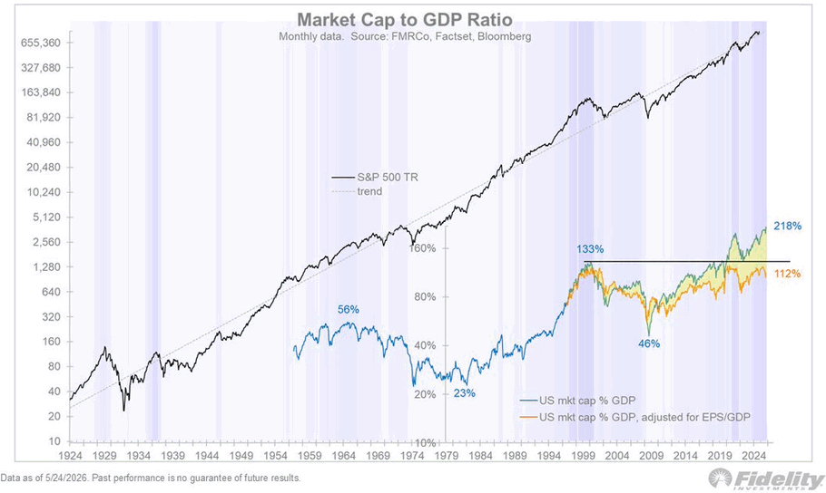
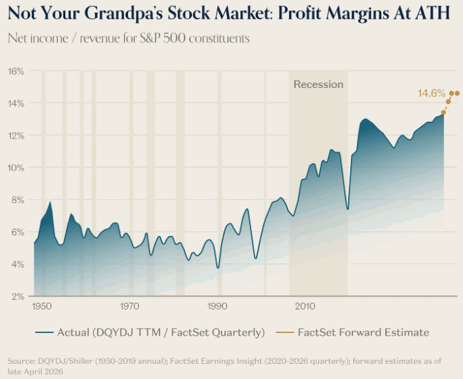
But the adjustment carries its own failure mode, and it is the more important point. The entire reduction from 238% to 112% rests on the assumption that the elevated corporate profit share is permanent. Profit margins are the single most mean-reverting series in finance — they have never stayed at a new plateau indefinitely, because high margins invite the competition, wage pressure, and regulation that erode them. If margins so much as normalise toward their own recent average, the adjusted indicator is dragged back toward 133% and beyond. The tripwire, in other words, is not the absolute valuation level today. It is a margin reversal. Which makes the behaviour of margins the question that matters, and the answer is not reassuring.
Headline S&P 500 net margins sit near 14.6–15%, roughly triple their post-war norm, and forward estimates extrapolate them higher still. Strip out the Magnificent Seven — Apple, Microsoft, Nvidia, Alphabet, Amazon, Meta, and Tesla — and the picture inverts: margins for the other 493 companies sit around 8–9%, flat to falling, well below their 2018 and 2021 peaks. The two series tracked together for two decades and decoupled completely after 2023. What looks like a structurally more profitable corporate America is, on inspection, a handful of platform companies pulling the aggregate upward while the broad market's profitability quietly erodes. There are two stretched springs in that one chart: a headline margin at a historic extreme, and a forward estimate that assumes it climbs further.
The same fragility shows up in earnings revisions. Through the first months of 2026, analyst EPS revisions ran about +7%, against a historical median of roughly −8% at the same point in the year — a positive divergence of some 15 percentage points with no real precedent in the data. The optimism is concentrated where the AI capital-spending boom is feeding the numbers; the index keeps grinding higher because it is tracking that earnings tape while the broader signals of manufacturing softness and narrowing breadth have not yet bitten. A simple catch-down to the normal seasonal path would imply downward revisions of 13–15% from here. The valuation is extreme on every absolute gauge, and the earnings base supporting it is narrower and more reflexive than the headline suggests.
The cleanest single expression of the valuation leg, though, is none of the price multiples. It is the equity risk premium — the S&P 500's earnings yield minus the yield on the 10-year Treasury, which measures the extra compensation an investor receives for taking equity risk over owning a risk-free government bond. With the earnings yield near 4.73% and the 10-year around 4.56%, that premium has collapsed to roughly 0.17%. Essentially zero. The historical norm is 300 to 500 basis points. The last time investors accepted so little extra reward for holding stocks over bonds was the dot-com bubble. This is the sharpest signal in the valuation cluster precisely because it is not a pure valuation number at all — it folds in the rate environment, and it says that at today's prices and today's yields, equities are priced to offer almost no premium for their risk.
The equity risk premium near zero is the most precise tie between current conditions and 1999–2000. An investor is being paid roughly seventeen basis points to hold equity risk instead of a risk-free Treasury, against a historical norm of three to five hundred. Either earnings must deliver growth far above the trend already embedded in those forward estimates, or the premium normalises the only other way it can — through a lower price.
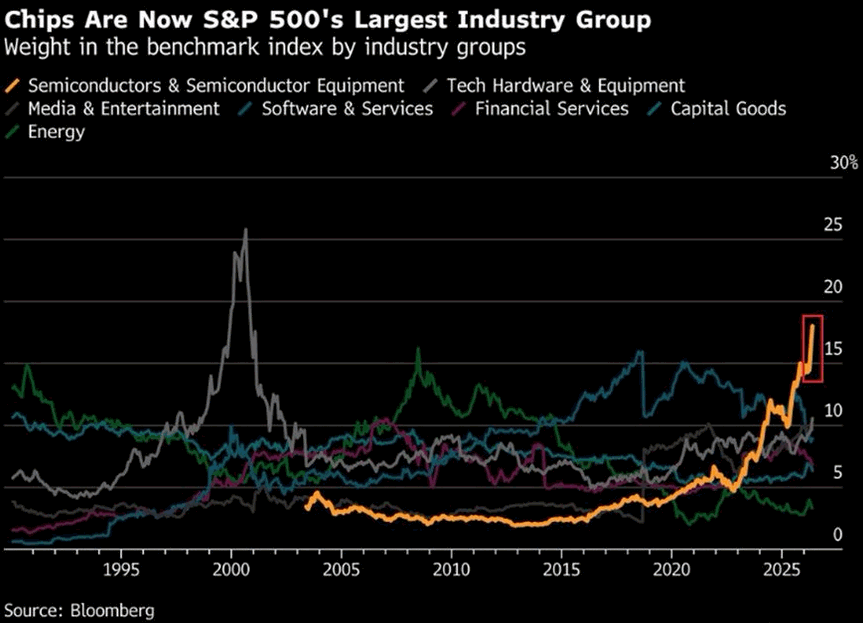
A high valuation tells you the market is expensive. The structure of the rally tells you how it is being held up — and that is where the 2026 cluster shows its most distinctive feature. The Magnificent Seven now account for roughly 34.8% of the S&P 500 by weight. The top ten names sit near 38–40%, up from about 22% in 2020. The single most important fact is not the level of concentration but its shape: this is single-name-heavy in a way no prior top was. Semiconductors alone represent about 17% of the index, and Nvidia by itself is around 7% of the entire S&P 500. Concentration is no longer a sector story. It is increasingly a one-stock story.
Set that against the historical pattern and it stops looking like a quirk and starts looking like a fingerprint. At the 2000 peak, Media & Entertainment reached roughly 24% of the index. At the 2007 peak, Financials reached roughly 22%. Each time, the sector that had absorbed the marginal dollar on the way up became the sector that led the way down. Today's chip weight has travelled from about 5% to 17% in three years, tracing almost exactly the vertical arc that Media drew into 2000. The difference — and it is the dangerous difference — is dispersion. The 2000 and 2007 concentrations were spread across dozens of constituents within the leading sector. Today's 17% is dominated by a handful of names, with one absorbing the bulk of the passive bid. When the leadership is that narrow, the index's fate is lashed to a very small number of decks.
The mechanics of who is buying matter as much as how much is concentrated. A growing share of the marginal bid into these names is price-insensitive by design. Passive index funds buy in proportion to market capitalisation, which means they buy the most of whatever has already risen the most — a momentum loop dressed as diversification. Systematic and volatility-targeting strategies add exposure as realised volatility falls, and realised volatility has been falling. The effect is a flow that does not ask what anything is worth; it asks only what the index weights are and what the volatility reading is. On the way up that flow is a tailwind that compounds the concentration. The concern is that the same mechanism runs in reverse: if these funds are forced to sell, they sell the largest weights hardest, regardless of price or value, into a market whose depth has thinned precisely because everyone is positioned the same way.
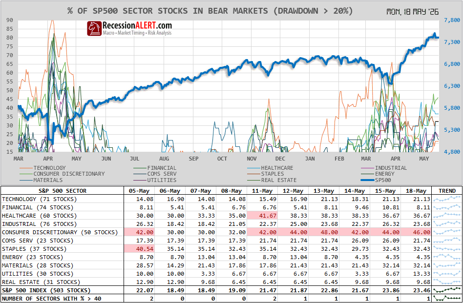
Beneath the record index level, the internals have been quietly decaying — the breadth leg of the cluster. The popular advance/decline line, a cumulative tally of how many stocks rise versus fall, recovered through the spring and on its own would suggest a healthy market. But it masks what is happening at the component level. As of mid-May 2026, roughly 23% of S&P 500 constituents were in their own bear markets — down 20% or more from their highs — while the index itself printed all-time highs. The damage is concentrated in the unglamorous parts of the market: Consumer Discretionary near 46% in bear-market territory, Healthcare around 37%, Staples and Materials near a third each. Only Energy, Financials, and Real Estate look structurally healthy. The index is at a record because a handful of mega-caps are at records; a large minority of its members are already in decline.
The participation measures confirm it. Through late April, the share of S&P 500 members trading above their 50-day moving average — a standard breadth gauge — stalled in the low-to-mid 60s even as the index made new highs, triggering two distinct warning conditions at once: new index highs unconfirmed by breadth reaching 80%, and a recovery that failed to reclaim its prior breadth peak. Both rules fired simultaneously, a configuration that historically precedes corrections rather than coincides with healthy advances. Investors have also been visibly abandoning ballast for beta: the ratio of high-beta stocks to the index sits at all-time highs while the ratio of low-volatility stocks to the index sits at all-time lows — mirror extremes that mark a crowd betting a single thematic direction with the defensive positions sold off.
The narrative holding the structure together is artificial intelligence, and it carries a structural fragility the prior narratives did not. Of roughly $2.1 trillion in disclosed hyperscaler computing backlog, an estimated $1.05 trillion rests on commitments from OpenAI and Anthropic — private, deeply unprofitable, unauditable counterparties whose ability to honour those orders depends on raising fresh capital again and again. Microsoft, Oracle, Google, and Amazon each carry roughly half their reported obligations against this circular arrangement, in which the buyers of AI computing are funded by the same ecosystem selling it. The earnings are real, which is exactly what makes the setup more seductive than 1999, when the dot-coms had no earnings at all. But real earnings do not make the assumptions behind them safe. If the circular capital flow normalises even partially, the forward earnings base shrinks quickly — and a market priced for it to expand has a long way to fall to meet the new number.
Bubbles rarely peak on stretched multiples. They peak on stretched assumptions about future earnings power — and the narrower the leadership, the fewer the decks holding the whole ship up.
Valuation tells you the price. Positioning tells you who is left to buy. The third leg of the cluster is sentiment, and the cleanest read on professional positioning is Bank of America's Fund Manager Survey — the closely watched monthly poll of roughly 200 institutional investors managing some $517 billion. In May 2026 it crossed the line. Cash levels fell to 3.9%, below the 4.0% threshold that triggers the survey's own contrarian sell signal for global equities. Equity allocations jumped to a net 50% overweight — the largest single-month surge on record, up from just 13% overweight the month before. A 37-point leap in one month, driven by EPS optimism and a forecast of rate cuts, is not the behaviour of investors easing into a position. It is the behaviour of investors who have decided the coast is clear and are afraid only of being left behind.
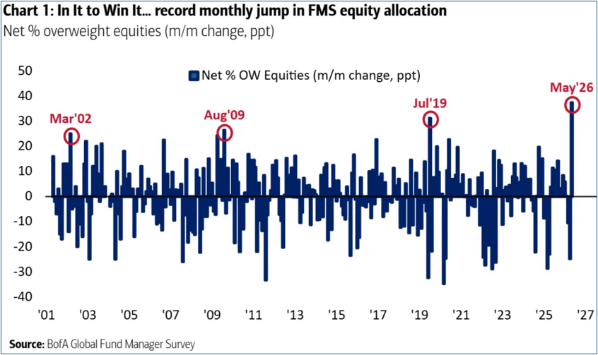
That is the textbook condition at a top: the professionals are nearly fully invested and holding minimal cash, which means the marginal buyer who powered the advance is running out of ammunition. The corroborating signals point the same way. The insider buy/sell ratio sits at 0.32, below its historical average of 0.39, with January's data showing nearly five shares sold by corporate insiders for every one bought — the people who know their businesses best are distributing into the strength. Berkshire Hathaway, run by the man whose valuation gauge opened Section II, holds a record cash pile near $397 billion, almost entirely in Treasury bills, which is as plain a statement as that organisation makes that it sees little worth buying at these prices.
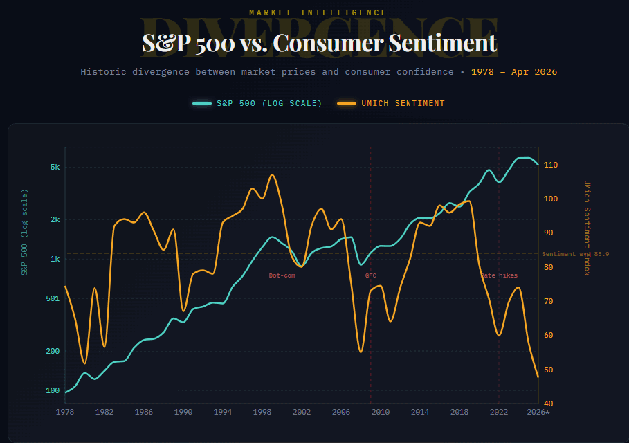
Sitting against all of that euphoria is a single jarring contradiction that defines the current cycle. Consumer sentiment, as measured by the University of Michigan, registered 47.6 in April 2026 — the third-lowest reading in the survey's history — while the S&P 500 sat near all-time highs. The gap between how Americans feel about the economy and where the stock market trades is the widest and most sustained since 2021. The market and the household have decoupled. That is itself a hallmark: in a healthy expansion, confidence and asset prices move together; when they diverge this far, the market is being held up by liquidity and positioning rather than by the lived condition of the economy underneath it.
This brings us to the most misread signal in the complacency complex — volatility — because the surface reading and the structural reading point in opposite directions, and getting the distinction right matters. On the surface, complacency looks total. The VIX, the index of expected 30-day S&P volatility derived from option prices, has sat in the mid-teens — around 17 through May, with single closes near 15 — and realised volatility has been even lower, roughly 10.5% on a 20-day basis. By that measure no one is worried, and at-the-money options are cheap.
At-the-money calm — realised vol just 10.5%
A persistent, elevated bid for tail protection
But the tail tells a different story, and the split is the signal. The CBOE SKEW index — which measures how expensive deep out-of-the-money puts are relative to at-the-money options, and therefore how much the market is paying for protection against a crash rather than a wobble — has climbed to roughly 139 even with the VIX asleep. That is elevated. It says that while headline volatility suggests no one is worried, a persistent bid for tail protection has been building underneath: someone is quietly paying up for crash insurance even as the surface stays calm. The texture confirms it — through May, traders were buying relatively cheap downside protection on the broad index while selling expensive volatility on the semiconductor names that had run hardest. The complacency is real at the at-the-money level and demonstrably absent at the tail.
The structural mechanism beneath that calm is worth understanding, because it is the part that can turn. When at-the-money volatility is cheap and demand for ordinary hedging is low, the dealers who have sold those options sit "long gamma" — a position that requires them to trade against the market's direction to stay balanced, buying dips and selling rallies, which mechanically suppresses day-to-day volatility. Low volatility begets cheaper options begets less hedging demand: the loop reinforces itself, and it is part of why the tape feels so placid. The danger is that the same machinery runs violently in reverse. Let volatility spike hard enough and dealers flip to "short gamma," at which point they must trade with the move — selling as the market falls — amplifying the decline rather than damping it. That is not a hypothetical; it is precisely what detonated the inverse-volatility products in the Volmageddon episode of February 2018. The elevated SKEW says some participants are already positioning for exactly that asymmetry.
Overlaying all of it is the narrative saturation that accompanies every top. In 1999 the magazine covers belonged to the New Economy evangelists; in 2026 the equivalent is the near-weekly cycle of Jensen Huang features and AI-transformation cover stories. Narrative saturation is itself a contrarian marker: by the time a story has penetrated to the point of weekly cover treatment, there are few converts left to make, and a market that needs new believers to keep rising has nearly exhausted its supply. The euphoria is not loud and obvious as it was in the meme-stock mania of 2021. It is quieter, more institutional, and wrapped in genuine earnings — which makes it more convincing, and harder to argue against, than any version that came before.
Cash at 3.9% triggers the Fund Manager Survey's own sell signal; a 50% equity overweight is the steepest one-month jump since 2001. The professional crowd is nearly all-in with the cash drawn down, while corporate insiders distribute and consumer confidence sits near record lows — and Berkshire Hathaway sits on a record $397 billion in Treasury bills, the plainest statement the Oracle of Omaha makes that there is little worth buying at these prices. The marginal buyer is running out of fuel at the same moment the structural gamma that has suppressed volatility is most primed to reverse.
The final structural leg is the one that did the most damage in 2008 and the one investors are most prone to wave away in 2026, because the headline credit gauges look benign. High-yield credit spreads — the extra yield investors demand to hold riskier corporate bonds over Treasuries — sit near 285 basis points, with investment-grade spreads around 80. Tight, but not at a historical extreme. This is the one place the cluster reads amber rather than red, and the note will say so plainly: spreads are not yet flashing the alarm they flashed in late 2007, when high-yield sat near 250–270 basis points before blowing out past 2,000. The current level is a yellow light, not a red one.
The structure beneath the spread is the concern, not the spread itself. Some 93% of all institutional leveraged loans issued in 2024 were covenant-lite — loans written without the maintenance financial covenants that historically let lenders intervene before a borrower deteriorates. About 91% of the entire outstanding stock now carries that loose structure, roughly $1.29 trillion of it, with average leverage running 5.8 to 6 times EBITDA, approaching the multiples that prevailed at the 2007 peak. The 50 to 75 basis points of extra yield that covenant-lite paper once commanded for its weaker protections has essentially vanished. Investors are taking on the late-cycle credit risk and being paid almost nothing extra for the privilege — the same compression of risk compensation that the near-zero equity risk premium showed in the equity market, expressed in credit.
Loose structure now the market norm
Approaching the 2007 peak multiple
The rate architecture sends a signal that is routinely misread, and the misreading is dangerous. The 2s/10s yield curve — the gap between two- and ten-year Treasury yields — has disinverted to roughly +50 basis points after the long 2022–24 inversion, the deepest and longest in the series. The instinctive read is relief: the curve is normal again, so the recession scare has passed. History says the opposite. Six of the last seven major 2s/10s inversions were followed by an NBER-dated recession, and the recession reliably arrives after the curve disinverts, not during the inversion itself. The disinversion is the signal that the credit event is approaching, not that it has been cancelled. Reinforcing the caution, the 3-month/10-year spread — the version the New York Fed uses in its recession-probability model — has slipped back into negative territory after a brief positive excursion.
Two further pressures sit on top of the rate picture. The 30-year Treasury yield has tested a multi-decade ceiling near 5.20% for the third time in three years without breaking through — a bear steepener driven by term-premium repricing rather than by recession fear, which is part of why earnings have so far outrun the drag from higher discount rates. A decisive weekly close above that ceiling would reset the cost of permanent capital across the economy, reaching mortgage rates already near 6.36%, auto loans, and credit-card rates. And the consumer credit data already shows the strain: credit-card delinquencies 90 days or more past due have climbed to roughly 13%, matching the 2010 post-GFC peak — in what is nominally a healthy economy. Student-loan delinquencies snapped from near zero to about 10% as pandemic forbearance ended; auto delinquencies are grinding toward 5%.
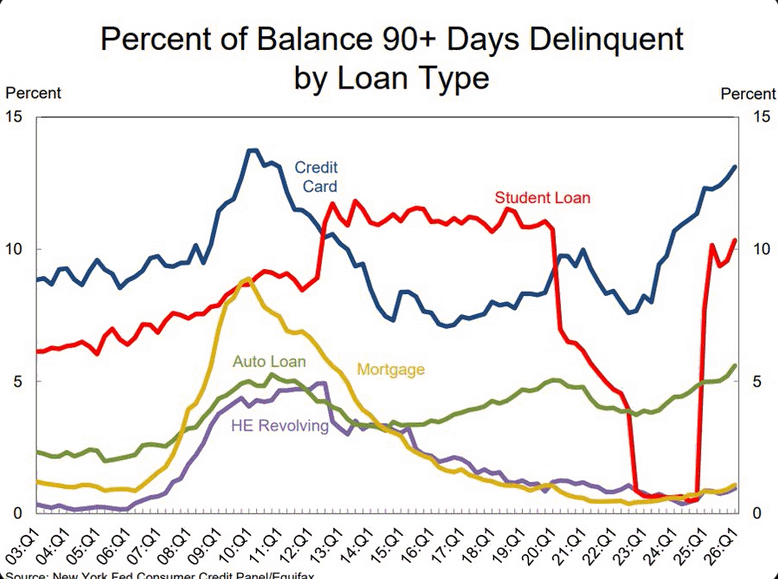
The shape of that stress matters for reading the risk correctly. It is a K-shaped signature — acute distress concentrated in unsecured, lower-income credit, while secured borrowing stays pristine, with mortgage and home-equity delinquencies near 1%. This is not the 2008 transmission channel, where a secured-debt and housing spiral took down the banking system. The 2026 watch is on consumer-card and consumer-discretionary flows, not mortgages. And the most under-appreciated reading is structural: the ratio of equal-weight consumer-discretionary stocks to the S&P 500 has fallen to 0.07, beneath the 0.08 floor that held even at the GFC trough and through the COVID wick. Cap-weighted discretionary looks healthy only because Amazon and Tesla dominate the weighting; strip them out and the apparel, casual-dining, and mid-tier auto names are priced for permanently impaired demand. Eleven years of structural bleed have removed the last historical backstop.
Credit spreads are amber, not red — and that is exactly how the prior two cycles looked shortly before they were not. The fragility is structural rather than priced: covenant-lite at 91% of the outstanding stock, leverage near the 2007 peak, the risk premium for weak protection gone, and a yield curve sending its historically reliable post-inversion warning. None of it is a problem until liquidity tightens. All of it becomes a problem at once when it does.
The point of the syndrome framework is that the legs are read together, not scored in isolation. The scorecard below sets all five against the four historical tops and the current reading — the composite at a glance, before the prose interprets it.
Syndrome Scorecard — Five Legs Across Five Episodes
| Syndrome Leg | 1999–00 | 2007–08 | 2020 | 2021–22 | 2026 |
|---|---|---|---|---|---|
| Valuation | Extreme | Elevated | High | High | Extreme |
| Concentration | High | High | Low | Moderate | Extreme |
| Complacency | Extreme | High | Low | Extreme | High |
| Internals | Decaying | Decaying | Healthy | Decaying | Decaying |
| Credit | Benign | Cracking | Quiet | Tightening | Loose |
Extreme / High / Elevated — symptom present and intensifying · Moderate — partial · Low / Healthy / Benign / Quiet — symptom absent. Read down the 2026 column against 1999–00; read the 2020 column for the exogenous-shock contrast.
Read down the 2026 column and the configuration is unmistakable: four of the five legs at or near maximum intensity, with only credit lagging — and credit lagged in 1999 too, right up until it didn't. That simultaneity is the analytical heart of this note: not that any single reading is unprecedented, but that this many are extreme at once. The honest comparison is to weigh it against the four cases. The 2026 cluster is denser than 2007, where valuation was only moderately elevated and the syndrome expressed almost entirely through credit and leverage. It is denser than 2021, where the mania was loud and retail-driven but breadth and credit had not decayed to today's degree. It is most similar in composition to 1999–2000 — the same valuation extremes, the same narrowing leadership, the same risk-premium compression, the same all-licensing narrative — which is the comparison the data keeps returning, signal after signal.
The contrast case keeps the framework honest. The 2020 COVID top scored almost nothing on this composite — valuations elevated but not extreme, breadth healthy, sentiment constructive, credit quiet — and the market broke anyway, on a shock from outside the system. That is the standing caveat on everything here: the syndrome reads the endogenous top the market builds for itself, and it is silent on the exogenous bolt from the blue. No single reading in this note is without precedent; what has no clean precedent outside 1999 is this many readings at this intensity at the same time, because a syndrome is defined by simultaneity, not by the severity of any one symptom. The internal conditions for a self-generated unwind are more completely assembled now than at any point since the dot-com peak.
The framework also identifies what would convert the barometer reading into an actual break, because a dense cluster is a condition, not a catalyst. The most identifiable trigger on the horizon is the IPO pipeline. The 2026 listing slate is the most AI-concentrated on record — SpaceX, OpenAI, Anthropic, and Databricks among them — with a combined projected listing value north of $2.9 trillion and a capital demand of roughly $100–200 billion, two to four times the size of the entire 2025 US IPO market. New issuance on that scale drains liquidity from existing equities as institutions rotate into the new paper, delivering a supply shock and a rotation drain at the same moment. It is the kind of mechanical liquidity event that turns a fully invested, narrowly led, complacent market from stretched into falling.
SpaceX, OpenAI, Anthropic, Databricks
A simultaneous supply shock and rotation drain
One feature argues for patience rather than alarm, and it belongs in an honest composite. The market has been trading as a liquidity gauge more than an economic one, and the Federal Reserve has quietly been reflating after the deepest balance-sheet drain of the post-COVID period. As long as that liquidity tide is rising and the AI earnings tape holds, the cluster can persist and even intensify without breaking — which is the precise reason this note refuses to issue a timing call. The configuration tells you the ship is in dangerous waters. It does not tell you the hour the weather turns. That distinction is the whole of the investment posture, and it is the subject of the final section.
Four of five syndrome legs at or near maximum intensity, the fifth at amber and structurally primed — the densest configuration since 1999–2000, with a clean comparison case (2020) confirming the framework reads endogenous tops and not exogenous shocks. A dense cluster is a barometer, not a catalyst; the IPO-pipeline liquidity drain is the most identifiable thing that could convert one into the other.

The hardest discipline in late-cycle investing is acting on a barometer without mistaking it for a clock. The cluster is dense; the timing is unknowable. Both statements are true at once, and the response that honours both is not a directional bet but a change in posture. The metaphor that governs this note is seamanship. When the glass falls and the sky turns, an experienced crew does not abandon the voyage and it does not pretend nothing has changed. It reefs the sails, checks the rigging, secures what is loose, and makes small course corrections while there is still time to make them calmly. The error in both directions is symmetrical: the investor who sells everything on a barometer reading forgoes returns the market may well keep delivering for quarters; the investor who changes nothing is trimming sail in the gale instead of before it.
Translated into allocation, the posture is specific without being a stock tip. An investor who is overweight the most concentrated index exposure, fully invested with minimal cash, and carrying leverage is positioned for the tide to keep rising and for nothing else. The seamanship response is to trim the concentrated winners back toward target weights rather than let them run to ever-larger shares of the portfolio; to raise cash modestly, restoring the optionality that a 3.9% professional cash level has surrendered; to reduce leverage while it is cheap and voluntary rather than forced; to shift the equity that remains toward quality and earnings durability and away from the narrowest thematic exposure; and to add downside hedges, the one move worth treating as urgent. None of this is a call to be out of the market. It is a call to be in it differently.
Hedging deserves that urgency because it is the only part of this prescription the market is currently mispricing in the investor's favour. With the VIX in the mid-teens, the at-the-money volatility that prices broad-index downside protection is about as cheap as it has been this cycle — and far cheaper than it will be the moment a volatility spike flips dealer gamma from suppressing moves to amplifying them. The rising SKEW is the tell that the window is closing: the most sophisticated participants are already bidding up the deep tail while the headline gauge still reads calm. Of every move available, buying protection while it is still cheap is the lowest-regret way to batten the hatches — it costs little if the bull runs on, and it is the one position that pays precisely when everything else in the portfolio is failing at once.
Mid-2026 carries the densest cluster of major-top conditions since 1999 — extreme valuation, the narrowest leadership of any modern top, professional positioning past its own contrarian sell trigger, a quarter of the index already in private bear markets, and a credit structure as loose as 2007. This is a barometer reading, not a timing signal: the configuration can persist while liquidity rises, and it offers no date for the turn.
The response is to reef the sails — trim concentrated winners, raise cash modestly, cut leverage, tilt toward quality, and buy tail protection while it is cheap. Stay invested; change how you are invested. The asymmetry favours the investor who prepares the ship before the weather turns over the one who waits for confirmation that never arrives in time to act on calmly.
The honest risk to this view is that the bears are early, as they have been before. If AI productivity gains prove structural and lift earnings durably above trend, the valuations the note calls extreme could be partially grown into rather than corrected — the "grow into it" path that CAPE has occasionally taken after prior peaks. If the Federal Reserve sustains its reflation and provides an explicit liquidity backstop, the complacency clock resets, as it has before. And the cluster itself could simply diverge: breadth could durably recover, spreads stay tight, and margin debt recede, in which case the simultaneity that defines the syndrome dissolves and the thesis weakens with it. These are real possibilities, not rhetorical hedges. The reason the thesis remains the better base case despite them is that the seamanship posture costs little if the bull continues — a modest drag from carrying more cash and quality — and protects a great deal if it does not. That payoff is asymmetric in the investor's favour, which is the only durable reason to act on a barometer at all.
The instruments do not tell you when the storm hits. They tell you the glass is falling and the sky has changed — the densest such reading since 1999. You do not turn the boat around on a barometer. You reef the sails, and you do it while the sea is still calm enough to work the lines.